 Back
Back featured reads
Behind the scenes: Designing Mesquite Outlaws F.C.’s cowboy inspired brand.
April 13th 2020
9 Minute read
Christopher Payne is an award-winning British designer and passionate football fan. Backend up by his knowledge of football and the execution in design, Payne creates stylish, unique practical and relevant designs for ambitious and forward-thinking football clubs that are looking to progress both on and off the pitch.
Payne has worked with many football clubs and organizations around the world, designing iconic new logos and creating a detailed branding system, that makes the football club standout, grow off the pitch, and thrive in the modern world.
You can see examples of Payne’s work by clicking here.
Contact me¿Hablas español? Yo también. Contactarme.
Mehrdad Moayedi, of Centurion American Development Group, a hugely successful man in the business world. Has built his success in the construction industry and owns many substantial buildings in and around Texas. Recently, Mr. Moayedi purchased and renovated the World Famous – Mesquite Rodeo Arena – a venue which, as the name suggests, is traditionally associated with Texas Rodeos.
Besides having a love for business, Mr. Moayedi also has a huge passion for soccer. Now he wanted to use the newly renovated and revitalized Mesquite Arena as a venue for professional indoor soccer. Mr. Moayedi wanted to build a new team, one that would be good enough to play and compete in the Major Arena Soccer League (The World’s Biggest Professional Arena Soccer League) – A team for the people of Mesquite, and for the people of Texas.
With the objective being the recently renovated Mesquite Arena would become the new home of this new team.
Mr. Moayedi and his team dended up choosing a name fitting for the area: Mesquite Outlaws F.C. The name referenced Texas’s history and long association with the cowboy and outlaw culture. It was a bold, aggressive, descriptive and unique name. This was a great first step in building the new brand. But now, that name – Mesquite Outlaws F.C. – needed a logo and brand that was equally as bold, unique, and could visually represent the cowboy and outlaw culture, simultaneously with soccer. The name needed a brand and a logo that would work commercially, and help create new fans to fill the arena. While being able to sell official club merchandise.
So, I was given the honour and challenge of designing this new brand.
The kick-off meeting and belt buckles
I always listen intently to team owners views and suggestions on what they envisage for their brand. As a football brand designer, it is my job to execute on their vision and bring the best possible creative and strategic outcome to them.
In one of the early kickoff meetings, the idea of the logo design referencing a belt buckle was suggested. My initial thought was, ‘oh that’s interesting’ and then the more I thought about it, the more I loved the idea.
Belt buckles come in all different shapes and sizes and have long been associated with cowboys and outlaws. Their elaborate designs often have interesting shapes, markings and messages are made to catch the eye. In researching cowboy and outlaw culture, and looking at countless images of cowboys, rodeo riders and outlaws, I noticed that almost all historical and modern-day images of cowboys, rodeo riders and outlaws show the subject wearing a belt buckle.
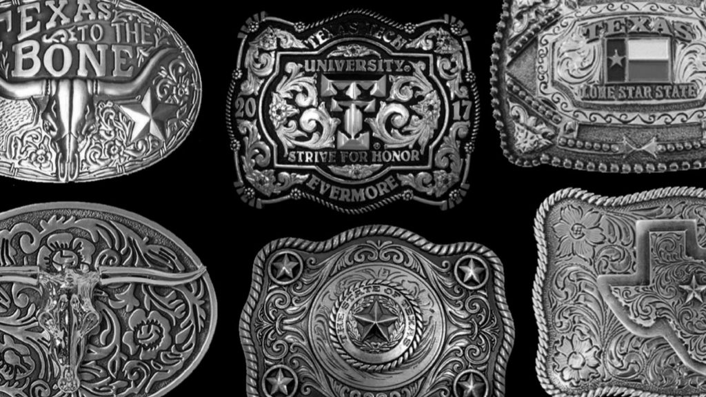
Researching belt buckles further, I became fascinated with their design and unique shape. I loved the floral marking that traditional belt buckles often have, and the detailed, organized patterns that are carefully cut into the design. These helped me see the potential in creating a meaningful design with this iconic Texas reference. Many football team logos have shapes that are circular or shield-like. While also being narrow in width, and slightly bigger in height. As this football club’s logo design would be shaped like a traditional belt buckle – which naturally (and functionally) are wide and short, I knew that this design would instantly look and feel different. Using belt buckles as a reference I sketched out various shapes and forms for how the logo’s outer border could be constructed. I wanted it to be detailed and instantly recognizable as a belt buckle, but also have symmetry and a controlled sense of style. I was intrigued by the organic floral patterns that were incorporated into traditional belt buckle designs and I wanted include pattern in this new football logo design.
Testing the concept: Sketching out the initial ideas.
Once I had a rough outline and form for the belt buckle, I started to look at how I could fill this shape with relevant and useful information.
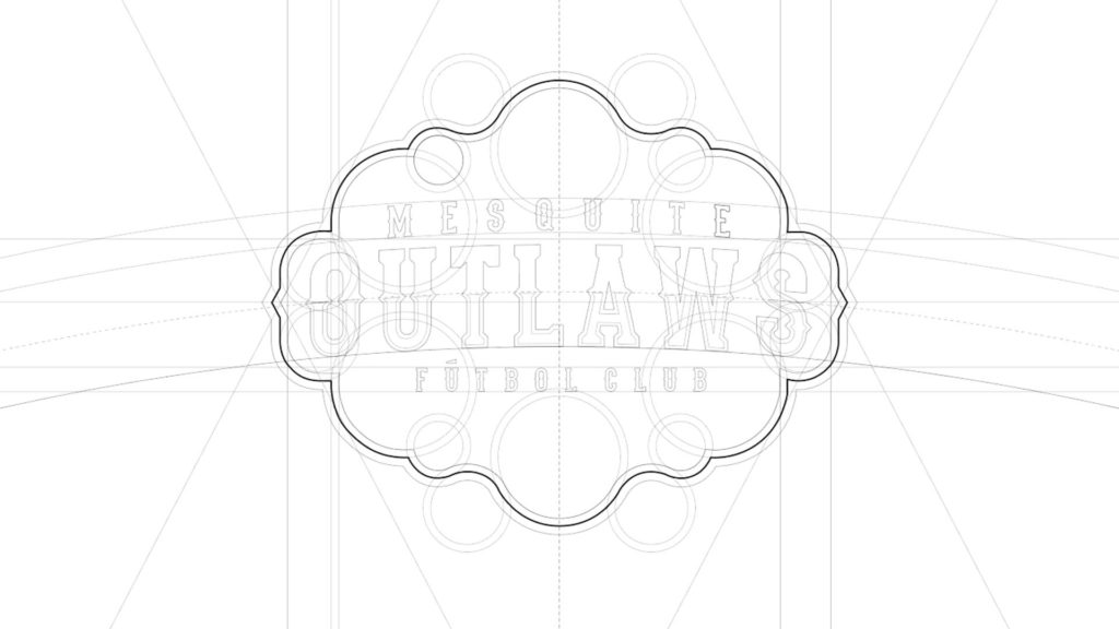
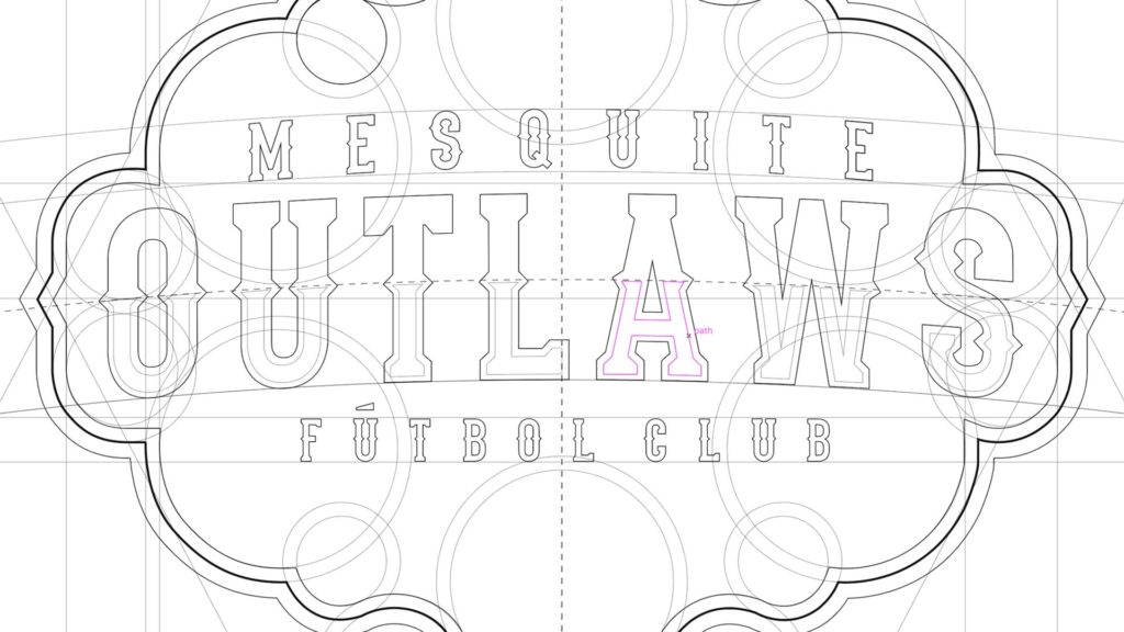
Typography would play a huge role in the football club’s logo, (and the wider brand), I placed the word ‘Outlaws’ at the centre of the belt buckle shape, with the words ‘Mesquite’ and ‘Futbol Club’ sketched either side of the word. By making the word ‘Outlaws’ as big as possible within the design, this would ensure that the football club’s’ name ‘(The) Outlaws’, would remain legible when the logo is replicated at a smaller size.
The next phase is to build relevant design elements around the name.
“It is important that when designing a logo for a football team, that every design element placed within the logo design must have purpose and a valid reason for being there. There should not be any ‘fluff’ or unnecessary design elements placed within the design. You have limited space so each design element must have meaning, and work seamlessly with the other design elements”.
As the football club would be playing in an international league (Major Arena Soccer is hosted by teams in the USA, Mexico and Canada). The Mesquite Outlaws would not only be representing Mesquite, but also be representing Texas, and the USA. To show this passion and pride for the area in which it represents, I placed a Texas state outline at the peak of the logo design. This allows the design to better communicate the brand story and endear the logo design to the Texas locals.
Placed at the bottom of the logo sketch is a soccer ball, referencing the sport that the Mesquite Outlaws play, while drawing a connection between the football club and the sport.
![]()
Designing a structured floral pattern
Looking to stay true to the belt buckle theme, I added a floral pattern to the design.
While researching for floral patterns on belt buckles (and other metals pieces from the western period). I noticed that the patterns felt very organic, free flowing and spontaneous, but when examined closely you notice they are in fact, very well structured, planned out, and organized.
The floral patterns have strong symmetry and balance and intertwine to fill the canvas in which they are placed. These are design traits that I would take inspiration from and incorporate into this logo design.
Digitizing the logo design
With the sketches complete, I began digitizing the logo design.
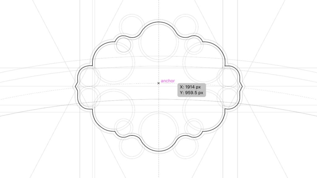
After scanning the initial logo sketch into the computer, I cleaned up and recreated the outer shape of the logo sketch, by blending geometric shapes with vertical and horizontal lines. I used a series of circles that intersect each other to form the unique outer border of the logo.
Typography that is inspired by ‘WANTED’ posters
I wanted to ensure that the new Mesquite Outlaws F.C. brand boasted both iconic and eye-catching typography. As a designer with a good knowledge of typography sets, I knew early on that the typography for this brand would be inspired by old cowboy / western ‘wanted posters. Influence by both genuine posters from the 1800s and posters that have since been popularized by film, culture and folk law.
Determined to be as authentic and creative as possible. I researched old western posters, to study the typography’s characteristics and form. Studying how the letters were constructed and what made this type style so unique. Whilst researching old western ‘wanted’ and ‘reward’ posters, and looking at existing modern typefaces that could potentially be used to bring this new football club to life. I wanted a typeface that was stylish, though legible, strong and able to carry a brand.
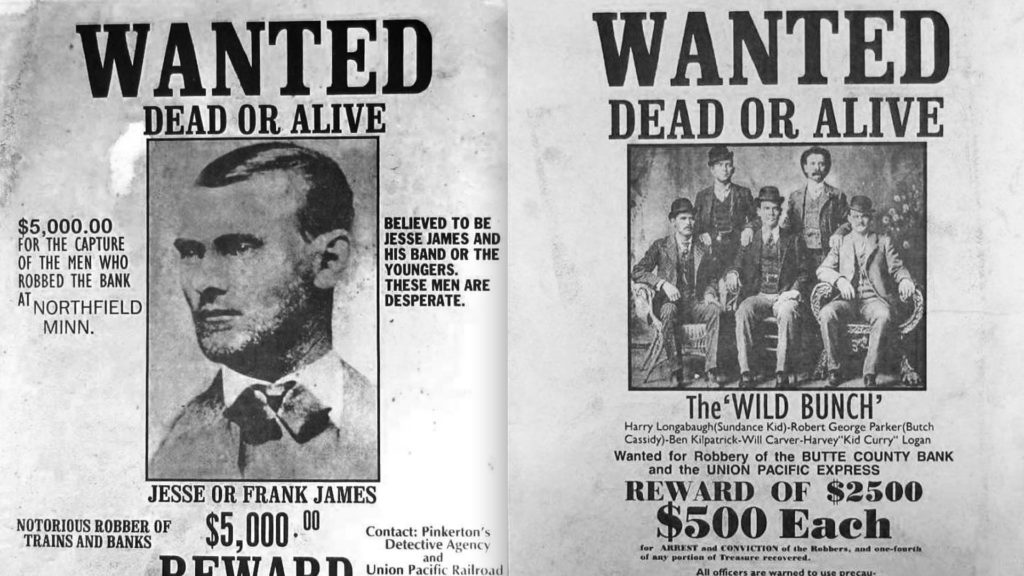
After reviewing 100s of typefaces, I liked the visual impact and style of a typeface called ‘Stadium’. Its design and structure had good form and nice presence. It’s spurs (the triangular shapes that are seen at the midpoint of each letter) gave the typeface aggression and personality, and referenced the old western wanted posters, but it also had a modern, and progressive feel to it.
Although the font ‘Stadium’ would work as a base font for this brand, in the logo, particularly the part that the said ‘Outlaws’, I modified the design slightly, to make it thicker, and have more presence and give it a two colour appearance. I stylized it to have a metallic look, and to feel like it is raised into the logo, and have a 3D shine to it.
Digitizing the floral patterns
I digitized the floral patterns that would reference traditional belt buckle designs, and would add balance and structure to logo design, I created these using a series of intercutting circles that would create an organic-looking pattern. I wanted these patterns to have symmetry and balance so, once I had one pattern complete. So I replicated, and reversed the design, and placed it on the opposite side of the logo.
Texas state graphic and football graphic
I built out the Texas state graphic to be unique to the Outlaws. With the border of the Texas state lines, I added the iconic shape of the texas flag as well as experimented with the position of Texas’s ‘lone star’. I placed the star in the centre of the graphic to help with the design’s symmetry and visual balance.
At the foot of the logo design is a football. There were many iterations of the style of the football, even the consideration of changing it from a football to a house shoe (to reference Mesquite Arena’s long association with horse shows and rodeos), however, in communications with the football club’s ownership group, they stated that they would love to see a football designed into the logo.
“When designing a logo for a football club, you have to explore all avenues and test out 100s of design ideas, from large disruptive changes to small simple tweaks. You also need to occasionally step back and review your work, as your original design execution might have been better than a more developed design. It is important to experiment, and keep working at the design because the logo must be designed right! Once you launch the logo, there’s no going back”.
Adding colors with meaning
When creating a new brand, especially for a football team, the colors must have valid meaning and be relevant to the club, and the area that the football club represents. The colors that are chosen will be worn by passionate fans, and determined players, and so there must be a reason behind the color choices.
My thinking when deciding the brand colors for Mesquite Outlaws F.C. was simple. I took inspiration from the Texas flag and the USA flag, I liked the red, blue and white – as it felt very patriotic, and I felt that it would work well for a team that will represent both Texas when playing domestically, and the USA when playing internationally in Canada and Mexico.
I added bronze and silver to the brand’s color palette as these are colors that belt buckles often had. I explored what happens when light hits the metallic surface and so added light and shade to the bronze and silver. I also looked at sandy and brown colors that are seen in western and cowboy cultures.
I also too inspiration from at the varying shades, and rough texture of blue jeans, that many cowboys, outlaws, and rodeo riders wear.
This rich color pallet would be the base for the new logo design and inform the wider brand’s color scheme.
Launching the logo
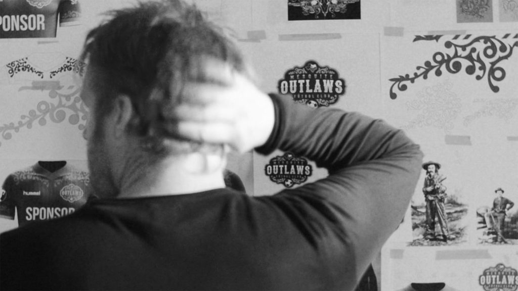
The logo design and brand rollout was a huge success. I provided the football club with a comprehensive brand guidelines document, which would enable the club’s internal team to create content that quickly, and easily and ensure consistent quality across all branding, marketing and merchandising activities. The brand would become famous in and around Texas, with the new logo and brand being seen on TV regularly.
![]()
![]()
Further reading
Mesquite Outlaws F.C. case study