Back
Back Got
Questions?
Want to
Start A
Project?
No project too big or too small. I work with football
clubs from around the world, who are passionate about
progressing their club, both on, and off the pitch.
¿Hablas Español? Yo también - Contactarme
-
Call / Message / Whatsapp
+ +34 657 87 33 53
-
Email
chris@footballbranddesigner.com

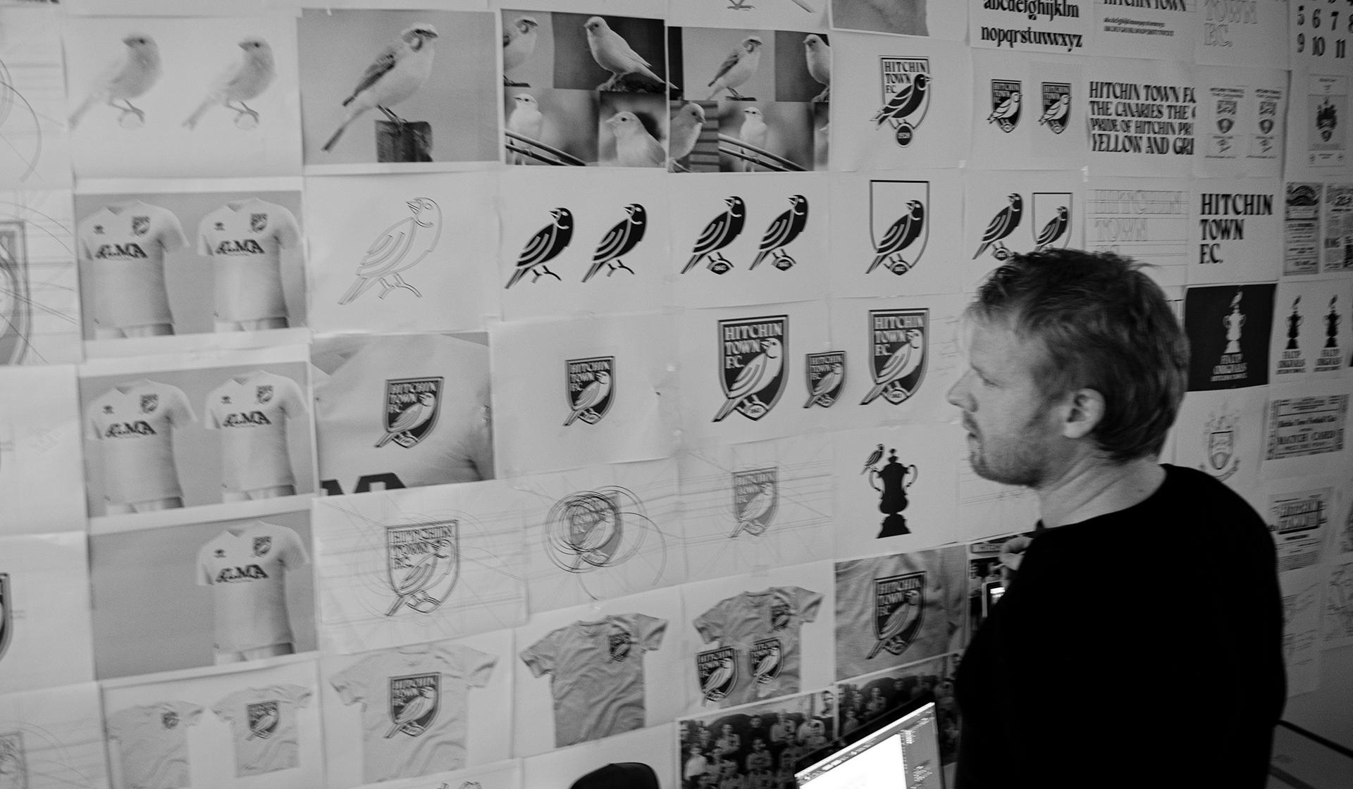
From initial sketch to produced badge
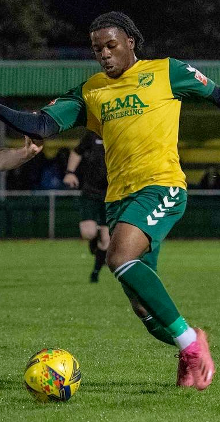
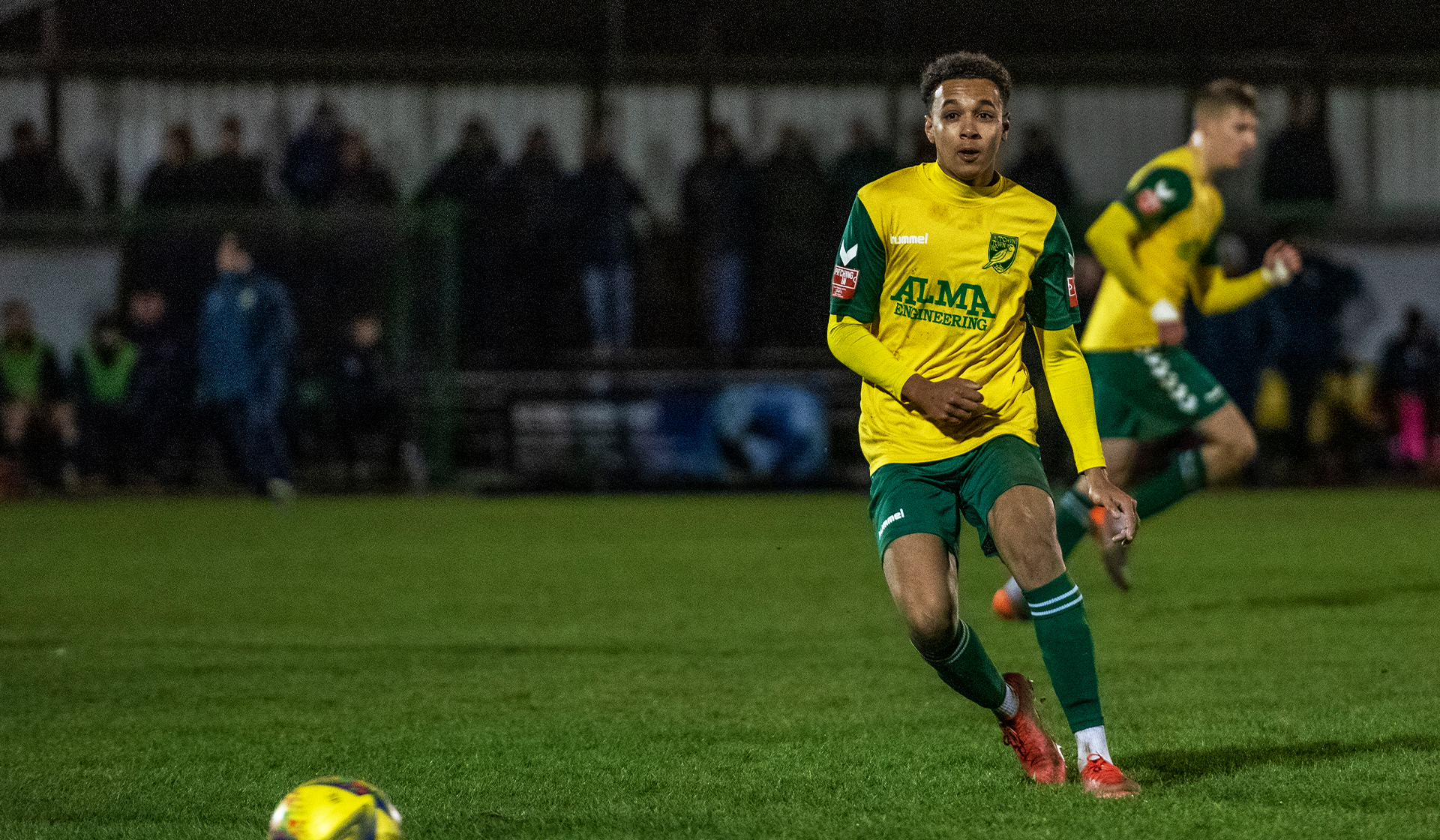
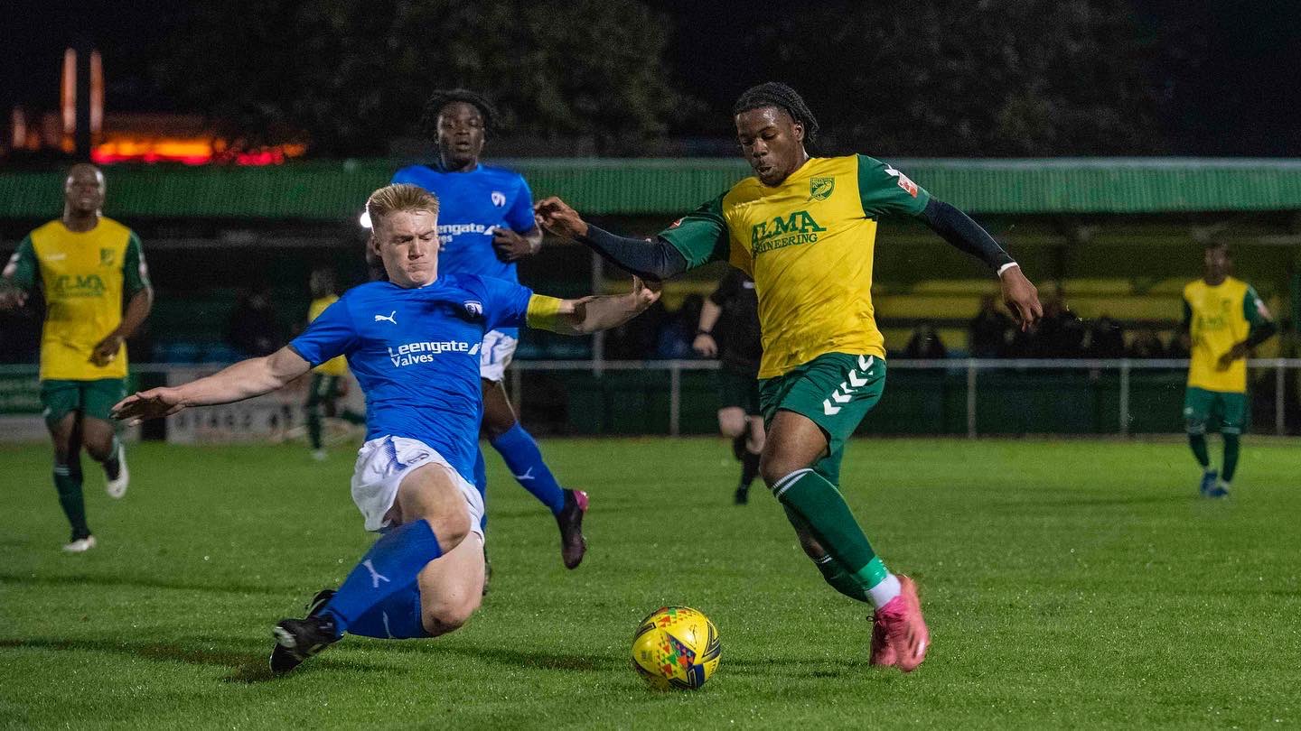
Hitchin Town Football Club
Hitchin Town Football Club has been nicknamed 'The Canaries' since 1928. A canary bird first appeared on Hitchin Town F.C. shirts in 1949. The club is steeped in history. I closely collaborated with the football club to build a fresh new brand identity that respected the club's long history while bringing their nickname - 'The Canaries' to life.
Testing the functionality and performance of the badge
From initial sketch to produced badge
This is the sketch that became the final design. We loved how we could position the club’s name (Hitchin Town F.C.) alongside the club’s nickname (the canaries) within the traditional and historically used shield shape - we also really like the subtly of the canary looking back to the club’s proud past. We immediately saw a huge amount of potential in this sketch.
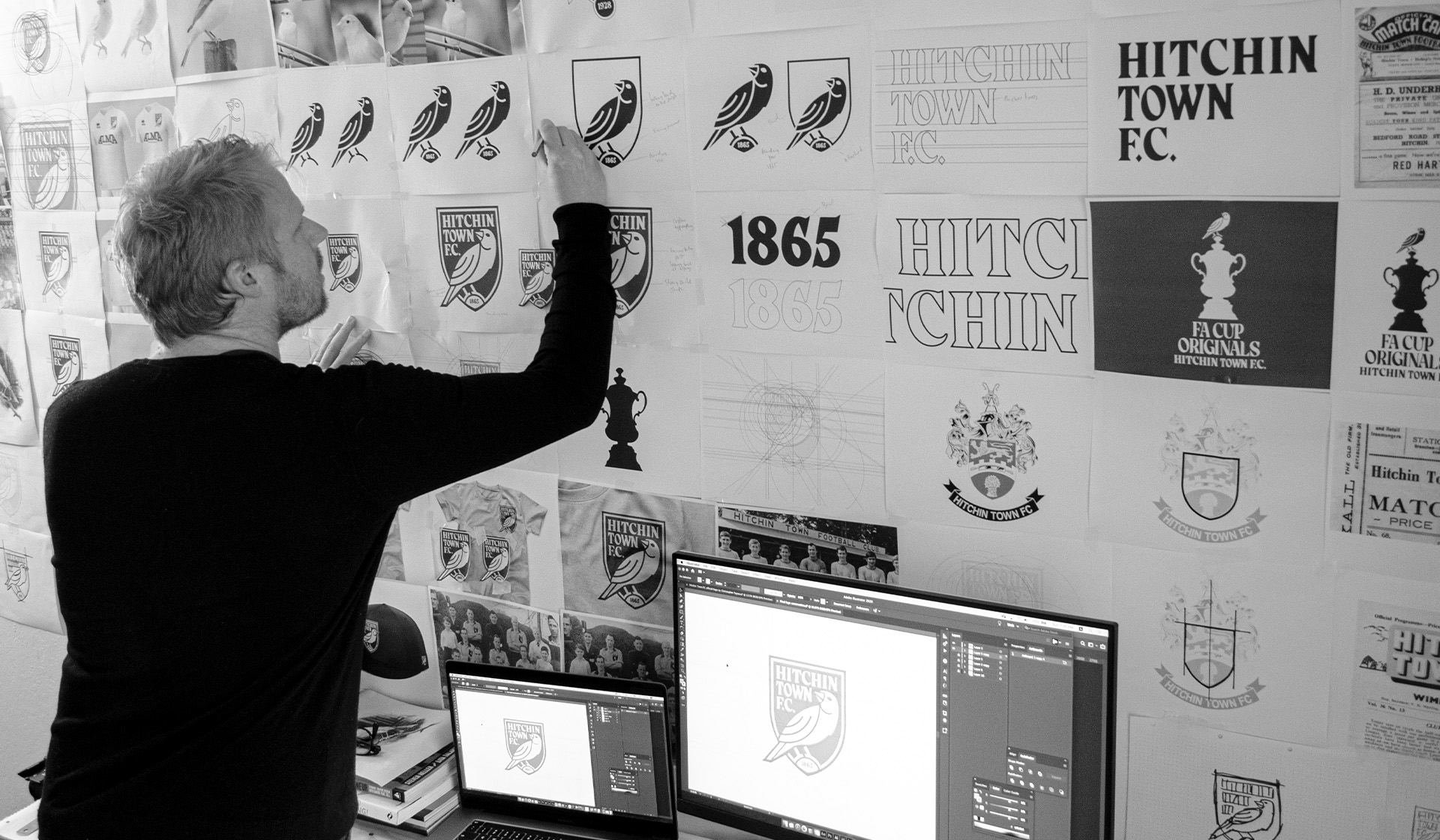
The in-depth design process
Testing the functionality and performance of the badge
Beyond designing the identity, I also pay a lot of attention to testing the identity to see how it looks, feels, and functions when produced in various materials. Below, I am checking the embroidered version of the design.
The in-depth design process
The in-depth design process
Behind the scene in the studio: My design process is detailed and dedicated. I take the design process seriously as the final design will mean so much to so many. I am in a constant mode of perfecting the designs to ensure the best possible results. I leave no stone unturned as I strive to build the best brand possible.
Typography with style and meaning
The in-depth design process
Behind the scene in the studio: My design process is detailed and dedicated. I take the design process seriously as the final design will mean so much to so many. I am in a constant mode of perfecting the designs to ensure the best possible results. I leave no stone unturned as I strive to build the best brand possible.
Hitchin Town Football Club brand consistency

Typography with style and meaning
The club’s typeface is distinct and classy. Each letter has a mesmerising beauty: flowing curves mixed with sharp triangular edges (reminiscent of a canary’s beak). This club typeface will help Hitchin Town F.C. stand out and have a distinct personality in their communications.
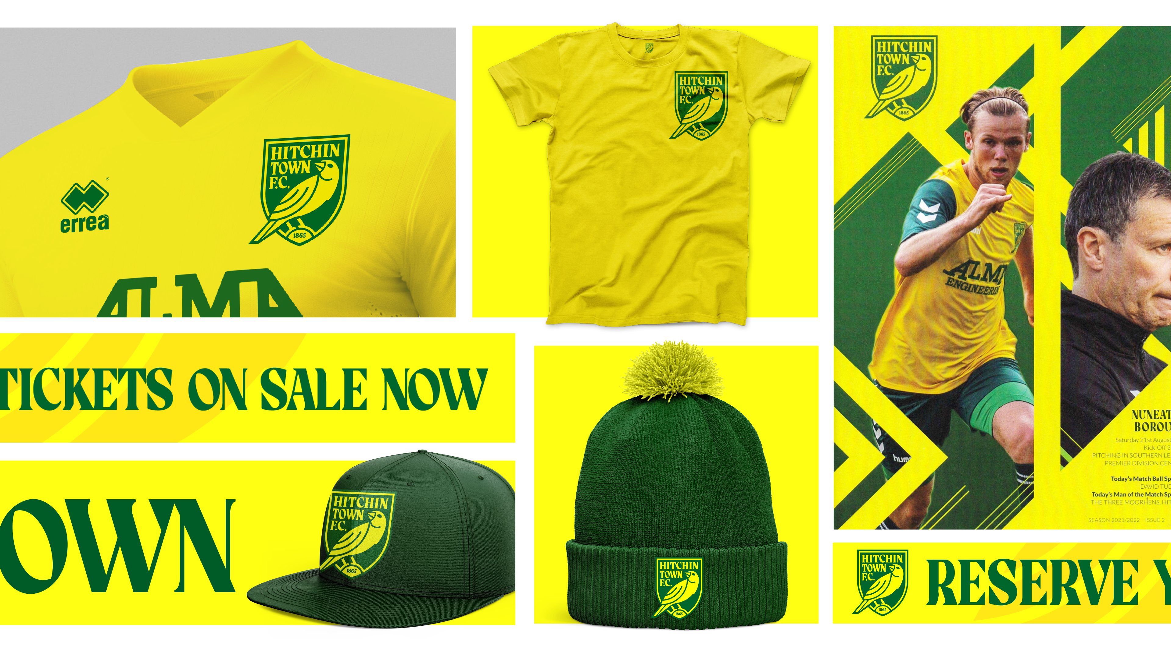
Green and yellow - like the club's kits
Hitchin Town Football Club brand consistency
Hitchin Town F.C.’s brand was built to be unique to Hitchin and the club’s history. Each element of the brand, from colour to typography, was designed to complement each other and to create a highly consistent and striking brand look and feel.
Green and yellow - like the club's kits
Green and yellow - like the club's kits
Hitchin Town has always played in green and yellow; now, for the first time in its history, they have a badge that is also green and yellow—making for a consistent, focused, and memorable brand identity.
Launching the new identity with history in mind
Green and yellow - like the club's kits
Hitchin Town has always played in green and yellow; now, for the first time in its history, they have a badge that is also green and yellow—making for a consistent, focused, and memorable brand identity.
From initial sketch to produced badge
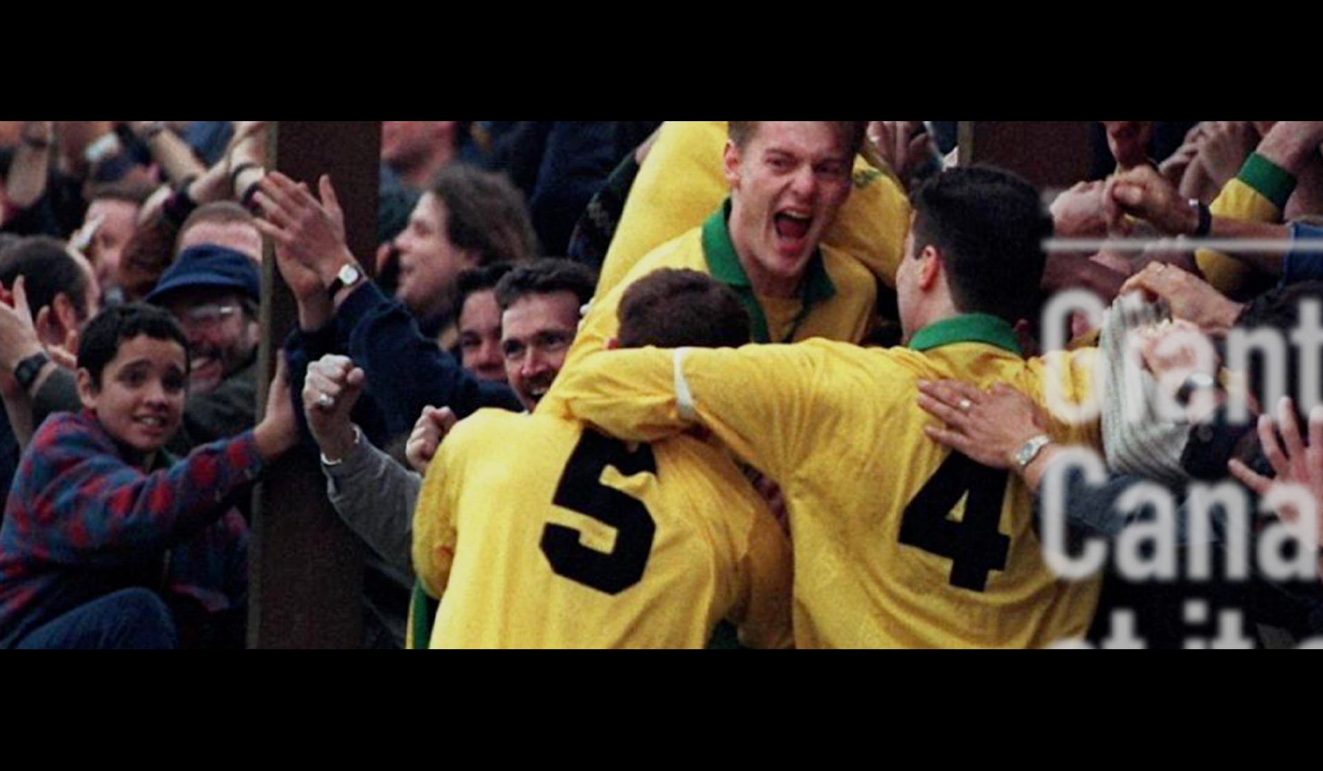
Launching the new identity with history in mind
To capture the hearts of the fans and pay homage to club history, I wrote, produced, and edited a short film that showed the club’s proud history - from 1856 until the day the new crest was launched. This launch film showed the football club’s progress and set the tone for introducing the new identity.
Overview
Hitchin Town Football Club has been nicknamed 'The Canaries' since 1928. A canary bird first appeared on Hitchin Town F.C. shirts in 1949. I collaborated with the football club to design a new identity that respected the club's long history, while setting the club up for success in the modern era. The result saw the club sell more merchandise in 1 year than it had in the previous 10 years put together.
Team
Hitchin Town Football Club
League
Southern Football League
Project Length
5-6 months
Club location


Services Provided
Logo design
Brand guidelines
Launch film
Explainer video
Quote from the owners
"We were honoured to be joined on the project by renowned football designer Christopher Payne, who curated the final design and launch collateral – he has been nothing short of sensational throughout the process. His attention to detail, commitment, and passion for the project has been superb".
Stewart Curtis - Marketing Officer
Quote from the fans
"This is superb, love the new identity and the launch video. Well done Hitchin".
@NellyEvans79