 Back
Back featured reads
Behind the scenes: Redesigning Alfreton Town F.C.’s logo
March 19th 2020
6 Minute read
Christopher Payne is an award-winning British designer and passionate football fan. Backend up by his knowledge of football and the execution in design, Payne creates stylish, unique practical and relevant designs for ambitious and forward-thinking football clubs that are looking to progress both on and off the pitch.
Payne has worked with many football clubs and organizations around the world, designing iconic new logos and creating a detailed branding system, that makes the football club standout, grow off the pitch, and thrive in the modern world.
You can see examples of Payne’s work by clicking here.
Contact me¿Hablas español? Yo también. Contactarme.
I became acquainted with the Alfreton Town Football Club owners and investors, after I sent an email directly to their Chairman, Wayne Bradley. Asking him if he would consider updating and developing their logo. In this email I included a 20 page dossier that respectfully outlined why current Alfreton Town F.C. doesn’t work in the modern world, and how I could help the football club progress. I had done my research, I was prepared… but didn’t expect a reply.
The Alfreton Town F.C. logo at the time wasn’t doing the football club too many favors. It was an old styled football logo that was taken from the town’s crest of arms – it was never meant to represent a football club. The design was busy with lots of complicated elements and shapes. A major problem with the old logo was that it didn’t have a single point of focus , nor did it clearly say the football clubs name within the design. The logo had served the club for many years, however, it was now holding the football club back from progressing – so the logo wasn’t iconic, relevant, or recognizable. It hindered the football club from becoming a brand, and thrive in the new modern era.
![]()
Even the most die hard fans knew that a change needed to happen in order to help progress the football club, and thankfully, the Chairman, Wayne Bradley realized this. When he replied to my email saying,
“Hi Chris, thank you for your email, we would like to take you up on your offer to redesign the football club’s logo. Lets chat” – Wayne Bradley
After a short conversation with Wayne, he put me in touch with Alfreton Town Football Club’s new American investors, lead by Michael Hitchcock. Michael and I spoke about the football club’s ambitions, the current brand and their plans for the future brand. Then compared notes on how we can work together to help progress the football club, and reach new markets, both in England and in America.
I was instantly impressed by Wayne and Michael and their ambitions for the football club. Intrigued by their drive and passion, and their strong realization that in order to progress the football club. A change of logo was needed, and after our initial weeks working together I was proud to team up with them on this project.
Researching the Football Club and the place it represents
After my conversations with the owners of the football club, and listening to their ambitions and vision for the club, I did my own independent research. This is the first phase of any project and it’s one of the most enjoyable parts of the process – I love learning everything I can about a football club. I am motivated by researching the history, past players, and club traditions. Each and every football club is beautifully unique, and are built on generations of history and stories from seasons gone by. Each football club has its own traditions and spirit. So when rebranding a football club, it is important to respect the soul of a football club, and to ensure that the club’s spirit is respected and encapsulated within the new designs.
I started out by researching the town of Alfreton – I found out that it is said to be named after ‘King Alfred the Great’ – the former King of England. This immediately intrigued me, and when researching the town further, I discovered that many of the street names referenced ‘King Alfred the Great’ – with examples like ‘Alfred Street’ and ‘King Street’ – (the main road that passes through the center of the town). This was an key part of my research and ideas began to formulate.
When researching the history of Alfreton Town Football Club, I found out that one of the original logos for the club featured a King as the centerpiece of the logo (pictured below). This king is believed to be ‘King Alfred the Great’. Now ideas were formulating, and during conversations with the football club owners it was decided that the facial point of the new logo should be a King. King Alfred the great. This would ensure that the new brand respects the proud and unique history of the football club, and also the place that the club represents.
![]()
![]()
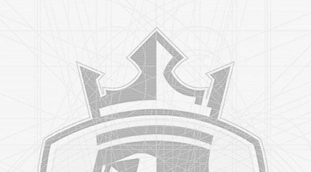
Above is the original Alfreton Town F.C. logo. This became a huge source of inspiration. I loved the side profile of the King, and how distinct his hair and beard are. I also loved the three points of the King’s crown. I set out to use, reference as many design elements from this original logo, and use them in the new logo design.
King Alfred the Great would become the centerpiece, and focal point of the new logo.
Executing the King Alfred concept
With the focal point of the logo decided for– ‘King Alfred the Great’ – The next step was to sketch out ideas on how the design can incorporate ‘King Alfred the Great’ within a badge type structure. During the sketching process, I constantly referenced the original Alfreton Town Football Club logo (created in 1959), and examined how the king’s facial structure, beard and long flowing hair was displayed. I experimented with different shapes, forms, and hierarchies and looked at how typography would fit within this new design.
From my sketches I was intrigued by the one that had the crown shape extend beyond the exterior of the logo, giving the design a unique and memorable shape. I scanned this concept into the computer and started the process of digitizing the designs.
![]()
![]()
After creating a rough sketch that I saw potential in, I then started to build the design digitally. During this lengthy process, I aim to ensure that the design is made up of geometric shapes and reference lines. Doing this ensures that each mark within the design is related to another, in some shape and form. Making the design scalable and have a traditional British design look.
There is a huge amount of tweaking, repositioning and experimenting in the digitization process. I chose to display ‘King Alfred the Great’ at a side profile – to reference the original 1959 logo. In building out King Alfred’s look, it was important to ensure that his facial features had the right balance between being detailed, yet minimal. I spent a lot of time designing, tweaking and analyzing the structure of King Alfred’s face, so that it had expression and character, but did not have too many details (as this detail would be lost when the logo is reproduced at a smaller size).
“It was important to ensure that his facial features had the right balance between being detailed, yet minimal. I spent a lot of time designing and tweaking King Alfred’s face so that it had expression and character, not not have too much details”.
When forming King Alfred’s face, I prioritized facial features that were unique to King Alfred, and facial features that were seen on the original 1959 logo design. Features such as the long hair, the pointed beard, and the mustache. Staying true to the original design and historic images of King Alfred was important for the design.
I also worked hard to ensure that King Alfred’s expression was determined, focused and ‘ready for battle’. I didn’t want this logo to have a happy look or feel too ‘cartoony’, The design had to feel steely, strong and determined. I referenced the form of the original logo and replaced curved lines, with straight lines and sharp edges – This added strength to the design.
“I wanted this logo design to have a unique shape, to ensure that it is memorable and stands-out on a page”.
The shape and positioning of the crown made the logo design unique. The crown is strong and powerful due to its sharp edges and symmetry. The crown was designed to have three points, this references the three points of the crown in the original Alfreton Town F.C. logo. The crown is one of the most iconic parts of the new design and gives the logo a unique and memorable shape.
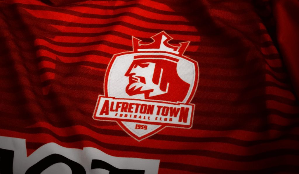
Beyond the crown, it was important that the logo design had the football club’s full name – Alfreton Town Football Club – incorporated within the design of the logo. Having the football club’s name displayed within the borders of the design would make the logo more practical to use. While ensuring that it would work seamlessly on official club merchandising and marketing assets.
The typography used in this logo is strong and impactful, and works well with the design of King Alfred. The typography is placed in a ‘moat like structure’, further referencing the royal theme. In addition to the football club’s name, I wanted to show pride in the history, and longevity of the football club. To do this, I placed at the foot of the logo design, 1959. Which is the year in which the football club was founded and the year when the original logo was used.
![]()
Adding colour to the design
With the design structure complete, I then looked to add colour to the design. It is very rare that a football club changes its colours, and it would have to take exceptional circumstances for me to suggest to a football club to change their colour scheme. For Alfreton Town Football Club, their colour has always been a vibrant shade of red, mixed and softened with white. So it made sense that the primary colour in this new logo would be red.
To compliment the red, I used white, and sliver. These colours would contrast against the vibrant red, and allow the design to have the necessary details and depth. The addition to the white and silver, I also introduced gold to the logo. The gold trim references the royal connection that the football club has, and adds class and prestige to the football club’s identity.
![]()
![]()
Presenting to the board
I presented the new design to the football club’s chairman and investors, and it received amazing support. The design would give the football club a clean, modern, relevant and iconic new look. One that is inspired by the history of Alfreton and the history of the Football Club. With the design being visually interesting and tells a unique story. Furthermore, beyond being iconic and stylish – the design is practical and flexible, and can be used across all imaginable marketing and merchandising.
This new design wouldn’t have been possible without the chairman’s and investors’ support and vision. I am proud to have worked with Wayne Bradley and Michael Hitchcock on rebranding Alfreton Town Football Club, and have helped progress the football club off the pitch.
Launching the new design
The new logo design was launched on April 5th 2015 and received rave reviews from Alfreton Town F.C. fans, the local community and football fans from across the country. A wave of positivity washed over the club as people recognized Alfreton Town F.C. as a forward thinking and progressive Football Club, not afraid to make positive changes in the name of progress.
![]()
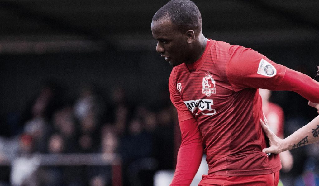
Shortly after the logo launch the football club released a new range of merchandise items that featured the new logo – and shortly after that came the launch of their official new kits. The new logo and brand design brought forward a rolling wave of momentum and optimism for the football club and its owners – with positive update after positive update appearing in the news.
![]()
Sales rocketed and the football club has never seen anything like it, with merchandise sales since the logo launch running at over 200%.
Further reading
For further information on this project feel free to check out: