featured reads
Behind the scenes: Redesigning Taunton Town F.C.’s logo
March 25th 2020
7 Minute read

Christopher Payne is an award-winning British designer and passionate football fan. Backend up by his knowledge of football and the execution in design, Payne creates stylish, unique practical and relevant designs for ambitious and forward-thinking football clubs that are looking to progress both on and off the pitch.
Payne has worked with many football clubs and organizations around the world, designing iconic new logos and creating a detailed branding system, that makes the football club standout, grow off the pitch, and thrive in the modern world.
You can see examples of Payne’s work by clicking here.
Contact me¿Hablas español? Yo también. Contactarme.
I remember being instantly excited when this project came in – Giuseppi Fraschini, Taunton Town Football Club’s forward thinking Director of Marketing. Had recently joined the football club and was looking to build a scalable brand that would push Taunton Town Football Club forward, and help them progress.
Giuseppe reached out to me, initially via email, to schedule a quick phone call. During that call, Guiseppi pitched the football club to me and their ambitions. He also explained that the current logo was becoming a problem for the football club, both from a practical and strategic standpoint. As the football club looked to attract and retain a younger audience and increase their social and digital media presence.
I was more than happy and excited to help Guiseppi and Taunton Town Football Club build a new brand that would drive the football club forward.
The original Taunton Town Football Club logo
Guiseppi was right, the Taunton Town Football Club logo at the time was holding the football club back. I learnt about a logo previously used as Taunton’s coat of arms. It had a busy design, one which had no focal point. A design that was complex and unbalanced. It had a latin phrase – Defendimus – which was interesting – but it made the logo design feel a little outdated. It was a design that needed simplifying to suit modern day demands and fan expectations.
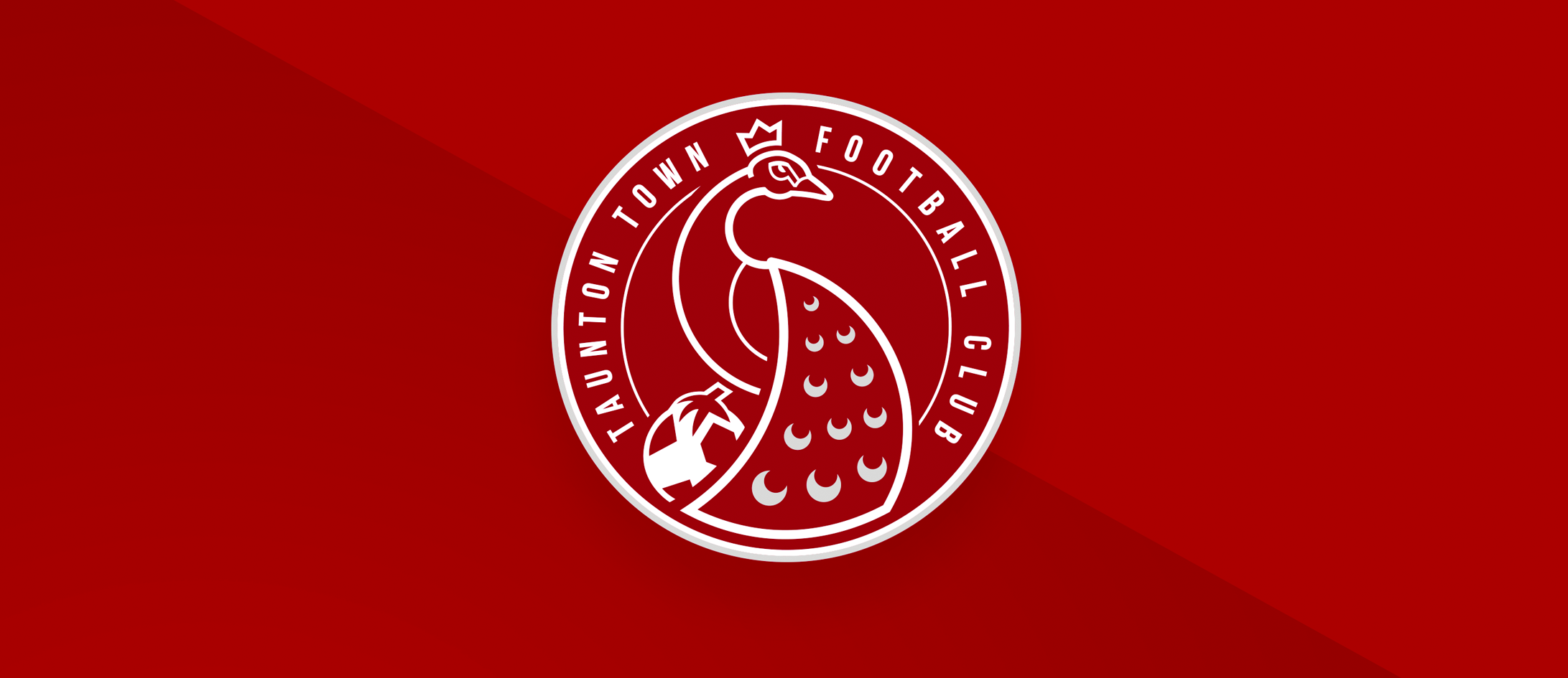
From conversations with Guisppi, and researching Taunton Town Football Club, I was instantly intrigued by the football club’s nickname – The Peacocks. This had been the football club’s nickname for many, many years, and the original logo, (amongst all the complexity) had a peacock at the top of the design.
I immediately thought that a peacock should be the focal point of the new logo design. A peacock is a majestic creature, beautiful, yet powerful, dominating and intimidating. I also liked the fact that not many other sports teams in England and beyond had the nickname ‘The Peacocks’. This would make the peacock branding very unique, and ‘ownable’ to Taunton Town Football Club.
Researching peacocks
Upon deciding that a peacock would be the focal point of this new design, I immediately began analyzing pictures, painting and videos of peacocks. I monitored the way in which peacocks moved, and key characteristics – I was intrigued to break down what distinguishes Peacocks from other birds.
The peacocks feathers, or plumage (as I learnt it they were called) were the main and obvious point of interest, and something very unique to a peacock, however these birds also had interesting markings on their faces, small but powerful looking legs, and their long curved necks made these birds visually recognizable.
I began sketching ideas on how this logo could look. I experimented with all different designs and shapes, all with the peacock as the focal point of the logo.
Defending the football
An early idea that caught my eye was to have the peacock, with its foot on a football. I love the imagery of the peacock interacting with a football and using its body to protect / defend the football. Just as the Taunton Town F.C. player would use his body to defend the ball on a Saturday afternoon.
Another reason why I liked the visual imagery of a peacock protecting a football is that the original Taunton Town F.C. logo design had the latin phrase ‘Defendimus’ as part of the logo design (meaning ‘to defend’). Another aspect I loved was how this design could incorporate that same message – but in a visual manner – the peacock is defending the football.
I debated for a long time if the peacocks feather should be up or down, and in the end the design had better balance and meaning with the feather pointing down and protecting the football.
Designing the peacock
I built the peacock design using a series of circles, these circles were all scaled at different sizes and intercutting each other to form a unique, and iconic central graphic.
Although the peacock’s body is facing left (shielding and protecting the football), I wanted the peacock’s head and slight to be facing to the right, facing forward. I wanted the peacock to invoke optimism, and look forward to the future.
The curvature of the peacock’s neck, runs in the opposite direction to the curvature of the peacock’s wing. In order to create a nice flow within the design.
The football graphic is slightly hidden behind the peacock’s wing, with the peacock’s foot placed on the ball – showing protection of the ball while adding layers and depth to the design.
To add extra personality to the peacock, I replaced the peacocks ‘head feathers’ for a crown. A peacock is a royal bird, and this crown placed upon the peacocks head adds extra interest and prestige to the design.
Adding typography and placing within a shield
The logo’s shield and outer border is circular in shape, it encapsulates all of the design elements, such as the peacock graphic, and typography. Having all the design elements encapsulated within a solid shape helps the logo be more practical, scalable, and easier to use across all scenarios.
The typography, that displays the football clubs name follows the same circular motion and theme. The typeface wraps around the peacock and the words ‘Taunton Town’ and ‘Football Club’ are cleverly broken up at the top of the design, by the peacock’s head adding a divided symmetry.
Adding colours
In the football logo design process, when building out the logo’s structure I always in just two colours – Usually black and white. I do this to ensure that the logo’s balance and visual hierarchy is perfect – then after that I add colour to the design.
Taunton Town Football Club play in burgundy and white – with light blue as an accent colour. The final logo consists of just three colours – burgundy, white, which together provide a high contrast and clear look. With the addition of grey, which provides a softer colour for some of the logos secondary details.
I purposely designed this logo to have very few colours, though strong design details, so that the logo could change colours – should it need to. These days, football clubs often change the colour of their logos for the away kit, third kit and, or, for merchandise items. This keeps the logo fresh, and offers the football club flexibility in creating wearable assets and fan gear.
Launching the logo
The logo was launched at Taunton Town F.C.’s end of season gala, with players, staff and many fans in attendance. Externally, the football club launched their logo with a press release, and launched the video via their social media channels.
I created a launch video that introduced the new logo with the impact, emotion and excitement. It highlighted the need for the football club to progress, as well as explaining to the fans the reasons behind each design element that is placed on the logo.

Further reading
Taunton Town Football Club case study
 Back
Back