 Back
Back featured reads
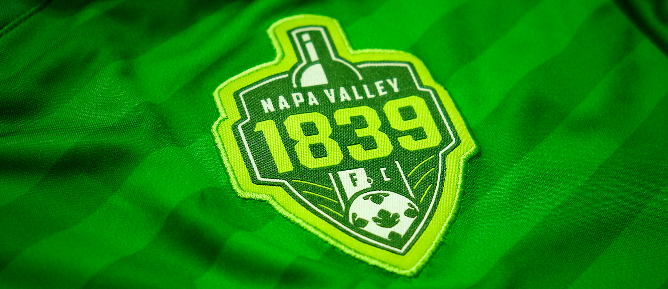
Behind the scenes: Building Napa Valley 1839 F.C.’s brand.
March 8th 2020
4 Minute read
Christopher Payne is an award-winning British designer and passionate football fan. Backed up by his knowledge of football and the execution in design, Payne creates stylish, unique practical and relevant designs for ambitious and forward-thinking football clubs that are looking to progress both on and off the pitch.
Payne has worked with many football clubs and organizations around the world, designing iconic new logos and creating a detailed branding system, that makes the football club standout, grow off the pitch, and thrive in the modern world.
You can see examples of Payne’s work by clicking here.
Contact me¿Hablas español? Yo también. Contactarme.
“Chris, we loved what you did with the English team, (Alfreton Town) and now we are wondering if you want to build a new brand for a new American Soccer Club”.
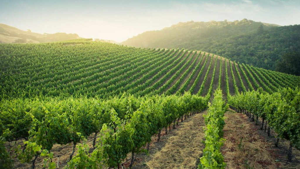
Michael had invested in a new professional ‘soccer’ team that will play in Napa Valley, California – A region famed for its wine industry and lush green landscapes, here Michael wanted to introduce me to the football club’s ownership group.
I accepted straight away.
My goal had always been to design a brand for a professional US ‘soccer’ club. I have long been fascinated by the design style for American sports teams, and how they are stylistically different to that of British and European sports teams.
I always had an admiration for American sports teams and their merchandising strategies. Sports organizations in the U.S. go big on merchandising, and fans love to drape themselves head to toe in official club gear. So this was an opportunity to adapt my traditional ‘European’ design style for the U.S. market.
Back to the phone call, and Michael then mentioned two things that alarmed me –
“Yeah we need the final logo design in 3 weeks, oh, and the ownership group wants to have a wine bottle somewhere within the logo design”. – Michael said.
Wow. Three weeks, what? A wine bottle? At first I thought I had misheard Michael. But he then confirmed that the ownership group wanted to see a logo design that incorporated, and referenced Napa Valley’s famous association with the wine industry.
It became immediately clear that this was going to be a different type of football club, and a unique style of brand.
Designing the logo.
The football club’s board were adamant that they wanted a wine bottle on the logo to represent them. And so this became the starting point for my designs.
If I am being honest, I didn’t initially love the idea of the wine bottle, as it felt very ‘unsporting’ and strange that a professional football team would have an alcoholic beverage displayed on their logo. However, after speaking with the owners about this, I soon realized that the U.S. sports branding mindset is different to the more traditional European branding mindset.
Adding to this, the football club was based in Napa Valley – the world’s famous wine region, so that association with the wine industry should be there within the logo design.
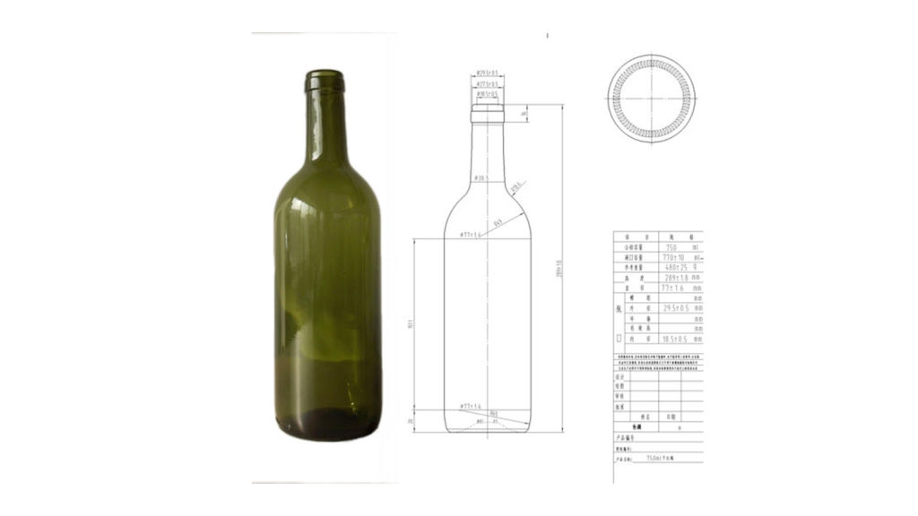
The wine bottle was the first visual ‘ingredient’ I had to consider for the football club’s logo design. The second was the name, Napa Valley 1839 F.C. Why 1839 though? It was one of my first questions. The reason for the 1839 was that the ownership group liked numbers within their names, and secondly, 1839 refers to the year that the first grape seeds were sown in the Napa Valley region.
“1839 refers to the year that the first grape seeds were sown in the Napa Valley region – This started and grew the industry that Napa Valley is now famed for – and so the ownership group wanted to reference this historic year”.
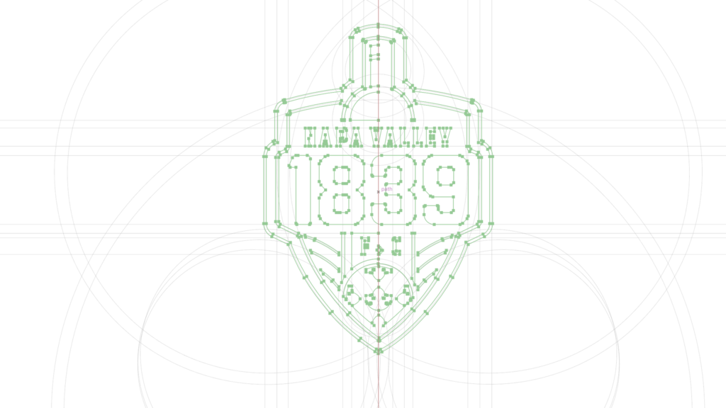
In the early stages of this process I sketched out 100s of rough ideas, trying to figure out how the wine bottle and the numbers 1839 could work together within a shield-like shape. It was important that the wine bottle felt powerful and had a presence within the shield, as this would be the major graphic within the design.
I also wanted the design to have a unique shape, making it stand out and be memorable. So I began thinking, and sketching out concepts with the wine bottle as the catalyst for that unique shape while having the wine bottle exceed the shape of the shield.
![]()
In keeping with the wine theme, the shield shape was subtly inspired by a wine glass’s bowl and rim (the top part of a wine glass). Before being adapted to contain the informative design elements, such as the wine bottle and football clubs name.
Over time the football club would become known as 1839 F.C., and so I wanted the year 1839 to stand out. To become instantly recognizable both at a large size (for example like outside the football club’s stadium), but also in smaller executions (such as social media icons and website favicons). To give the year 1839 impact I enlarged the numbers, and even made them stretch the outer border of the shield. This further added to the logo’s unique shape and interesting look and made the logo more practical. As the club’s name 1839 would be legible at even the smallest of sizes.
Digitizing the design
After landing upon a sketch that I saw amazing potential in, I then scanned it into the computer to digitize the design and perfect it.
Guided by the sketch and the rough positioning of the elements, I built out the logo design using geometric shapes to inform the placements of the elements. This part of the process involves a lot of tweaking and small changes. I aim to ensure that the logo has great symmetry and balance. While analyzing how each design element works with each other. If the visual hierarchy is correct. I also look at how the logo design will function and have impact replicated at large sizes, as well as what impact and legibility it will have when replicated at smaller sizes.
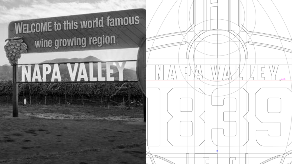
Typography that is inspired by the iconic Napa Valley sign
It is in this phase of the process that I add typography to the design. The influence for the typography style in the words ‘Napa Valley’ and ‘F.C’ is drawn from the famous ‘Welcome to Napa Valley’ sign. It’s well known there and greets 1000’s of tourists and locals back to the region on a daily basis.
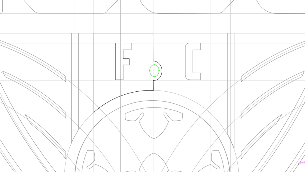
Subtle design details
Beneath the year 1839 I placed the initials F.C (Football Club). For consistency the type is styled and scaled in the same way as the Napa Valley type style above. Interestingly, and almost unnoticeably, the dot between the ‘F’ and the ‘C’ takes on the oval shape of a grape – this subtle design detail again references the Napa Valley wine region.
Abstract vineyards
While building out the design digitally, I noticed that the design felt a little empty, as a wine bottle is inherently a narrow shape. To combat this I added abstract, curved lines to represent vineyards – Pictured below: You will see 3 curved lines either side of the wine bottle. This adds style, balance and symmetry to the design, but also represents the striped hills, and vineyards of the Napa Valley area.
![]()
Adding a ‘soccer ball’ to make the logo more identifiable with the sport we love.
With the wine bottle being so prominent within the design – I felt that the logo may need something to make it visually clear that this is a logo for a football team – (not a winery, or wine bottle production company). To achieve this we introduced a football at the foot of the logo design (as seen below).
The football is used to reference the sport to be played, and represent how it is passionately supported in the Napa Valley area.
I wanted to make the football unique and distinguishable to Napa Valley 1839 F.C., as I saw potential for the football graphic to be used as a secondary logo mark. In designing the football, I altered the usually hexagon patches, into stylized chardonnay leaves. This action added personality and distinction to the design.
![]()
Designing in duo-tone to get structure right
During the design phase, I always limit myself to just two colours – as I want to ensure that the design structure is solid and visually appealing. I peer into the hierarchy of the elements within the design, and how they visually interact with each other. I then observe the balance of the logo, and design, to see what could be improved or tweaked.
Once I am happy with the design structure and hierarchy, I then look to add colour and complete the design.
Don’t overcrowd the logo design
When designing a logo for a football team, it is extremely tempting to add multiple regional, and historic references to the design. Although a football logo should have a few, be careful as this can overcrowd the design. As a designer you have to know when to stop with the references, reflect upon the design and say, yes, this is the right balance.
Occasionally you have to strip back the design, and make it simpler. The job of a football club’s logo is to identify the football club, cleanly and simply. The wider brand can be used to tell the complete story.
With this Napa Valley 1839 F.C. concept, I felt that we had achieved the right amount of visual references to successfully identify the football club and to be the starting point to build that brand. The logo design was shaping up to be visually interesting and extremely unique to the Napa Valley.
Choosing meaningful colours
Originally the Napa Valley 1839 F.C. ownership group wanted the football club’s colours to be red and black, as a junior soccer team in the area. As the football club’s academy used red and black. However after visiting Napa Valley on multiple occasions to research the area, all I saw was shades of green, in varying and beautiful tones. Green rolling hills, green vineyards, green leaves, green grapes, green bottles of wine. So I made the recommendation to the ownership group that this football club was to represent Napa Valley on a national, and international level.
The club’s official colours need to be green.
The ownership group took my advice, and I started applying green to the logo design.
The Napa Valley 1839 F.C. brand would have a controlled range of colours to it. However, I wanted to ensure that the logo design didn’t have too many colours. This self restriction was put in place as I wanted the design to be simple to look at, and practical to work with. I limited myself to three main colours. A vibrant and youthful green, a dark and mature green and a clear and cleansing white. All these colours have different meanings, and can be used for different needs.
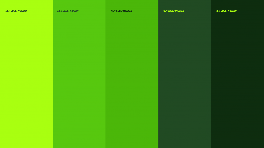
(Above) Napa Valley 1839 F.C. Brand Colours
The vibrant green represents the liveliness of the players and the youthful spirit that the football club has. It is bright and exudes energy, confident and fearless.
The mature green, or dark green, represents the knowledge, professionalism and authority that the football club has. It is the perfect canvas and support to vibrant green, as it adds contrast and support to the more youthful colour.
Clear white helps purify the logo design, ensuring the designs colour combinations don’t make the design ‘too green’. Clear white also helps the design with its structure and the hierarchy of the elements, while adding separation between the year 1839 and the wine bottle to help distinguish between the two entities.
![]()
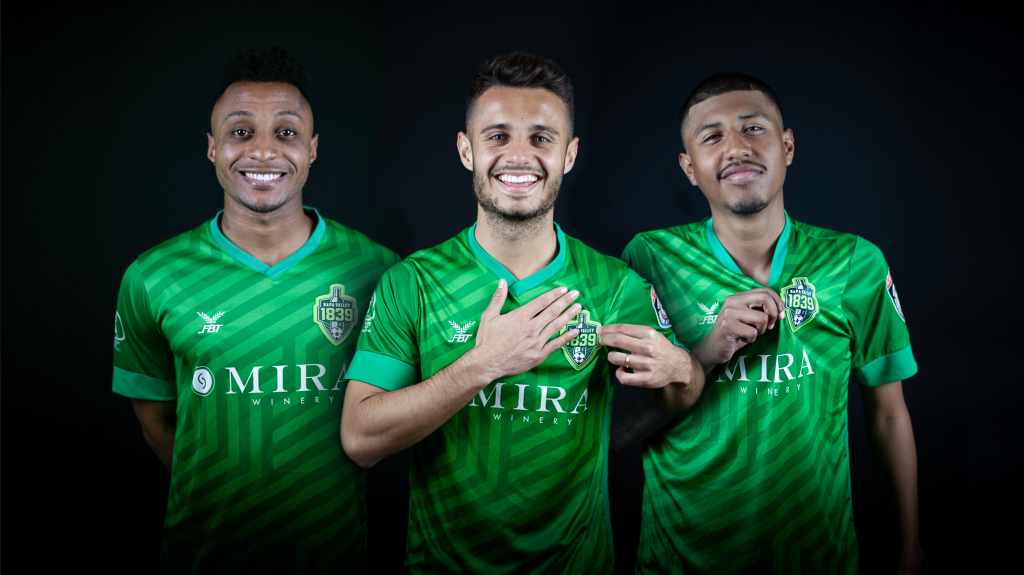
Launching the brand
3 weeks after the call from Michael, the Napa Valley 1839 F.C. logo and brand was launched. Players, fans, business partners and the wider community loved the new brand and what it represented. The wider U.S. soccer community also adored the new brand – with some sports writers and journalists even calling it – ‘The best logo in America’.
This was just my first involvement with Napa Valley 1839 F.C. and I have since supported the football club on multiple other projects. To this day I continue to loyally influence how their brand grows and thrives in the modern era.
![]()
Further reading
For further information on this project feel free to check out: