 Back
Back featured reads
Designing New Amsterdam Football Club’s brand.
May 11th 2020
9 Minutes read
Christopher Payne is an award-winning British designer and passionate football fan. Backed up by his knowledge of football and his execution in design, Payne creates stylish, unique, practical and relevant designs for ambitious and forward-thinking football clubs that are looking to progress both on and off the pitch.
Payne has worked with many football clubs and organizations around the world, designing iconic new logos and creating a detailed branding system, that makes the football club standout, grow off the pitch, and thrive in the modern world.
You can see examples of Payne’s work by clicking here.
Contact me¿Hablas español? Yo también. Contactarme.
Laurence Girard is a successful businessman and a massive football fan. One day we were introduced through Michael Hitchcock, a friend and partner whom I have worked with in the past.
Laurence was in the early stages of building a new football team that plans to be launched in the spring of 2020. With a desire to compete in NISA (National Independent Soccer Association), the USA’s fastest growing league.
This team would be called – New Amsterdam Football Club.
My initial thoughts were… ‘This is strange? This club will be based in New York City but called ‘New Amsterdam F.C.?
Laurence explained… “New York City was originally called ‘New Amsterdam’ (Nieuw Amsterdam), when the Dutch settled in the 16th century, this was until the English came and took the land, and renamed it: ‘New York’”.
It then all made sense, I knew early on this wouldn’t be a brand with “your typical New York City look”. But instead a brand that dared to be different, unique, eye-catching. This made me even more excited.
Inspiration and ideas from the owners.
Meeting with the owners of a football club is an exciting and informative experience. I love sitting in a boardroom, or joining a call, just being able to listen to the owner’s passion and excitement for the game and their new project. I always get inspired an owner’s strategic mindset in building and operating a successful football club.
In these meetings, I listen intently, take notes, and ask the right questions that will get telling answers.
It was in one of these owners meetings that Laurence Girard (Founder and president of New Amsterdam F.C.) was answering my questions, when he causally came up with an idea.
Laurence suggested that the main graphic in the logo could be a ship – to represent 16th century immigrants discovering and settling in America.
Some in the room fell silent, others skeptical however.
But I loved it straight away!
Instantly ideas sprung up into my mind. Laurence’s causal, ‘off-the-cuff’ comment, could really work!
Why a 16th century Dutch ship would work for this brand.
I knew, even before the initial meeting with the owners, that, with a name like New Amsterdam Football Club. The main graphic and focal point of the design couldn’t be anything modern, or anything directly related to New York City – This meant that there couldn’t be a New York City skyline. Meaning no Statue of Liberty, no Brooklyn Bridge, etc, etc.
It would be strange and visually confusing to have modern-day New York City icons with the name ‘New Amsterdam Football Club’. The main focal point of the graphic had to come from the era when New York City was called New Amsterdam – the graphic must reference the 16th century – and the ship idea did this perfectly.
I loved what a 16th-century Dutch ship represents. They were big, strong, iconic and progressive. A ship from this era represents teamwork, sacrifice and bravery, with a band of shipmates all pulling together to row in the same direction, and discover new lands. The captain would be aware of rough seas, but the ship and the crewmates on board will work together to keep sailing forward and navigate through rough and calm seas.
There are many parallels between a ship and a ship’s crew, with a football team, and its players. This gave me further confidence that Laurence’s ‘off the cuff’ idea of having a ship in the logo design, would be great for this new brand.
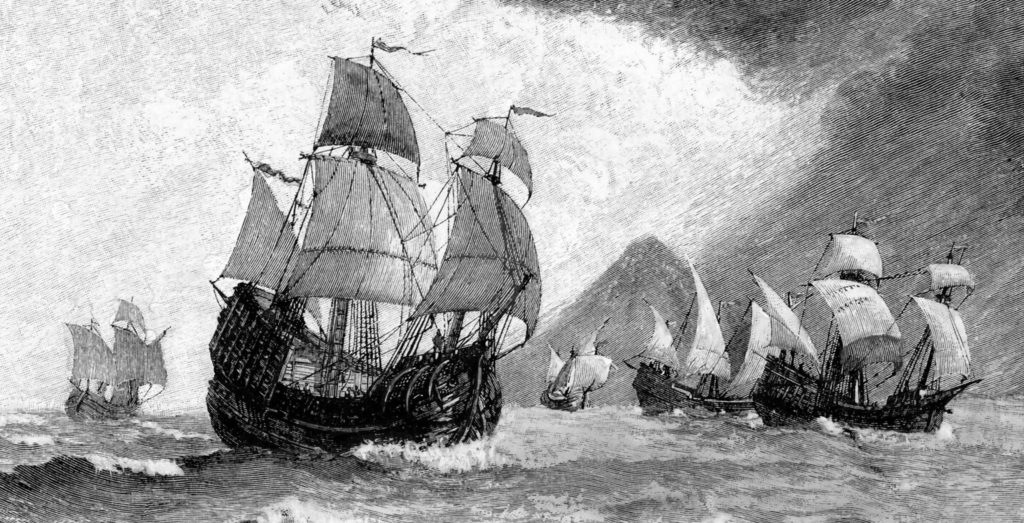
Researching 16th century dutch ships.
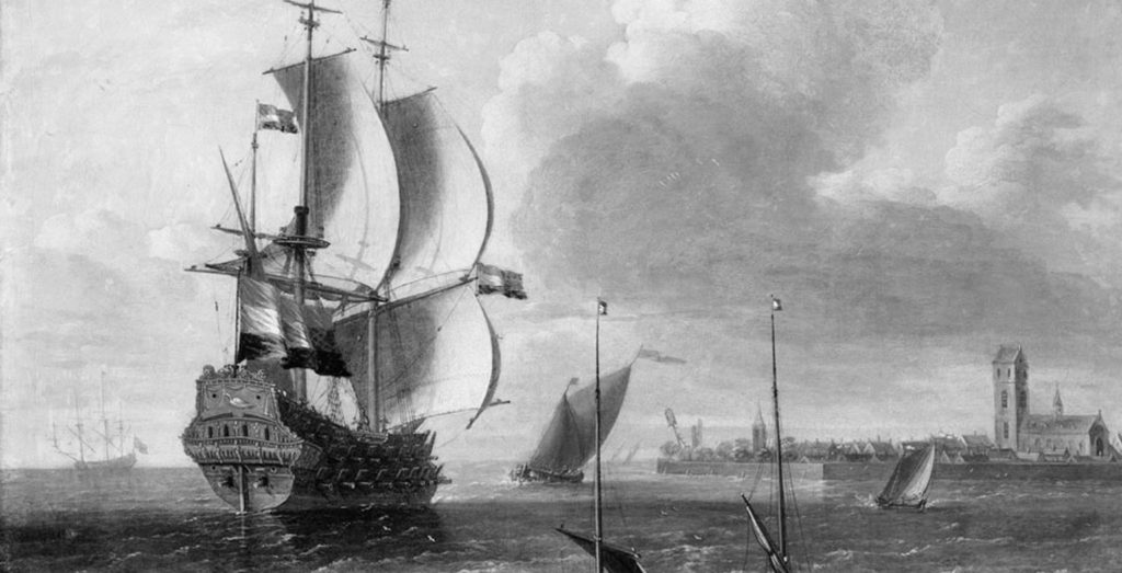
I started to research the time period of the 16th century (when New York, was known as New Amsterdam) and looked intently at the shape and form of dutch ships that set sail in this time period. – Obviously, no photography was available at the time, so I relied heavily on dutch painting, and historical records, to help inform how the design could look.
I wanted the ship to feel strong and powerful, and have it moving forward through rough seas. I instantly loved the iconic shape of these ‘old-world’ ships, and how tall they were in structure, especially when their sails captured strong gusts of winds. I also loved how the waves of the sea crashed against the body of the ship.
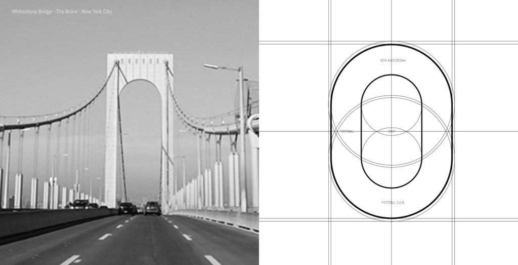
Researching The Bronx.
As the football club would play its home games in the Bronx, I researched The Bronx to understand the place, and the significant structures that could be found in this iconic part of New York City. In my research I discovered – The Whitestone Bridge. This bridge connects the Bronx with Queens, and is widely used on a daily basis.
I was intrigued by the shape of the bridge, and the curves of it’s inner structure. Using this as inspiration, it helped me figure out the shape of the logo.
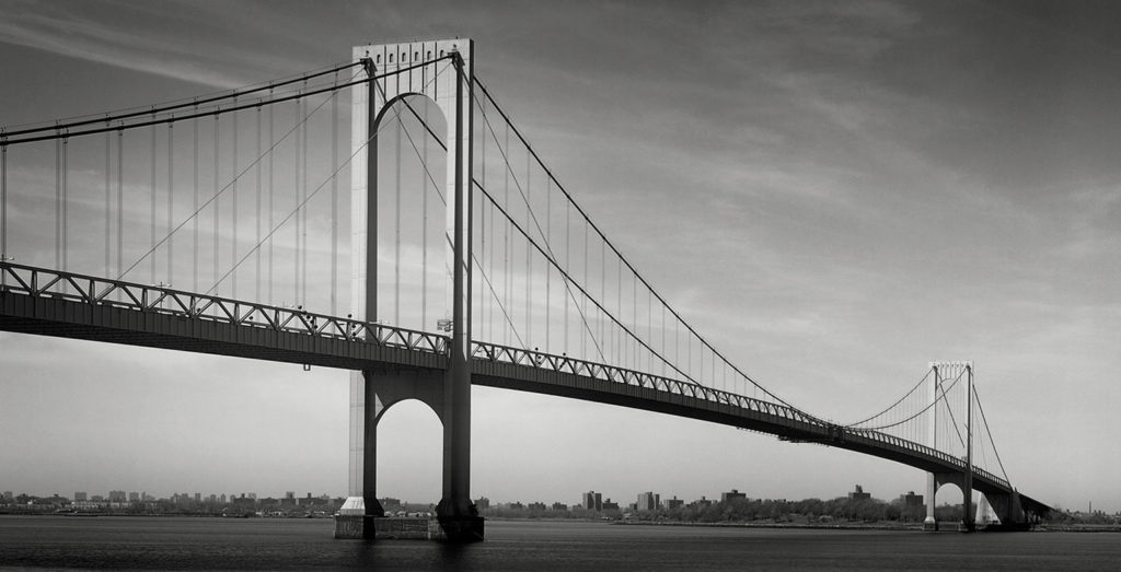
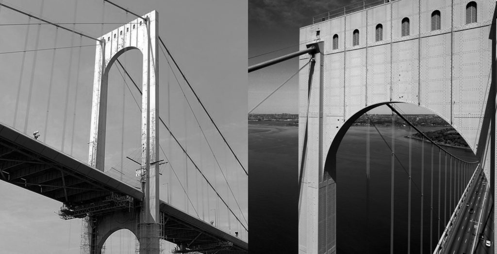
Photo credit: Dave Frieder (www.davefrieder.com/bronx-whitestone-bridge/)
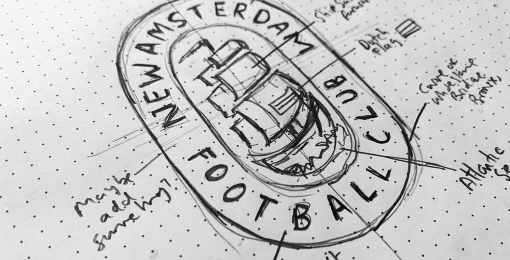
Sketching out the design.
After researching the theme of the design, which included the 16th-century ship and New York City. I began to sketch out a few ideas.
In this stage of the design process, I paid attention to how all design elements could potentially work with each other. I sketch whilst asking myself, how does this typography work with the ship? Is the outer space of the badge unique enough? Does the typography need to be separated by some graphic of some kind?
I am constantly analyzing and questioning the sketches, until I have a solid design.
Below is a solid sketch which showed great promise. I loved how powerful the ship felt within the space, along with the depth and forward motion that the ship had. How the curved outer shape of the logo (inspired by Whitestone Bridge) worked, not only with the central graphic, but also with the football club’s name ‘New Amsterdam Football Club’. I appreciated how it encompassed the ship.
Digitizing the logo design.
The ship was created with a series of well-positioned circles. These circles would guide the final strokes and shapes, and would make sure that the correct perspective and depth of the ship was achieved.
Once I had the ship’s basic shape and wind fueled sails, I added subtle details to the design. One of these small, though important, details was the three-striped flag at the front of the ship – this graphic references the three blocks of colour that can be found on the dutch flag.
At the base of the ship, I used negative space to show the waves of the sea crashing against the body of the ship. This grounded the ship’s design in a location (at sea), and was an extra detail that made the design more unique (without these waves, the ship would look like it is floating in space).
![]()
![]()
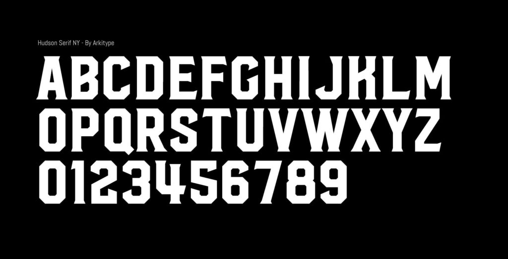
Choosing the right typography.
The approach to selecting the correct typography for this logo design followed the same principles as the designing of the ship. The typography must have the ‘old-world’ feel, (as if it could have been seen in the 16th century). But must maintain style, legibility, character, power, and presence. It should also be typography that can be used beyond the logo, and be utilized across the football club’s wider brand.
I did an extensive search for the right typography, testing out 100’s of different typefaces, until I discovered ‘Hudson Serif NY’. A typeface designed by type foundry Arkitype. This was designed with New York City in mind. I loved it upon first sight. I knew that this typeface would work perfectly with the design of the logo, and for the football club’s brand.
The characteristics of this typeface instantly appealed to me, being tall and bulky it gave off a strong and dominant presence. It is a typeface that stands out on a canvas, capable of delivering club messaging with authority and style. While also being a typeface with‘old-world’ values, which would make it a great match for the brand.
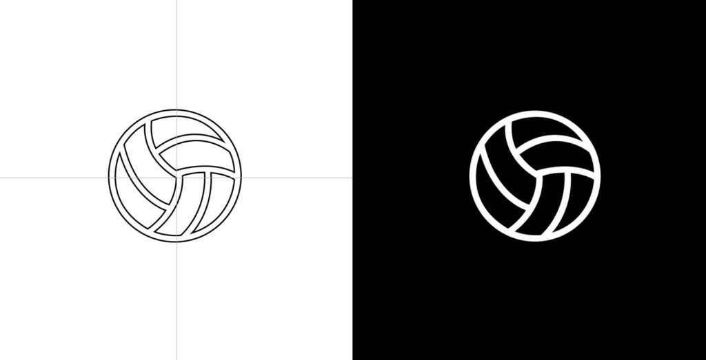
Adding balance, symmetry and visual description to the logo.
In building out the structure of the logo, I chose to add two footballs on both sides of the design. These footballs would act as ‘separators’ for the typography – segregating the words ‘New Amsterdam’ and ‘Football Club’. Offering a sense of symmetry and balance to the design. While providing a visual reference to the sport that the club plays football.
It was important that even these footballs maintained that ‘old-world’ feel. So instead of using the traditional hexagon patches that many football graphics often have. I created footballs that looked like they were from the past, and had a traditional feel.
Choosing the club colours.
Admittedly, there was a huge temptation to incorporate orange as part of this logo’s design. In reference to the dutch, who’s national football team famously plays in orange. However, this was too obvious, and I felt that it was also equally important that the ‘feel’ of the logo and the brand took on some ‘New York City vibes’. I wanted the brand to feel edgy, gritty and part of New York City’s urban landscape.
My inspiration came from New York City photography. You see many photographs of all corners of this city published as classic black and white photos. This influenced the colour choices of the brand, with the final logo designed to be black and white.
I must add that orange wasn’t dismissed, as mentioned earlier – orange is so heavily associated with dutch football, that it would be a part of the New Amsterdam Football Club brand, however not in the principle logo. It would be the football club’s third colour, reserved for moments when the designs needed a splash of colour. It would also be strategically used as a directional colour – used to draw attention to certain messaging, or actions that the Football Club’s marketing department wants the viewers to make.
The final logo.
The final result was a logo design that was strong, powerful, iconic and memorable. A logo design that had old-world traditions, but would stand out in the modern marketplace.
All the elements of the logo design worked in conjunction with one another, from the ship to the meaningful focal point of the design, to the typography that wraps around the central graphic.
The final design had great balance, symmetry and visual harmony.
![]()
![]()
![]()
The launch.
The New Amsterdam F.C. logo and brand launched on April 22nd, to a wave of positivity. Football fans, and New Yorkers took to social media to express their admiration of the logo and new brand. With many new fans immediately asking when merchandise will be available for purchase. The New York city sporting landscape had gained an extra team with a brand like no other.
Further reading.
- See the New Amsterdam F.C. case study.
- Read New Amsterdam F.C.’s Brand guidelines.
- Watch the New Amsterdam F.C. brand sizzle reel.