 Back
Back featured reads
Designing Appalachian Football Club’s logo and brand.
November 19th 2020
9 Minute read
Christopher Payne is an award-winning British designer and passionate football fan. Backed up by his knowledge of football and the execution in design, Payne creates stylish, unique practical and relevant designs for ambitious and forward-thinking football clubs that are looking to progress both on and off the pitch.
Payne has worked with many football clubs and organizations around the world, designing iconic new logos and creating a detailed branding system, that makes the football club standout, grow off the pitch, and thrive in the modern world.
You can see examples of Payne’s work by clicking here.
Contact me¿Hablas español? Yo también. Contactarme.
“We’d like to incorporate a Sasquatch in the design of the club’s badge” – Michael Hitchcock said, as we chatted about this exciting new project.
Slightly in shock, I replied with, “A sasquatch??! As in a big-foot type creature?”, trying to confirm that I heard him right.
“Yes” – Michael said, “A sasquatch. The club is located in Boone, North Carolina, it’s in the highlands, imagine lots of forests, lots of mountains, it’s the perfect place for a sasquatch to hangout – We can build a fun brand, with a unique personality. Are you in?”
“Yes!”, I instantly replied!
I have been lucky enough to have worked with ‘American Soccer legend’ – Michael Hitchcock, and his various ownership groups on several soccer-related projects. We work extremely well together and we have created some great brands, with striking designs, and this new project would be no different.
How I got involved with this club.
Incredibly this is actually the 2nd football team that Michael Hitchcock and I have worked on and helped launch during a pandemic (we previously worked together on the New Amsterdam F.C. brand creation).
Appalachian Football Club was formed because Appalachian State University cut their funding of the Men’s soccer team, due to the financial implications of COVID19. This left the local soccer-loving community without a professional soccer team to support, and many players, coaches, and soccer professionals without a competitive organization to be a part of.
Michael used his vast network of connections in the game and pitched the idea of creating a new soccer team that would pick up from where the state’s university soccer team left off, and represent the town and the people of Boone and North Carolina. It was a great idea! Michael helped form a local ownership group and the idea was soon becoming reality – The name Appalachian Football Club was decided upon – But, to launch this new soccer team the ownership group needed a striking logo and well-designed brand to represent them – This is when Michael called me, and ‘the sasquatch conversation’ above happened.
The legendary sasquatch.
The more that I thought about it, the more the sasquatch idea appealed. It was fun and quirky and extremely different from anything in the market.
Boone, North Carolina, is the place where this new football club will play it’s home games. It is situated in the Appalachian Mountain range and is known for it’s wide-spread and beautiful forestry – the perfect place where a sasquatch or big-foot could be hiding.
Over the years there have been multiple sightings of sasquatches in the local area.
https://www.charlotteobserver.com/news/local/article224283380.html
https://www.wbtv.com/story/29735031/video-boone-man-says-yorkie-saved-me-from-bigfoot/
This mythical resident is a very popular character amongst the local community and the vast amount of tourist that visit the area. After doing my extensive research on all things sasquatch related, and researching Boone, North Carolina and the Appalachian Mountains, I was excited about the prospect of creating a football club logo that would feature a sasquatch as the focal point it’s the brand. This would be a brand full of character and personality.
The approach to the design.
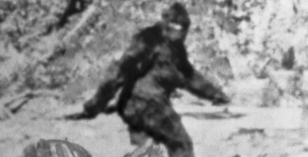
There were many looks and forms that this design could have taken. I initially experimented with displaying the full body of the sasquatch, in the famous ‘upright and passively walking position’ (as captured on film many years ago, see above).
I even experimented at giving the sasquatch a ball at its feet, in an attempt to fuse ‘sasquatches + football’ in one simple design, however, the more I sketched out and experimented, the more it became apparent that this design needed to have more symmetry and more of a central focus.
A key reason for the brand having a symmetrical feel was that with a name like ‘Appalachian Football Club’ (a pretty long name – 23 letters) the typography would more than likely need to wrap around a central graphic, so all the letters can fit comfortably within the design, and they wouldn’t be squeezed into the design, or produced at a smaller size – With this in mind, I looked to create a central graphic that was well balanced and ideally symmetrical in its appearance.
Representing sasquatches accurately.
As the main focal point of the logo will be a sasquatch, I looked at ‘historical’ and fictional references of how a sasquatch is depicted in popular culture, with the intent of identifying some common visual features that make them recognizable as a sasquatch (below are two of the many images that I referenced in the research phase).
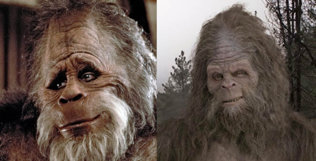
Having looked at countless images of sasquatches, I figured out that some of the most common features of a sasquatch were:
– The large forehead.
– The forehead having many lines and wrinkles.
– The centre parting of the hair.
– The small nose – with nostrils showing.
– The deep-set eyes.
– The large upper lip.
– The shaggy hair that wraps around the face.
– The beard.
– The large bottom lip
I concluded that these features make a sasquatch recognizable, and I set out to incorporate many of those facial features into the new design.
Sketching out the design.
Constantly referencing the research, I begin the sketching phase. In this sketching phase, I am looking at how each and every design element works together, from the main focal graphic (which in this case is a sasquatch) to the club’s typography, and where it could be placed. I looked at how the club’s name – Appalachian Football Club could be incorporated into the design and work harmoniously with the central graphic.
Below are some sketches that instantly appealed to me.
![]()
When designing logos for football teams, you have such a limited amount of space, that you must always make sure that all design elements are there for a reason, and have a genuine purpose for being there. The sketches can’t include design ‘fluff’ or unnecessary design elements that distract from the main focal point (in this case the sasquatch). When sketching, I constantly ask myself – ‘what value does this design element add?’ and ‘is it highly necessary?’ sometimes it is better to take things away from a design, rather than add to it, to ensure that the new logo is meaningful and clutter-free.
Instantly I saw a huge amount of promise with the sketches above. The oval shape of the logo is interesting and works well with the club’s name, and inner graphic. As planned, the central graphic of the sasquatch has great symmetry and interesting facial features. I loved how the sasquatch is looking at the audience in the eye and grabs the viewers attention.
Digitizing the design and ensuring great visual balance.
After sketching several different ideas. I then scanned the sketches to the computer and use digital illustration software to create the new logo design.
This is a lengthy part of the process – but an extremely important part of the process, as I strive for perfection.
I ensure that the design is accurate and scalable and that each shape feels right and looks right. This part of the process is part mathematical, and part intuition. I spend hours, sometimes days, sometimes weeks, perfecting and tweaking the design. I experiment with slightly different positioning of the various elements. I look at all stroke widths, type sizes and visual hierarchy to make sure that the logo design has a perfect balance. It is a long process, but highly necessary.
![]()
![]()
Getting it right with club typography.
Typography is a huge part of a football club’s brand and something that I pay special attention to.
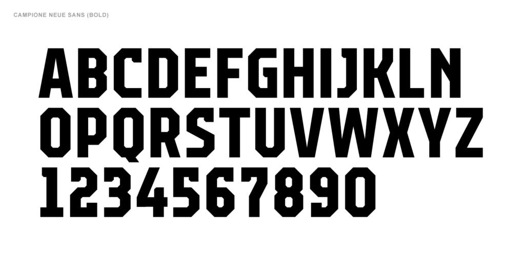
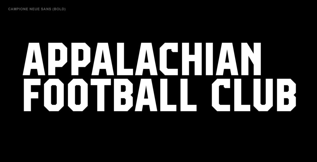
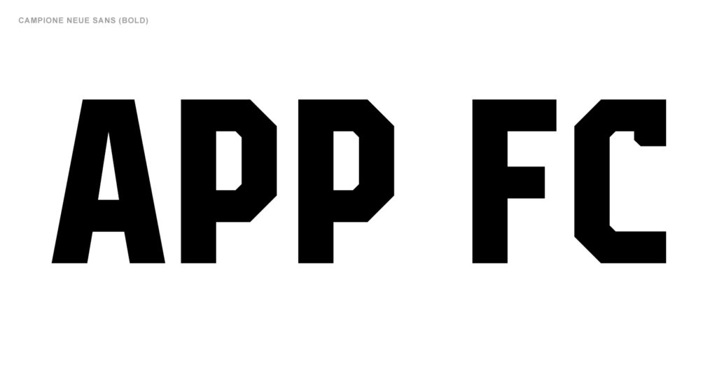
Although often I design custom typefaces for football clubs, however in this case, I found an existing typeface that worked extremely well with the sasquatch graphic and could be used across the wider brand. The typeface: ‘Campione Neue’ by Box Tube was my recommended typography set for this brand. I loved how it felt strong, powerful and athletic, it feels heavy duty and tough, but also has some flair and style to it. It stands out and has an authoritative look and feel.
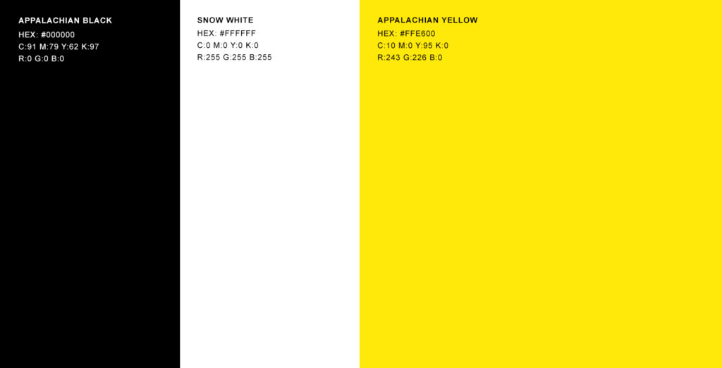
Team colours.
Although we experimented with different colour schemes, it was decided pretty early on that this new football club’s colours would reference that of the now defunded University Soccer Team, as there is history in those colours and a strong association with soccer in the local area.
Additionally, from a purely visual standpoint, these colours are bold and vibrant and work extremely well together. They offer a serious, gritty side, as well as a fun, youthful, energetic side.
The black, adds a seriousness, and a grittiness to the football club’s colour palette and the yellow purposely contrasts the black colour scheme and adds a vibrant, exciting and youthful vibe to the brand.
Finalizing the design of the new Appalachian F.C. logo.
The new design, and brand vision, was presented to the ownership group and was instantly loved.
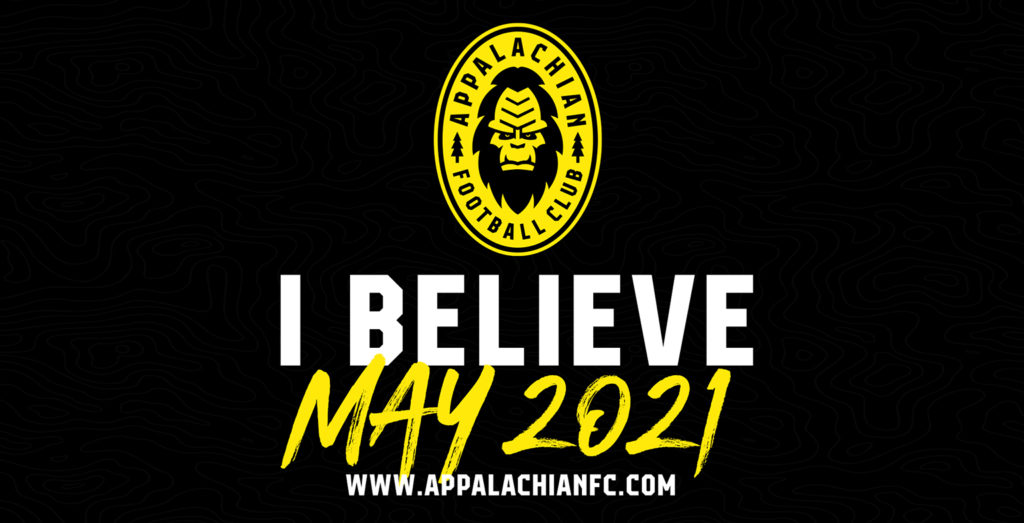
Below is the final Appalachian Football Club logo design. It is unique, clean, modern, relevant and stylish. The design has great balance and symmetry. It is simple, yet packed with personality.
This new logo design sets the newly formed football club up for success. Not only is it a solid design, that is practical, and on point with modern-day best practices, it is also a logo that and will be the focal point of countless ‘sasquatch inspired’ marketing campaigns.
I must admit that initially, I thought that the ownership group were brave to suggest building a football club’s brand around a sasquatch, but it turns out that it is genius, and perfect for the area that the football club represents. Expect the football club’s marketing department, and matchday experience department to utilize the legend of the sasquatch to its full potential. Expect that there will be numerous sasquatch sighting in the lead up to the games, and potentially during the game.
I am proud to have worked with the club’s ownership group and have been able to deliver a memorable and ‘different’ brand that will play an important part in the growth of this football club for years to come.
![]()
![]()
![]()
![]()
Launch day
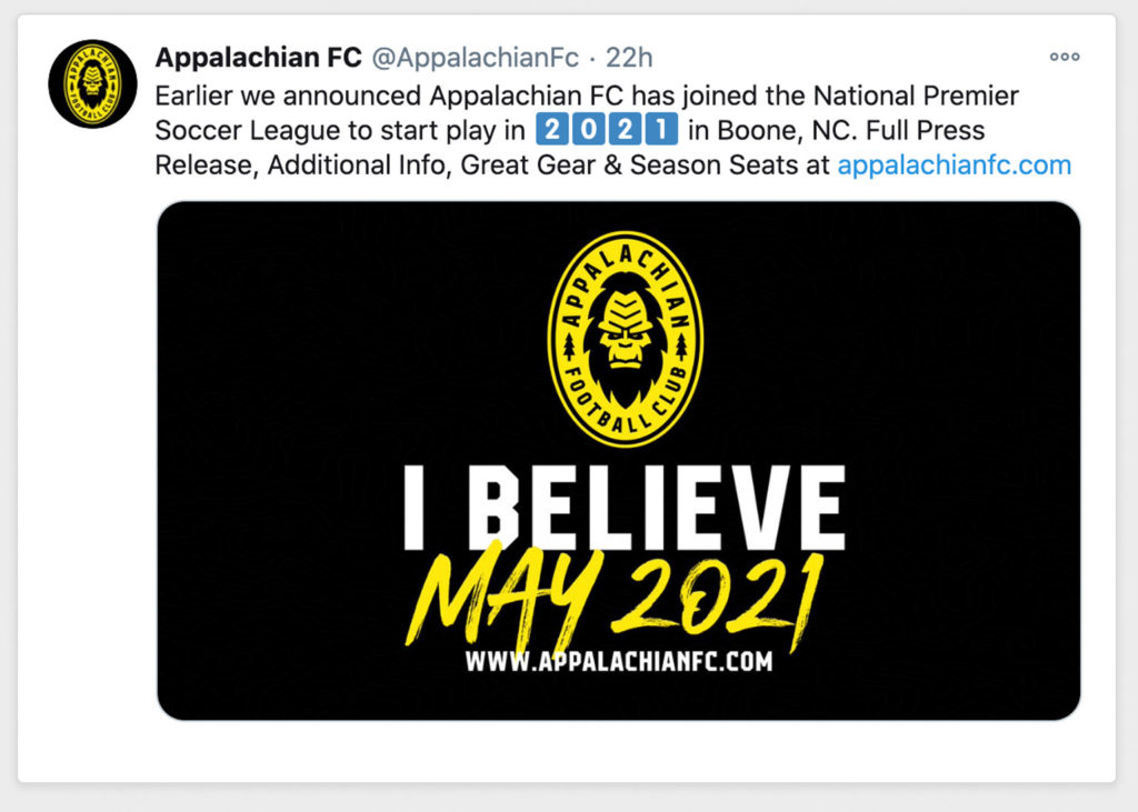
Appalachian F.C. launched to their new logo on November 18th 2020.
The reaction to the US Soccer’s latest club was hugely impressive. The local community lead the way with their praise for the logo and brand, and the international community soon followed, with many football fans taking to social media to comment on the design – some calling it the best logo design in US Soccer. On the day of the launch, the football also made merchandise available for purchase online. They sold out within hours and had to restock due to overwhelming demand.
![]()
Official club merchandising and next steps
You can support the football club, (and look cool) by purchasing official Appalachian F.C. gear – https://www.appalachianfc.com/
Should you wish to ask questions about this brand, or the design process, or if you want to collaborate on a project of your own, I will be more than happy to discuss further: chris@footballbranddesigner.com
See more football-related designs: www.footballbranddesigner.com