 Back
Back featured reads
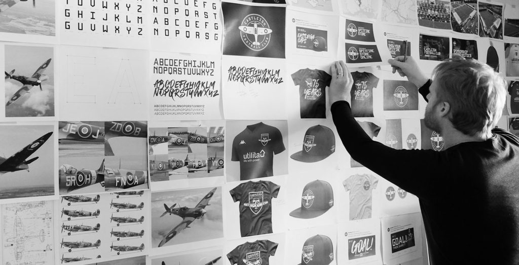
Designing Eastleigh Football Club’s new logo
June 9th 2020
11 Minutes read
Christopher Payne is an award-winning British designer and passionate football fan. Backed up by his knowledge of football and the execution in design, Payne creates stylish, unique practical and relevant designs for ambitious and forward-thinking football clubs that are looking to progress both on and off the pitch.
Payne has worked with many football clubs and organizations around the world, designing iconic new logos and creating a detailed branding system, that makes the football club standout, grow off the pitch, and thrive in the modern world.
You can see examples of Payne’s work by clicking here.
Contact me¿Hablas español? Yo también. Contactarme.
From my first conversations with Eastleigh F.C. Chief Executive – Kenny Amor , and Operations Director – Tom Coffey. I knew instantly that this is a special club, with smart, and youthful directors who run the club with great humility and passion.
It was clear to see they always have the progress of the football club in mind.
Kenny and Tom wanted to update Eastleigh F.C.’s logo for many years, but hadn’t found the right partner to work with to help design a new logo and guide them through this change.
The previous logo
The previous logo (seen below) was originally the town of Eastleigh’s crest / coat of arms. The football club adopted the town’s crest as their logo in 1980. However the town’s crest was never meant to represent a football club. Such was the trend around this time period, the football club began playing with this crest on their shirts.
The previous logo had certainly served the football club well over the years, but it had become outdated and lacked a strong identity that the club needed. It was worn on the players’ shirts for 40 years, so change needed to happen to help the club progress and thrive in the modern era.
![]()
Initial meeting with the club
Shortly after initial contact with the club. I set up a ‘kick-off and planning meeting’ with Kenny and Tom to discuss the design process, offer some best practices, and share examples of my previous work. With the objective to map out a plan to improve the football club’s logo and wider brand.
The more I conversed with Kenny and Tom, the more I liked them. They spoke passionately about football, and the club they run. In the meeting we talked in depth about the history of the football club, and in-particularly their club’s nickname – ‘The Spitfires’, and how the supporters, along with the wider community have really embraced this unique nickname.
The history of the football club’s nickname – The Spitfires
In 2005, Eastleigh Football Club wanted a nickname on which to build their identity. So they held a fan vote on what the football club’s nickname should be. Many entries were submitted, and the most popular one – ‘The Spitfires’ – was chosen.
The Spitfire aircraft is an example of British engineering excellence. The Spitfire is commonly thought of as a differentiator in World War II. The iconic aircraft was used by the Royal Airforce and other allies, and is long considered one of the UK finest, and most important inventions.
Spitfires were designed and manufactured in Eastleigh, by designer, R. J. Mitchell , The Spitfire’s maiden flight happened at Eastleigh Aerodrome. The community of Eastleigh are very proud of this local engineering feat, that ultimately impacted the history of the world, and so, the local community, and the football club’s fans voted for the football club’s nickname to be ‘The Spitfires’.
![]()
Incorporating the nickname into the new logo design
Back to the ‘kick off and planning meeting’ with Kenny and Tom.
Kenny and Tom were open to all suggestions, but loved the idea of creating a new logo that featured a Spitfire as the main focal point of the new logo design.
Today, football logo designs should be simple, and instantly recognizable. When working with football clubs, I always recommend that the design of their logo has a single point of focus. With that point being something that is relevant and recognizable. In this case the Spitfire Aeroplane would be ideal.
Having a Spitfire as the focal point of the design would bring the football club’s beloved nickname into its principle branding (the logo). Which would allow us to create a unique design that celebrates the birthplace of this iconic war time aircraft.
I left the meeting with a clear direction: to come up with a new logo design that would have a Spitfire as the centerpiece of the design.
Research
The first step in any successful design project is research. I take great pride in researching a football clubs’ history, knowing that I will have the honour of influencing its future. I spent hours researching, reading and learning about Eastleigh Football Club’s history. From the early days when Derik Brooks founded the football club, under the name Swaythling Athletic, to the name change in 1980, (to Eastleigh Football Club), to the various promotions and cup runs that the fans have enjoyed.
I also spent a lot of time researching Spitfires, – as this would be the focal point of the new design. I bought scaled models of spitfires, and studied technical drawings of spitfires. It was important to know the form and shape of these flying machines. I noted what made these machines recognizable, and concluded that a spitfire is instantly familiar with the public because of its thin body, the curved shapes of the wings, the RAF roundels (the circles on the wings) and the markings on the side of the planes.
![]()
Sketching ideas
While researching, I began to sketch out a few ideas of how this new logo could look. I experimented with different shapes and different views of a spitfire. I knew that the spitfire would have to be incorporated within a shield shape of some sort, and so I explored how a spitfire would interact when placed in different shield shapes.
There were many sketches that had potential, however, there was one concept that really stood out from the rest, due to its simplicity, and the immediate visual impact – see below.
![]()
In assessing the sketch above, I was particularly impressed by the clear shape of the spitfire. Showing the spitfire from above helped clearly enforce the fact that this is a graphic of a Spitfire aeroplane. This meant that the viewer could see the symmetry of the aeroplane, as well as the curved shapes of the wings. Showing the aircraft from above also allowed me to show the thin body, and the round circles on the wings (RAF Roundels).
Additionally, I loved the fact that the spitfire’s wings slightly out-scaled the shape of the shield, making the overall shape and silhouette of the design unique and interesting.
I also enjoyed how the typography wrapped around the spitfire, with the word ‘Eastleigh’ being placed on top, and ‘Football Club’ placed below. The hierarchy of information was really working.
Digitizing the spitfire design
Seeing potential in a sketch is one thing, but, digitizing it, and ensuring that it will work seamlessly at all sizes and across all scenarios is another process. After sketching, I began to digitize the design. During this process, I strive to build out the design with precision, symmetry and balance. This phase of the project takes the most time, as I looked to perfect the design. During the digitization process, I analyzed how the design element interacted with each other, from the shape of the spitfire, to the size of the typography that wraps around it, and all design elements in between.
It is a lengthy, but necessary process.
To help me with this, I use circles and guiding lines that run parallel to each other, these guidelines ensure that the design has good balance, symmetry and visual harmony. I made thousands of small tweaks to the design, analyzing each and every element to ensure perfection and balance. It is a long process, but it must be done to give the football club the best possible logo design.
![]()
Creating custom typography for the football club
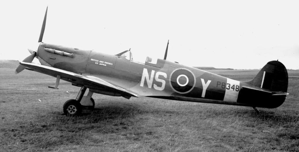
As mentioned before, during the research phase of this project, I studied many different images, photos and drawings of Spitfire Aeroplanes, looking at their shape and form. While researching and studying these images, I noticed the 3 lettered marking and typography on the side of the Spitfires. This taught me that these letters indicated the squadron, as well as one letter to indicate the individual aircraft.
I was fascinated by the style and form of this typography, I loved the characteristics that each letter had, and I wanted to use these identification markings to create custom typography that could display the words ‘Eastleigh Football Club’ within the logo.
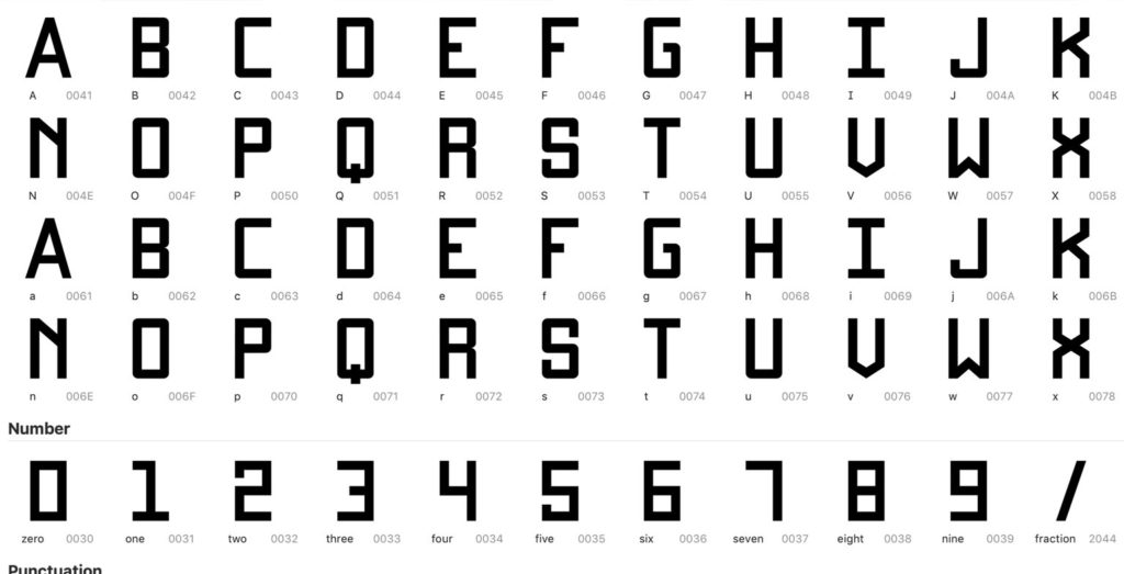
Additionally, thinking beyond the logo, I aimed to build out a full custom typeface and font that was inspired by these markings.Tto give the football club’s brand it’s own unique typography that could be used across all aspects of the football club’s marketing and communication.
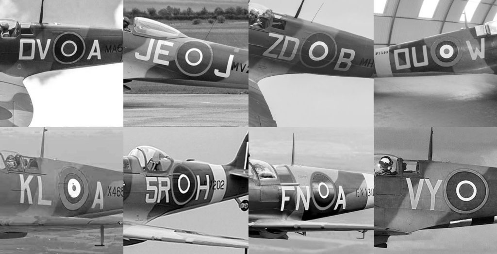
I studied 100’s of different spitfire photos, looking to find consistencies in the typography – this enabled me to design a robust and accurate font family for the football club.
After many weeks designing, tweaking, and perfecting each and every character in this typeface – It was finally done. The football club would have a custom typeface, unique to them, and inspired by their nickname – The Spitfires. We would call this new typeface ‘Eastleigh Sans’.
![]()
Putting all elements together
With the club’s custom typeface (Eastleigh Sans) complete, and the design of the central graphic – The Spitfire – complete. I then concentrated on fusing these two important design elements together, and encapsulated them within a circular shield shape. It is always exciting to see a rough sketch you’ve created, come to life in a digital form.
![]()
Adding colour to the design
The football club has long played in blue and white. Additionally the previous logo features blue and white as its principal colours, and so, this new logo would be blue and white.
I purposely ensured that this logo design had very few colours. I didn’t want to over complicate the logo design with an array of colours. I strived to keep it simple, high contrast and striking.
Having a logo with just two colours, not only makes the design simple and high contrast – but it also allows the logo design to be flexible and adaptable, and easier and cheaper when it comes to printing and creating merchandise and fan wear.
![]()
The final logo
With the final design tweaked, and perfected, I presented this logo, (along with other options), to Kenny and Tom. They were blown away by the logo design, and agreed that this design should represent the football club for the next chapter in the club’s history. To confirm their initial thoughts about this new logo, Kenny and Tom showed the design to a select few fans of the football club, for their opinion – again. The reaction to the new logo was extremely positive, and the board gave the logo the green light to proceed.
![]()
![]()
![]()
Eastleigh Football Club’s new logo is striking, bold, simple and iconic. It references the history of Eastleigh and brings the football club’s nickname to life. It will represent the football club, the fans, and the community of Eastleigh with style and distinction. It will also help bring the football club into the modern era and increase marketing, merchandising and commercial opportunities.
Further reading
Eastleigh Football Club case study
Contact / Ask questions – chris@footballbranddesigner.com