 Back
Back 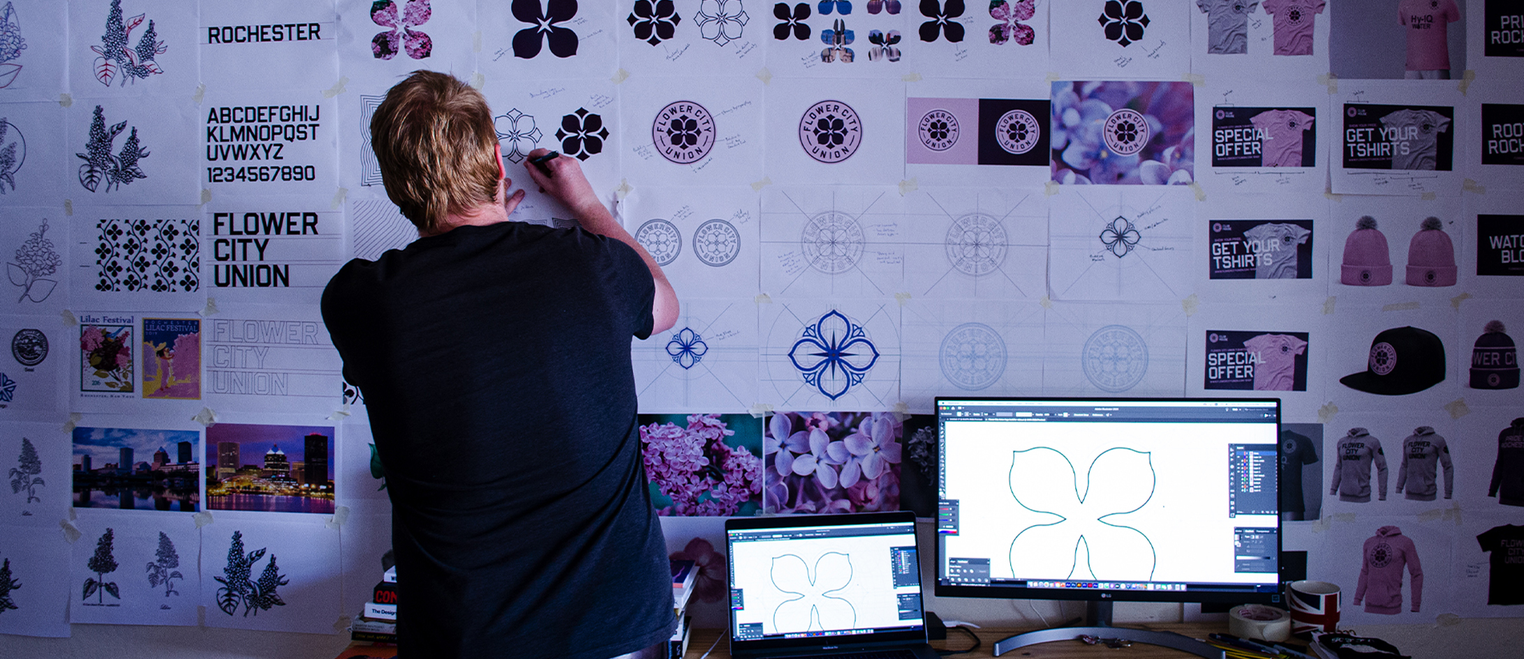
Christopher Payne is an award-winning British designer and passionate football fan. Backed up by his knowledge of football and the execution in design, Payne creates stylish, unique practical and relevant designs for ambitious and forward-thinking football clubs that are looking to progress both on and off the pitch.
Payne has worked with many football clubs and organizations around the world, designing iconic new logos and creating a detailed branding system, that makes the football club standout, grow off the pitch, and thrive in the modern world.
You can see examples of Payne’s work by clicking here.
Contact me¿Hablas español? Yo también. Contactarme.
For many years, the Rochester Rhinos has lead the charge as the city’s leading soccer club. However, in recent years, the Rochester Rhinos has taken a sabbatical, with no re-emerging signs, leaving the Rochester community frustrated.
With no professional soccer being played in Rochester and a frustrated, soccer-loving community, this led three forward-thinking local business people and soccer enthusiasts – Dave Weaver, Mark Washo, and Todd Harrison to hatch a plan and bring professional soccer back to Rochester.
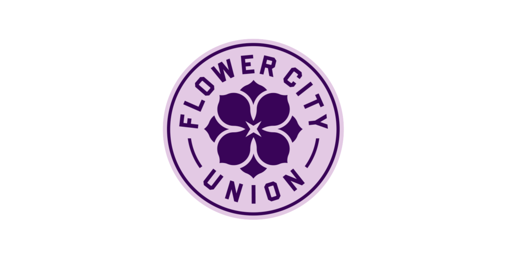
The name: Flower City Union.
The City of Rochester has had the nickname “The Flower City” since the 1850s, when it boasted the worlds largest seed company, The Ellwanger & Barry Nursery, among other major seed companies. Additionally, the city’s crest is based on a floral design, and Rochester’s most famous event is the annual ‘Lilac Festival’ hosted in Highland Park (more on lilacs later).
There are numerous connections to flowers in this city, hence why the city has the nickname: The Flower City.
With such a beautiful and unique city nickname, the new ownership group, in consultation with local soccer fans, looked to incorporate ‘Flower City’ into the soccer club’s name – ultimately deciding upon the name: Flower City Union.
How I got involved with Flower City Union.
My involvement with Flower City Union came about as I had previously designed branding for another New York football club – New Amsterdam Football Club. This brand design proved to be hugely successful; the football club has followers worldwide, and is often spoken about as one of the best logos and brands in American soccer.
The ownership group at Flower City Union was aware of my work. When they learned that I was available for the project, we set up an initial meeting to discuss the club’s vision.
I must say, right from the start, everything about this club appealed to me. I loved the name: Flower City Union, the ambition and passion of the ownership group, and importantly, I loved their vision for Flower City Union and the brand/culture that they looked to create. I proudly accepted the honour of designing a brand for this soccer club.
Capturing the communities voice.
With any football club rebrand, it is always a collaboration between the designer, the club owners, and the community that the club represents – in this case, Rochester (or Rochestarians as they are known).
In the initial stages of the branding process, I conducted my own independent research on Rochester to find out about the history of the place and the pride of the people. In addition to independent research, I also hosted many focus groups with local ‘Rochestarians’. I asked many questions about Rochester, Rochester symbolization, and their sentiments towards life in Rochester, and the prospect of a new professional soccer club coming to the city.
Focus groups with residents give a fascinating and authentic insight into what the community wants and expects from the football club; they help shape its brand and tone. As more and more listening sessions were conducted, more common trends started to emerge, over time you start to hear the same answers and same affections towards local symbols and representations of the city. One of these local symbols was: the lilac.
The lilac.
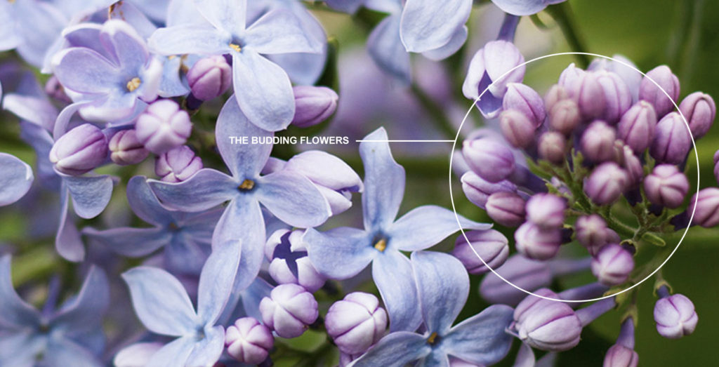
Rochester is known as The Flower City. Historically this is due to the city having the most prominent seed manufacturer in th world; these days, the city’s nickname ‘The Flower City’ remains relevant due to the city’s vibrancy when the flowers bloom. When the flowers blossom, it is a sight to behold. The owner of the club, Dave Weaver, told me that: “it is a sight you will never forget.”
When the flowers bloom, there is one particular flower throughout the city – The Lilac. Rochester is a place where lilacs flourish, so much so the city has a festival called the ‘Lilac Festival’ – an event that Rochestarians mark on the calendar and enjoy every year.
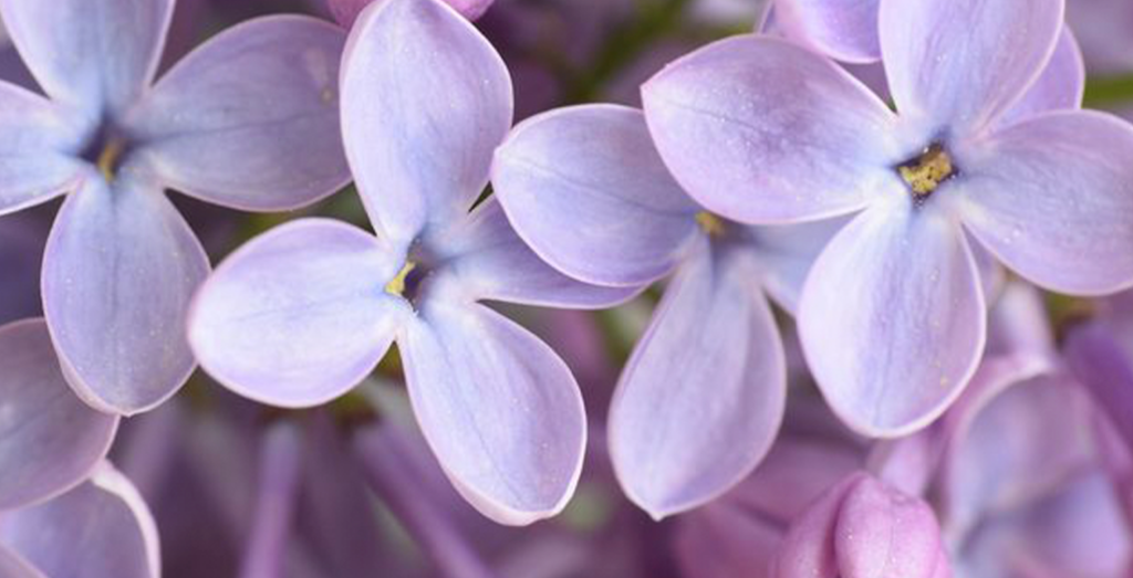
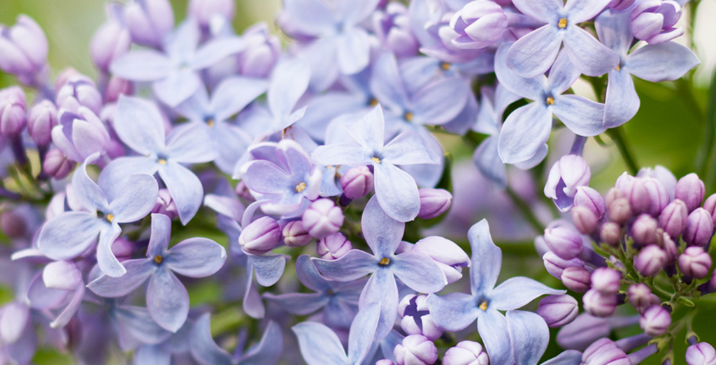
From speaking with many local Rochestarians, I quickly concluded that there is an emotional connection with Lilac flowers, and I wanted to incorporate this beautiful symbol into their soccer club’s logo design.
Building the brand.
With the club being called Flower City Union, and the community having an affection with the lilac, I knew early in the process that this soccer club’s brand design should revolve around a flower – specifically a lilac.
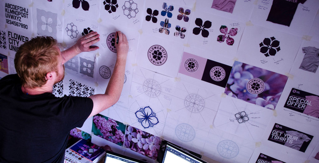
With input from the community and knowledge of the city’s historical and geographical association with lilacs, I began sketching ideas that placed the lilac a the center of the design.
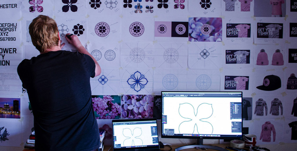
Pen and paper before computer and software.
While some designers go straight to the computer, I always prefer freehand sketching before digitizing the mark. This approach helps me quickly create good designs (and bad designs) and figure out the shape relationship within the logo’s design.
In sketching Flower City Union’s new logo, I wanted ‘quarter symmetry’ to play a big role in the design’s look. A single lilac is a beautiful flower that has four petals, all equal in shape and size. I looked to draw balance and symmetry from those four petals.
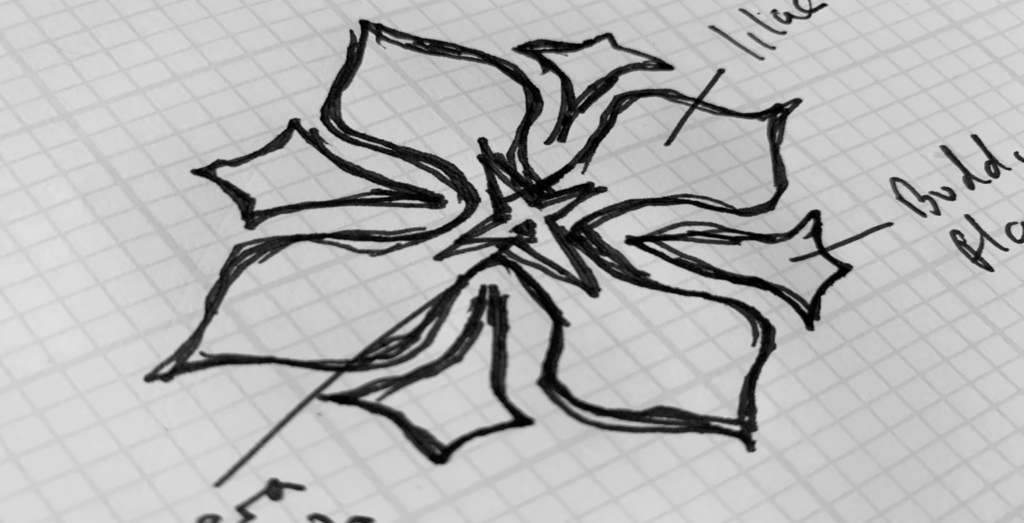
The quick sketch above shows the origins of the Flower City Union logo. I liked this sketch as it had fantastic symmetry and balance. I was intrigued by how the typography wrapped around the central graphic and how the design draws the viewer in. I saw great potential in this sketch and wanted to digitize it.
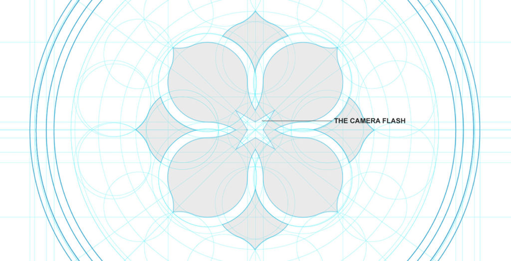
Digitizing the design.
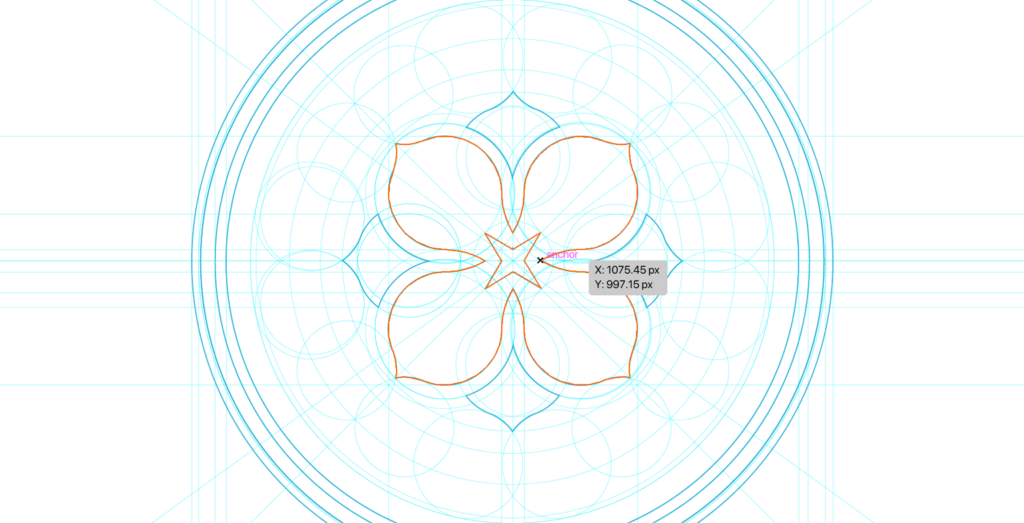
After scanning in the sketch and bringing it to the computer, I then digitized the design. To ensure that the logo has excellent balance and form, I build a framework that helps inform how each design element looks and intersects.
The screenshot below shows you how the framework is built and how important it is to the final design’s structure and form.
Building out the design and building a framework for the design is a lengthy part of the process, with many micro tweaks; however, it is an essential step in this process, as it helps ensure that the design has perfect balance, shape relationships, and form.
A sign that good times are coming.
Many of the focus groups with local Rochestarians mentioned how cold the city was most months of the year.
“It sucks to go outside in the winter,” – one local told me;
Rochester is a cold place with harsh winters. However, a key learning from speaking with local Rochestarians was that when the locals begin to see the flowers start to blossom, and the community sees the budding flowers, it is a key identifier that warmer days are approaching; this is an exciting moment for the community. One local Rochestarian described it as:
“A sign that good times are coming” – I wanted to incorporate this feeling within the logo’s design.
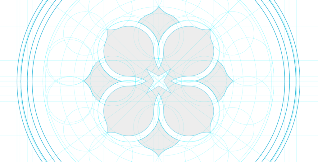
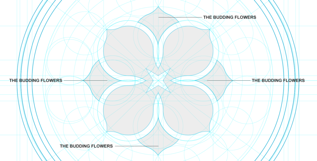
The budding flowers.
The design of the logo has the four-petaled lilac as the central focus, but surrounding the lilac’s four petals are ‘the budding flowers’. These budding flowers reference the joy and excitement of flowers blossoming in Rochester – the sign that the warmer days are head and the good times are coming.
From a design perspective, these ‘budding flowers’ also add extra interest, and intrigue to the design. They are in keeping with the symmetry that the design boasts and help draw the viewer’s eye into the design, they also help the central graphic feel more circular – forming a harmonious relationship with the typography that will wrap around the design.
The camera flash – a nod to an iconic Rochester industry.
My independent research on Rochester lead me to learn about the city’s other nickname, besides ‘The Flower City’. Rochester was also once known as ‘The Image City’ due to the presence of photography giants Kodak.
At one stage, Kodak employed 60% of the city, and was a proud Rochester export that put Rochester on the map. Many locals who I spoke within the focus groups told me that;
Everyone knows someone who has some relationship with Kodak, either they used to work there, or their parents, neighbours, uncles, or aunties work / worked there.
In Rochester city centre, the Kodak Tower remains dominant in the skyline. A 19-story skyscraper that can be seen from where Flower City Union’s stadium is located.
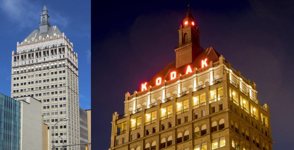
I wanted to reference this historical business and industry in the design of the soccer club’s new logo. Experience and design know-how tells me that incorporating this additional meaning needed to be a subtle nod to the industry, instead of overcrowding or offsetting the balance of the design.
To references this city’s historical association with photography, I used ‘the camera flash’ in the centre of the lilac. The shape of the camera flash was in line with the overall design aesthetic. It matched the symmetry and balance of the design and added that subtle nod to an iconic Rochester industry.
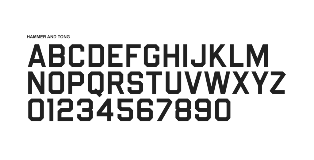
Typography for the logo design and the wider brand.
Simultaneously to designing the lilac’s shape and form, I was also paring the lilac with different typeface options.
As the petals of the lilac are soft and gentle, beautiful and inviting, I wanted the typeface to act as more of a protector of the lilac. I used type to add some grit and edge to the design, to contrast but complement the lilac.
The typeface used in the design is called Hammer and Tongs. It is powerful, athletic, bold, and legible. This typeface has a strong visual presence and works exceptionally well in the logo’s design and the more expansive brand.
This recommended typeface will be used across Flower City Union’s wider brand, giving the football club a solid and robust look as well as an athletic presence.
![]()
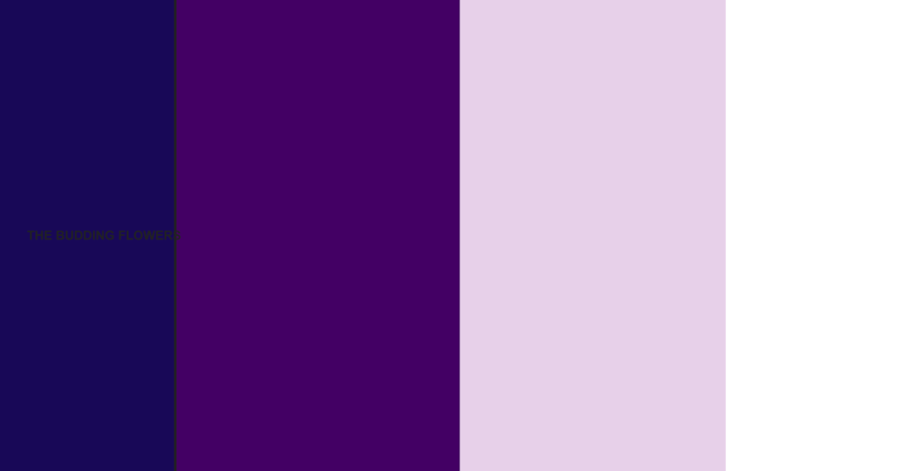
Choosing the club’s colors.
Colors are a vital part of any football club’s brand, as colors will be an essential identifier for the football club. In initial conversations with the football club’s ownership, the group spoke passionately about wanting this club to be different from other clubs.
In choosing the color palette for Flower City Union, there were many things to consider.
My first consideration was that the club is called Flower City Union. With a name like Flower City Union – which is already highly different from other clubs on the market, it felt right to give the football club different colors from other teams in the league.
Additionally, as the design’s central focus would be a lilac, I began experimenting with the colors commonly seen in lilacs. Luckily for me, Lilacs boast and a wide array of colors, ranging from creamy colors to dark purple shades.
After much consideration, the colors that I settled on were lilac (the color) and purple, with dark blue and white used to add contrast and clarity. These colors were brave, beautiful, and highly unique. The lilac offers a soft, beautiful palette, with the purple adding a more profound contrast to the club’s overall look.
Adding color to the design.
With the crafting of the logo complete and the colors are chosen, I then put it all together to see how it looks.
The design has a unique and elegant look, though feels solid and robust. The combination of the lilac – the flower and the lilac – the color, works well; this pairing adds an approachable, humble feel to the design, with the typeface offering a more sturdy, athletic look.
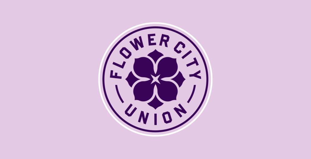
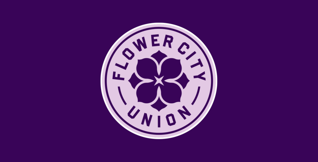
As the design has just two prominent colors, this enables the club to adapt and change colors when needed – yet the design structure and style remain recognizable.
Having a design in which the colors can quickly shift and adapt to other color palettes is very advantageous for football clubs. Flower City Union’s colors can be changed to suit future away kits, training kits, club merchandise, fanwear, marketing campaigns, etc. I designed this brand to be adaptable and future-proof and ensure branding success for the club.
Designed to scale.
Like all football club logos that I design, Flower City Union’s logo was built for scale and gives the club the ability to have secondary identities.
Secondary identities are a great way of extending the football club’s brand. Secondary identities work exceptionally well when their design is derived from the club’s primary identity. With the new Flower City Union logo, the lilac + budding flowers were designed to be taken out of the primary design and used independently as a subbrand for the football club.
Secondary identities are often used on club merchandise, on players’ training gear, and on social media. They are a vital part of the club’s visual language and give the club more flexibility when creating assets.
![]()
Presenting to the ownership group.
I immediately knew that this logo would work great for Flower City Union. The design was inspired by the many conversations that I had with passionate Rochestarians in the various focus groups and discussions with the club’s ownership. The design is bold and unique, inviting and different. I love how bright and optimistic the brand is, it oozes positivity and gives the viewer a good feeling. I knew when sharing the design for the first time in a private setting with club ownership, that they would fall in love with the brand, and their vision for the club would be accurately visualized.
I presented this design concept to the ownership group and fan representation. I talked through all the various design decisions that were made in creating this design and highlighting the flexibility of the brand.
The reaction from the ownership group and incredible. The ownership group loved the beauty of the design, as well as the intelligent strategy behind the brand and how it was built for scale. The fan representative that was in the meeting said.
“I love it! when can I get merchandise”.
A collaborative process.
When building brands for football clubs, it is often the designer that gets credited with the design, however, in reality, it is a team effort. I work collaboratively with the football club’s owners and seek input from the community to ensure that the designs that are put out there, are of the highest quality and represent the values of the club, but also create an emotional connection with the community.
Flower City Union’s ownership group are one of the best that I have worked with, they are ambitious and thoughtful, and create an environment for creativity and collaboration to thrive. I enjoy each and every meeting with them and view them fondly as my friends from the Flower City.
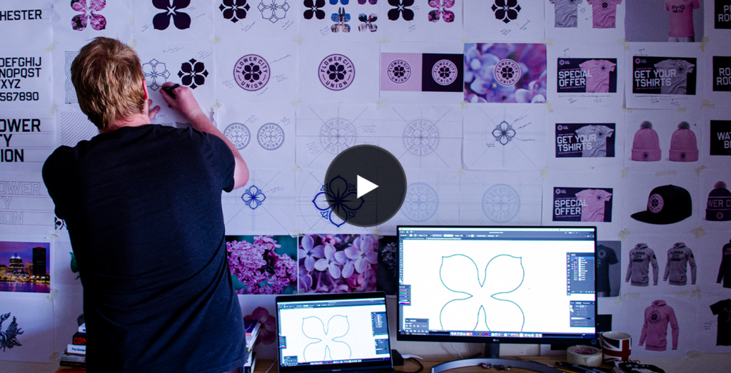
Launching with a video that shows the design process.
To launch this brand, we create a short video that documents the design process, giving the fans a look behind the scenes at what went into creating a striking brand for Rochester’s only professional soccer club.
See the video below.
A design instantly loved by the community.
The brand launched on April the 14th, just as the first budding flowers began to appear in Rochester. This brand launch, like the budding flowers, was a sign that good times are coming.
The reaction from world football and the local community was huge, the design was instantly liked by many soccer fans, and many non-soccer fans (who will be converted into passionate soccer fan thanks to this club, and its branding). Fans took to social media to she the designs with their followers and express their delight and admiration for Flower City Union’s bright and optimistic new brand.
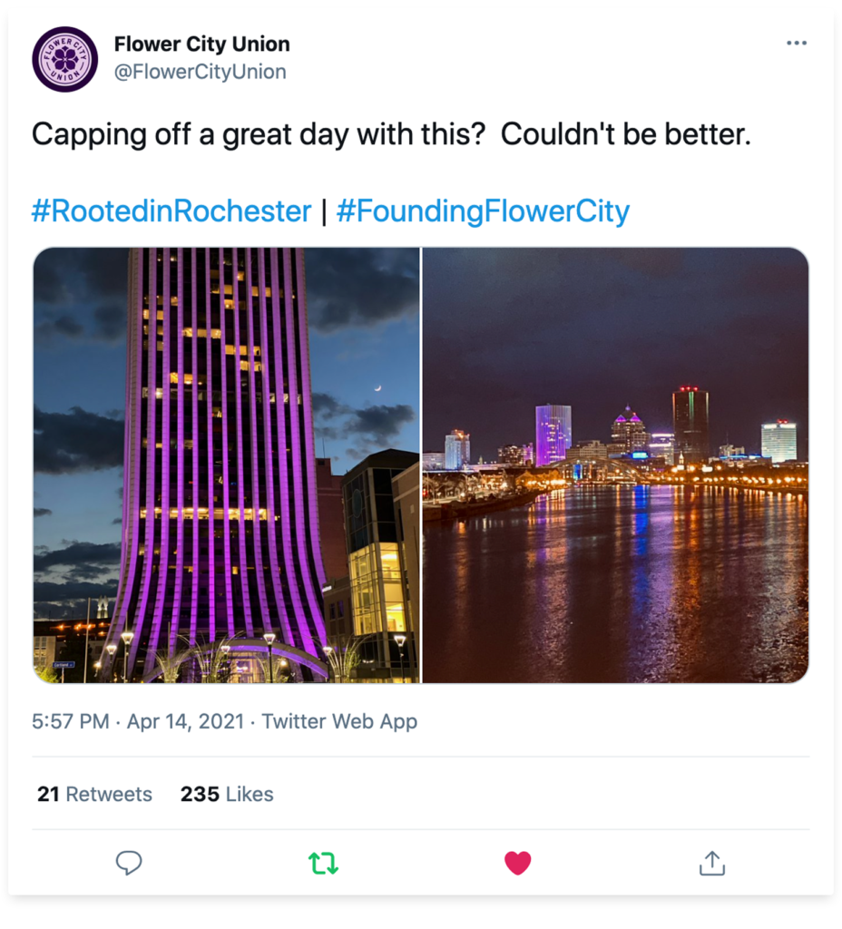
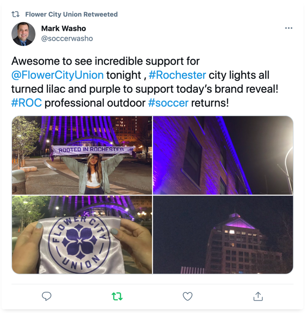
Making Rochester Lilac and Purple.
In addition to the online love that Flower City Union was receiving, the City of Rochester also turned its skyline lilac and purple to celebrate this brand launch!
Further reading.
Flower City Union – Launch video
Let’s work together: Contact me