 Back
Back featured reads
Designing Hitchin Town Football Club’s new brand identity.
April 28th 2021
11 Minutes read
Christopher Payne is an award-winning British designer and passionate football fan. Backed up by his knowledge of football and the execution in design, Payne creates stylish, unique practical and relevant designs for ambitious and forward-thinking football clubs that are looking to progress both on and off the pitch.
Payne has worked with many football clubs and organizations around the world, designing iconic new logos and creating a detailed branding system, that makes the football club standout, grow off the pitch, and thrive in the modern world.
You can see examples of Payne’s work by clicking here.
Contact me¿Hablas español? Yo también. Contactarme.
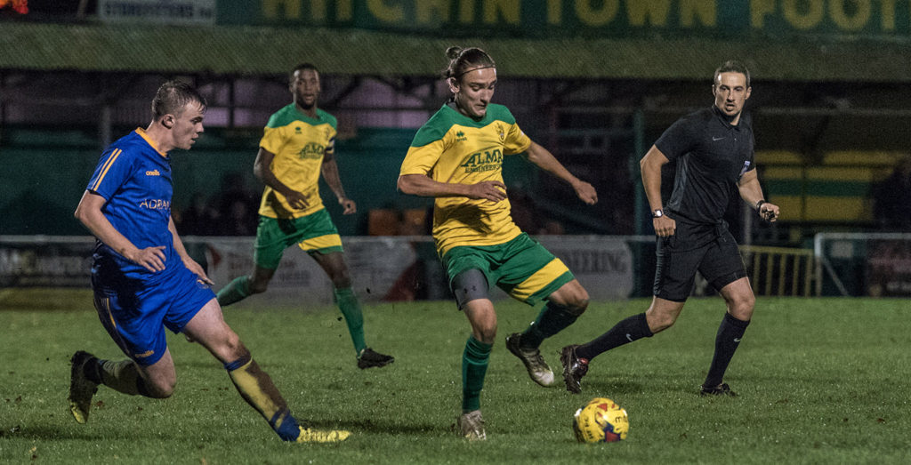
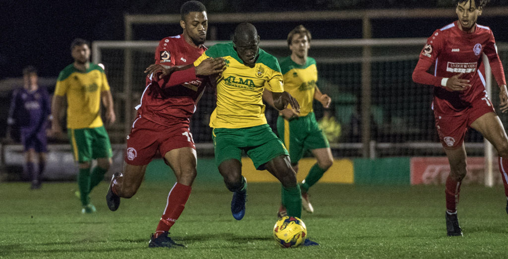
I was introduced to Hitchin Town F.C. in 2020, and worked closely with club Marketing Officer Stewart Curtis, to create a design that represents the football club, its long history, and brings their long-standing nickname – the canaries to life.
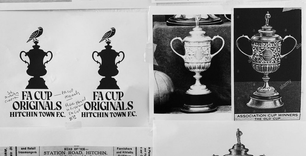
Hitchin Town Football Club is a historic English football club whose origins date back to 1865. Proudly the club is one of the ‘F.A. Cup originals’, participating in the first-ever F.A. Cup in 1871. Since then, the club has had a long-standing affiliation with the F.A. Cup. Many ‘giant killings’ and memories have been made participating in this famous tournament.
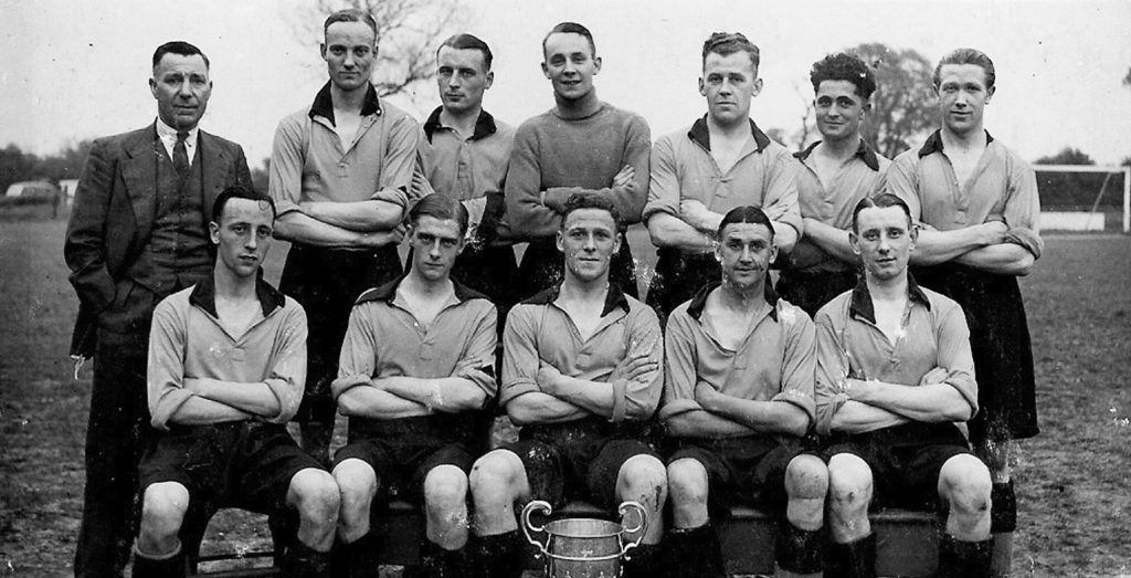
Hitchin Town Football Club has had the nickname – ‘The canaries’ since 1928. A canary bird first appeared on the club’s shirt in the form of a club logo in 1949 (see middle photo below). Historically, the canary-bird has been a substantial part of the club’s visual language – with the bird being used countless times on matchday programs, stadium signage, and chanted by the fans.
Respecting the long history of the club.
As a designer that specializes in creating new logos and brands for football clubs, I have a strong understanding of the pressure and responsibility in my role, and take it very seriously. A football club means so much, to so many, and history and local pride are associated with these football clubs and their identities. I never look to throw history away, it’s the opposite infact. I always look to embrace the history of the club, and respect those people from the past (and present) who have worked (and played) tirelessly to build and progress the football club. In this project, with the support of the club, I studied and learned the full history of Hitchin Town Football Club, and was inspired by Hitchin Town’s longevity in the English game and passion for progress.
Initial meetings with the club.
After a few email exchanges, and confirmation that the club would like to partner with me to help progress the club’s brand identity, Stewart Curtis and I met regularly to discuss all things football and design. In these meetings, we spoke about the club’s long association with the F.A. Cup and the club’s long-standing nickname: ‘The Canaries’.
‘The Canaries’ nickname dates back over 80 years. In discussions with the football club, it was agreed upon that a canary would be a great focal point for the new design, bringing the club’s nickname and visual identity closer together.
We also discussed ideas about having the canary sitting on the F.A. Cup to pay homage to the club’s association in this famous tournament.
Canary + Yellow and green? could this look too much link Norwich’s logo?
With the desire for the football club’s new logo to feature a canary as the focal point of the design, and the fact that the football club play in yellow and green, (Hitchin Town F.C. have played in yellow and green for over 80 years), I instantly knew that I needed to find ways to differentiate the new logo design from Norwich City’s very well respected identity. Going into this project I knew that this would be one of the biggest challenges; however, it was a challenge that I wanted to take on, and with each design decision I made during the process, I asked myself: does this look too much like Norwich City’s logo?
Football club’s with the same nickname and colours
Having two football clubs (or more) with the same nickname and colours is commonplace in English football; many clubs share the same nickname, there are multiple football clubs with the nickname, ‘The Reds’, ‘The Blues’, there are two teams with the nickname ‘The Red Devils’. It is not unheard of clubs having the same nickname and even playing in the same colours. An example of this is the nickname – ‘The Robins’.
‘The Robins’ is the nickname for Bristol City, Chelmsford Town, Swindon Town, Altringham Town, and Ilkeston Town; what’s more, all of those teams mentioned above play in red, and the majority of them feature a robin within their logo design.
In the case of Hitchin Town F.C.’s brand identity, I knew that I had to create the right design for Hitchin Town Football Club, that respected their history and their longstanding nickname but make sure that the logo design was as different as possible to Norwich City’s logo.
Looking to the past to inspire the future.
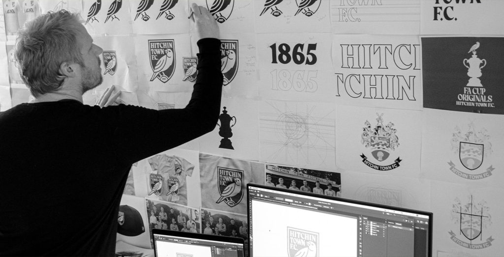
In the early stages of the research and discovery stage of the project, I looked at previous identities and typography treatments used in the clubs’ history. This would enable me to draw inspiration from past designs, to incorporate in the new design.
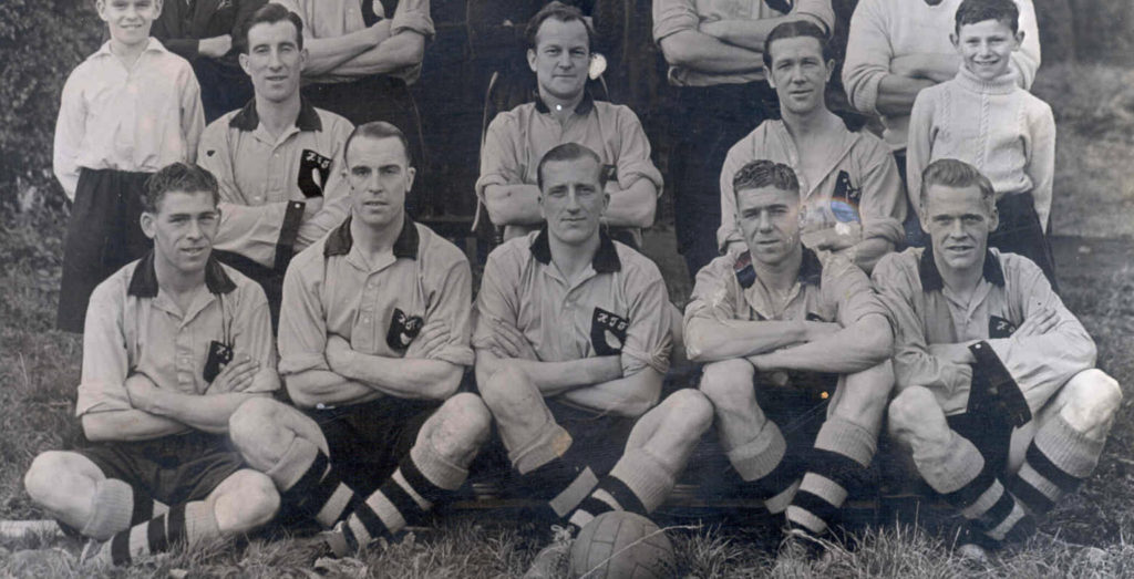
As Hitchin Town F.C. has a deep history, with many squads formed over the many years of its existence. The club provided me with vast amounts of historical photography and match day tickets that have been used and represented the football club in the past. This rich history was a great reference point for he new brand. I looked to retain some of that Hitchin Town F.C. tradition, whilst adding a modern touch to the brand.
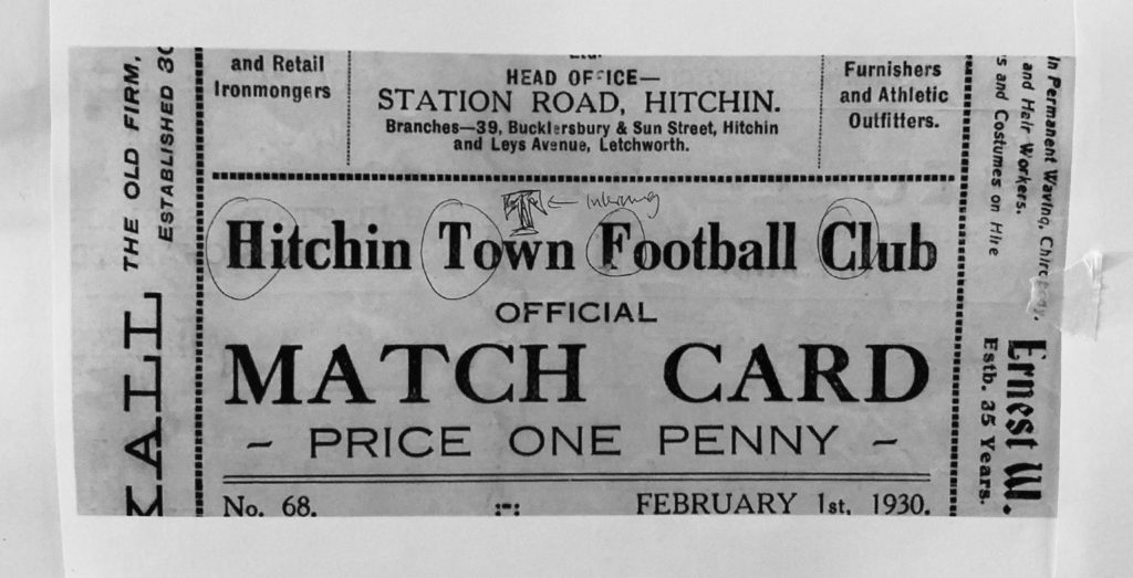
Below is an old match card from 1930. I loved the solid typeface and how it spelled out Hitchin Town Football Club. It was strong and powerful, let stylish and classy. Typography like this would be a great source of information for the new brand.
The photo below of the Hitchin Town F.C. team of 1949 was also a big draw of inspiration. This the first team in Hitchin Town F.C.’s long history that featured the Canary bird on their shirts.
![]()
Another example of drawing inspiration from the past, can found in the shield shape, used in the previous design (seen above). I loved how strong and powerful this shape felt; it had a solid presence and I know that it could be a great outer shape for the new design.
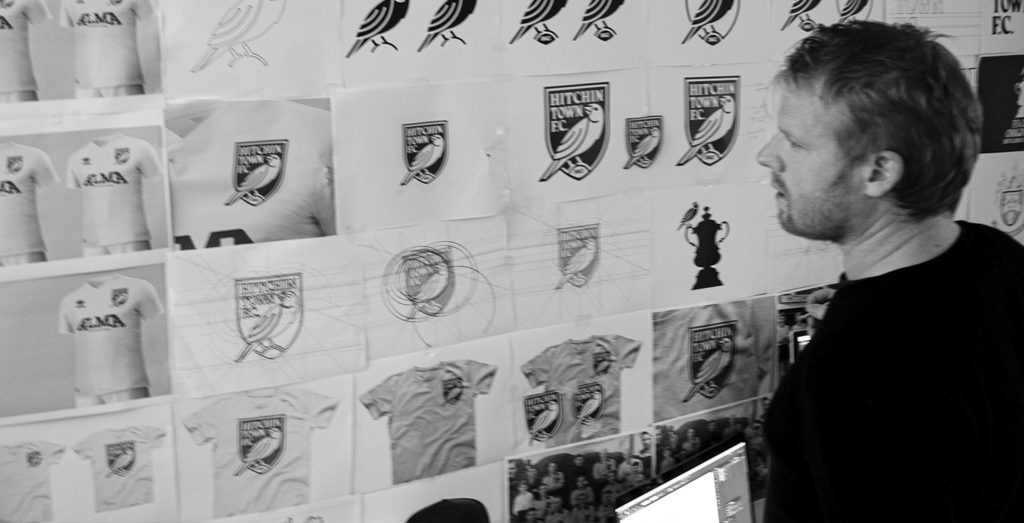
Sketching out the design
To create a modern logo for Hitchin Town Football Club, a logo that represents and references the club’s long and proud history and utilizes key club identifiers such as the Canary and the club’s association with the F.A. Cup, I begin the process of sketching out the shape and hierarchy of the design.
![]()
The sketch above is the origins of the final design. I was intrigued by this sketch. I loved how the logo’s ‘shield-like shape referenced the previous logo design, providing an interesting visual continuation from the old design to the new.
I also loved the shape and form of the canary, and how the canary’s tail extended beyond the shape of the shield, giving it an empowering and interesting look.
I loved that the sketch left space for the club’s name to be placed at the top of the design. I also enjoyed the fact that the canary’s position is facing forward. Still, its head is turned, glancing back, almost as if the bird is looking back at the club’s history.
I saw great potential in this sketch and quickly began to digitize it.
Digitizing the design
Once I have a sketch (or series of sketches) that I like and see great potential in, I begin the digitization process.
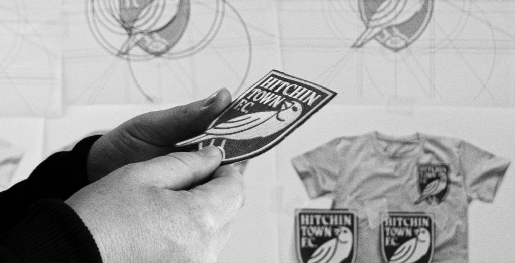
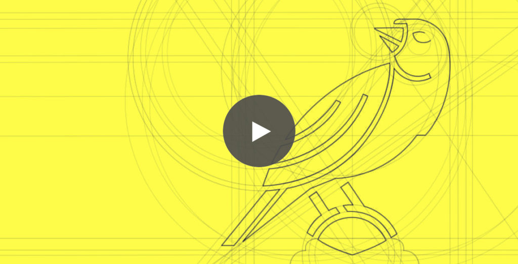
During this process, I refine the design and ensure the design has perfect visual harmony and balance. I use guiding lines and circles to help guide the shape relationship and ensure that the new logo design is based on a solid structure and form.
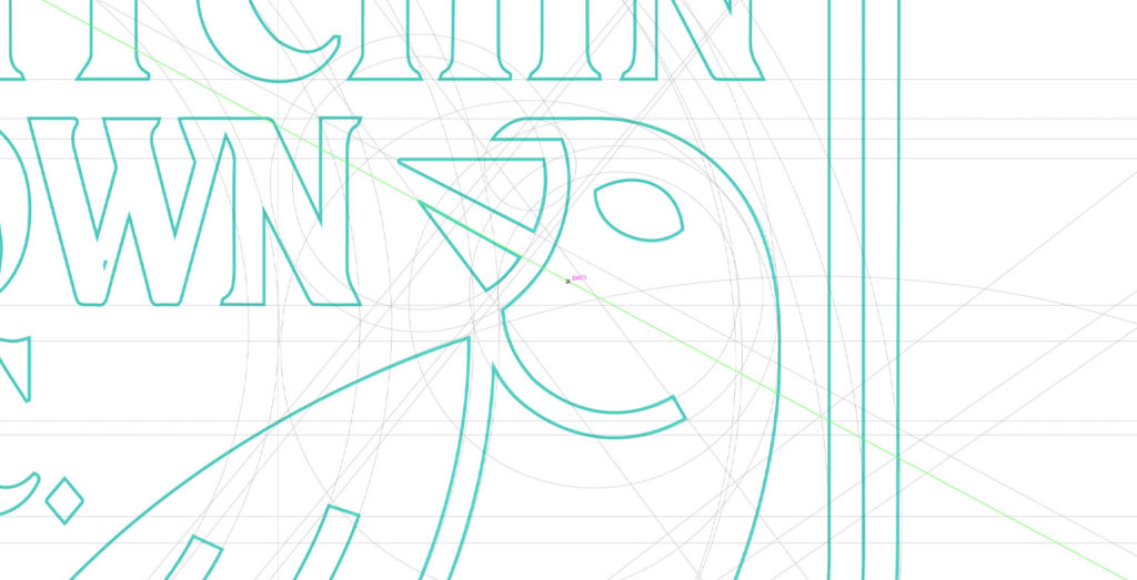
I immediately loved how this design was shaping up. The canary stood tall and proud. I loved the story of the canary ‘facing forward, but glancing back, never forgetting the club’s history’.
I loved how the typography integrated perfectly with the shape of the canary, clearly spelling out Hitchin Town F.C.’s name, meaning that all viewers of the design would instantly know which team this logo represented.
Additionally, I loved how the feet of the canary wrap around the top of the F.A. Cup and become part of the outer shield shape.
The structure of the design felt complete.
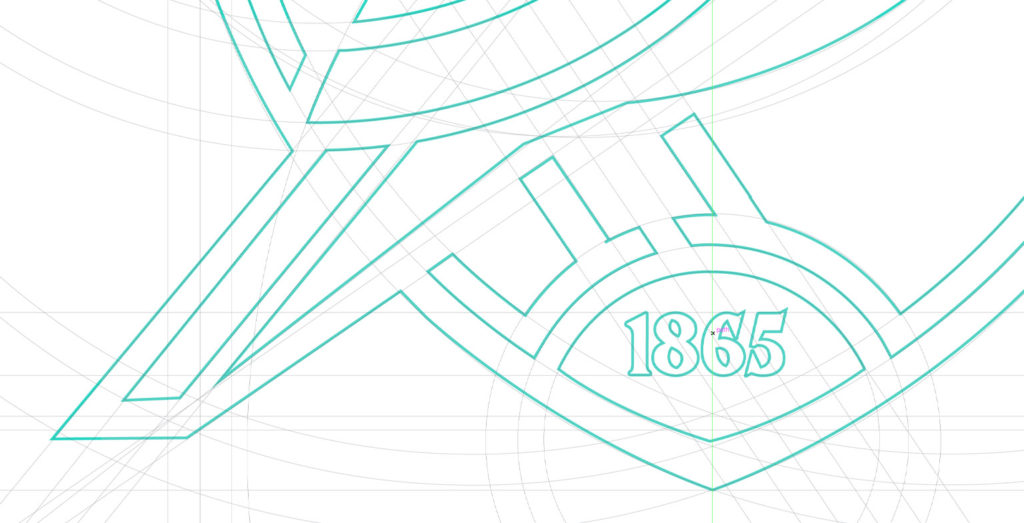
Perched upon the first-ever FA Cup
An interesting feature about this design is that the canary is perched upon the FA Cup trophy. This references the football club’s pride in being one of the eight original teams to participate in the first-ever FA Cup tournament in 1871.
In the design process, I looked to feature the FA Cup more prominently within the shape of the logo, however by doing this, the design lost some of its balance, and simplicity, so instead we opted for a cropped-off version of the first-ever FA Cup trophy. As the brand progresses, the canary sitting on the FA Cup will be better demonstrated in different graphics, and brand campaigns beyond the logo design.
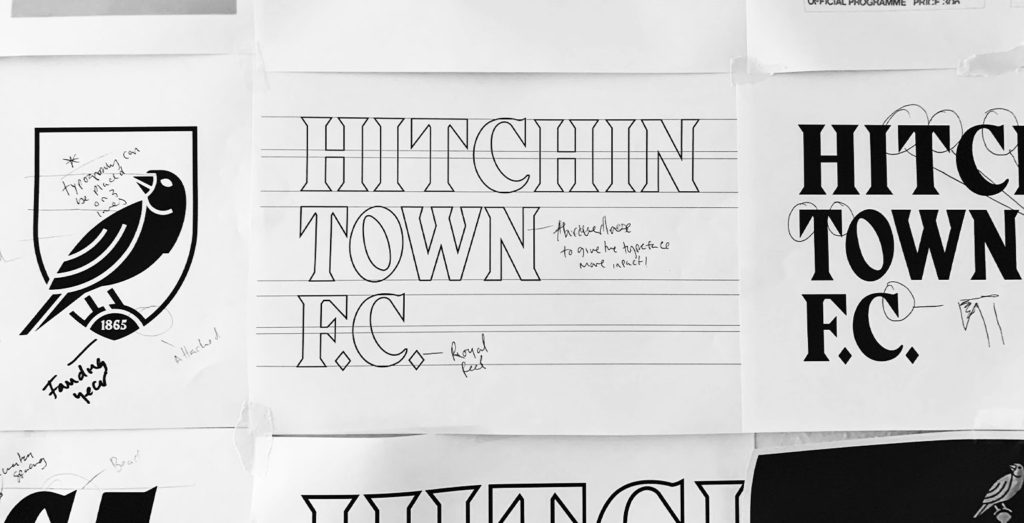
Stylish typography
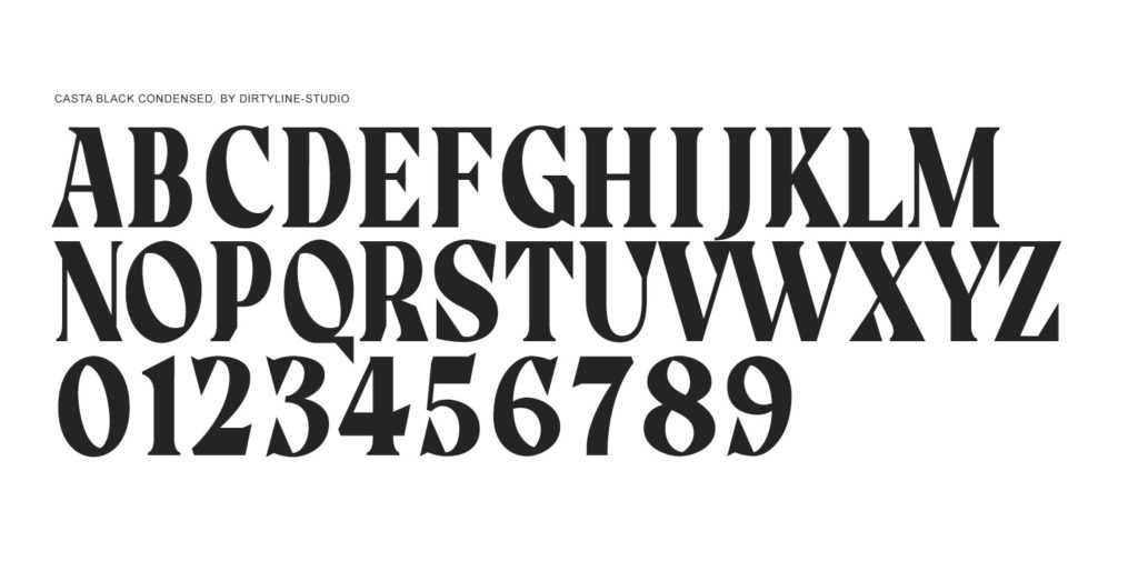
The typeface for this design was inspired by past typefaces used in the football clubs history. I was particularly inspired by the old Match Cards that the club produced in the 1930’s. The letterpress typography style had a strong feel with traditional vibes. I opted for a typeface with a similar tone, look and feel.
I researched and experimented with multiple typefaces that followed this course of inspiration, before deciding upon the unique and stylish typeface called Casta Black Condensed by Dirtyline-Studio.
Football clubs should do more with their club typography
I have held the opinion for many years that football clubs in England can be much more creative in their typography choices, and I wanted Hitchin Town F.C.’s new logo design and type treatment to demonstrate this.
The typeface Casta Balck Condensed is stylish, though simple; it has ‘old-world’ charms mixed with modern-day strength. I love how it works with the rest of the design, complementing the shape of the canary, while adding style and distinction to the design. This is a typeface that can also be used beyond the logo design and in Hitchin Town F.C.’s wider brand.
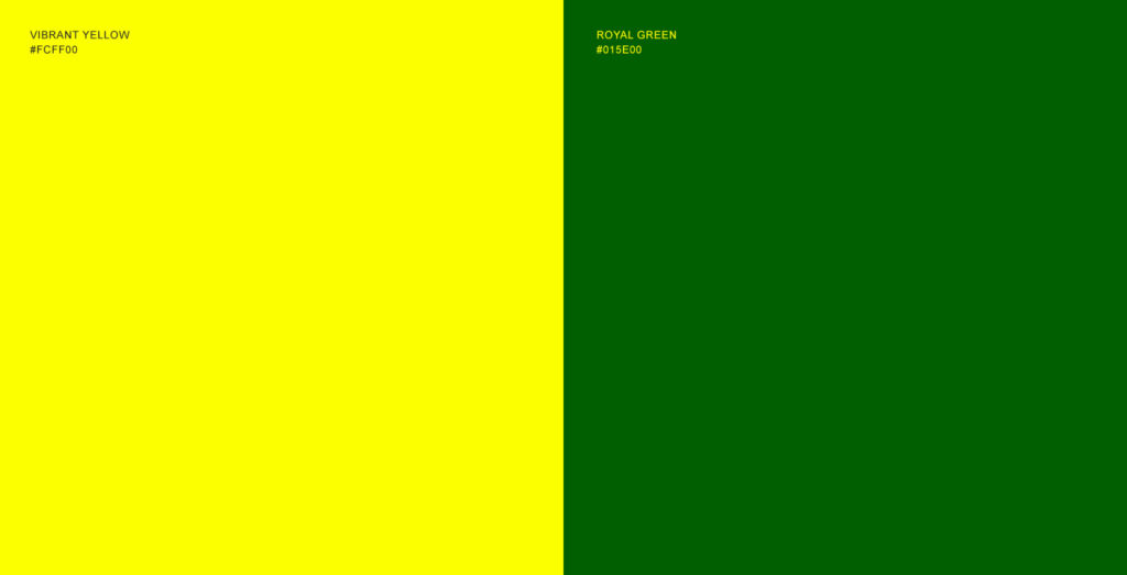
Adding Hitchin Town F.C.’s green and yellow to the design.
With the design’s structure complete, the final touch was to add colour to the design.
Hitchin Town F.C. has played in yellow and green for almost all of it’s existance. Going into this project, I knew that the yellow and green combination would be a key component to the design’s look and feel, it is the colour on the player’s shirts, and the colour of their famous old ground – Top Field.
The design boasts ‘royal green’ as the design’s background colour, with ‘vibrant yellow’ providing the detail in the design.
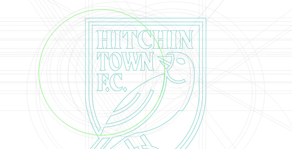
The final design.
I am very proud of this design. The design is strong and powerful, modern though it has a traditional feel, it is practical and scalable.
Although comparisons with Norwich City will be hard to avoid, as both clubs play in yellow and green and feature a canary on their logo this new design has enough differentiating design elements to separate the two. For example:
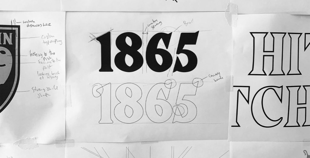
– This design features the club’s name within the design.
– This design features the club’s founding year within the design.
– The canary is perched upon the F.A. Cup.
– The canary’s head is turned, looking back.
– This design also has deeper green colour.
– The design is constructed using block shapes, as opposed to using line art.
A design that captures the history of the club.
I take a great deal of pride in the fact that this historic English football club chose to partner with me on the design of their new logo. It is a huge responsibility and a project that I take very seriously. I know that this famous old club means so much, to so many Hitchin Town fans. The club and I worked tirelessly to ensure that the new brand would encapsulate and respect the deep history that the football club has, yet still pave the way for progress. ‘The canary faces forward, but glances back – never forgetting our history’.
It is often the designer that gets credited with the new design, however, in reality, it is always a collaboration between the football club and the designer. Without Marketing Officer – Stewart Curtis, pushing the idea for a rebrand through, and exciting the rest of the board about the idea of rebranding, this new era for the club wouldn’t have been possible.
![]()
Launching the brand.
To launch the new logo and brand identity, we created an exciting and competing launch video that would showcase Hitchin Town F.C.’s progress and growth as a football team over the years.
With access to the club’s historical photographs, we created a compelling storyline that featured key moments in the club’s history before unveiling the club’s new identity. See the launch video below.
Further reading.
Want to start a project? Get in touch