 Back
Back featured reads
Designing These Football Times brand identity
February 27th 2021
5 Minute read
Christopher Payne
Christopher Payne is an award-winning British designer and passionate football fan. Backed up by his knowledge of football and the execution in design, Payne creates stylish, unique, practical and relevant designs for ambitious football clubs that are looking to progress both on and off the pitch.
These Football Times
Following content-affirming partnerships with the likes of The Guardian, print was the next step in 2016 to forward These Football Times into one of the largest independent sports publishers in the UK. The bi-monthly magazine is a representation of our best work, featuring award-winning writers, artists and photographers from across the game, in the UK and beyond. With each issue themed – from country to competition to club – the magazine has proved popular for those looking for authentic football content from start to finish.
Contact me¿Hablas español? Yo también. Contactarme.
These Football Times is a highly successful football magazine and website, providing compelling and riveting content about football, the stories behind the game, and the characters and teams that make the game we love.
These football times offer a different type of football writing, it exists in the open space between the professional game and mainstream media. The magazine and website uncover parts of the game that may not be mainstream but are certainly interesting.
These Football Times bring stories to life with striking graphics and interesting art pieces. It is a masterclass in the fusion of creative writing and creative art, and from cover to cover it celebrates the beautiful game.
![]()
One of my first impressions of These Football Times was the romantic way in which they write about football, you can feel the love for the game in between each paragraph, and each sentence. Add to this their appreciation for modern artists and contemporary design. You can tell that These Football Times only work with high-quality writers and artists, and I was honoured to be asked to represent them by designing their new identity.
Research and reading the magazine
After researching the history of the magazine, reading various articles, speaking with Editor-in-Chief: Omar Saleem, I set out a vision to create a brand identity that would have a sophisticated feel, with modern practicality. Adding to this, I also wanted the new logo to feel like it belonged in the world of football.
(Below: Previous These Football Times logos)
![]()
As seen above, previous iterations of the magazine’s logo incorporated letters to represent the brand. This was a visual tradition that I was keen to evolve. I purposely looked to use letters as a main focal point, as this is a brand that will represent talented writers who string together letters to form beautifully constructed words and sentences.
Building the logo
Visual language is important for a brand. Its identity or logo mark must leave first-time viewers with a strong impression of your brand, and hint at what industry your organization operates in. In this case, I was designing a brand for a football magazine, and so I wanted to make sure that the logo design felt like it came from, and lived in the world of football.
After a series of sketches, where I was exploring various shapes, hierarchies and concepts, I landed on a really interesting concept for the logo –
![]()
As seen above, I looked at giving the logo design a classic ‘shield-shaped’ crest. I love the power and nostalgia that shield-shaped crests bring. There’s a sophistication about the shape, and a beautiful symmetry to them.
Inside the shield shape, I added the initials T.F.T. (initials for These Football Times). The form of these letters fit within the shield shape and interlocked nicely with one another to form a harmonious design.
Digitizing the design
Following the sketching stage, I brought the designs into the computer to digitize the design.
During this digitization stage, it was important to refine the design and ensure that I get the shape of the shield just right – I wanted the shield to be tall and lean, but not too tall that it looked unnatural – visually you should be able to feel the strength of the shield.
During this digitization stage, I paid close attention to the stroke width that formed the shapes, I also looked at the negative spaces between the stokes – It was important that they were consistent and the overall design had good visual harmony. All elements of the design must work together and feel consistent.
![]()
![]()
After digitizing the logo design, I saw the huge potential that this design had. It was perfect for what we were looking to achieve. The letters stood tall and proud, the stroke weights were strong, and the shield shape gave you that traditional ‘football feeling’.
I loved how the F (that stands for football), is the dominant letter in the design and contributes to forming the top of the shield. Additionally, I really admired how the two T’s either side of the F, interlocked and filled out the negative space around the F.
Subtly, the foot of the letter F would meet the bottom of the shield shape and would form a ‘pen tip like shape’ that would represent the creative writers that make These Football Times a joy to read.
![]()
![]()
Adding a splash of colour
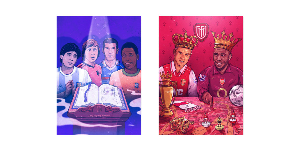
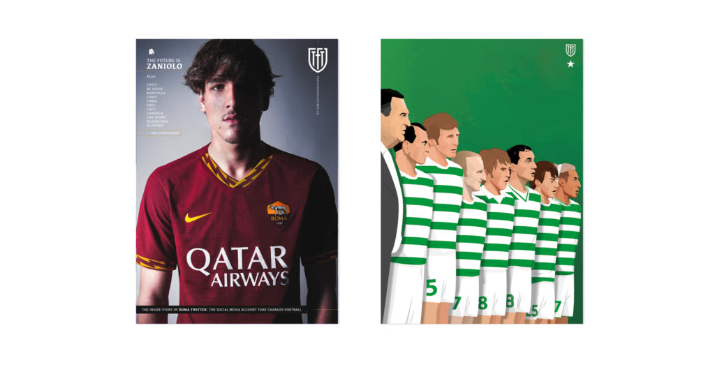
These football times is a fresh and exciting magazine, that is visually stimulating. TFT constantly works with and highlights different football clubs, all of whom have different colour schemes. With this new identity, I didn’t want to restrict the magazine into a single colour scheme but instead let the These Football Times logo embrace the colours of the football clubs and footballing nations that the magazine so often writes about.
For example, if These Football Times wrote about and featured a club like Borussia Dortmund, who famously played in yellow and black, the magazine’s logo could adapt and take on a yellow and black colour scheme.
With the design so simple but striking, the logo could change colours to suit its environment, yet still, retain its iconic design and memorable feel.
![]()
![]()
![]()
Launch and impact
The new logo launched online in April 2019. and has been seen on the front cover of their magazines ever since.
The impact of the new design has been huge. It has given These Football Times an iconic, though adaptable brand, that many believe to be one of the best designs in the UK magazine industry.
Quote from These Football Times Chief Editor:
“These Football Times had gone through many iterations of a logo – until we hired Chris Payne in 2019. – Respected across the game, having worked with clubs around the world, his concept was to symbolise both the sophisticated nature of These Football Times and its modern appeal. What he created has proved to be one of the most popular sports magazine logos in the UK”.
– Chief editor Omar Salam
Further reading
– These Football Time media pack
– Christopher Payne – One-pager – An overview of my adventures in football brand design
– Start a project / Ask questions – Contact Christopher Payne