 Back
Back featured reads
Designing York City Football Club’s centenary crest
May 6th 2022
12 Minute read

Christopher Payne is an award-winning British designer and passionate football fan. Backed up by his knowledge of football and the execution in design, Payne creates stylish, unique practical and relevant designs for ambitious and forward-thinking football clubs that are looking to progress both on and off the pitch.
Payne has worked with many football clubs and organizations around the world, designing iconic new logos and creating a detailed branding system, that makes the football club standout, grow off the pitch, and thrive in the modern world.
You can see examples of Payne’s work by clicking here.
Contact me¿Hablas español? Yo también. Contactarme.
Dan Simmonite is York City’s media officer. He expertly runs the club’s social media and digital marketing channels and is considered one of the best in the business. In fact, many aspiring sports marketers use his work as a benchmark.
Dan became aware of my work in 2020 when I launched Eastleigh FC’s new identity. This included a launch video titled ‘Chapters’. He was very complimentary about the project and got in touch to ask if I would appear on his podcast: The Press Conference Pod. I said yes immediately.
We recorded a great chat that covered my design process, the impact of the launch, the design decisions that made Eastleigh Football Club’s crest, and my overall experience in the world of football branding.
A few months passed before Dan reached out again. This time, he had an idea and he wanted me to help execute it. He sent me a private message via Twitter:
“Hey Chris,
Next season will be York City’s 100th anniversary and the club are thinking of introducing a special edition badge to commemorate this important moment in the club’s history.
We’d like to see if you would be interested in designing the club’s centenary crest?”
I said yes without hesitation, but the reality of this prestigious offer soon sank in. Designing a new identity for such a storied football club was a huge responsibility. I was confident I could do a great job for Dan and the club, and my initial excitement turned into a determination to the best job possible. I knew that this would be a great project to work on, with 99 years of history to draw inspiration from.
My first instinct was to involve the passionate York City fans as much as possible.
Making the project public and getting the fans involved
By now, Dan and I had met many times to discuss the project and the club. We both agreed that the fans should be heavily involved and that their voices should influence the design long before pen met paper.
Dan used the club’s media channels to announce that York City would be introducing a special centenary crest. In the same press release, he announced that I would be designing it and that we were looking for fans to share their thoughts.
The announcement was typical of Dan’s open and honest style, giving fans a clear picture of what’s going on behind the scenes.
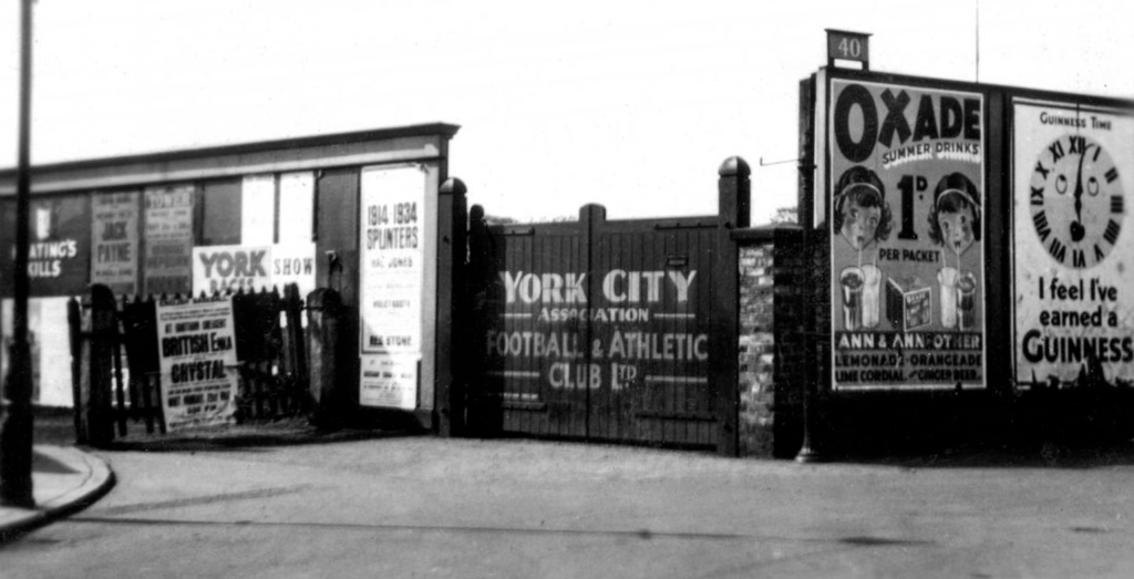
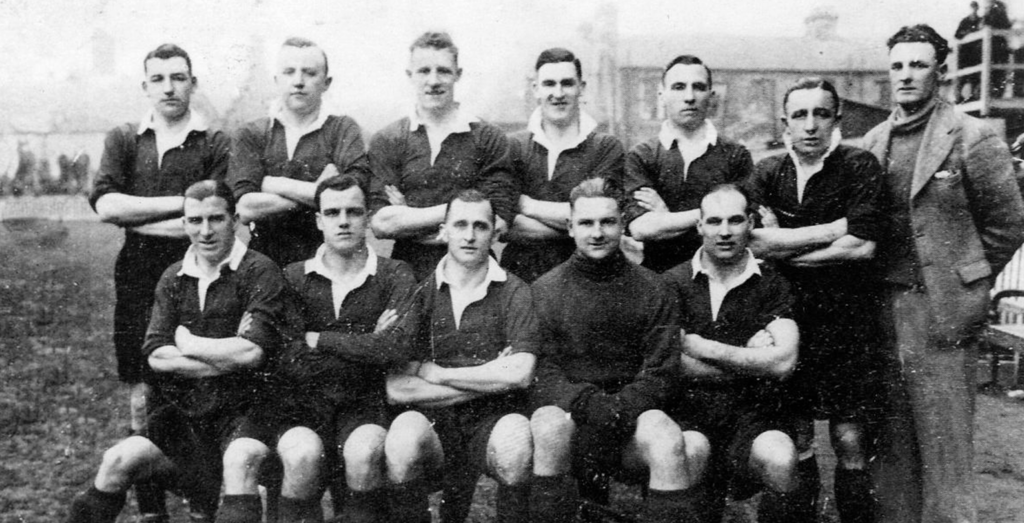
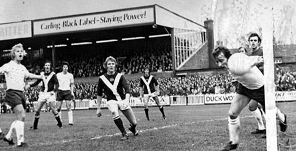
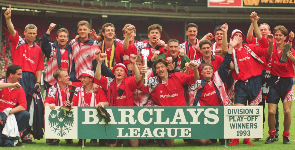
Researching York City F.C.s 99 year history.
While Dan was beginning the conversation with York City’s supporters, I began my independent research into the club’s history.
My fact-finding mission covered the club’s entire existence. Highs and lows. Club legends on and off the pitch. Cherished moments. Fascinating folklore. It was all there in spades. I soon learned that York City truly is a wonderful club with a captivating history, but the history books only tell one side of the story. It was time to learn from to the people who live and dream in red, blue, and white.
Listening to the fans
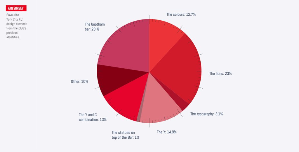
A vital part of our learnings was encouraging supporters to share their experiences with us. Our first touchpoint was an online survey that allowed us to assess the sentiment for past identities, old kits, and moments in history. We sent out the survey to the club’s large fanbase, asking multiple questions. The results were fascinating.
![]()
Focus groups with the fans.
As the survey responses flooded in, Dan and I organised a series of focus groups with York City’s fans. I designed a presentation that would help guide the conversations, and help trigger memories that the fans were fond of.
We invited the club’s extremely knowledgeable and likeable historian, Paul Bowser, to join us. Paul helped us host the sessions. He was great at getting the conversation flowing and encouraging fans to freely air their views. The discussions we had were truly inspiring. We spoke for hours about everything from past players and famous games to favourite kits and club traditions. We also spoke in-depth about the club’s previous identities. I learned a lot, and become more and more enamoured with York City Football Club.
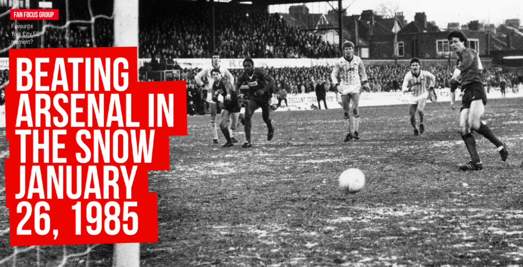
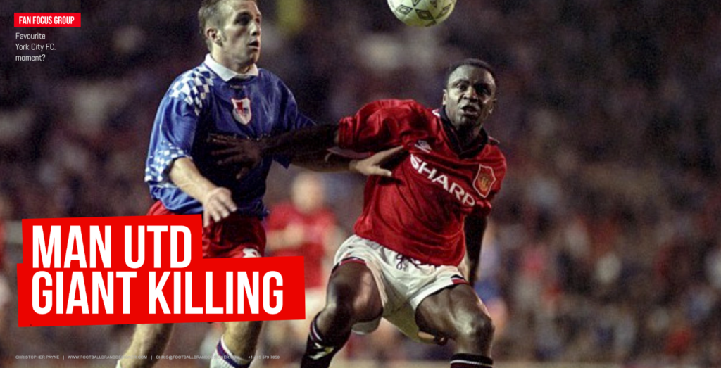
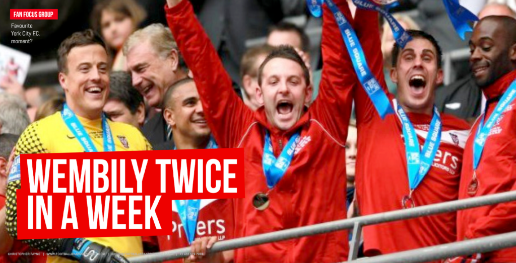
It was a real honour spending time with York City’s supporters. Their unwavering passion was an inspiration and I learned so much more than history books could ever teach me. Most importantly, the fans’ input gave me a much better idea of how to create a crest they could relate to.
Starting the design phase
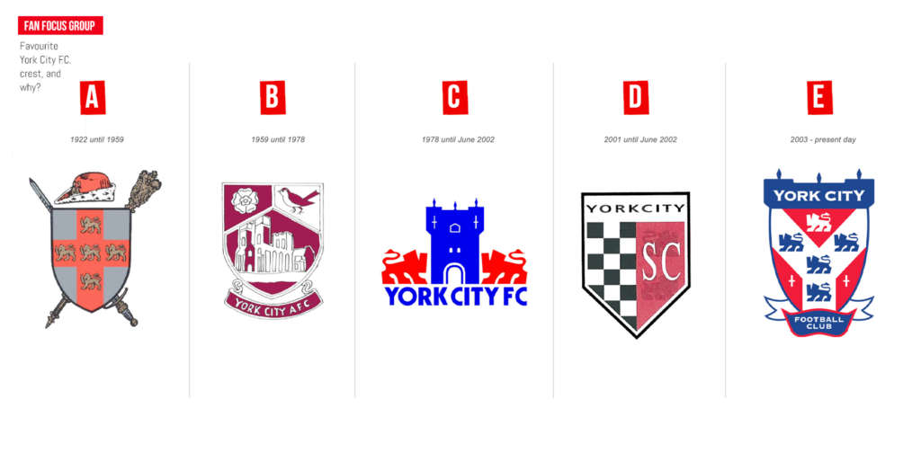
The starting point for the centenary crest design was to look back at previous identities. Five crests have been used in York City’s long history, with varying levels of popularity among supporters. I studied them all, looking to draw inspiration and find reference points.
One question we posed in the focus groups, and in the fan survey, was which, of all the club’s previous crests, was their favourite? Interestingly, the crest from 1978 to 2002 was overwhelmingly popular with supporters, with over 55% declaring it their preferred design.
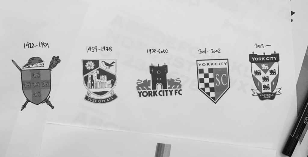
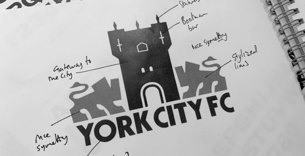
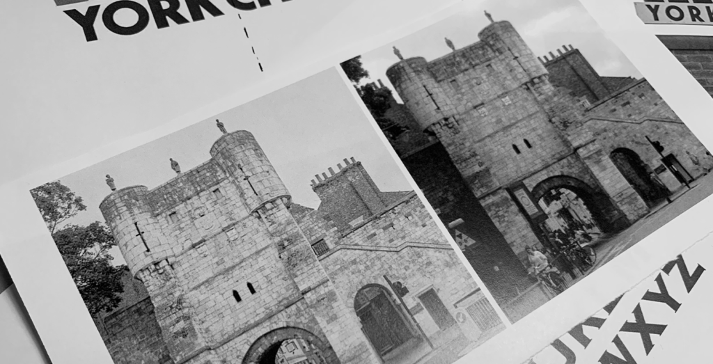
I also liked that design. The stylised lions facing Bootham Bar, the ancient stone tower that acts as a gateway to York, had very strong symmetry. I sensed that, in a city that’s not short on historic landmarks, Bootham Bar tower offered a potential pillar of strength for the centenary crest.
Typography
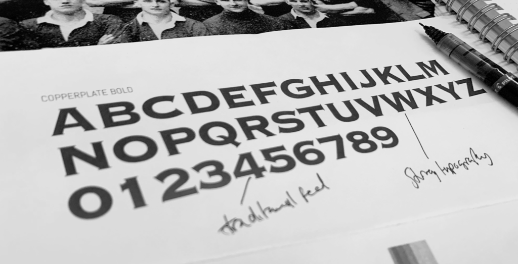
While analysing the club’s previous identities, I also looked at their typography. I wanted the new design to instinctively feel like a York City crest; incorporating design elements that the fans would instantly recognise.
The typography on the modern-day crest, launched in July 2002, had an interesting look. It felt strong, traditional, and very York City. I took note, as I wanted to capture this combination in my design.
Sketching ideas
Armed with buckets of inspiration and a newly acquired knowledge of the club’s history, I began sketching concepts for the centenary crest.
My instinct was to use the fan-favourite design from 1978 to 2002 as the starting point for the sketches.
The crest that the club used from 1978 to 2002 featured two stylised lions both facing inwards towards a graphical representation York’s Bootham Bar – an iconic and historic structure in York City centre. I liked this design for it’s simplicity and symmetry.
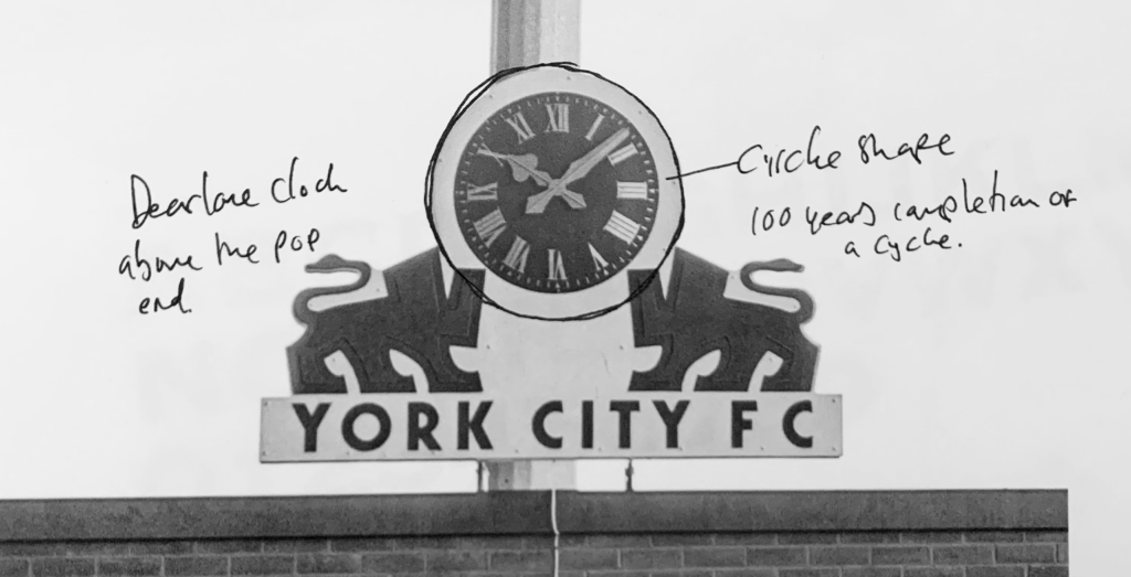
I also aimed to frame the design in a circular shape. This would represent the completion of a one-hundred-year cycle, and it would reference the famous ‘Pop Stand Clock’ that once stood proudly at Bootham Crescent, the club’s beloved old ground.
That clock, donated in memory of supporter Phil Dearlove, was recently refurbished and installed in the family zone at the club’s brand-new stadium. This sense of old becoming new seemed a fitting element to subtly incorporate in the crest.
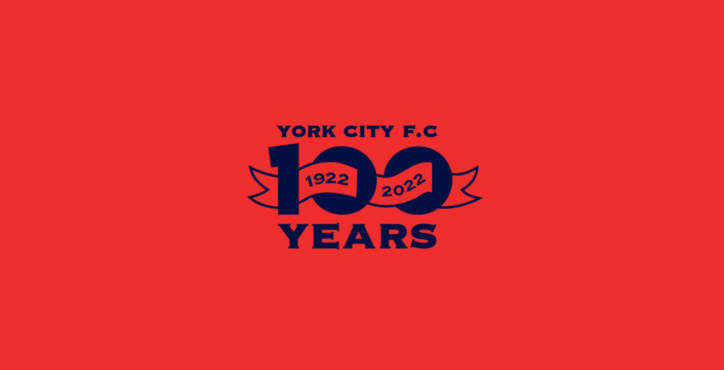
To complete the sketch, I placed typography around the central elements of the design. The top section of the crest clearly displayed the club’s name. Then, to avoid cluttering the design, the space at the bottom simply spelled out: 100 years.
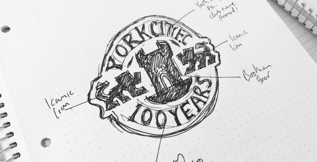
This concept instantly clicked with me. The positioning of the two lions and the city’s famous Bootham Bar tower gave the design the balance, strength, and symmetry I was after, while the curvature of the circle seamlessly tied everything together.
This rough sketch had outstanding potential, so I transferred it to the computer and began digitising the design.
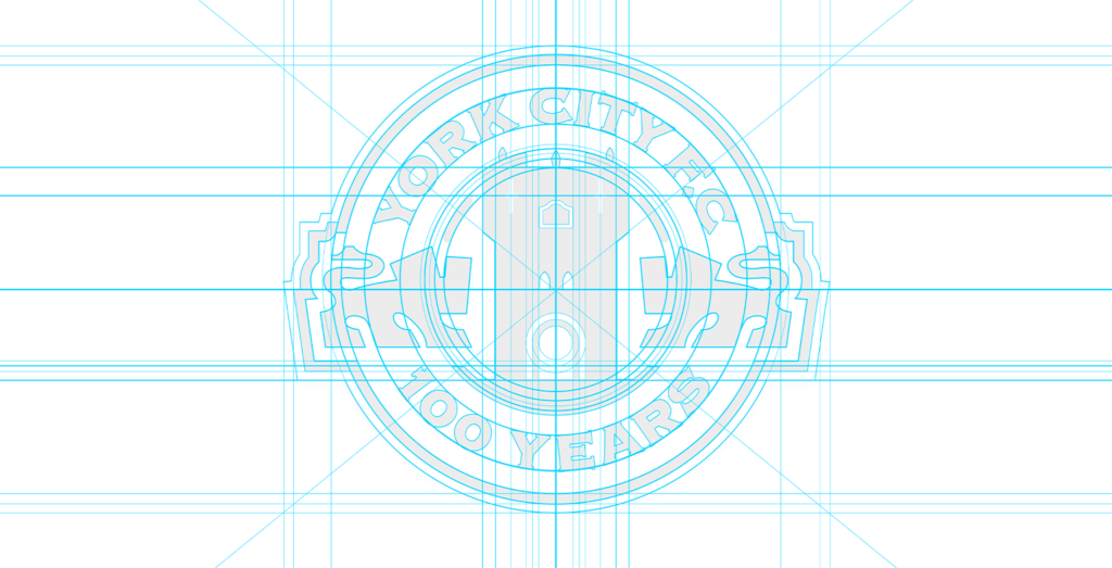
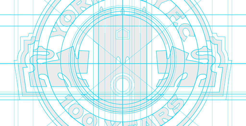
Digitising the design
The digitising process is where the architecture of the design gains definition. Using graphic design software, I built the crest with the aid of accurately measured guidelines and circles. This painstaking measurement process ensures that the visual hierarchy of the design has perfect balance. If you’re new to that term, visual hierarchy describes the specific arrangement of design elements to highlight their order of importance. Getting the balance right requires extreme precision.
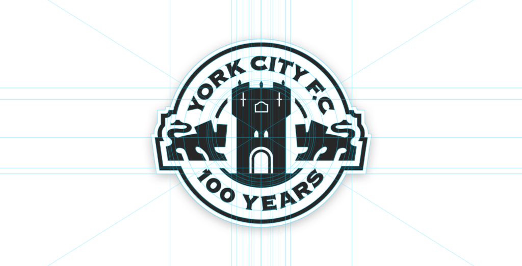
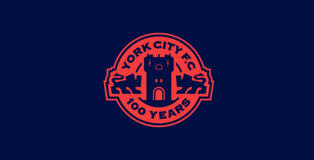
Once the basic architecture of the design was complete, I blocked it out using two simple colours: black and white. Doing this helps me to analyse the structure and weight of the design and allows me to assess how well the elements work together.
Now that the design was digitised, I stood back and instantly loved what I saw. It perfectly captured everything we’d set out to achieve. It was simple, yet it said a lot. Most importantly, it spoke of the history of York City Football Club.
I sensed I was really on to something.
Adding colours
So far, I had only seen this design in black and white, so I was keen to add some colour to complete the look.
Input from the club’s supporters was at the forefront of my mind throughout the process, but it had a particular influence when deciding on the crest’s colours. Fans in the focus groups, and club historian Paul Bowser, had spoken at length about the club’s original colours: maroon and white.
I realised that maroon would be a great colour to lead with. It spoke of the humble beginnings of the club and would help this crest to stand apart from previous ones.
To add a touch of prestige to the design, I added gold. This brought a ceremonial feel to the design and it paired beautifully with the dusky maroon elements.
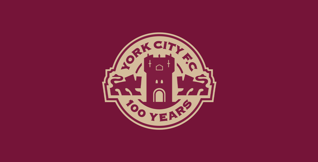
The crest was complete and, to me, it felt perfect for the club and the occasion. But how would the board react?
Presenting to the board
I presented the crest to the club’s board of directors, talking them through the various aspect of the design, and how it related back to the history of the football club, and what we heard from the fans in our listening sessions. The board listened intently, before confirming that they instantly loved it. They understood the reasoning behind my choices and appreciated the depth of research and fan engagement that Dan and I had undertaken.
The board gave us the green light, and approved the design. This crest would officially mark the centenary of York City Football Club.
Shortly after they ask if I would be interested in designing the kits for the club’s historic season. Without hesitation, I said yes, and a new design adventure would begin with York City F.C.
Proud to have played a part in York City F.C.’s history.
I take great pride in all that we have achieved for York City Football Club. I’m so proud of the design and the process of its creation. It was a joy to meet so many passionate and honest York City supporters along the way. I’m confident they’ll wear this special crest with pride as, collectively, we celebrate one hundred years of York City Football Club. Here’s to one hundred more!
Further reading
– Get in touch, start a project