 Back
Back featured reads
Behind the scenes: Designing Lexington Sporting Club’s visual identity.
March 22nd 2022
14 Minutes read
Christopher Payne is an award-winning British designer and passionate football fan. Backed up by his knowledge of football and the execution in design, Payne creates stylish, unique practical and relevant designs for ambitious and forward-thinking football clubs that are looking to progress both on and off the pitch.
Payne has worked with many football clubs and organizations around the world, designing iconic new logos and creating a detailed branding system, that makes the football club standout, grow off the pitch, and thrive in the modern world.
You can see examples of Payne’s work by clicking here.
Contact me¿Hablas español? Yo también. Contactarme.
USL is the United Soccer League, it is America’s second division, placed just one tier below Major League Soccer. The USL boasts several professional tiers, including the USL Championship, USL Leagues One and Two, two women’s leagues, and a youth league that develops players for the professional leagues above. It is a growing and exciting league to be a part of.
Lexington, Kentucky, is a market the USL had been keeping an eye on. Lexington is a passionate sporting community with a tradition of producing winning teams, and world class athletes, so a new professional soccer club would surely be a welcome addition to the sporting landscape.
The people behind the project
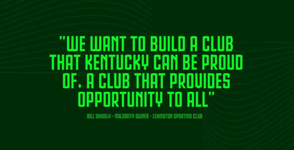
Vince Gabbert, who sent the initial email, is the president of this new football club. A proud Lexingtonian, and passionate sports fan, Vince had aspired to bring professional soccer to central Kentucky for many years. To get his ambitious project off the ground, he worked with the USL to build an ownership group that could match their equally ambitious plans. This is where Bill and Donna Shively enter the picture.
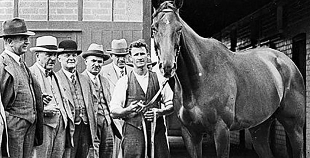
Bill and Donna bring success, humility, and kindness to whatever they do. Their business experience encompasses insurance, film production, and even thoroughbred horse breeding. When they agreed to become principal owners of Lexington’s new soccer club, they entered an exciting new arena. The ownership group also welcomed Stephen Dawahare as a minority owner, and Carter Carnegie as a strategic advisor; both highly successful locals who add considerable passion of the project and bundles of business acumen.
The club will also draw on the footballing expertise of former Wycombe, Port Vale, and Barnet defender Sam Stockley, and the former New Zealand international, and highly respected local coach, Michelle Rayner.
The initial meeting
I’d met with the club’s ownership group to outline what I could bring to Lexington’s new team. While presenting examples of my previous work, I got the feeling they’d done their research on me. They were particularly impressed with my work for Monterey Bay FC.
I had finished designing Monterey Bay FC’s brand just a few weeks before this meeting. That project called upon all of my research and design skills to create a football club brand from scratch. Lexington’s project had a lot of similarities. I walked the group through my design process and showed them examples of my work. It was a great conversation and a real honour to meet everyone.
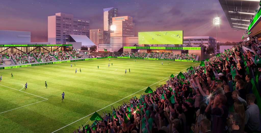
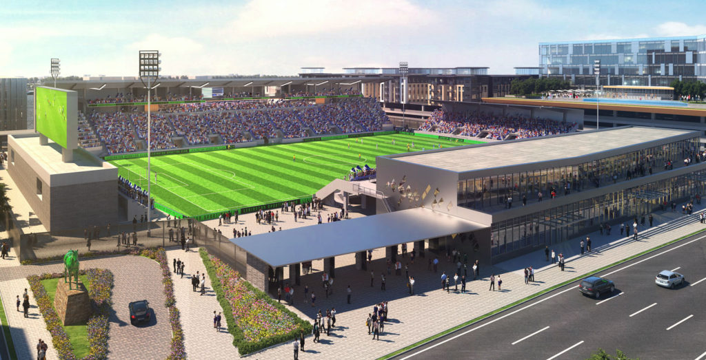
During the meeting, Vince revealed the club’s ambitious plans to build a state-of-the-art soccer stadium in downtown Lexington and gave me a sneak peek of the stadium renders. It was beautiful, and in a prime downtown location too! As it became clear that this group meant business, my hunger for the project grew.
A few days later, Vince called me to officially offer me the privilege of creating the brand identity for this bold new club. Struggling to contain my excitement, I immediately accepted and began preparing for another exciting design journey.
Getting started
To get the ball rolling, I arranged one-on-one conversations with all key stakeholders and club owners. In these conversations we informally discuss their hopes and dreams for this new club, and new brand. It is important that I find out their vision for the club early on, so I can design a brand that matched that vision.
In addition to speaking with each member of the ownership group, I also sat down to talk design with the club’s media and PR partner, Bullhorn Creative.
Based in the heart of Lexington, Bullhorn Creative is a hugely successful creative agency. Their team of designers, art directors, animators, creative writers, and PR specialists share their unique creativity with businesses in Kentucky and beyond. As the project progressed, I met with them weekly and got on with them instantly. They were responsible for project management, creative services, and messaging beyond the brand design. Importantly, they would also be helping the club to decide on a name.
Independent research – and discovering the ‘Horse capital of the world’
Having built relationships with the key stakeholders, I started researching the local area. I spent countless hours researching Lexington’s past; looking for historic moments that could influence the future. Local history, traditions, cultures, and industries were all covered in depth. This work is vital, as a football club’s brand needs to instantly connect with the community and foster an authentic sense of pride.
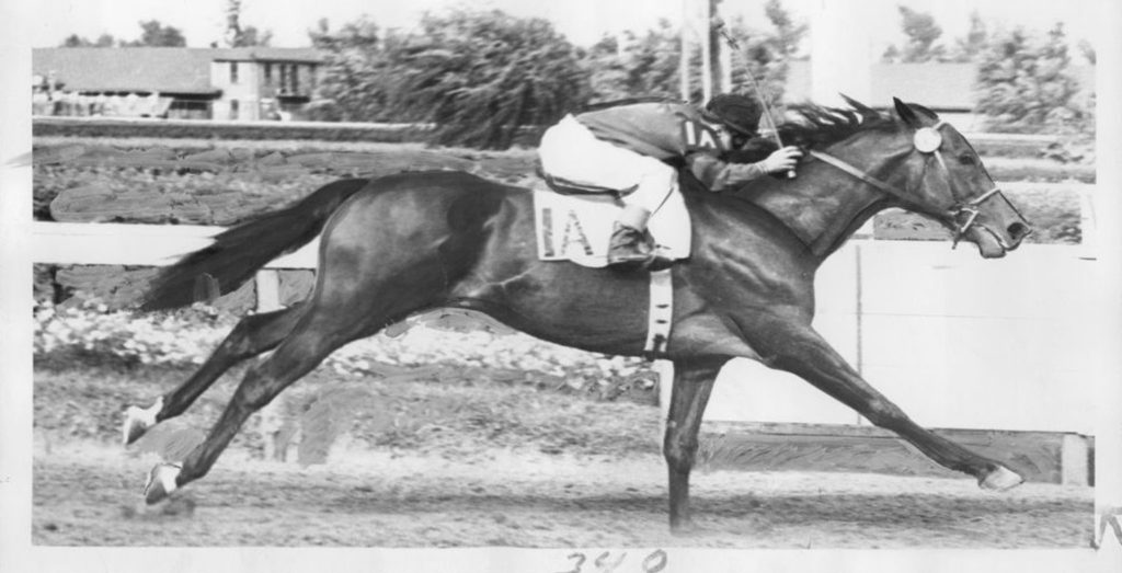
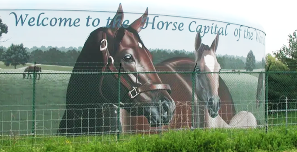
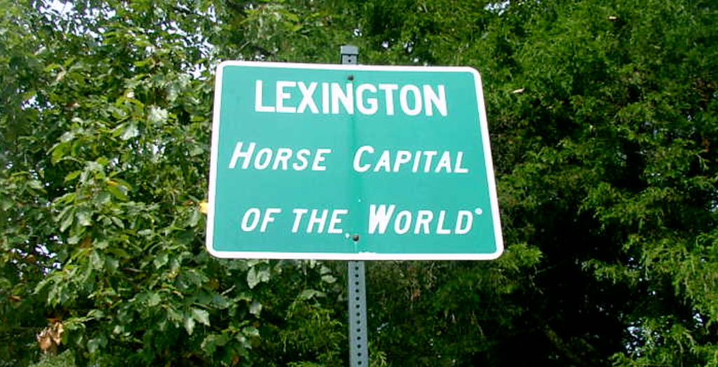
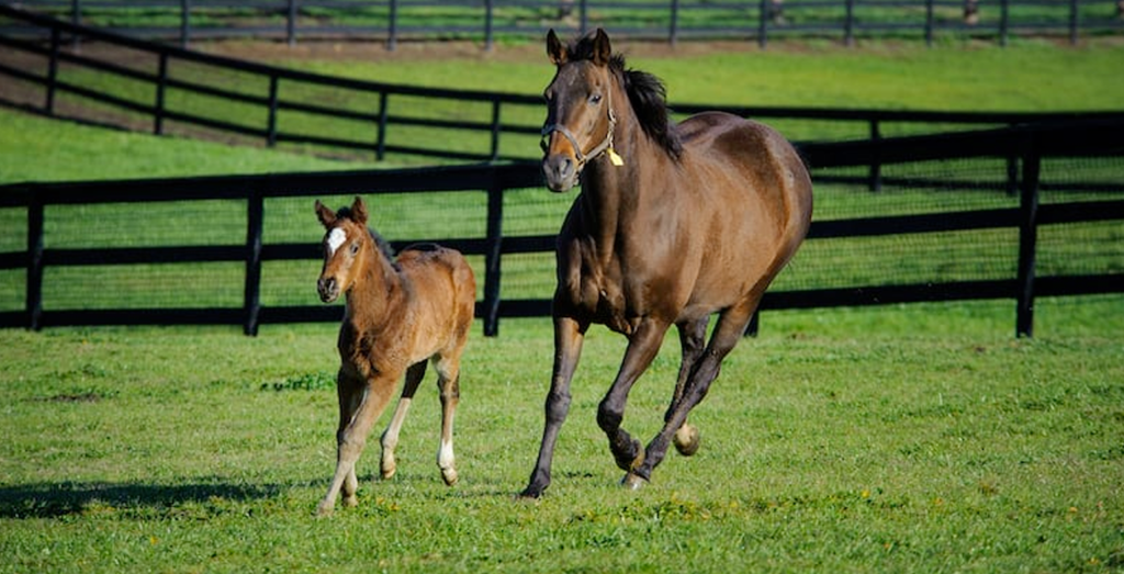
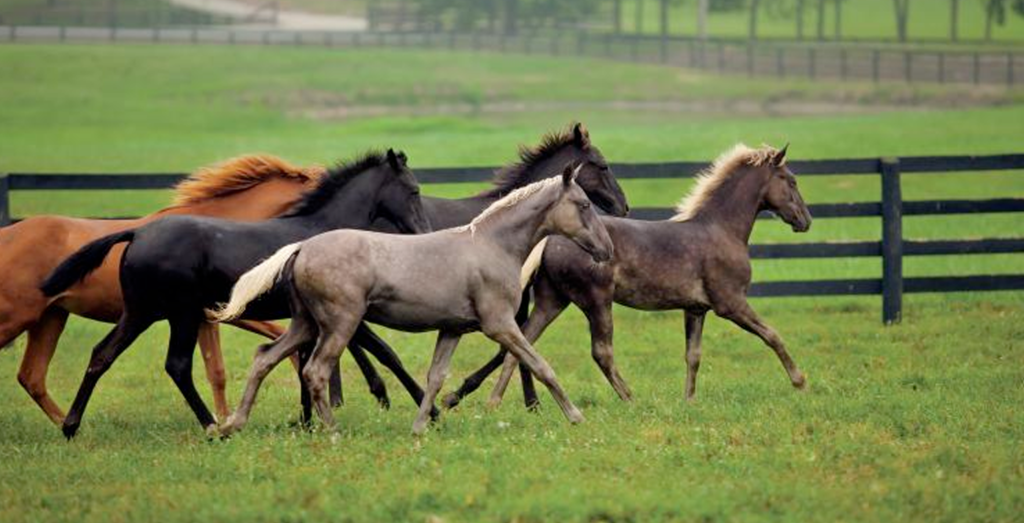
When researching Lexington, one of the first things anyone would discover is that, due to its famous horse farms and race tracks, the city is known as the ‘Horse Capital of the World’. This isn’t just idle boasting. Lexington’s long history of horses, trainers, jockeys and race tracks attracts tourists from every corner of the globe.
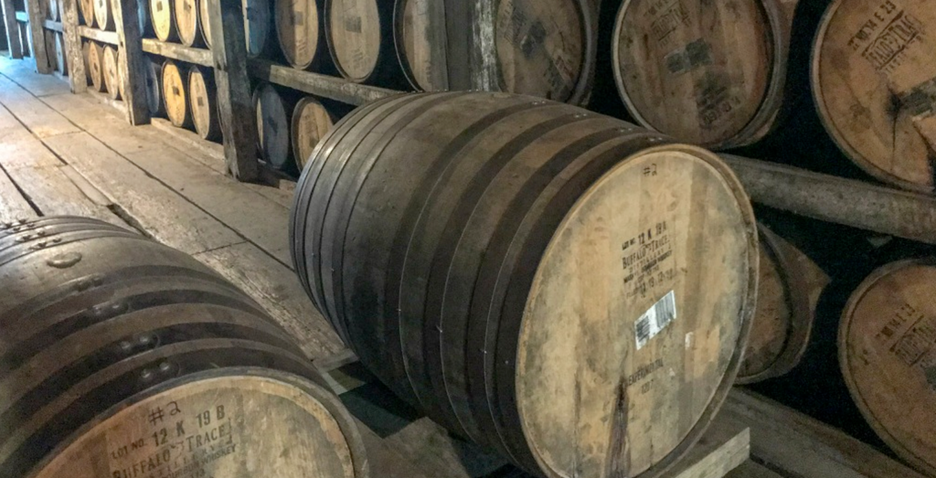
The bourbon capital of the world
My independent research also taught me about another historic Lexington and Kentucky institution: the bourbon whiskey industry. Kentucky is the birthplace of bourbon. Technically, you can make ‘bourbon’ anywhere in the United States, but 95% of it is made in Kentucky.
Lexington’s big-name bourbon distilleries, like Woodford Reserve and Knob Creek, attract a constant stream of whiskey-loving tourists. And, like the horse industry, this isn’t just the reserve of passionate Americans. People come from all over the world to immerse themselves in the heart of Kentucky’s bourbon culture.
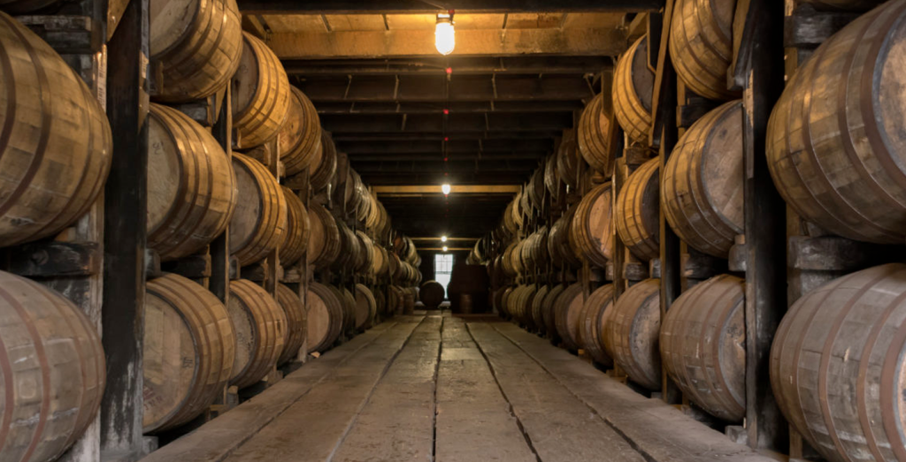
While my independent research didn’t quite stretch to building an extensive bourbon collection, it gave me a good knowledge base to start talking about Lexington and the local area with confidence. But the research didn’t stop there. To get a true sense of what it means to be a Lexingtonian, we scheduled a series of listening sessions with the local community.
Listening to the local community
By now, I had a great sense of what the club’s owners and key stakeholders were looking for in this new brand. I also had good knowledge of the history and traditions of Lexington. It was now time to speak with the other key stakeholders in this process – The local community – and future fans of the club. This is where we host listening sessions.
Listening sessions are vitally important when creating an identity for a new football club. If you fail to listen to the club’s community, you risk designing a brand they don’t connect with.
Lasting roughly the length of a football match, listening sessions are focus groups where locals from all walks of life are invited to share their views. Informative and inspiring, these sessions provide a perspective that you wouldn’t otherwise have access to.
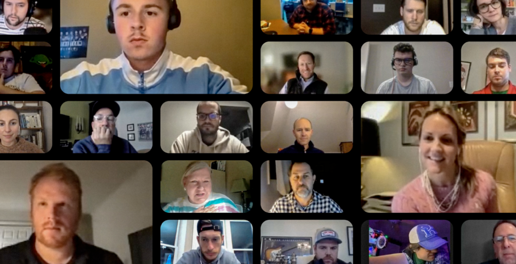
Working with my new friends at Bullhorn Creative, we hosted fifteen listening sessions with the Lexington and Central Kentucky communities. We asked questions about local symbolism, industries, and traditions while trying to spot patterns in the answers. The participants spoke openly about their love and affection for Lexington. They also spoke about aspects of Lexington-life they were less enthusiastic about, helping us to avoid potential pitfalls. These conversations were essential in shaping the club’s brand.
Were horses and bourbon over-used references?
Were horses and bourbon an overused reference point for Lexington? This was a question I was keen to examine in the listening sessions.
I paid close attention when horses and bourbon entered the conversation. It quickly became clear that there was a huge amount of local pride in the two industries. The quote that stuck with me: “No one does horses and bourbon like Lexington does horses and bourbon.”
Our listening sessions weren’t just an ode to horses and bourbon. Participants spoke passionately about the beauty of the local landscape and the kindness of the people.
While bourbon was a clear point of pride, the community’s love for horses was overwhelming. There seemed to be a special connection between the people of Lexington and this majestic, athletic animal. With that in mind, a horse was the front-runner to be the focal point of the club’s crest.
Visiting Lexington to get a better sense of people and place.
To get a better feel for the football clubs that I design for, I always look to visit the local area. One Saturday morning, I boarded a plane from New York City, where I’m based, to visit Lexington. I was eager to experience first-hand the places the listening session participants had described.
As the plane descended into Lexington, a glorious tapestry of green fields, separated by white fences and country roads, spread out beneath me. This was something that I’d heard about in the listening sessions, but I wasn’t prepared for quite how stunning it would look. The abundance of varied green tones stuck with me.
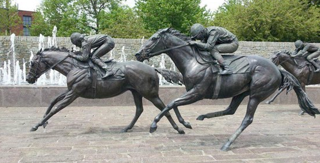
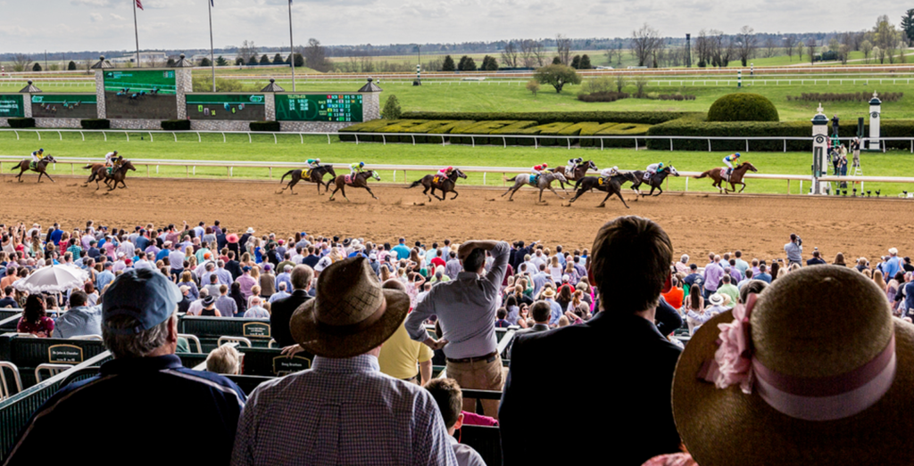
Wherever I travelled in Lexington, I kept a notepad and camera to hand because inspiration was everywhere! Along with several horse farms, I visited the famous Keeneland Race track, which left a big impression on me. I also spent time in the downtown area where the stadium is being built, taking notes and photographs and chatting with friendly locals. A University of Kentucky basketball game and a tour of a bourbon distillery gave me a lot to think about, too. During my visit, I also had a chance to meet the members of the ownership group. They were always happy to chat about football and expand on their vision for the club.
The Lexington trip was fascinating and informative. I’d been sketching and taking notes throughout, so when I landed back in New York, I had a notebook full of designs and interesting ideas.
Single point of focus: The Horse
When designing a crest for a football club, I absorb vast amounts of information from a variety of sources. From independent research to community-lead listening sessions, I arm myself with the information I need to make the right design decisions. It is a real honour to design a crest that will be part of the community’s sporting landscape for decades to come, so I pride myself on working hard and listening to the communities to ensure the best results.
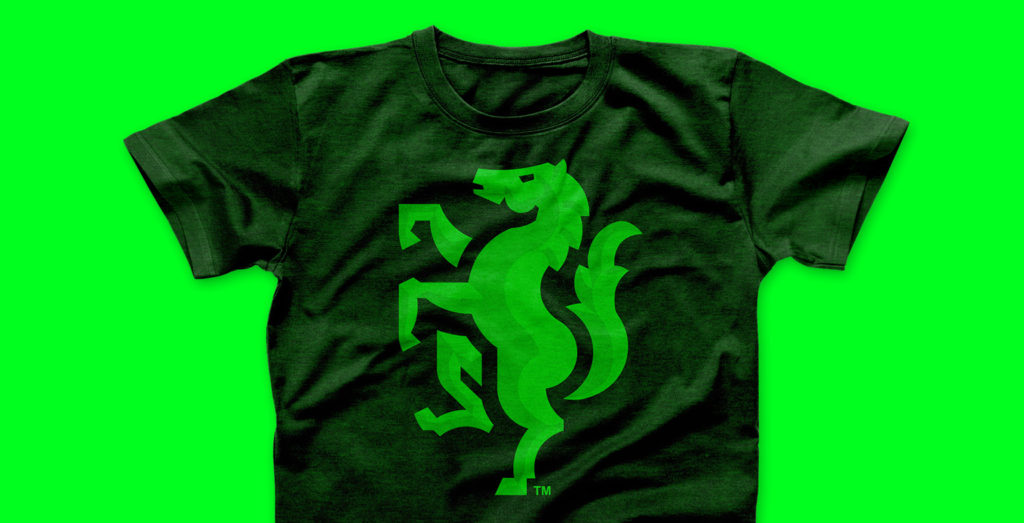
I take all of this information and boil it down to a single mark; a single graphic that perfectly represents the people and the place. For Lexington, this would be a horse.
My cumulative research made it clear that horses are a point of pride and an already established symbol for the community. It would resonate locally but make sense nationally. In addition, a horse’s athletic nature draws parallels between a horse and a footballer, making for a compelling story and offering an avenue for future scale. It felt fitting that this majestic and athletic animal would be a key identifier for the new soccer club.
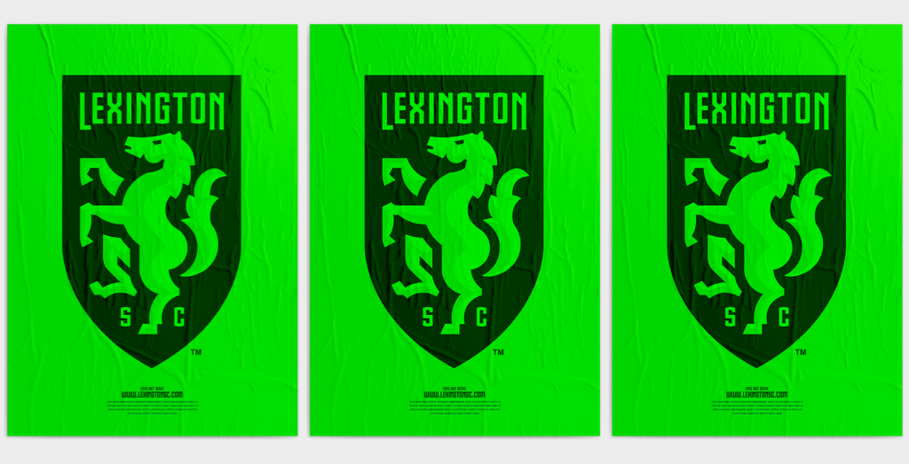
The clubs name: Lexington Sporting Club
By this point in the process, Bullhorn Creative had worked tirelessly with the club owners to come up with a name for this new club. There were many strong options presented, and I was impressed with the amount of research and creativity Bullhorn Creative did to showcase potential names. Ultimately the club’s owners settled on Lexington Sporting Club. It was a name that had a strong and powerful, traditional feel to it. I wanted to create a design that would complement those feelings.
Sketching horses
There are many ways to draw a horse. I sketched and sketched, blending concepts with different crest shapes to look for a design that showed potential. I also paid close attention to how the typography that spelt out the club’s name – Lexington Sporting Club – would look when positioned with the other design features.
Establishing the visual hierarchy is essential in football club crest design. If you’re new to this term, visual hierarchy describes the specific arrangement of design elements to highlight their order of importance. In a club crest, the design elements must have an instinctive balance and order. When you see it, you know! For that reason, the sketch below intrigued me.
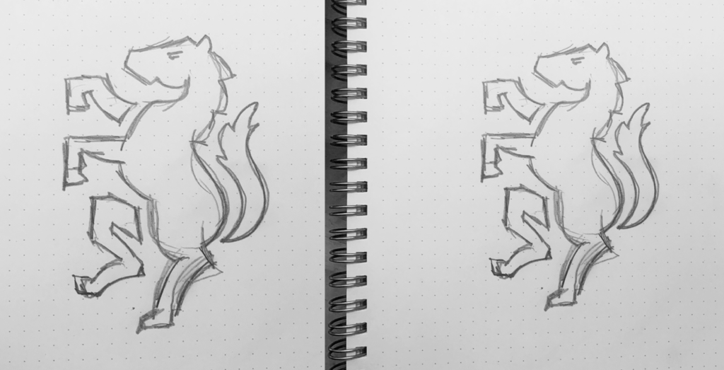
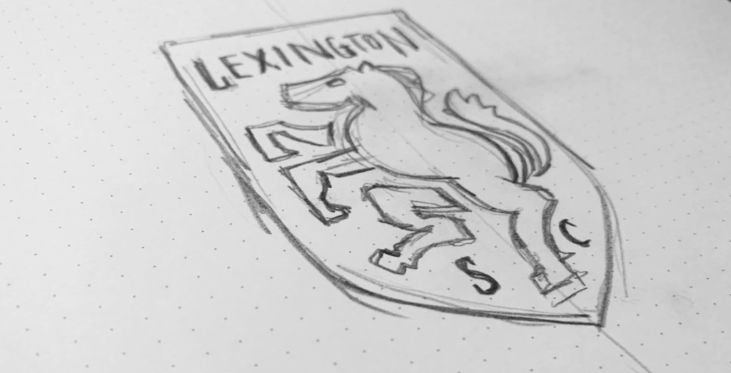
There was something stylish and traditional about this sketch. I knew I was on to something. In the listening sessions, we got a sense of the community’s appreciation for the longstanding traditions of football/soccer as a sport. This sketch instantly embodied that.
The horse rearing upward, in a ‘rampant’ pose, gives the crest a sense of excitement and power. It also has a traditional feel. I saw great potential in this idea, so I moved it across to the computer to solidify the design.
Digitising the sketch
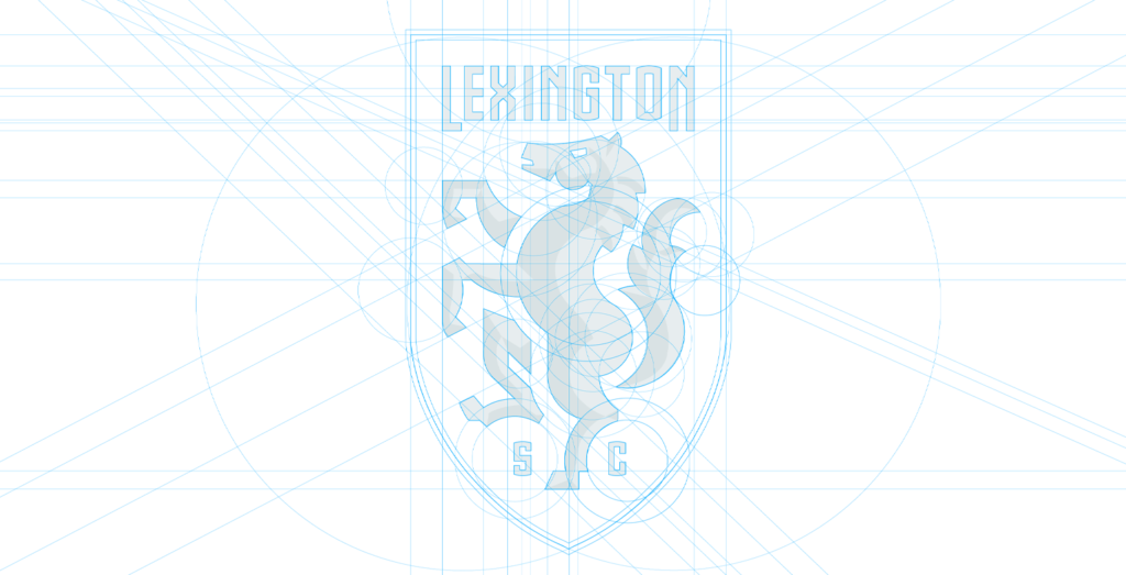
After scanning the sketch into the computer, I began the precise process of building the design digitally. This is a detailed and mathematical procedure where I use acutely angled lines and sweeping circular shapes to inform the design.
I look carefully at the intersections where the circles meet and assess the shapes they create. Obsessing over even the smallest details, I piece together a perfectly balanced design that befits a professional soccer club.
![]()
![]()
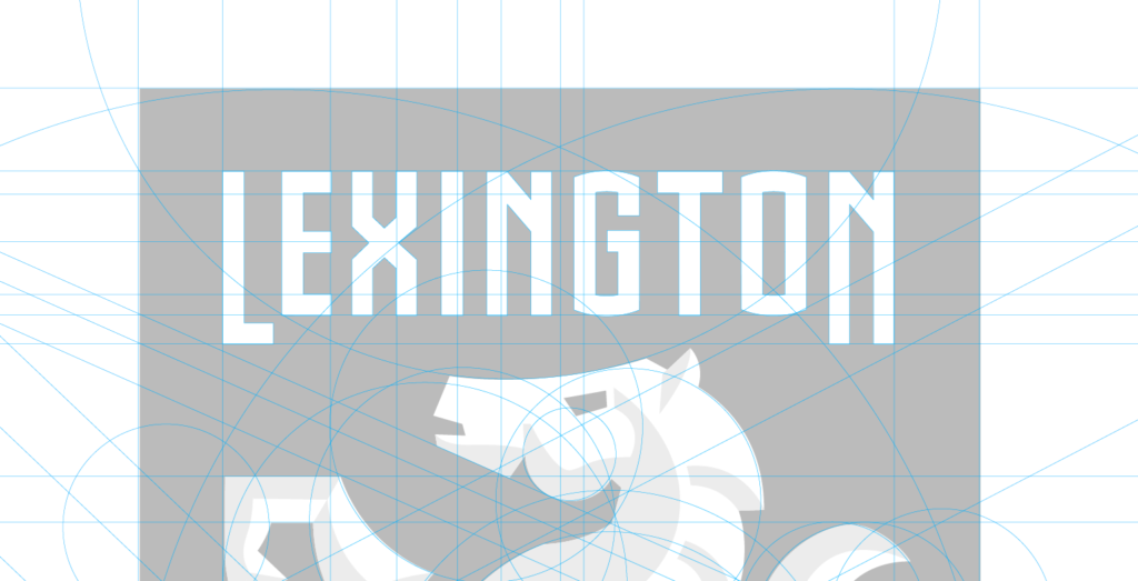
Once the outline is mapped, I fill the design with two simple colours: black and white. This process, called ‘blocking’, gives me the contrast I need to forensically assess the form and structure of the design. Then, when everything is to my liking, I stand back and take a good look.
I instantly loved this design. It was intricate and interesting. It also managed to straddle the fine line between modern and traditional.
![]()
Creating typography for the crest and brand.
With the design of the horse fixed, I focussed my attention on the typography.
Typography plays such an important role when building a brand as it sets the tone for the entire visual presence. As the design of the horse was so striking, the typography needed to be strong enough to hold its own when placed alongside it.
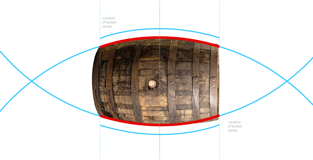
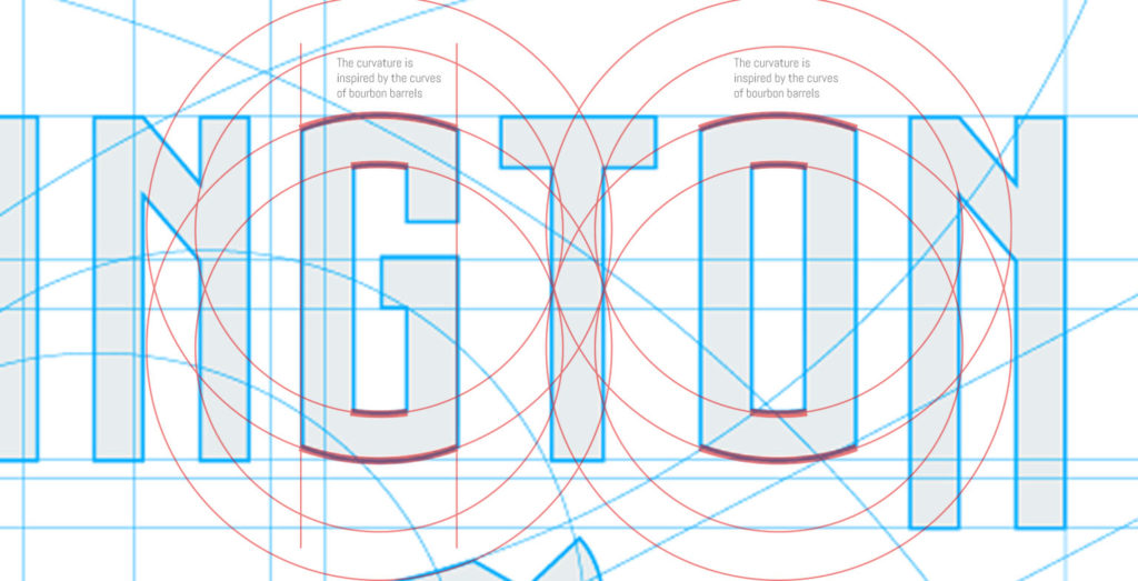
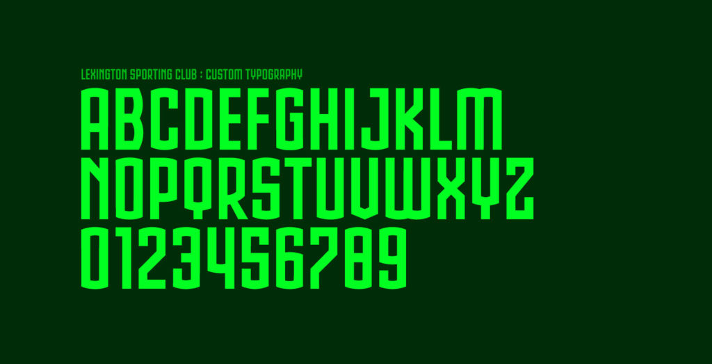
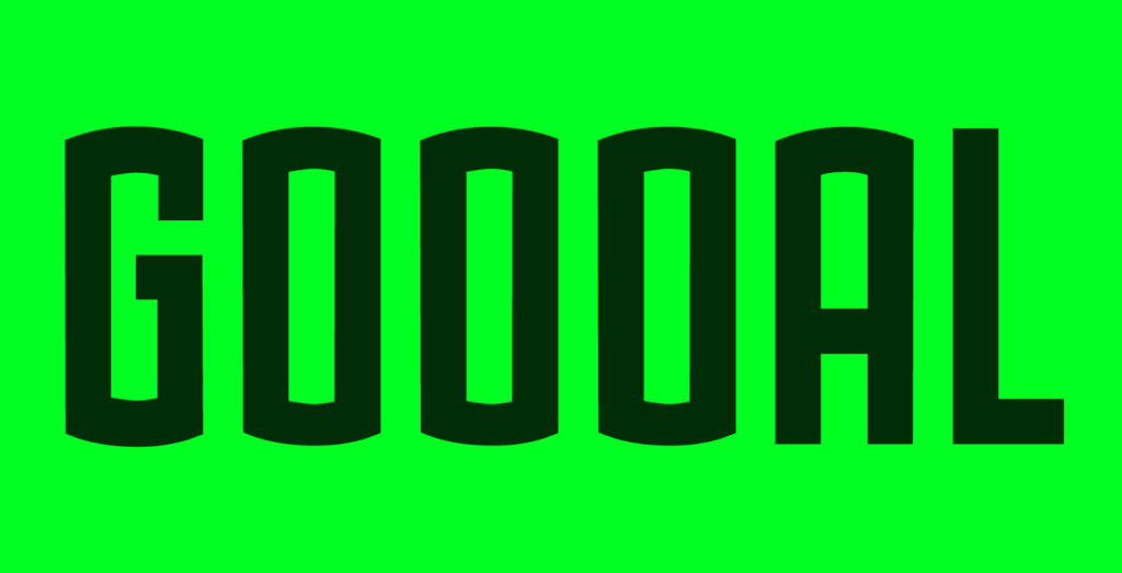
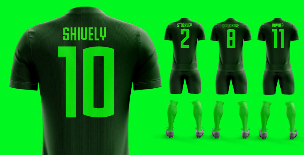
Drawing inspiration from the region, I designed a custom typeface called ‘Lex Type’. Like a horse, Lex Type is tall, powerful, and athletic. However, if you look closely, you’ll notice the typeface has subtle curves at the top and the bottom of the letters. This detail is inspired by the graceful curves of a bourbon barrel, tying the typography to this important element of local history and tradition.
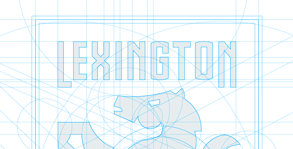
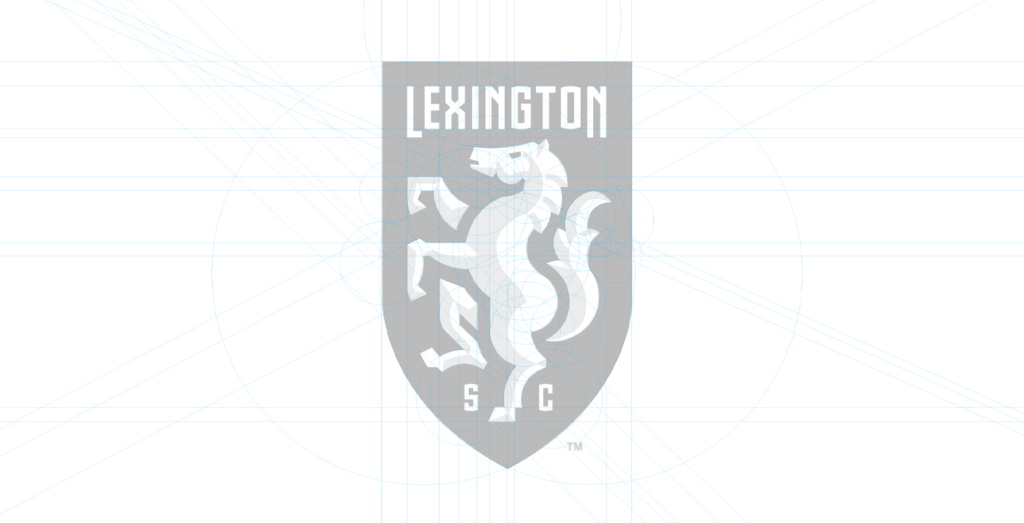
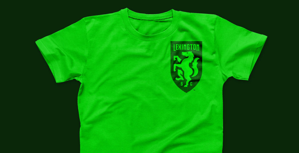
‘Lexington’ sits at the peak of the crest, prominent but not overbearing. The letters S and C, standing for Sporting Club, are placed at the foot of the design, adding balance and symmetry. The placement of every element was measured to the smallest pixel to give the crest perfect poise.
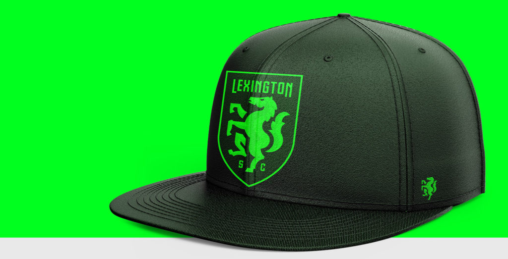
Lex Type won’t just feature in the club’s principal identity, it will appear in every area of the club’s communication. From stadium signage to email footers, this typography will speak for Lexington Sporting Club wherever it travels.
The shield
Every part of the crest draws inspiration from the listening sessions. This includes the shield shape that frames the design.
A consistent note from the listening sessions, and from conversations with the club’s owners, was the desire to have a brand that felt traditional yet modern. This is a fine balance to strike.
The shield was designed to reflect the longstanding traditions of the game. This shape, with its heraldic connotations, has been popular in football club crests since the sport’s creation in the Victorian era. But this wasn’t a case of shoehorning a design element for the sake of it. The tapered shape of the shield acts as the perfect frame for the horse and the typography.
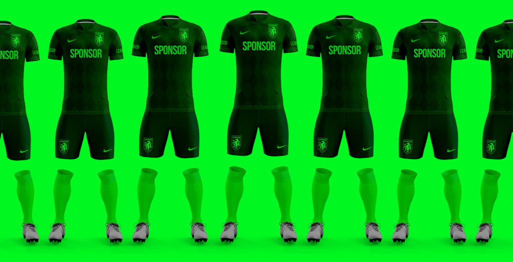
Choosing the club’s colours
Throughout the process, colour was at the forefront of my mind. The University of Kentucky boasts many successful sports teams that wear blue and white, so these colours are an obvious source of pride for the community. But the listening sessions highlighted a desire for the club to forge a new identity, including a bespoke colour scheme that the community could get behind. The ownership group agreed wholeheartedly.
My thoughts turned to the local landscape. Lexington’s rolling green hills and lush, leafy woodland were a source of inspiration. Green was certainly a colour that made the locals feel at home. I heard several anecdotes about the joy of flying into Lexington Airport and seeing acres and acres of green farmland beneath you. It certainly left a mark on me.
I did my due diligence and looked at other sports teams in the region, along with other teams competing in the USL. There was definitely a gap in the market for a team that leant on a green palette.
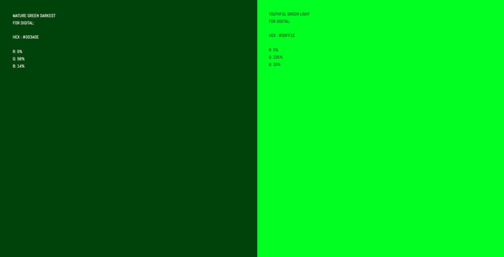
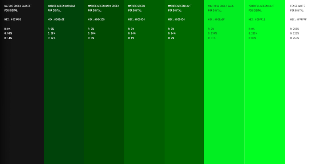
To attract as broad a fan base as possible, the club needs to appeal to fans young and old. With this in mind, I combined a bright, youthful green with a darker, more mature green. This combination worked well, as the youthful green brought vibrancy and energy to the brand while the mature green offered authority and a sense of tradition.
The green tones were directly inspired by my visit to Lexington. The darker green comes from historic locales like the Keeneland Race Track and the Shively family’s Dixiana Farm. The brighter, more vibrant green flows from the rolling hills and farmland that make this beautiful region so special.
Finalising the design
With the crest design complete and the colour palette finalised, it was time to show my work to the club’s ownership group.
I presented this design alongside two other concepts. I was confident they would love all three, but, ultimately, the choice was theirs.
![]()


The presentation to the ownership group was extremely successful. The more designs I showed, the more excited the room became. We examined the minutia of each design and discussed how the brand would scale in the coming decades. I sensed they were impressed with the level of detail and meaning in my designs and the quality of the execution. It was going to be a hard decision.
We spoke at length about why the proposed brand would be right to represent the people of Lexington. The owners liked the strong, powerful look of the horse design and understood the reasoning behind it.
Before this meeting, the owners didn’t have a colour scheme or a brand identity in mind. In many ways, it felt like the club was just an idea that had yet to be pinned down. This presentation changed that. Suddenly, it was a real soccer club with club colours and a crest that fans could wear with pride.
It was an exciting meeting and an honour to pitch ideas to the ownership group. Two weeks later, with a few minor tweaks to the designs, they made a unanimous decision. Lexington Sporting Club finally had its identity.
Beyond the crest
With the design of the crest approved, I got to work on the other vital parts of the brand.
I finalised the club’s custom typeface, Lex Type, and made it available to their key creative and merchandise partners.

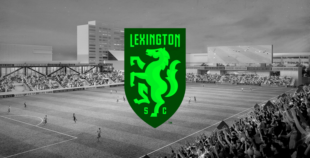
I also worked with the stadium architects to help them incorporate the new branding in their stadium renders. I find it unbelievably exciting when stadium renders reflect the brand. It really hammers home that the club is taking shape beyond the identity.
Working alongside Bullhorn Creative, I also created a short video titled: Know Your Crest. This two-minute video explained the process and inspiration behind the final design.

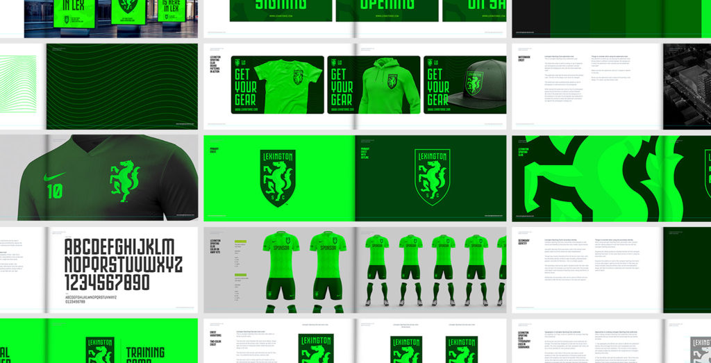
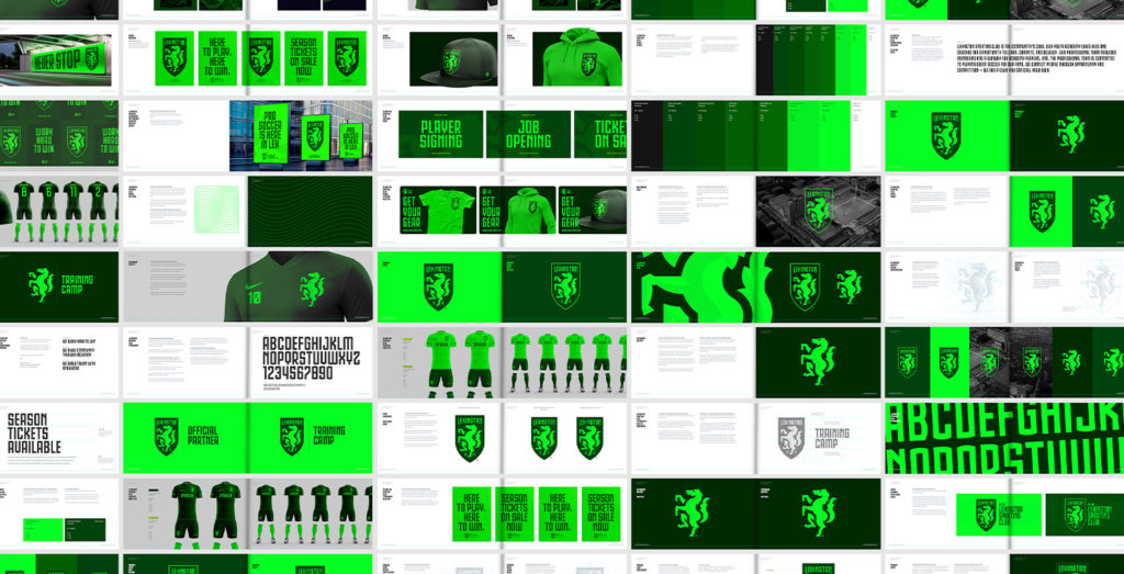
Brand guidelines
Another important part of the process is creating brand guidelines. This mini-rulebook removes ambiguity and helps creative partners and internal staff keep the brand on track. These guidelines are particularly important during the early days of a brand, as so many people are new to it. You can see Lexington Sporting Club’s brand guidelines below.
![]()
Pride in the process and the result.
From Vince Gabbart’s initial email to the final hand-over, Building Lexington Sporting Club’s brand was a long journey. But I loved every minute of it.
The process gave me the good fortune to get to know the people of Lexington; some of the kindest I’ve ever met! Whether it was the club’s ownership group, the team at Bullhorn Creative, or the passionate locals in the listening sessions, everyone played their part in the creation of this exciting new soccer club brand.
Working with so many welcoming and talented people has been a real privilege, and I’m extremely proud to have played my part in the club’s history. I can’t wait to visit the new stadium on opening night. I’ll be there in the club’s crest and colours, joyfully congratulating the ownership group on achieving something truly spectacular. Together, they’re bringing professional soccer to the proud people of Lexington, Kentucky.
Further reading
– Buy Lexington Sporting Club merchandise
– Lexington Sporting Club website
– Lexington Sporting Club case study