 Back
Back featured reads
The Greatest Union of Land and Sea: Designing Monterey Bay F.C.’s brand identity.
September 13th 2021
12 Minute read

Christopher Payne is an award-winning British designer and passionate football fan. Backed up by his knowledge of football and the execution in design, Payne creates stylish, unique practical and relevant designs for ambitious and forward-thinking football clubs that are looking to progress both on and off the pitch.
Payne has worked with many football clubs and organizations around the world, designing iconic new logos and creating a detailed branding system, that makes the football club standout, grow off the pitch, and thrive in the modern world.
You can see examples of Payne’s work by clicking here.
Contact me¿Hablas español? Yo también. Contactarme.
It began in January 2021 when I received a call from Erika Bjork. Erika is a highly respected soccer executive who acts as an adviser to many clubs in Northern America. Her knowledge of soccer club dynamics, and the game in general, is second to none. Our paths had crossed several times at this point, but we hadn’t had the opportunity to work together. That was about to change.
Erika asked if I would be interested in developing the brand identity for a new soccer club. Based in Monterey, California, the team would compete in the prestigious USL Championship, one tier below the MLS. Without any hesitation, I said “yes!”
Erika set up a meeting with the club’s newly appointed president, Mike DiGiulio, and the club’s owner, Ray Beshoff. In the meeting, we spoke in detail about my previous projects, along with my design and film experience. They seemed impressed, particularly with my work on the New Amsterdam F.C. brand. The meeting turned into a free-wheeling conversation about football and design, and I felt a great connection with the two of them. It wasn’t a done deal at this point, but I was quietly confident of landing this amazing opportunity.
An agonising three weeks passed before Mike DiGiulio called to ask if I was still interested. Trying to contain my excitement, act cool, and remain professional, I blurted another emphatic “yes!” And so began the most unique and invigorating design process that I’ve ever undertaken.
About the club.
Monterey Bay F.C. is backed by businessman, and passionate football fan, Ray Beshoff. Ray is a Dublin and Liverpool native who moved to the U.S. in the early ‘80s to make a name for himself in the auto dealership industry.
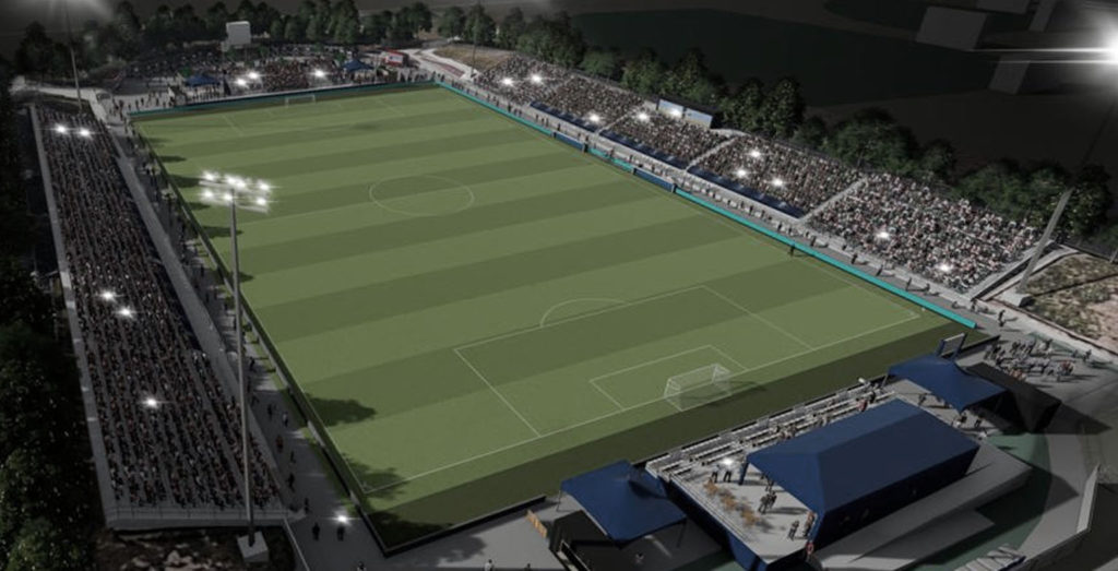
His team have been granted a coveted spot in the USL Championship for 2022, so the project is moving forward at pace. At the time of writing, the club is busy redeveloping Cardinal Stadium: a historic but timeworn arena on the campus of California State University Monterey Bay. Located in a vibrant spot just one mile from the ocean, this stadium will soon become the region’s home for professional soccer.
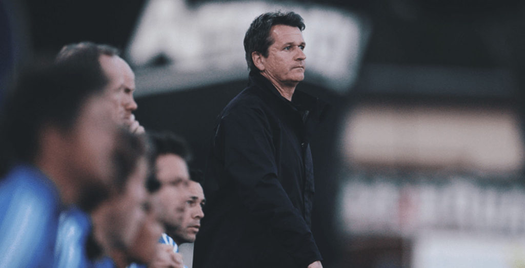
Shrewd appointments have been made behind the scenes, but by far the most notable is two-time ‘MLS Coach of the Year’ Frank Yallop. The former LA Galaxy, San Jose Earthquakes, and Canadian National team coach will be Monterey Bay’s sporting director and first-team coach.
This new club is serious about success, and foundations are being laid to meet those expectations. I knew that if I could craft a best-in-class brand identity, it would set the club up for success and be a significant milestone in its history. I was excited to meet that challenge.
Listening to the local community.
When partnering with English clubs, I usually have decades of history and tradition to draw from. And clubs in the U.S., even new ones, usually have a strategic colour scheme in place at the very least. But, when I joined the Monterey Bay project, the brand was essentially a blank piece of paper. This was a unique opportunity, to say the least.
Our instinct was to engage with the local community. This would be their club after all, so what did they want and expect from it? Erika reached out to the Monterey community and invited them to a series of ‘listening sessions’. During these sessions, lasting roughly the length of a football match, Erika thoughtfully directed the conversation.
Her work helped us pinpoint elements of the local culture and history that resonated positively with the community. Importantly, it also helped us to uncover values they definitely wouldn’t gel with. It was a fascinating process to be a part of, and I felt privileged to hear the voices of the many community members who attended. I took A LOT of notes.
The land.
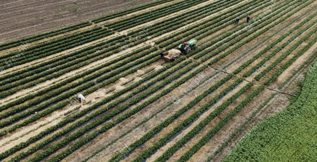
From our listening sessions, we quickly understood why this area is referred to as ‘the salad bowl of the West’. Monterey locals take immense pride in their agriculture and farming communities, and they speak fanatically about the lettuce, garlic, artichoke, strawberries, and cabbage they produce. These crops, among others, are carefully nurtured and hand-harvested before being distributed nationally.
The Monterey area has been a haven of sorts for the immigrants who have settled there. In many cases, successive generations have worked the land as farmers. This tough but rewarding work has allowed them to build a life for themselves and their families, but it has also fostered a tangible sense of community.
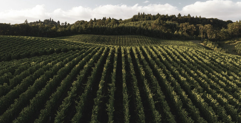
The immense pride that the locals have for the land was apparent from the start, and I knew this new brand must pay homage to that.
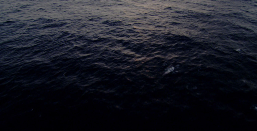
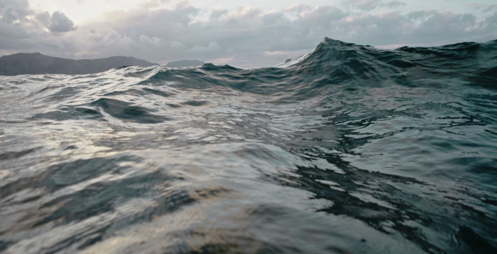
The sea.
In addition to the community’s pride in the agricultural industry, the listening sessions taught us about their love for the ocean. Sat snugly on the North Pacific shoreline, Monterey’s history and culture has been shaped by seafarers. Historically, many of the immigrants who now call the area home arrived by sea. And a significant number of them have set sail once more to harvest its riches.
The locals aren’t alone in their admiration for the ocean. This exciting strip of coastline attracts millions of tourists annually. Among its attractions is the Monterey Bay Aquarium, which is considered to be one of the most important habitat and research centres in the world. It even inspired Pixar’s Finding Dory movie.
With the club’s stadium just one mile away from an ocean that means so much to the community, it was only natural that I give serious thought to the role Monterey’s marine culture would play in the branding.
Over an eight-week period, we learned a great deal about the people that make Monterey Bay such a special place. And the more we listened, the more their love for the land and the sea became evident. Clearly, the brand had to represent both.
The Challenge
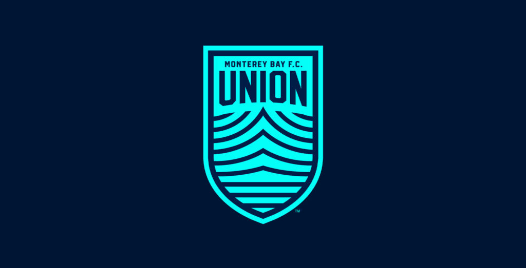
Designing the club crest boiled down to a single sentence: Create a simple but striking design that references two very different entities: Land and Sea.
When designing crests, I always advise clubs to have a single point of focus. For example, Arsenal has a cannon, Derby County has a Ram, and Flower City Union has a lilac in honour of Rochester, New York’s signature flower.
I’ve seen other designers try to cram more than one iconic symbol into a crest. This tends to overcomplicate and clutter the design, making it forgettable and less impactful. When I craft football club identities, I always look for a single point of focus. This, along with good typography, clarifies the visual hierarchy of the identity. For Monterey Bay, however, rules would have to be broken. But I was up for the challenge.
The club’s nickname – The Union
The Monterey Bay F.C. hierarchy also sat in on the listening sessions. They too recognised the consistent allusions to land and sea but were concerned about a potential divide in the community, with some resonating more with the land than the sea and vice versa.
With this in mind, the management team told me that they wanted the team’s nickname to be ‘The Union’, and to have the word ‘Union’ appear on the crest. They wanted their club to unite the two communities, serving as a union of land and sea.
I have to say, I immediately loved the idea. ‘The Union’ made total sense. It was perfectly aligned with the purpose of the club and was a clear sign that the club was listening to its community.
Designing the crest
With ‘The Union of Land and Sea’ as a theme, I began the design phase of the project. This is where ideas come to life and the brand begins to take shape.
My process is almost always the same. Working with a blank sheet of paper and a pen, I sketch one idea after another. These quick concept drawings are a great way to experiment and assess how different shapes and symbols relate to one another.
As the sketches mount up, I borrow elements from the designs and pair them in different ways. This helps me get to grips with the crest’s visual hierarchy. If you’re new to that term, visual hierarchy describes the specific arrangement of design elements to highlight their order of importance.
Typography plays a part in this too. While I work, I look at how the typography merges with the central graphic, and I experiment with the shapes that frame the overall design.
During the sketching phase for Monterey Bay F.C., I explored an ocean of ideas. The most elemental were monograms with intertwining letters and the most high-concept were a series of designs featuring mermaids. I had an interesting idea that a mermaid, being half human and half sea-creature, would be a good representation of land and sea.
Then, a moment of real inspiration struck. I envisaged a design where the land became sea and the sea became land, forming a union. It sounds deep, but I had a clear vision with a simple execution in mind.
Out came a fresh sheet of paper.
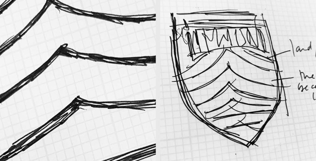
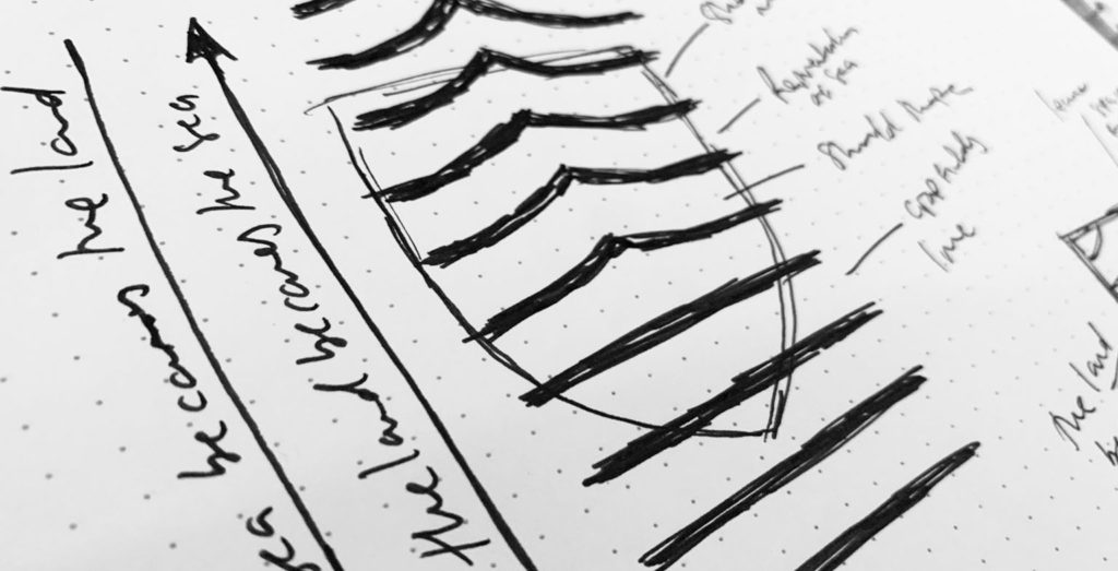
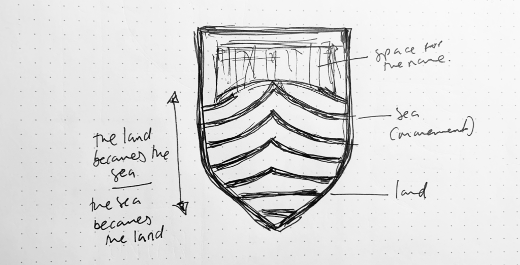
I sketched frantically for fear of it evaporating from my thoughts, then stepped back to see the very rough design. I loved it. It was interesting and intelligent, yet simple, striking, and thought-provoking.
The lines at the foot of the crest represented the rows of crops found in the Monterey and Salinas areas, and the upward pointing curves referenced the undulating waves of the North Pacific. Land and sea were coming together before my eyes!
I found that the more I looked at it, the more I saw beyond the land and sea allusions. For example, the upward-pointing lines that primarily reference the water also subtly reference Monterey’s rich military history. Those inverted chevrons wouldn’t look out of place on the arm of a soldier at Fort Ord. Also, if you look closely at the lines, they form the bow of a boat in 3D space, offering a subtle nod to the fishing and sailing industries.
This design excited me a lot, so I moved on to the digitising process.
Digitizing the design
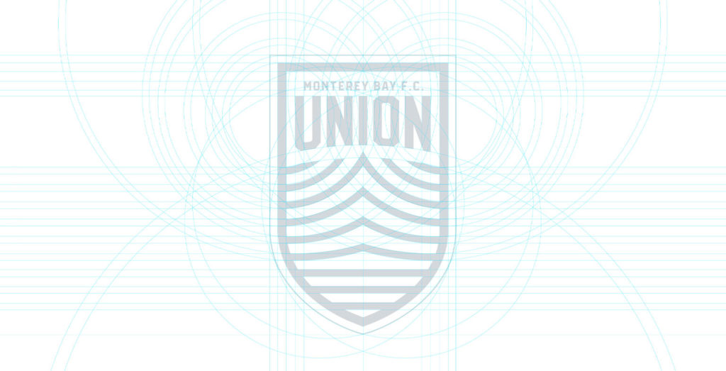
A digital design turns a rough sketch into a series of acutely measured lines and shapes. This accuracy informs the design and ensures absolute symmetry.
At this stage of the process, I block out the design in black and white. These high-contrast colours help to define the look, structure, and balance of the final crest. The typography is perfected at this point too as its style, size, and positioning are crucial to the overall design.

Typography with meaning
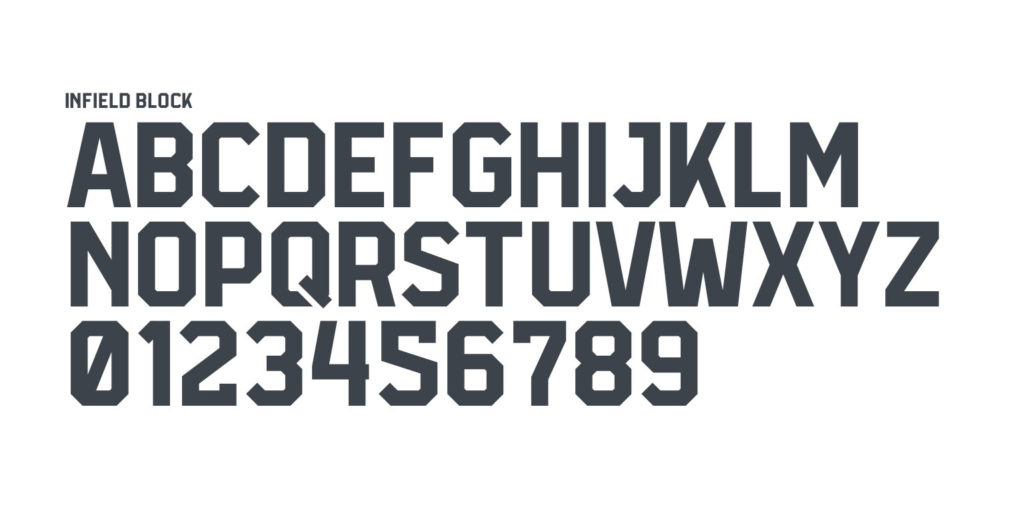
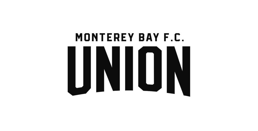
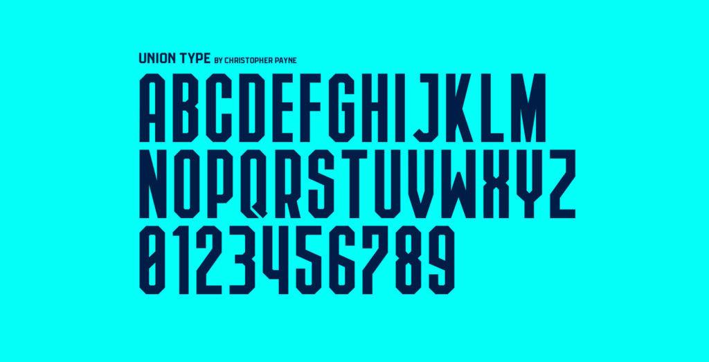
Typography is a huge part of a football club’s branding, and it’s something that I pride myself on getting right. I usually design custom typography, inspired by the club’s history or brand story. For Monterey Bay, however, I based the typeface Infield Block by Tobias Alexandersson. I love its robustness and strength, and its hard edges have a military feel that offers another nod to Fort Ord.
While experimenting with the crest, I sought to create a typography lockup that would act as a secondary identity for the club. A typography lockup, for those new to this term, is a design where the words and characters are arranged very specific way. Once set, this typography can’t be altered or the design will break. But that’s exactly the point when creating a secondary identity of this kind. The typography in Monterey Bay’s crest can be lifted out and used independently, taking the brand identity beyond the badge.
To achieve this ambitious task, I had to find a typeface that looked unique and referenced the Monterey Bay area. I went back to my notes from the listening sessions and saw the potential to draw inspiration from the Bixby Creek Bridge.
This bridge, spanning an otherwise impassable canyon, is one of Monterey’s standout landmarks. It also connects two sections of California’s State Route 1, known to many as the famously picturesque Big Sur Coast Highway.
Like the thousands of tourists who stop to take photos every year, I was captivated by the architecture of the bridge. Constructed in 1932, its open-spandrel arch was an engineering feat at the time and it’s still striking today. The precise curve of its frame, positioned below the straight line of the road, has a beautiful balance that I sought to mirror in the typography.
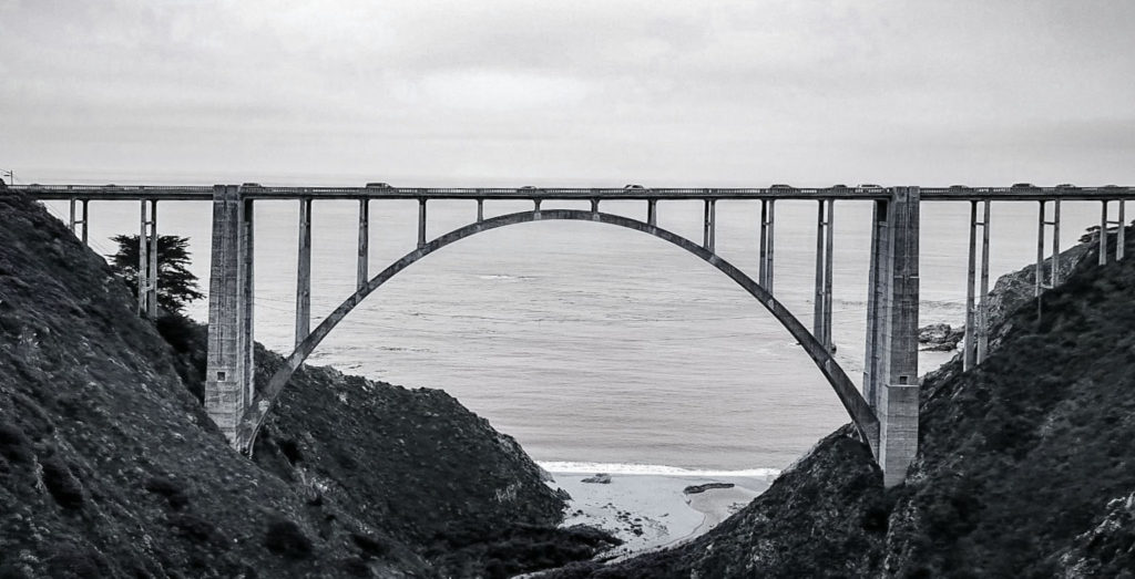
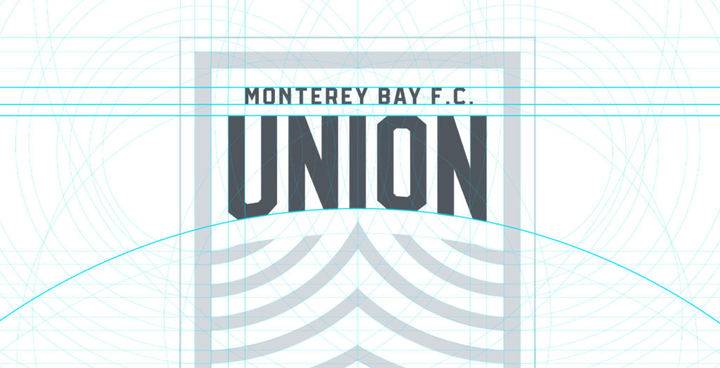
The typography at the top of the design, spelling out the club’s name, is rigid and straight, like the road across the Bixby Canyon Bridge. The club’s nickname appears in a much larger font below, with a curvature that mimics the arch of the bridge.
This typography lockup works extremely well when displayed on its own, and it works exceptionally in the principal crest. The way the world ‘union’ visually interacts with the land and sea graphic is particularly pleasing, both complimenting and completing the design.
Choosing colours for the club.
While working on the crest, I was also evaluating the colours that would work for this brand-new football club. Choosing a club’s colours is a huge responsibility. They have to be relevant to the community and the geography, yet be different to other teams in the league and the wider area.
Colours were a hot topic in the listening sessions. In reference to the region’s farming and agriculture, green was often mentioned. But the region’s marine life and vast blue skies inspired a lot of talk of blue. We had to pick a direction.
Having listened carefully to the community and assessed the competition, we landed on colours that were optimistic, eye-catching, and stylish. These colours represent the sea and sky and are distinctly in keeping with the stadium’s ocean-adjacent location.
Our brightest colour, Crisp Blue, was chosen to mirror the climate of the region. In our listening sessions, and in my meetings with the club’s owners, the word ‘crisp’ came up time and again when talking about the local weather. Neither too hot nor too cold, Monterey Bay has the Goldilocks of climates.
Crisp Blue also represents the mesmerising coastal colours of Monterey Bay. These colours are particularly striking along the Big Sur coastline, where the glistening azure waters delight locals and tourists alike.
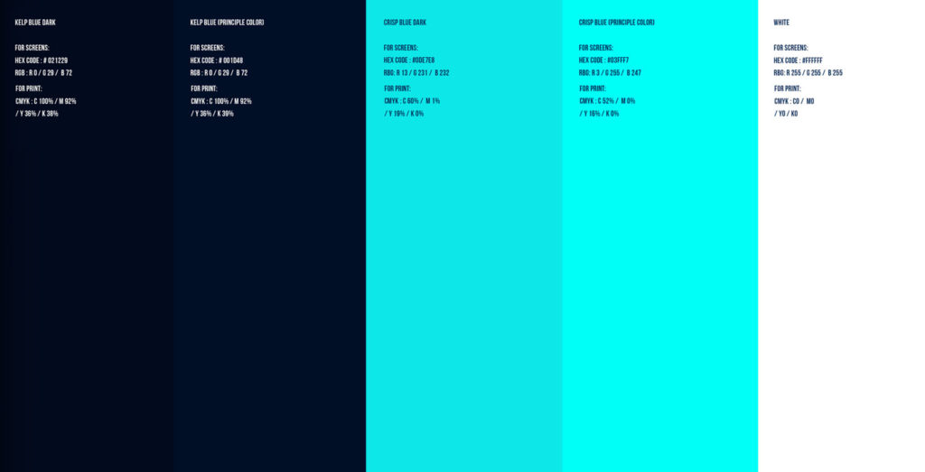
The darker of our two colours, Kelp Blue, was chosen to add contrast and be an authoritative colour in the brand’s colour scheme. It represents the famous kelp farms and estuaries that are found in the area. Combined, these high-contrast colours make for an exciting and relevant brand that has a uniquely local feel.
Putting it all together
When we put the colours, the crest, and the typography together, it made for an incredible identity for Monterey Bay Football Club. The design is striking and simple, yet smart and full of meaning.
In its high-contrast blue colours, the crest has a mesmerising effect, drawing you instinctively into the heart of the design. When I first presented it to Club President Mike DiGiulio, he said: “It’s amazing, I can’t stop looking at it.”
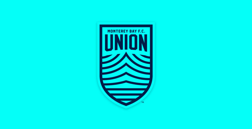
What I love about this crest is its oceanic feel. On the surface, its glistening beauty draws you in. But, when you dive a little deeper, you discover rich undercurrents laden with meaning.
I’m very proud of our decision to listen to the community as it allowed us to deliver a crest that represents them and their region in the most striking and positive way.
It will be a beautiful day when the new stadium is full of thousands of fans wearing the bold blue colours of Monterey Bay F.C. And, with this crest on my chest, I will be among them, draped in every piece of merchandise I can get my hands on!
Beyond the crest
In addition to the primary crest, and the standalone typography, I created a tertiary crest that will be used when the brand is more established.
In my line of work, I constantly study the evolution of football club branding. The emergence of streamlined, typography-less crests is a new and exciting trend with masses of potential. In time, I think every club will add this identity option to their brand hierarchy.
However, I also believe that new clubs, like Monterey Bay, should take care to establish their brand first. During a club’s formative years, leaving the name in the crest serves to reinforce the team’s identity in the minds of fans and the wider public. Once the club has gained renown, unleashing an alternative crest offers a great point of difference.
As seen below, Monterey Bay’s tertiary crest displays the design disciplines of the primary crest, sans typography. This streamlined badge is intended for use in the club’s merchandising line-up, along with training kits and third kits.
![]()
![]()
![]()
Custom typography
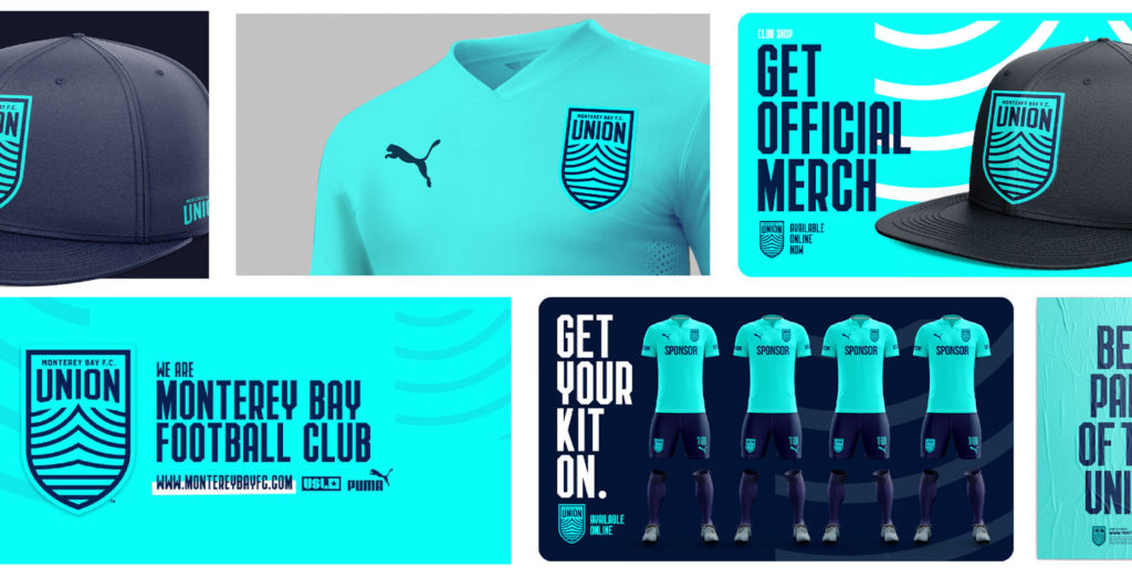
Beyond the crest design, we created other brand assets to launch the club and set it up for long-term success. Custom typography was a big part of this process.
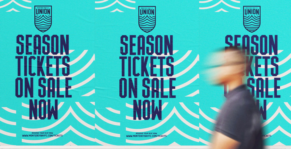
My bespoke typography, ‘Union Type’, is designed to unify every area of the brand. From stadium signage and social media to merchandise and corporate presentations, Union Type is an asset that will help the brand stand out from the crowd.
I took the Infield Block typeface, as seen earlier, and carefully tweaked it to make it taller and more condensed, giving it an athletic yet industrial feel. The hard edges and military feel of the original remain, but the added height makes it uniquely striking as the club’s primary typeface.
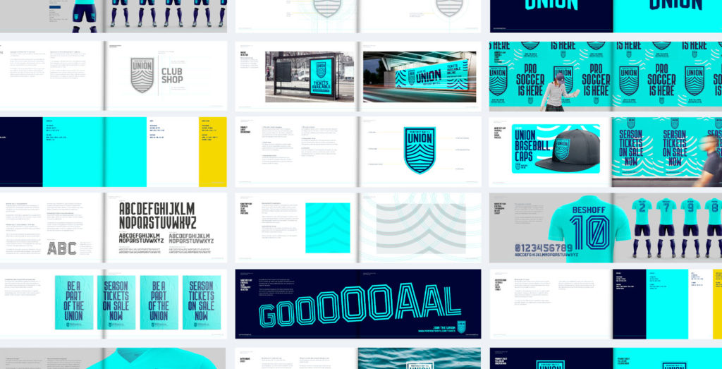
I created detailed brand guidelines that document and enforce the club’s brand, ensuring it will scale and be implemented correctly. Those guidelines are available via the following link: Monterey Bay F.C. Brand Guidelines
Launching the brand
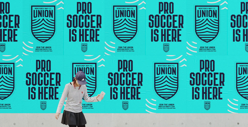
After months of hard work, on July 15th 2021, to an amazing reaction from the community, the league, and football fans around the world, we launched the Monterey Bay F.C. brand.
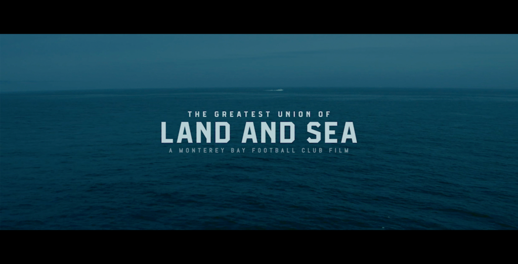
To support the launch, and control the narrative, we created a stylish cinematic launch film that captures the essence of our theme: The Greatest Union of Land and Sea. The launch film can be found here: The Greatest Union of Land and Sea
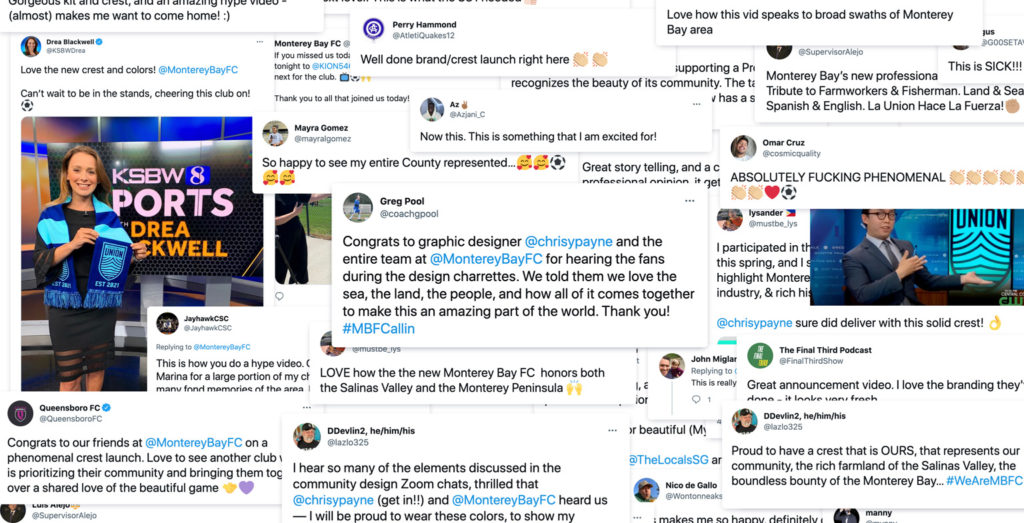
I will always be proud of the brand we created for the Monterey community. Throughout the creative process, I met so many amazing people. The proud and passionate participants in our listening sessions will live long in my memory. As will the club’s generous owner, Ray Beshoff, and his wife Liza and daughter Rachel, along with Club President Mike DiGiulio and his wife Megan. And, of course, I couldn’t end without returning to the amazing Erika Bjork, who worked tirelessly to guide us all through the process.
If you don’t already follow Monterey Bay F.C., you should! The excitement and momentum surrounding the team is growing by the day.
At the time of writing, the club has just launched its initial merchandise range. And they recently broke ground on their new stadium too. This development was followed by an announcement that the stadium will feature a state-of-the-art 5000-square-foot beer garden for fans to enjoy before and after the game, and even on days when the team isn’t playing!
I have no doubt that a fantastic future awaits this fledgling football club.
Further reading
Learn more about Monterey Bay F.C.
Buy Monterey Bay F.C. merchandise
See the Monterey Bay F.C. case study
Watch the launch film : The Greatest Union of Land and Sea
Monterey Bay F.C. brand guidelines