Back
Back featured reads
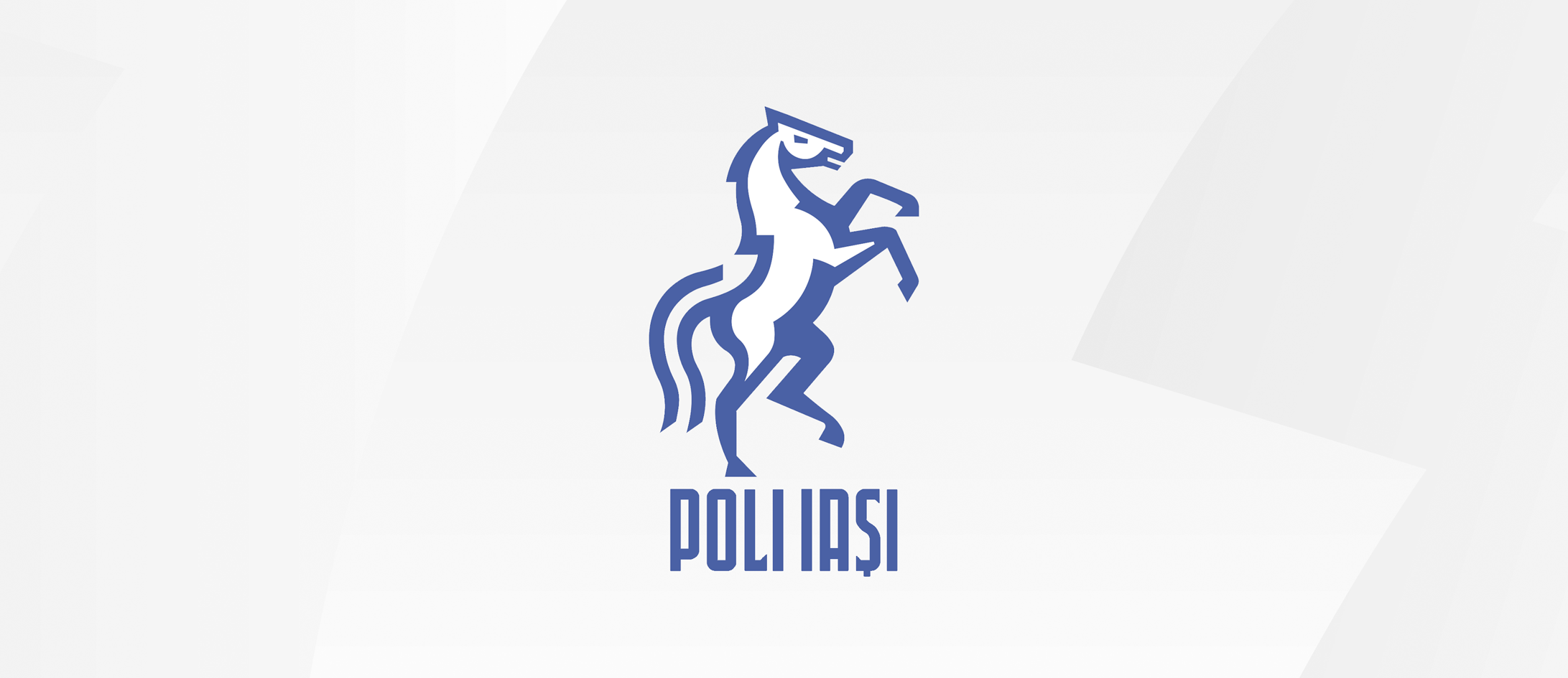
Designing a progressive new identity for top flight Romanian team: Poli Iași
July 27th 2023
14 Minute read
Christopher Payne is an award-winning British designer and passionate football fan. Backed up by his knowledge of football and the execution in design, Payne creates stylish, unique practical and relevant designs for ambitious and forward-thinking football clubs that are looking to progress both on and off the pitch.
Payne has worked with many football clubs and organizations around the world, designing iconic new logos and creating a detailed branding system, that makes the football club standout, grow off the pitch, and thrive in the modern world.
You can see examples of Payne’s work by clicking here.
Contact me¿Hablas español? Yo también. Contactarme.
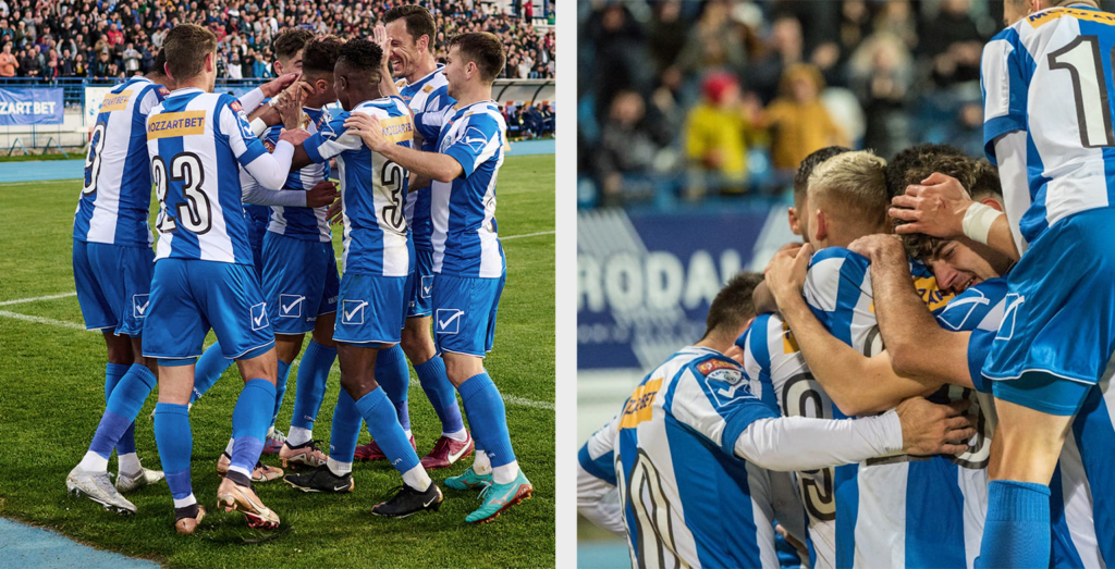
Romania is a beautiful country with beautiful people. It has a rich culture and a passionate football following.
I will always remember supporting Romania in The World Cup USA 94, a tournament England didn’t qualify for, leaving many English fans, including myself, adopting a nation to follow and cheer on during the tournament. Mine was Romania. There was something about that team at that time. Was it Georgie Hagi’s magic in midfield? In which he could seemingly always spot a goalkeeper off his line? Was it the colorful kits? or the underdog mentality? was it the wonderful talents such as Dan Petrescu and Gheorghe Popescu?
There was something purposeful and synchronized about their playing style. It was exciting for me at the time – an English kid in Derby – with no connection to Romania. I can only imagine how exciting it would have been for millions of Romanians to followed the team to the semi-finals.
Kicking off the project
This project came my way when Albert Potoroacă contacted me. Albert and I had worked together on some exploratory designs for another Romanian football club 12 months before this engagement, so it was good to hear from him again.
Albert had been following my work for a long time and was always very complimentary about my work and process.
Albert was polite, informed, intelligent, and ambitious; I liked him immediately. Beyond excellent personal skills, Albert was an incredible art director and creative collaborator. Without a doubt one of Romania’s finest.
Albert told me he was working with a club called Politehnica Iași, based in the beautiful city of Iași. It was a club with a lot of history and passionate and loyal fans. He told me that the club had enormous ambitions and wanted to progress both on and off the pitch. Albert mentioned that the club’s crest was causing them issues, and they wanted to develop their identity.
I was instantly excited by the project, and agreed to work with Albert to progress the football club’s identity.
Researching Iași.
With every football club identity design I do, I take great pride in understanding the people and places the football clubs represent. It is a an exciting excuse to broaden your knowledge of places in the world. I always strive to ensure that the design of the football club’s identity reflects the place it represents; the more you know about the place, the better, and more relevant the final design will be.
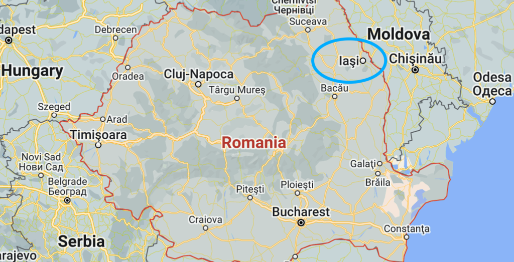
Iași is located in the northeast of Romania; it is the third largest city in Romania and is known as the Cultural Capital of Romania; Iași is a symbol of Romanian history, with an abundance of beautiful buildings, impressive architecture, and relaxing parks. Iași is also a university city with a youthful spirit and young vibe; being a university city, it boasts the youngest population in all of Romania, creating an exciting mix of traditional buildings inhabited by a youthful population – This mix of tradition and youthfulness, was certainly something that would influence the design of the city’s football club crest.
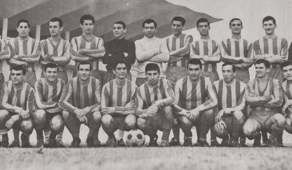
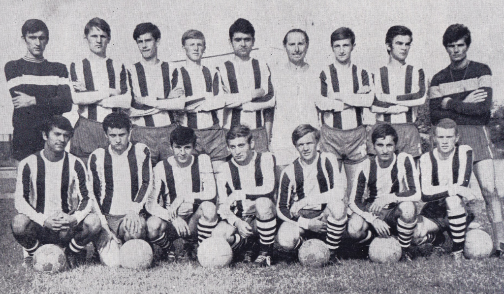
Looking back at Politehnica Iasi history.
After gaining a solid understanding of the city of Iași, Albert and I then switched our focus to the history of the football club – Politechnica Iași.
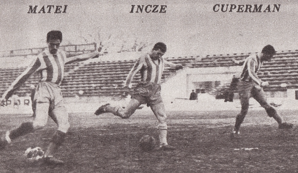
We spent hours watching old games and studying historical moments in the club’s past; we researched past players, looked at old kits, and read old match day programs – marveling at the print typography used to communicate with the fans.
We wanted to ensure that time was spent understanding where the club had come from, and where it was going. This new identity system would be inspired by the DNA of the club.
Looking at past identities to understand the club’s identity history.
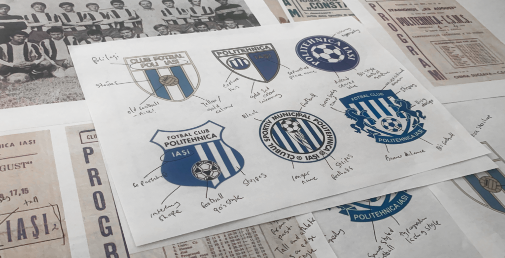
As part of looking back at the club’s past and proud history, we also studied past identities to see how the badge has evolved over the years. Understanding the evolution of a football club’s identity is a hugely important part of the process, and an analysis I take very seriously.
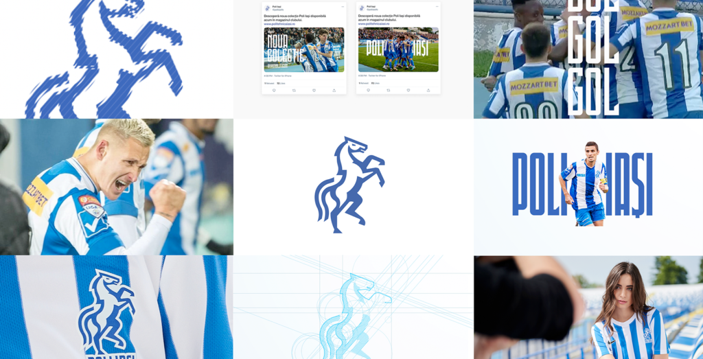
Looking back at past Politehnica Iași identities, I saw a history of stripes being used in the identity. Various shades of blue were used, and a graphic of a football was often used to show the viewers what type of identity this was.
The club’s most recent identity features two horses on either side of the striped shield, see below.
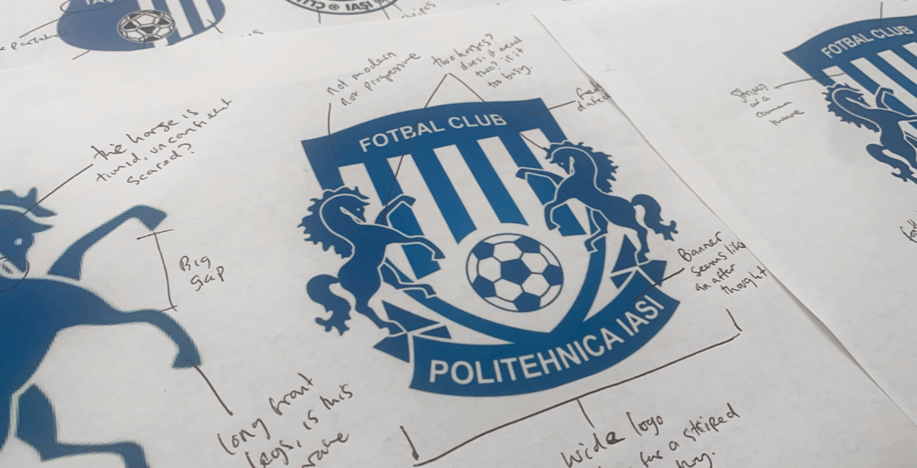
It was a popular crest amongst supporters, who had an apparent emotional tie to the identity; however, from a design standpoint, it was busy, heavy in appearance, and held the club back.
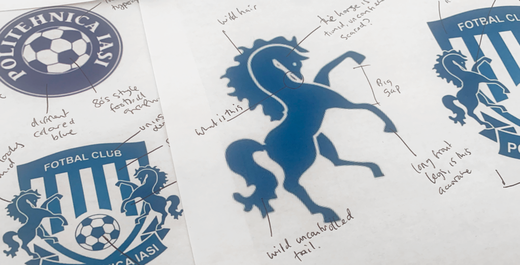
The two horses, which were placed either side of the striped shield were timid, with their heads bowed, seeming lacking confidence; their faces lacked definition, and the horse’s legs were wild, and out of proportion.
We knew that Politehnica Iași fans are proud, passionate, and strong: Their football club’s identity should reflect those qualities.
In addition to some graphical issues, the typography used on the badge was generic and lacked personality. It seemed like a typeface with no story or thought behind it. There were prominent area in which the design of the club’s identity could be improved.
Listening to the fans, and launching a fan survey.
In preparing to develop Politechnica Iași’s identity, Albert and I did a vast amount of independent research, understanding all we could about the city and the football club’s history.
It was a fascinating process, and with a culturally rich city like Iași, there were many moments of inspiration and ideas to be experimented with.
Beyond our independent research, we wanted to involve the fans in the crest development process. Like all football club rebrand projects I have done previously, it is vital that we listen to the club’s fans and take their view onboard when designing this identity.
To clarify what the fans valued and thought about the football club, we launched a fan survey, inviting all Politehnica Iași fans to give us their honest and open opinions on the city and the football club. Not all fans would agree, but we would undoubtedly see trends in their answers and get a consensus about what is popular amongst the fan base.
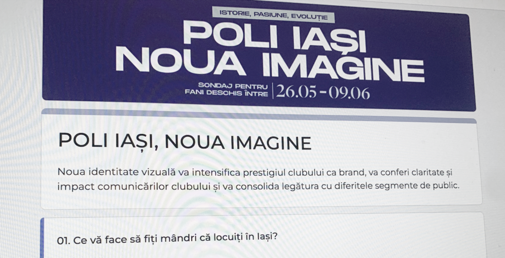
We asked multiple questions, such as:
- Tell us five words that would describe the feeling of the city
- What is your favorite part of the current identity?
- Which color best represents the football club.
- What makes Iași unique?
- Do you typically call the club ‘Politehnica Iași’ or ‘Poli Iași’?
We had an overwhelming response from the fans; their input was vital for the project.
We saw a lot of trends in the answers to the questions, with many fans believing that the city is modern, progressive, youthful, yet traditional and brave – these words became a guideline for how the new identity would form—words straight from the fan’s mouth.
Additionally, fans mentioned that their favorite part of the club’s current identity was the horses, and they felt that this was a positive representation of the city. Again this was a great answer that informed our decision to make a horse the focal point of the new design.
Fans also mentioned that they always refer to the club as ‘Poli Iași,’ as opposed to the full name ‘Politehnica Iași.’ This was an interesting response that gave us great food for thought.
The reaction from the fans was incredible. I sensed a thirst for something new, modern, brave, and youthful. Our collaboration with the fans was vital, and I appreciate all the fans who participated in the survey.
Starting the design process
With an abundance of useful information gained from collaborating with the fans and spending weeks learning about Iași and the football club’s history, we were ready to begin the design process.
The design process always starts with a piece of paper and a pencil. I often lock myself in the studio with 100s of references, many notes, and information from the fan survey.
Amed with the piece of paper and pencil, I sketch multiple ideas and rough designs freely and quickly, looking for a design that boasts the tone, look, feel, and power the club and its fans deserve.
During this process, I am very critical of which ideas will be successful and which ideas won’t. I assess whether the design is eye-catching enough. Does it have ties to the club’s history and city symbols? Is the design / idea different enough from other teams in the league? – after all – the fans in the survey mentioned that Iași is a progressive, brave city. Therefore its football club’s identity should follow suit.
A sketch that caught my eye is displayed below.
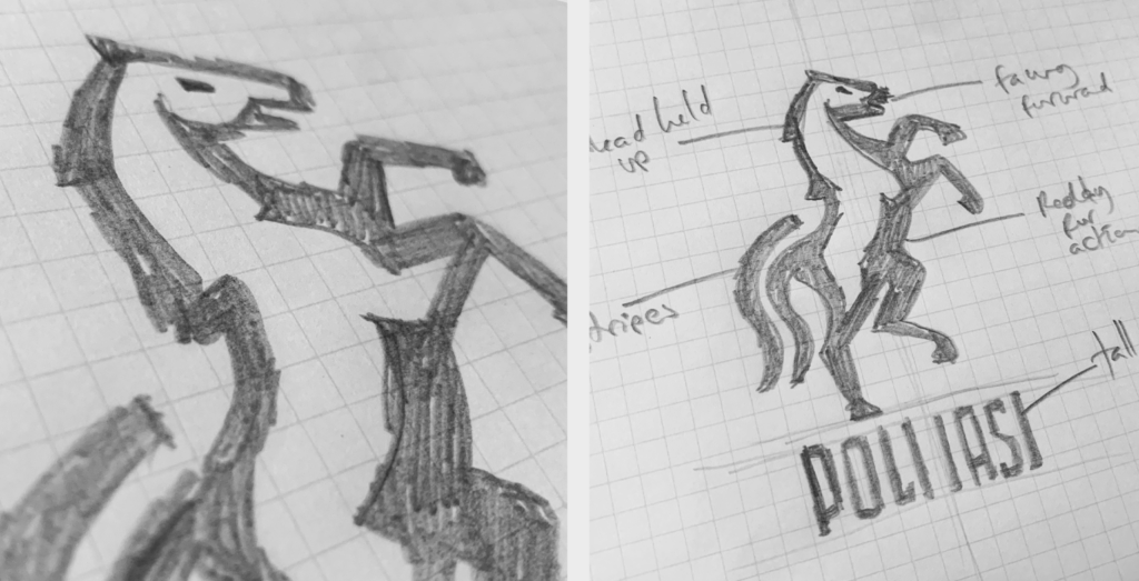
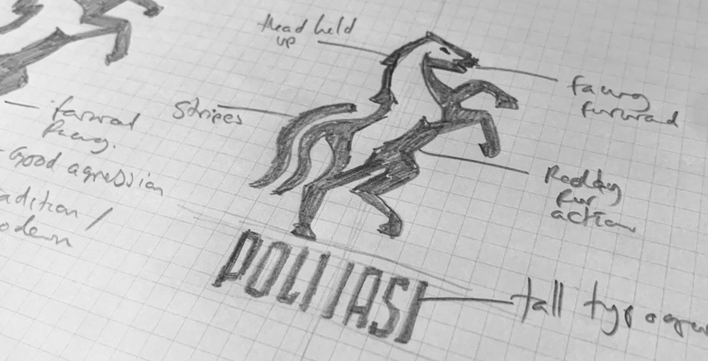
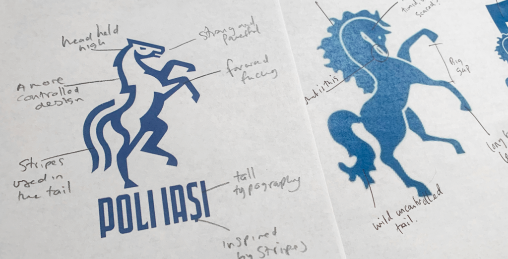
This sketch took inspiration from the club’s identity at the time. I looked at one of the upright horses from that identity and modernized it to make it bolder, more determined, and much more powerful.
There were a few key differences between the horse on the current identity and the sketch that would lay the groundwork for the new identity. Firstly, this new horse’s stance ensures that it’s head is held high instead of timidly sinking into its body.
Secondly, the horse’s legs are more controlled, proportioned, and angled.
These small changes made the horse less chaotic and more powerful and athletic.
I also admired how efficient the sketch / design was; it stripped away some of the ‘clutter’ from the exciting identity and simplified it. The stripes from the previous crest would be represented abstractly in the horse’s tail. It was a clever idea and a friendly ‘easter egg’ for the fans.
Designed right, this sketch could turn into a horse that is proud to represent Iași – I saw massive potential in this immediately.
Digitising the design
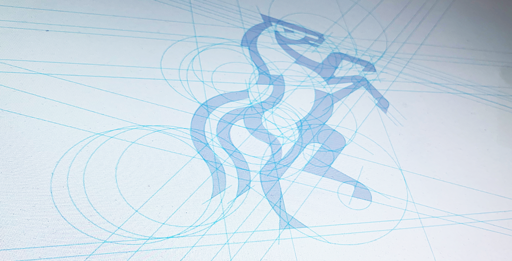
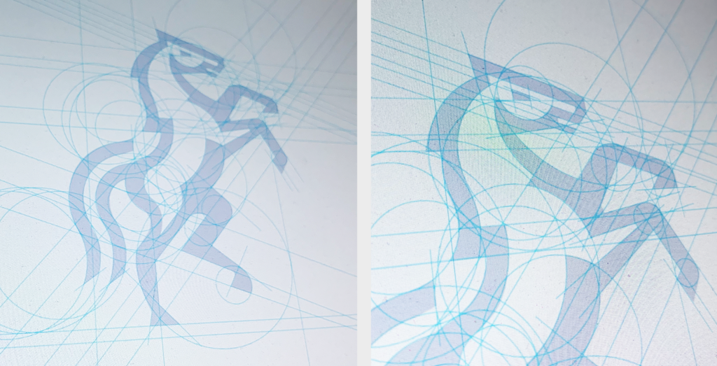
With an exciting sketch scribed onto paper, I began digitally building out the design.
Building the design digitally is a long process with acute accuracy. It is a mixture of following a designer’s eye, experience, intuition, and mathematicians’ passion for all elements to add up.
To build out the design, I use purposefully angled lines and various-sized circles to guide the shape of the identity. Building this grid helps structure and stylize the design and ensures a commonality between all design elements.
Taking a rough sketch and digitizing it requires deep concentration and discipline. Each line must be perfect; each angle must work with the wider design.
![]()
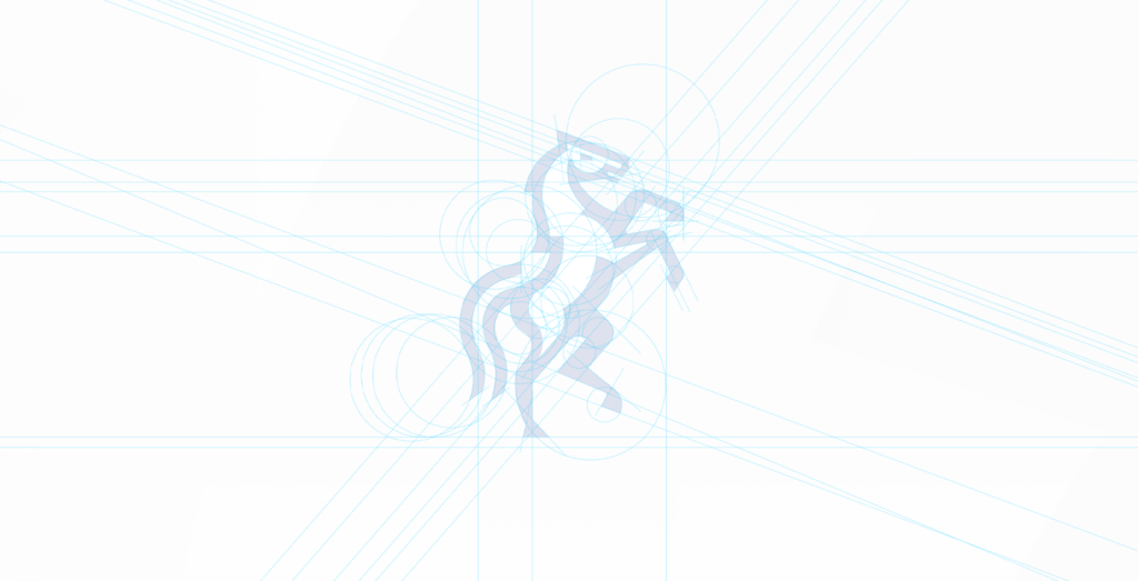
Stepping back, judging the design, eradicating weaknesses in the design
I often step back, zoom out, and judge the design from afar to see how it is shaping up – This constant assessment and critical review helps me see which parts of the design are working well vs. which parts need help and more attention. I look at balance, shape, scale, and design harmony. Every aspect of the new design has to be perfect and align with each other.
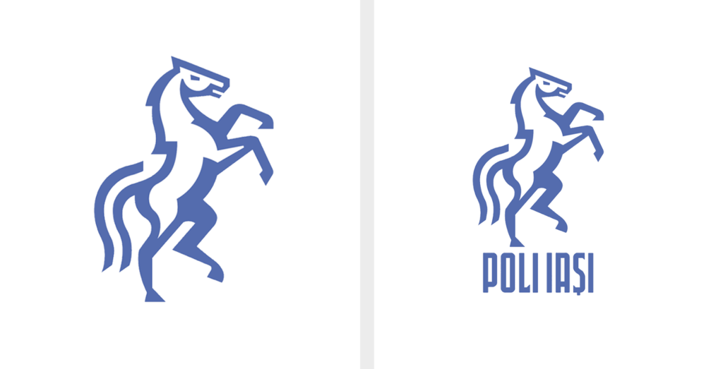
After days and days of small changes, tweaks, and slight modifications, I stepped back to see the Poli Iași horse reimagined – It was beautiful! It had everything we set out to create. The horse was strong, forward facing, and modern. It had a traditional feel yet a youthful strength – much like the city of Iași. The new design was an evolution and vast improvement on the timid looking horses on the club’s previous identity (seen below), and would signify a huge step forward in style and professionalism for the football club.
Creating custom made typography for the crest and beyond.
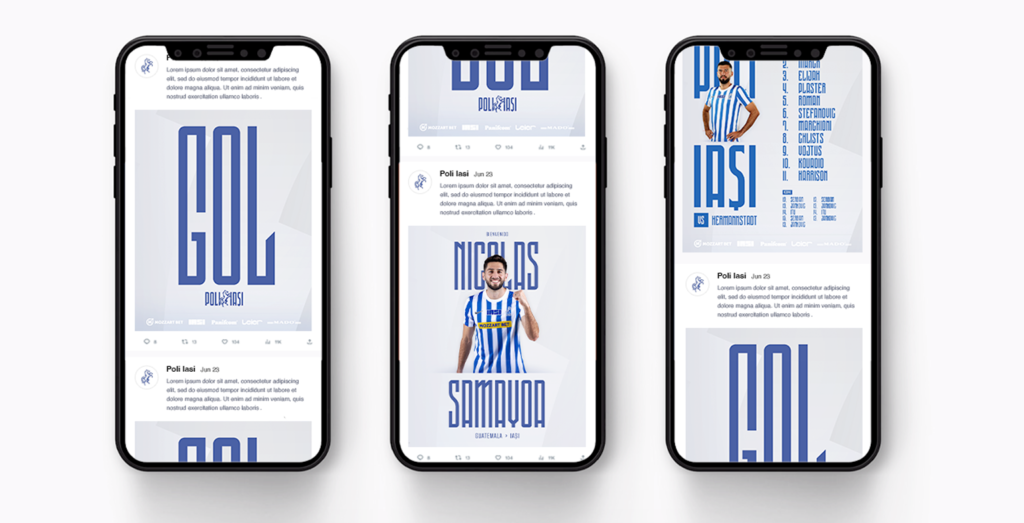
Designing a brand identity is much more than just the crest – don’t get me wrong, the crest is vitally, vitally important, and will be the headline act of the rebrand; however, the identity should function as a well-thought-out and detailed system, designed with various visual ingredients such as typography, color, grids, photography style, language, and predefined tones. These ingredients should all work together in harmony and be part of the same visual language.
Parallel to designing Poli Iași’s crest, I also defined the style, reasoning, and personality of the football club’s typography.
This custom designed typography would be used as part of the football club’s crest and independently. It will be a key communicant tool for the club, and so it needed to have its own unique style and story behind it.
The starting point for the club’s typographic identity was to revisit the past to see what typography had come before.
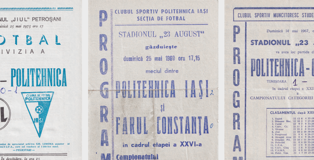
We analyzed typography from past identities and posters before returning to explore past match day programs.
These match day programs were beautifully simple, yet had character and style. They were originally published when photography was too expensive for match day programs, and typography provided style and differentiation of match day programs.
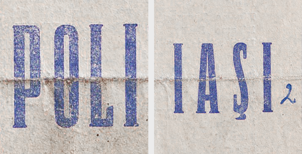
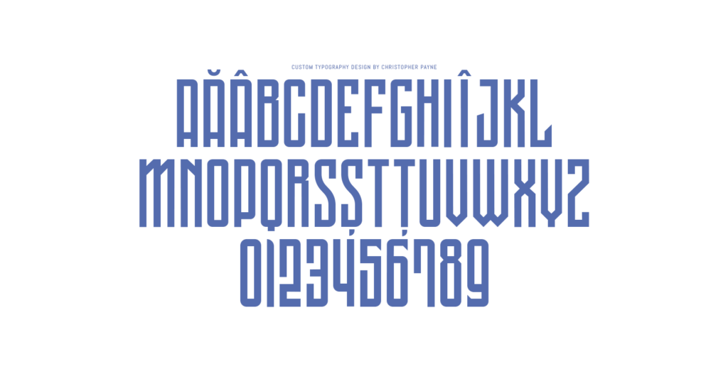
Immediately after seeing these well preserved programs, we became intrigued by the typeface that spelled out ‘Politechnica Iași’. It was tall and athletic, with sharp edges and distinctive letters. It was a great source of inspiration and a link to the football club’s past.
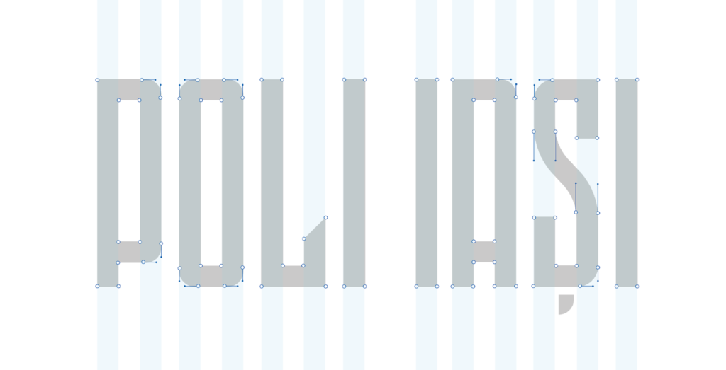
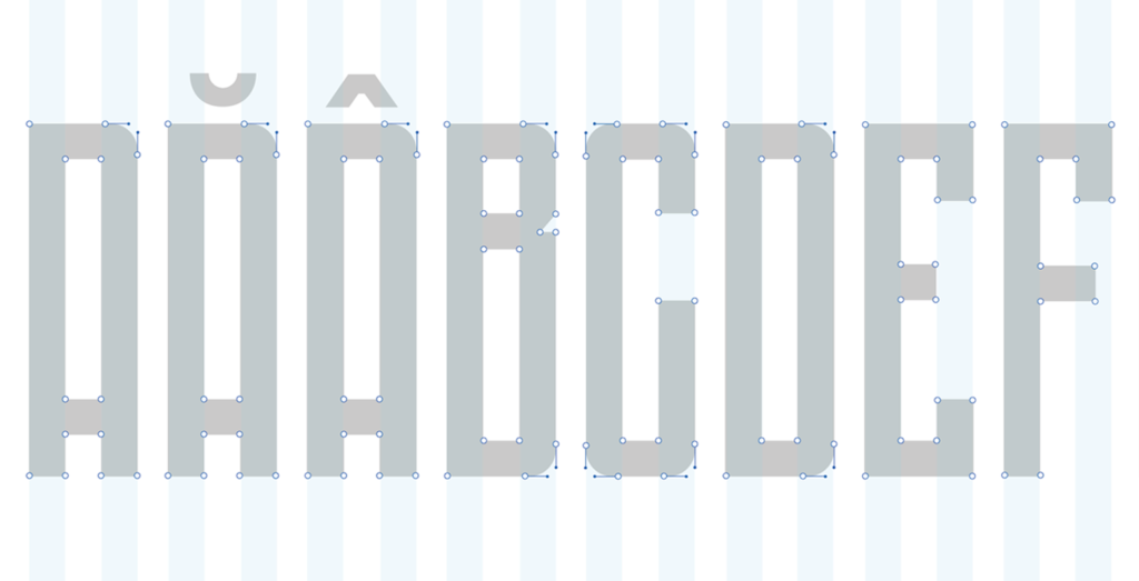
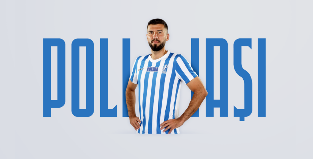
Creating custom designed typography that is inspired by the stripes on the players shirts.
In addition to taking inspiration from past programs, we wanted our typography to hold a more profound meaning tied to the football club’s history and visual appearance on the pitch.
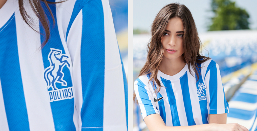
Poli Iași is nationally recognized as a team that wears blue and white stripes. These stripes would form the grid on which the typeface is built upon.
The club’s custom typeface had true meaning and referenced the stripes that players and fans would wear when they represent the football club.
It was a clever design treatment and a system that will make Poli Iași stand out from its competitors. The past inspired all of the new elements within this design, and the club’s DNA, from the horse to the typography. All details held significant meaning and were well thought out – We were excited about the design system being built.
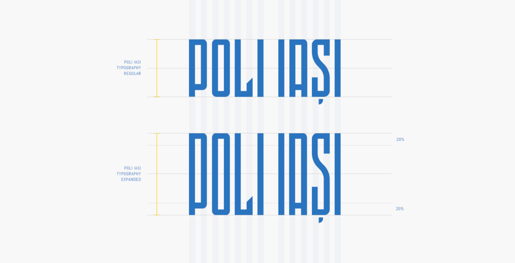
When pairing the bespoke typography with the horse design, it clicked straight away. The typography would act as a pedestal upon which the horse is perched. It was a solid visual combination reminiscent of the many equestrian statues in and around Iasi.
Assessing the final design
The final design is simple yet memorable – This is a best practice in identity design – the club’s previous identity was cluttered, and it was hard for a viewer to know what element to focus on – this new design was streamlined yet still had great character and story.
All elements of the new design were inspired by the football club’s past and the city that the football club represents – From the strong and powerful horse drawing inspiration from the previous identity’s horse, to the custom-designed typography that takes inspiration from past Poli Iași programs and the stripes on the players and fan’s shirts. It is an exciting new design inspired by club history and icons of the past.
Additionally, the identity was built to scale. It was designed to work as a well-thought-out design system.
The new design had to look great on TV, fan merchandise, players’ shorts, sponsorship activations, stadium signage, among many other places, but it also had to look great when it was a tiny icon on social media. This identity does all of that. It is a cohesive design system created to bring the football make the football club stand out and scale.
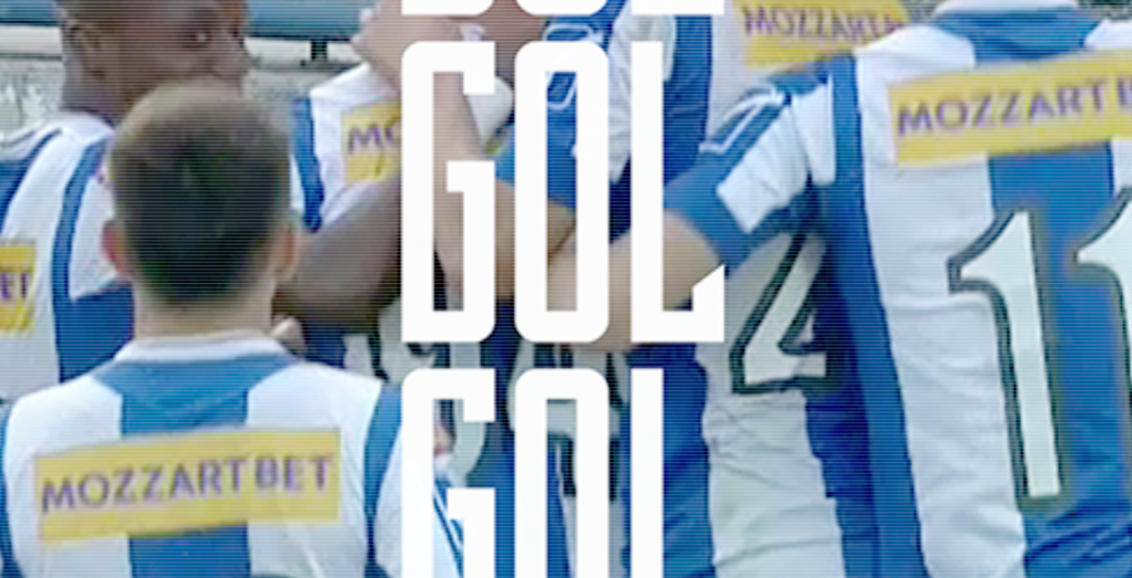
The custom-designed typeface, like the horse, has strength and personality. It is bold, progressive, confident, and athletic. It would extend beyond the identity and be used across all club communications and media.
Final thoughts
On a personal note, this project has been a dream project from start to finish and a massive point of pride for me. Working with Albert – one of the best Art Directors and Creative Collaborators in Romania, we created a brave new identity that will push sports design in Romania forward.
There were many late nights, many presentations, many ideas thrown back and forth, many design tweaks, and many assets created, but at the heart of the project, we wanted to create a design that was youthful yet traditional, distinct and memorable, different and brave. We wanted the football club’s past to inspire the future.
I am incredibly proud of what we created and how it will progress and further professionalize the football club. In collaboration with the fans, we have to evolved the club and progressed the football club’s image.
I will now always be a Poli Iași fan and look out for their results every weekend.
“Aha Poli Iași”.