 Back
Back featured reads
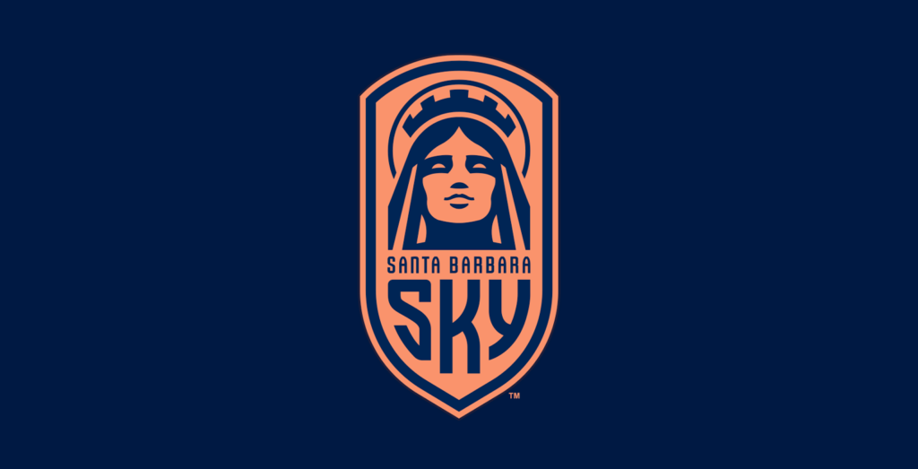
Santa Barbara Sky: Confident. Optimistic. Strong. Bold.
July 12th 2022
11 Minutes read
Christopher Payne is an award-winning British designer and passionate football fan. Backed up by his knowledge of football and the execution in design, Payne creates stylish, unique practical and relevant designs for ambitious and forward-thinking football clubs that are looking to progress both on and off the pitch.
Payne has worked with many football clubs and organizations around the world, designing iconic new logos and creating a detailed branding system, that makes the football club standout, grow off the pitch, and thrive in the modern world.
You can see examples of Payne’s work by clicking here.
Contact me¿Hablas español? Yo también. Contactarme.
As Santa Barbara Sky’s founding investor, Peter is combining his considerable business acumen with his lifelong passion for football. I sensed I would learn a lot on my journey with him and his team.
A small email that lead to big things
In early 2022, I received a small email that led to big things. A new USL (United Soccer League) team was coming to Santa Barbara and they needed someone to create a striking brand identity.
The email was from Sheralyn Baltes, a hard-working and instantly likeable consultant for the new club. I’d been recommended to Sheralyn by several of my previous football partners and she had become a fan of my work as a result.
A few days later, we met via Zoom to chat about all things football, design, and Santa Barbara. I walked Sheralyn through my previous projects, with a focus on my process and capabilities. Sheralyn then outlined the technical requirements of the new club and spoke in-depth about its ambitious plans. It was a lively call and I was instantly excited about the project. There was a lot of competition for the job, but I was confident I would be chosen.
A few weeks later, Sheralyn called to say that I was the outstanding candidate. If I accepted, I would be designing a compelling brand identity for Santa Barbara’s new professional soccer club. I said yes without hesitation and I couldn’t have been any more excited to get started.
Listening
Listening is a vital part of my process. Club directors and key stakeholders have a vision and it’s my job to implement it. So, before pen met paper, I sat down with the club’s hierarchy to discuss their plans and ambitions for Santa Barbara Sky.
Founding investor Peter Moore was there alongside Tim Vom Steeg, acclaimed coach of UC Santa Barbara’s highly successful soccer team. Not only is Tim one of the most decorated coaches in the college system, he also played for Santa Barbara’s original soccer team, Real Santa Barbara, during their brief existence in 1989 and 1990. The meeting also included my first point of contact, Sheralyn Blates, who is the club’s VP of Technology and Business Operations, and a Santa Barbara local named Peter Young, the club’s VP of Marketing and Business Development. It was an impressive team.
This meeting laid out essential details like the timeline for the project and the key objectives, but it also gave me a window into the community’s passion for football. Following the group meeting, to get to know the people behind the club, I hosted a series of one-to-one conversations with the club’s directors.
During this kind of meeting, I rarely ask questions about the design. Instead, I ask how they want the club to feel and how they want others to feel about the club. No matter who I spoke to, the message was the same. Santa Barbara’s brand identity should be confident, optimistic, strong, and bold. Those four words stuck with me and would guide every design decision I made.
Researching Santa Barbara
All of my projects include a detailed period of research. I’d visited Santa Barbara on a couple of occasions prior to the project, so I already had a sense of the vibe in this Californian coastal city. But there were gaps in my knowledge of the region’s background. Out came the history books!
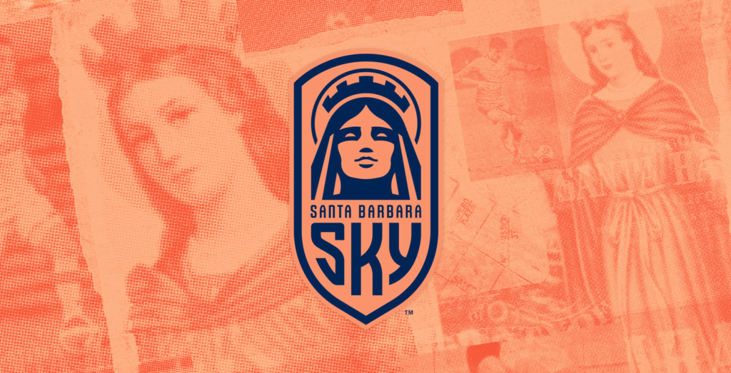
I wanted Santa Barbara’s rich past to inform its football club’s future, so I dug down into the city’s roots. The history books open with tales of the Native American Chumash tribe, whose influence can still be felt today in Californian place names like Malibu. My research taught me that life for the Chumash changed abruptly when Spanish explorers made contact in the 1500s.
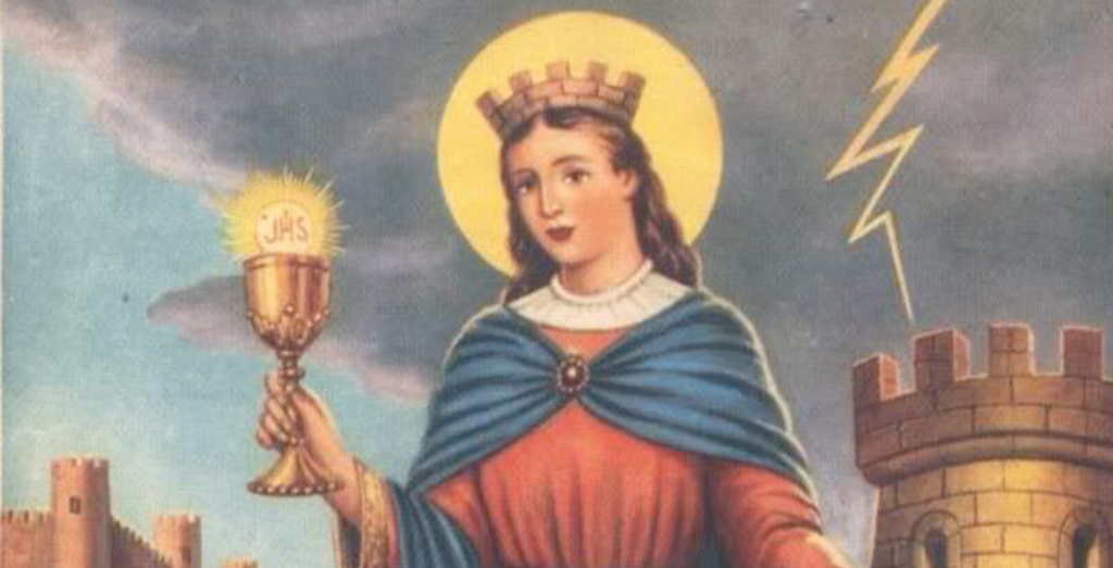
As Spanish culture took hold, the area became known as Santa Barbara, named in honour of the Christian saint. Looking for design inspiration, I studied historic artworks depicting the martyr saint. I discovered that, like my football club crest designs, these artworks were rich in symbolism.
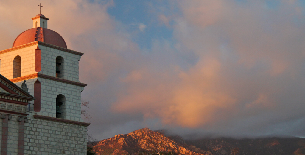
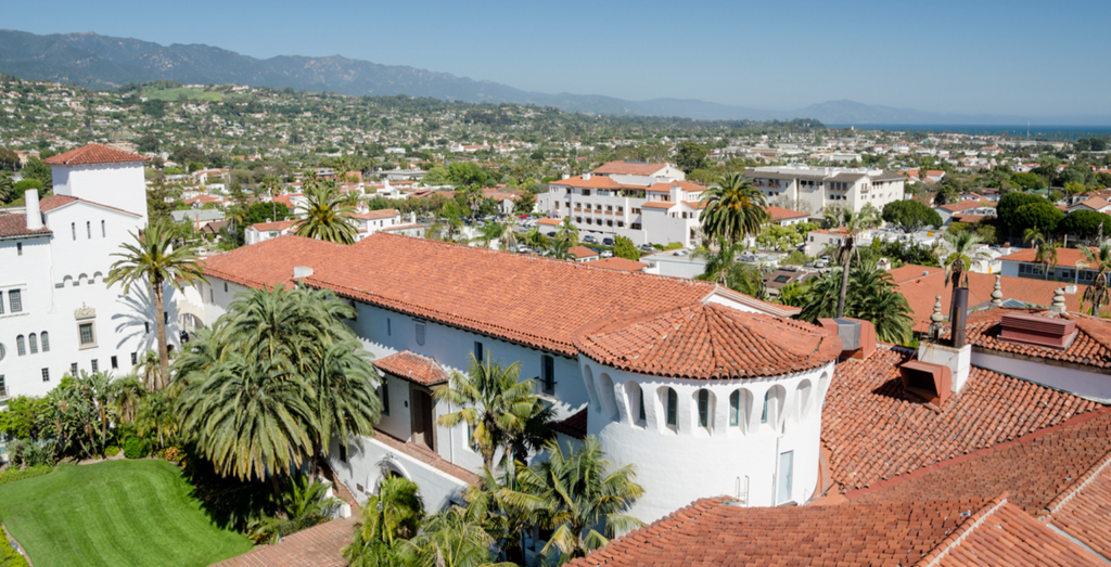
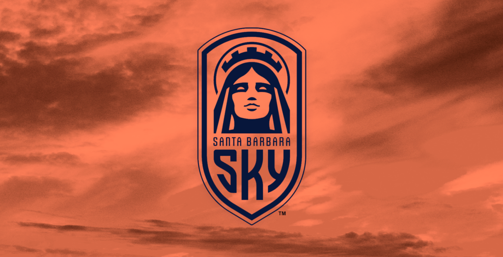
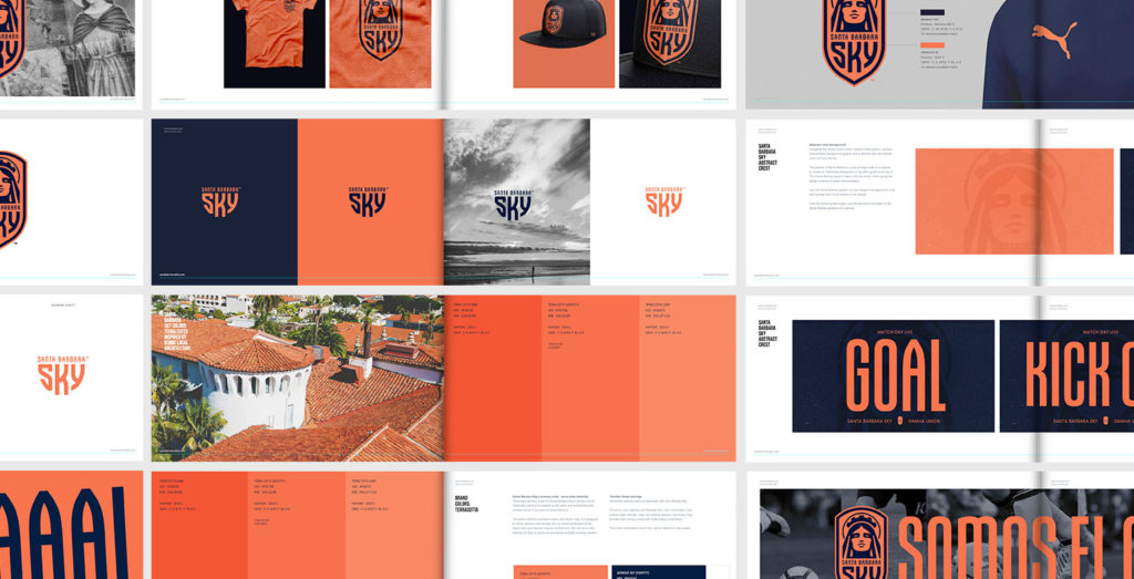
The city’s unique architecture and visual style owe a lot to the spread of Spanish rule. Tourists and locals alike can’t help but marvel at the distinctive curves and arches of the Spanish-influenced buildings. On my visits, I was particularly struck by the sea of terracotta tiles that soak up the sun on the city’s rooftops. I made a note of this colour for further investigation during the design process.
Designing the brand
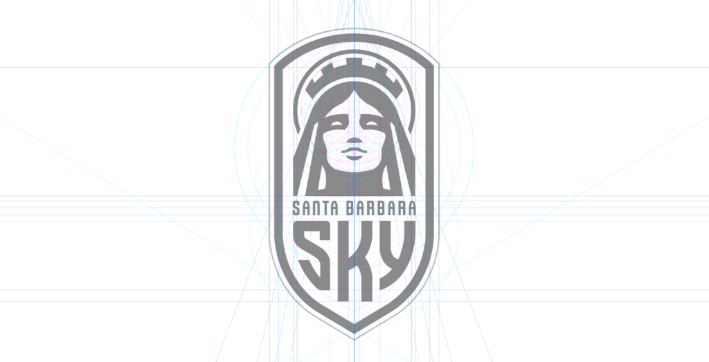
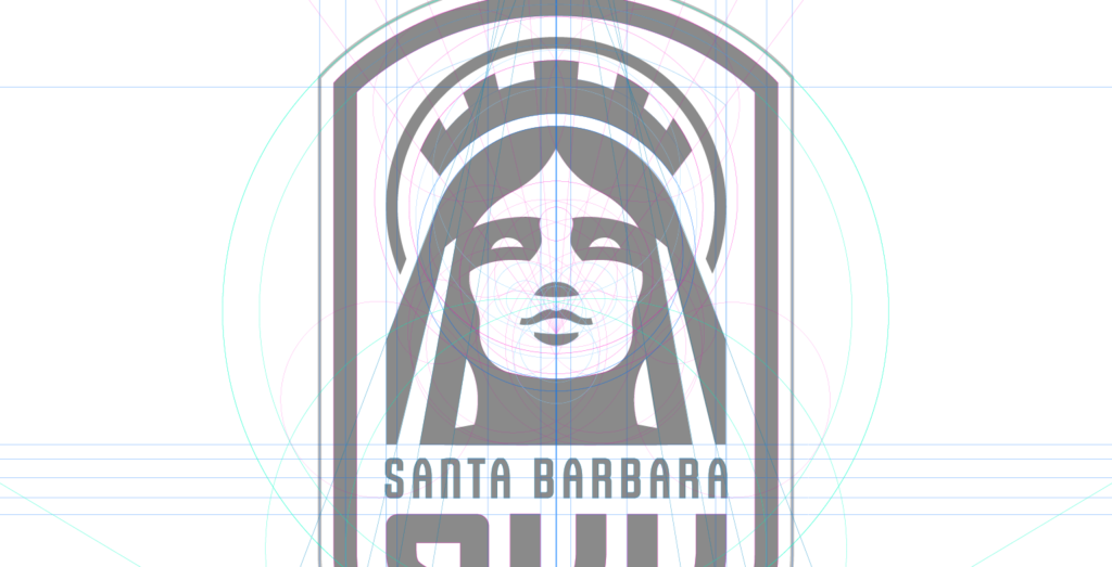
Surrounded by inspirational research notes, I began the design process. This starts with a series of sketches that explore concepts for the club’s crest. Finding the right imagery and balance is essential, as the crest will be central to the look and feel of the brand.
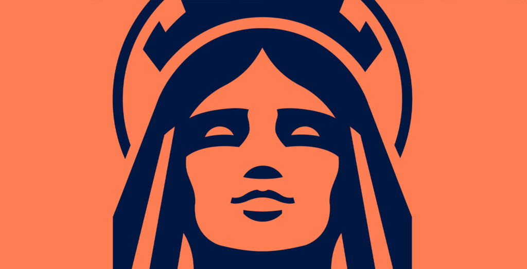
I was intrigued by the story of Barbara, the mediaeval Christian saint who lends her name to the city. The tale of her martyrdom is a grisly one, but she supposedly offers protection to everyone from artillery divisions to miners. She’s certainly a constant companion to the people of Santa Barbara.
To explore how this concept could work in the form of a football club crest, I revisited my research to cross-reference historical depictions of Santa Barbara.
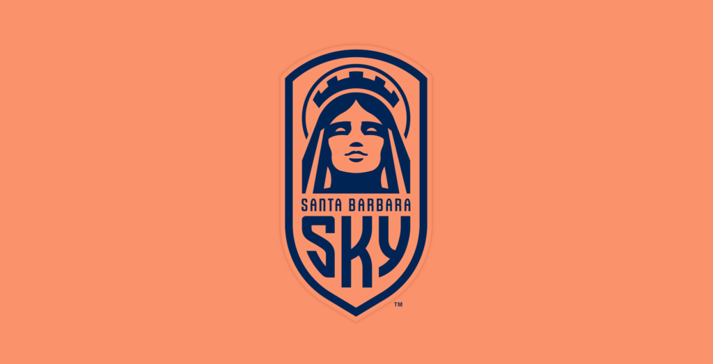
The first thing my design brain noticed is that her hair is always parted in the centre. This offers great symmetry when incorporating a stylised face into a design. Similarly, her imagery often features a striking brickwork crown topped with symbolic battlements. Battlements don’t feature in many club crests, but I can hardly think of a better way to add strength to a design. Santa Barbara’s glowing halo was another unique feature that stood out to me.
With research into the city’s Spanish-inspired architecture fresh in my mind, I sketched shield shapes that drew inspiration from the curves of the windows and doors in the historic city. Framing a design should never be an afterthought as it informs so many design choices.
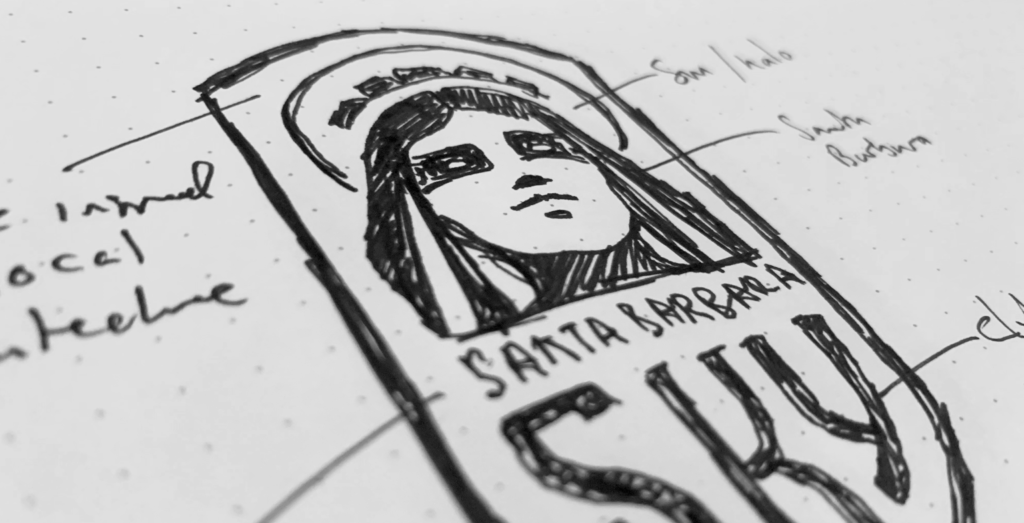
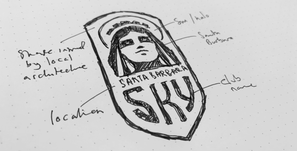
With this sketch, it felt like it was all coming together. It struck a balance between symmetry and power that can be tricky to find. I sensed it could be a contender for the final design, so I scanned it into the computer to start work on a digital version.
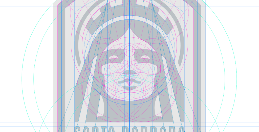
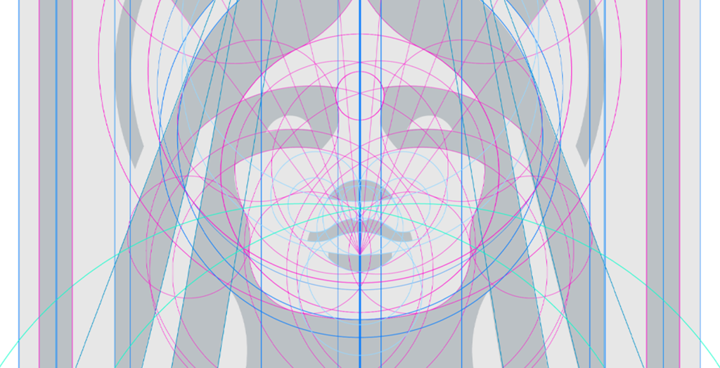
Digitising the sketch
My rough sketch acts as a guideline for the intricate digitisation process. Using Adobe Illustrator, I set out acutely measured lines and intersecting circles to define the placement of my design elements. Working to this degree of accuracy ensures the resulting crest has a sleek and professional look.
As I tweak and improve the design, I focus on how the different spaces and shapes relate to one another. My designer’s eye also pays minute attention to the crest’s visual hierarchy. Finding the right balance requires great patience, but it’s vital to ensure the design is pixel perfect.
The same can be said for the club’s typography.
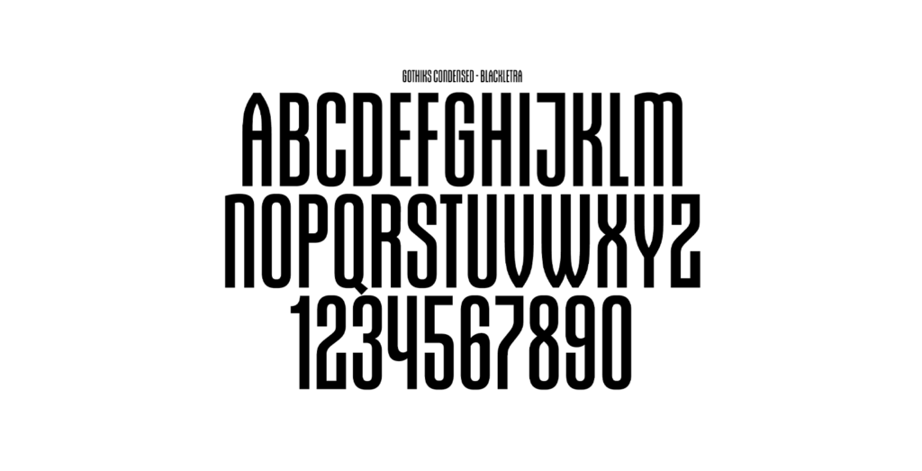
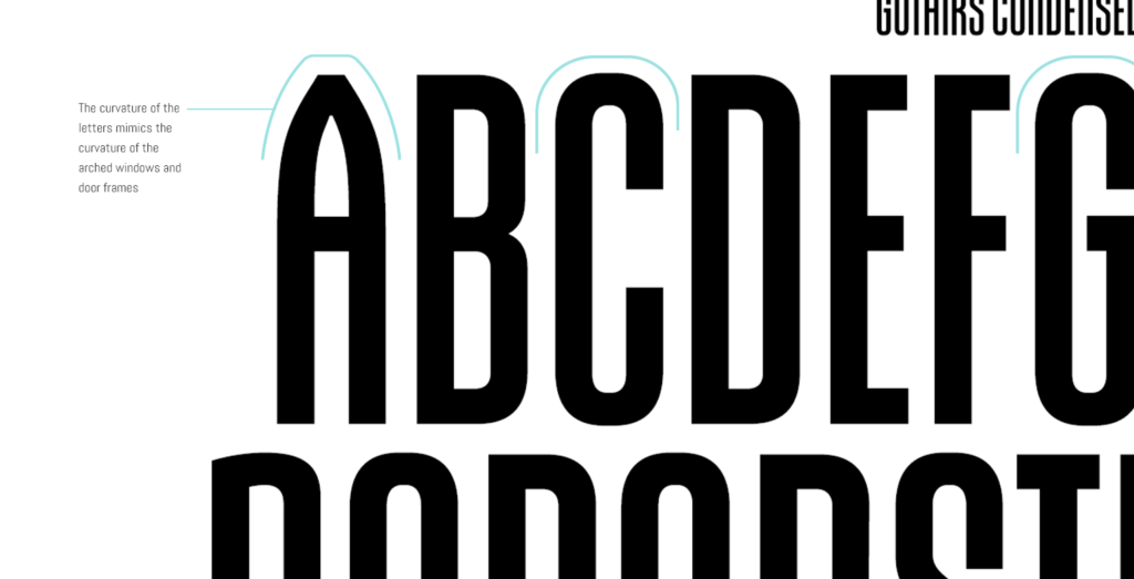
Typography
As the structure of the design takes shape, I also develop a typeface that represents the club and its culture. This typeface should enhance the crest design and make the brand instantly recognisable when used independently.
For Santa Barbara Sky, I selected a typeface called ‘Gothiks Condensed’ by Blackletra. This typeface is tall, athletic, and modern, and the curvature of certain letters mimics the arched windows and doors of Santa Barbara. It felt like such an instinctive fit for the club that I instantly put it forward to be used in every aspect of the team’s branding and communication.
Finalising the design
With the addition of a stylish typeface, the architecture of the crest was really coming together. The final part of the technical design process is to apply contrast. I do this by blocking out the shapes in black and white, which gives me an immediate sense of whether the concept works.
I stood back to look at the black and white design and was blown away. The crest had an unmistakable strength and confidence and it looked completely unique.
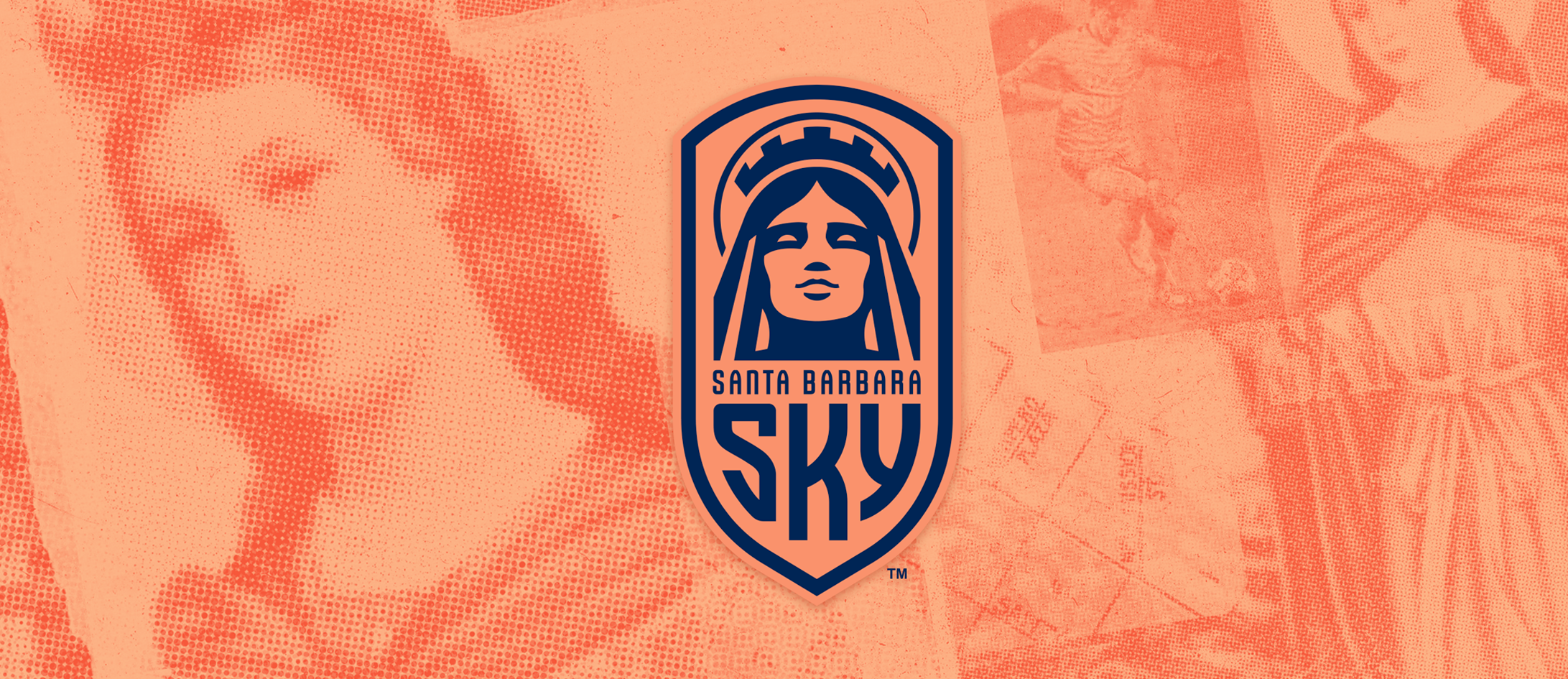
Santa Barbara, in all her glory, has a fantastic presence at the head of the crest. She embodies power, strength, and beauty, and seems somehow taller than the viewer; gazing down at you with warmth and authority. I also loved how the balance and symmetry of her hair and facial features draw the eye into the heart of the design.
All it was missing was a little colour.
Adding colours relevant to the region.
When it comes to a new football club, choosing the club colours is a huge responsibility. In any form of design, colour combinations can change the look and feel of a brand for better or worse, so you have to think carefully about their application. But when fans and players will be wearing your choices for years to come, it adds an extra layer of complexity.
A club’s colours don’t just represent the team, they represent the people, the place, and the culture at the heart of the club. They also have to stand out in the merchandise marketplace and look eye-catching when the club plays on ESPN.
To best represent a city, it makes sense to look at the inspirational colours that occur in its history and landscape. For example, Santa Barbara’s regional flag is white, red, and gold. A solid colour scheme for a football club, no doubt. In fact, the city’s original football club, Real Santa Barbara, used this exact colour scheme during their short-lived existence. But, to me, this felt far too obvious.
This new club deserved a bold and bespoke colourway that referenced the region in a new and exciting way.
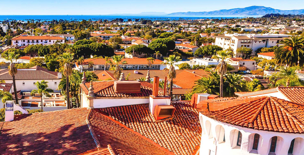
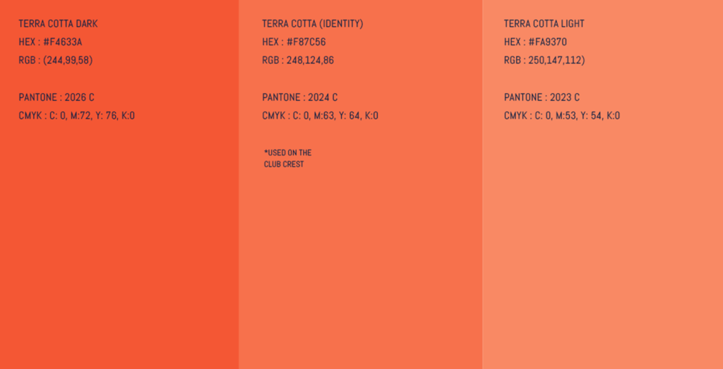
During my visits to Santa Barbara, I was constantly in awe of the beauty of its terracotta-tiled rooftops. Terracotta instantly struck me as an interesting colour for the club, and I couldn’t think of any major team that used it. It has a warm, earthy quality that seems to perfectly represent Santa Barbara.
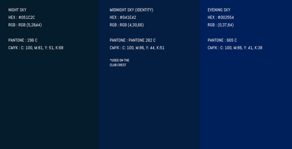
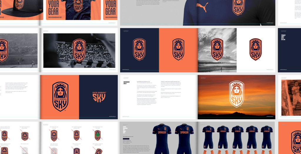
Then, to complement and contrast the terracotta tone, I introduced navy blue to the design; chosen specifically to reference Santa Barbara’s dusky night sky. Suddenly, the crest gained a layer of authority and a real aura.
The navy blue tone was so striking that I recommended it be the lead colour for the club’s home kit, with terracotta as an accent. This colour combination could easily be reversed for away kits and alternative branding, and it would really stand out in the merchandise market.
No matter how I combined the colours, the crest looked phenomenal. It had everything! An interesting look, great balance and symmetry, a central focus, a unique shape, and colours that not only referenced the region but were unique in the football landscape.
It was confident, optimistic, strong, and bold.
Presenting the final designs.
Creating a design is a huge part of the process, but presenting it is equally important. I like to tell the story of the design’s evolution. This helps me to explain the origin of the ideas and how they relate to the owner’s vision.
Showing the designs in context is also important. During the design phase, I test the designs to see how they function on kits, merchandise, social media and beyond. I like to include this testing in the presentation so that, like me, the stakeholders can envisage how the brand will look in the real world.
When presenting to Peter Moore and the club directors, I was keen to instil the story of the brand. Not only would it give the club a unique and stylish look, it would create an emotional connection with Santa Barbara locals and speak to the wider world about the values of the club.

The board loved the design. The core concepts and colours were a hit and they embraced the use of the city’s saint as the focal point of the crest.
I was impressed with the decisiveness of Peter Moore and his directors. Peter has worked in the top tier of the football industry, so he’s no stranger to this kind of presentation. I’d like to think he knows what he wants, and what top quality looks like, so it was a great feeling to impress him and the other board members.
A few days after the presentation, the design was officially approved. Professional soccer in Santa Barbara had a bold new identity.
Full circle.
I am extremely proud of the crest and brand we’ve created for this exciting new club. The design is stylish and unique and will speak positively for Santa Barbara wherever it travels.
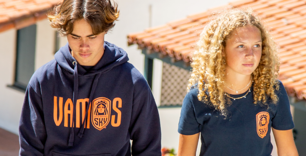
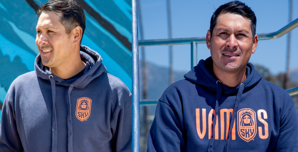
It will be such a thrill to see the brand come to life when the club kicks its first ball in the USL. That occasion will be a fantastic excuse for my third trip to Santa Barbara. Although, for once, I won’t be there for the beaches and the architecture. I’ll be there for the football; standing side-by-side with passionate Santa Barbarans, singing our hearts out in navy blue and terracotta.
Further reading.
Buy Santa Barbara Sky merchandise