 Back
Back featured reads
An interview with Stewart Curtis – Hitchin Town F.C’s Media Director
December 1st 2021
5 Minute read
Christopher Payne
Christopher Payne is an award-winning British designer and passionate football fan. Backed up by his knowledge of football and the execution in design, Payne creates stylish, unique, practical and relevant designs for ambitious football clubs that are looking to progress both on and off the pitch.
Stewart Curtis
Hitchin Town F.C.’s Marketing Officer and owner of Shaker Maker (www.shakermaker.digital) digital marketing agency.
Contact me¿Hablas español? Yo también. Contactarme.
I caught up with Stewart to ask a few questions about the redesign process, and the impact that he expects it to have on Hitchin Town Football Club.
Why did you decide to update the football club’s logo? What discussions were had about the logo?
We initially decided it was time to look at rebranding the football club a few years back. The decision was made to proceed on this due to a number of reasons. Firstly, the existing logo was being inconsistently used throughout the club, was elements removed and colours changed – providing a diluted brand image to the wider audience.
Secondly, we didn’t feel that the logo represented Hitchin Town FC in the 21st century, with the old coat of arms style crest representing various industries which are no longer prevalent in the modern day Hitchin.
Finally, we longed for an identity which our younger fans would engage with.
Why was the previous logo holding you back?
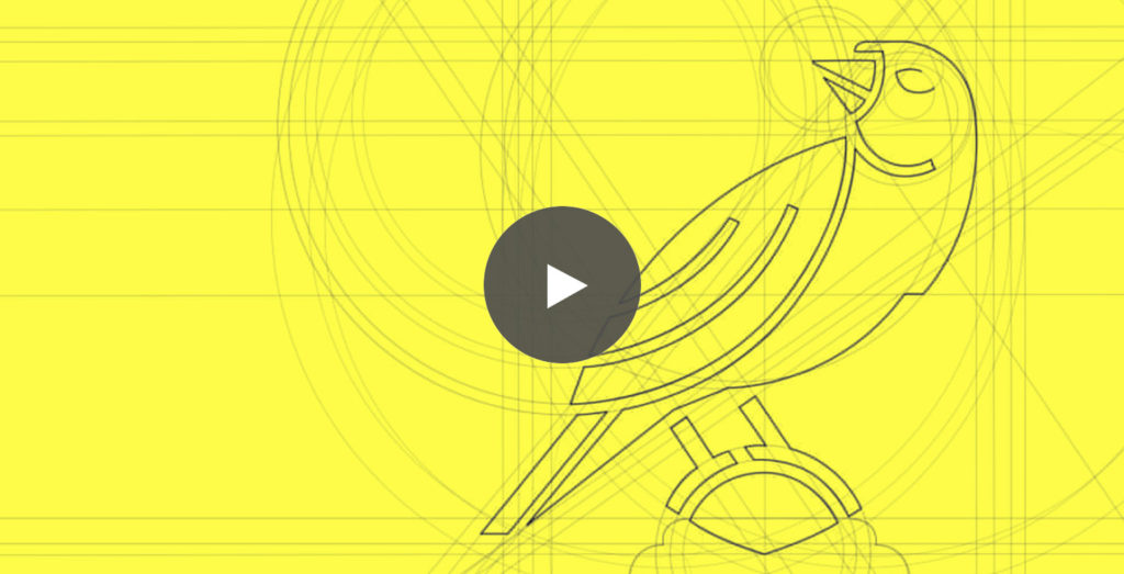
The general design was incredible dated and owing to the detail in the plume, incredibly difficult to replicate across various medias.
![]()
Why should football clubs consider updating their logo?
I believe this is entirely down to the Club, and the justification needs to there for that individual case.
For us, it was an opportunity to start a fresh with a vibrant new identity, echoing the vast changes occurring at the Club and illustrating to both our supporters and the wider audience that we’re a forward-thinking Club, whilst also being considerate, respectful and proud of our history.
What was it about Christopher Payne that made you want to work with him?
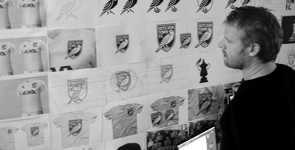
Prior to Chris we had worked with two other designers on the project, both of which brought very different ideas and designs to the table, which unfortunately didn’t tick of all of the boxes when presented to the HTFC committee.
However, the experience which Chris had made a huge different as soon as we engaged him. He was incredibly enthusiastic and keen to understand every aspect of the Club prior to the initial design stages.
Of Chris’s previous work for other clubs which design did you like the most?
Chris’ previous work was arguably the selling point for us. Even prior to Chris, we had looked at the Taunton Town F.C. example as one which we liked in non-league, as well as the Eastleigh launch video which was simply superb! To then have the opportunity to work with that same designer was hugely exciting for us.
We’ve since kept a close eye on Chris’ work and are equally impressed with his current work, with the New Amsterdam and Flower City Union works particularly impressive.
What was the process like? What was it like working with Chris?
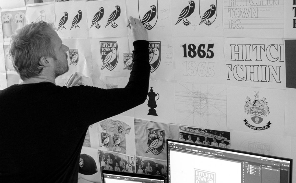
Chris was a perfectionist, which was fantastic. Nothing was half done or rushed. Every decision was methodical and considered, leaving nothing to chance. He was engaged in our project just as much as volunteers who had been involved with the club for 30+ years – passionate in seeing it through to be something spectacular. The launch process was then equally as impressive, as Chris created an amazing launch video which explained the process and our decision-making, allowing us explain the what’s and why’s.
What was your favourite moment in the process?
Launch day was a real treat. It was a day we’d been working nearly three years to reach, so to see the positive reaction of our supporters was really exciting!
What were your thoughts when you first saw the new design?
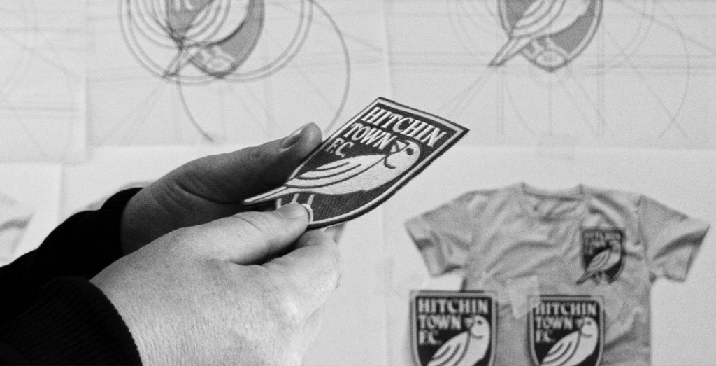
We were completely blown away when we first saw the new logo design. Whilst we made one or two tiny tweaks from the initially presented version, we couldn’t believe how Chris had managed to be considerate of our past whilst creating a vibrant new identity to represent us in the future.
How did the rest of the board / key decision makers react to seeing the new logo for the first time?
Very similar reactions. Let’s be honest, illustrating a bold-looking Canary is no mean-feat, but it was hugely popular with the committee members.
What makes a good logo for a football club?
I believe a good logo is something which supporters are proud to align themselves with and is easily utilized across various online and offline medias, with the latter a very important consideration in the modern-day. It should catch your eye, whilst being both unique and considerate of the Club’s history.
What impact will this new logo have on the football club? both next season and in the next 15 seasons?
This is our first season with the new crest and it was already had a huge impact on the Club. Merchandise sales have gone through the roof, with supporters ordering shirts, scarves, badges, hoodies and all sorts is vast quantities.
Why should football club’s look to progress their club’s identity / branding?
It needs to the right time to do so and for us, the changed marks 150 years since the FA Cup kicked off in Hitchin, so the timelines worked. But ultimately other Club’s should consider change if it’s needed. There are numerous examples of great rebranding projects, but equally examples of poor ones.
Our first recommendation would be to speak to supporters, compare your existing crest against other Club’s and ask the question, could this be better?
What would you say to other people who are in your position and art thinking about rebranding their football club?
We spent nearly a year looking at photos and other documents to understand everything we could about our Club’s history – enabling us to include many of these aspects in the current design (the canary and the crest shape).
That history, coupled with your aims for the future, will ultimately leave you with a design which ticks all the boxes.
Would you recommend Christopher Payne to other football clubs?
We would not hesitate in recommending Chris to other Clubs – in fact we already have to a large number of others. He’s professional, engaging and ultimately an incredibly talented graphic designer, who understands the modern game. If you’re considering a change then make contact with him, you won’t be disappointed!
![]()
Further reading
– Hitchin Town Football Club case study
– Behind the scenes: Designing Hitchin Town Football Club’s new logo
– Hitchin Town F.C. launch video
– Hitchin Town Football Club website
– Let’s work together: Contact me