 Back
Back featured reads
Designing custom typography for Eastleigh Football Club
June 11th 2020
7 Minute read
Christopher Payne is an award-winning British designer and passionate football fan. Backed up by his knowledge of football and the execution in design, Payne creates stylish, unique practical and relevant designs for ambitious and forward-thinking football clubs that are looking to progress both on and off the pitch.
Payne has worked with many football clubs and organizations around the world, designing iconic new logos and creating a detailed branding system, that makes the football club standout, grow off the pitch, and thrive in the modern world.
You can see examples of Payne’s work by clicking here.
Contact me¿Hablas español? Yo también. Contactarme.
Typography will touch almost everything that your football club produces. Carrying your messaging across various mediums while giving your followers and fans a sense of your visual language and brand tone.
Your club’s typography should be relevant and consistent, and help you stand out in a crowded marketplace. While being capable of telling the story of your football club.Your typography should be a key player in building your brand recognition.
In 2020, I redesigned Eastleigh Football Club’s brand, and created custom typography for the club to use across all of their marketing and visual communications. This is the story of what inspired Eastleigh Football Club’s typography, as well as why it is important, and how sets the club up for future success.
Why it is important to have your own custom typeface
Many top businesses, and elite football clubs have their own typefaces that help separate them from the crowd and contribute to building a strong, impactful and recognizable brand.
Custom typefaces were initially introduced in the tech industry around 15 years ago. As a way to save on the cost of licensing existing typefaces, and help the forward thinking tech companies stand out among the crowd.
These days companies from all industries are commissioning custom typefaces, and the football industry is now catching on.
Advantages of having your own typeface
A custom typeface will help your brand stand out and be unique, it will help tell the story of your football club. Your fans should be able to recognise anything you produce, in both print and digital media, and one of the best ways of ensuring this is to create consistency by using custom typography.
Working with a skilled designer to commission the club’s own typeface will,
- Make your brand more recognizable and memorable, beyond the logo.
- Improve brand awareness
- Show your brand to be well thought out and professional.
- Add style to all content that you produce.
- Build brand recognition
- Help build a consistent brand.
Building out Eastleigh Football Club’s custom typography
In January 2020, I began designing Eastleigh Football Club’s new logo.
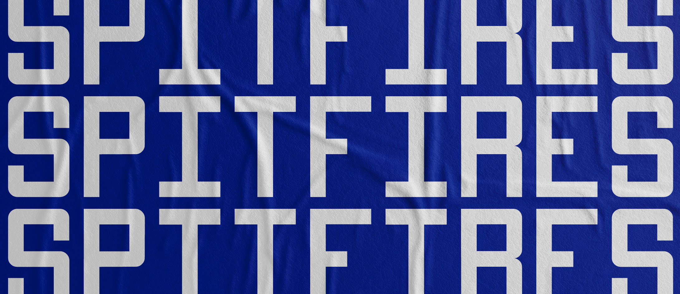
Eastleigh Football Club’s nickname is ‘The Spitfires’, as Eastleigh was the place where spitfire aeroplanes were designed and manufactured. After many productive meetings with the club’s board, we decided that the new Eastleigh F.C. logo would bring to life ‘the spitfires’ nickname, by incorporating a spitfire aeroplane within the design of the clubs new logo.
![]()
Researching Spitfires and finding inspiration in their typography
During the early stages of designing Eastleigh Football Club’s logo, I began doing a vast amount of research on spitfires aeroplanes. Soon I noticed the 3 letter markings on the side of these aircrafts.
Being a designer, with a ‘somewhat unhealthy’ obsession with typography, I became fascinated by the style and form of these three letters that has appeared on the side of aeroplanes, and instantly, I knew that I wanted to use this as the inspiration for the typography that would be used in the logo.
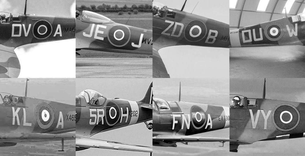
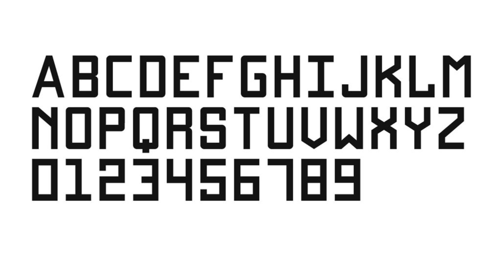
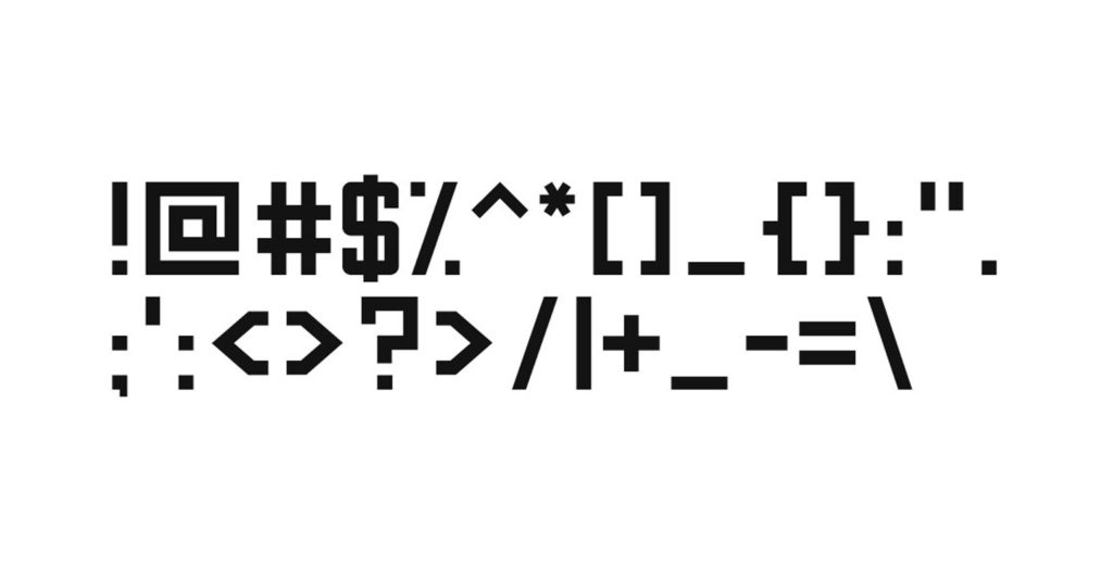
I studied 100’s of different spitfire photos and technical drawings specifically looking to find consistencies in the typography. Also to see if there was a pattern to the form of these letters – from this research I was able to design a robust and accurate typeface for the football club.
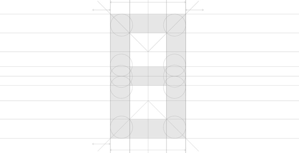
In approaching this typeface, I decided upon what characteristics I wanted it to have, I wanted the typeface to have a solid structure and frame for the typography, but also a sense of consistency across all letters. I wanted the weight of the typeface to be thick enough to stand out and feel confident, but also lean enough to feel like it could fly.
I built out a basic grid structure which I used for each letter, number and symbol, to ensure consistency. Additionally, I also had set rules on what angels I could use, and how curves should be utilized.
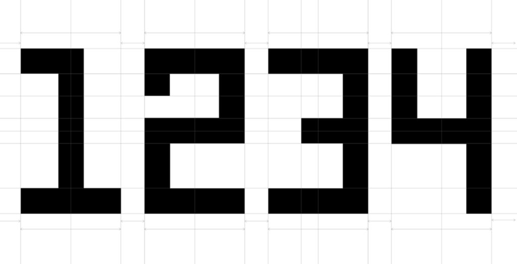
The process of creating a stylish and usable typeface takes a lot of patience and constant testing. Once I had created a letter, I tested to see how it displayed alongside other letters in the typeface. I wrote versus words using the letters I had designed and assessed how sentences would be formed using this new typography.
Additionally I also looked at how this type would look when replicated at a smaller size vs being used at a bigger size.
Typography in action
After 3 weeks of designing, testing, tweaking and perfecting, I finally completed the custom typeface.
The first place it would be used was in the football club’s new official logo. The typography would evenly wrap around the spitfire design, to display the name Eastleigh Football Club.
Additionally the numbers 1946 would be placed within the design of the spitfire at s as smaller size, to show the club’s historic founding year.
![]()
A consistent recognizable brand
Beyond the logo, the new typeface will be used consistently across all design, visual messaging and communication. From the club’s official website, to the official program, social media marketing and other key messaging opportunities. It will also be used on fan wear and official merchandising.
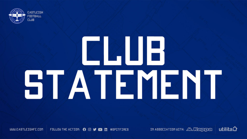
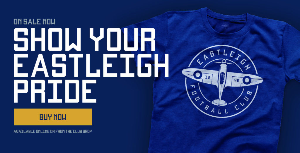
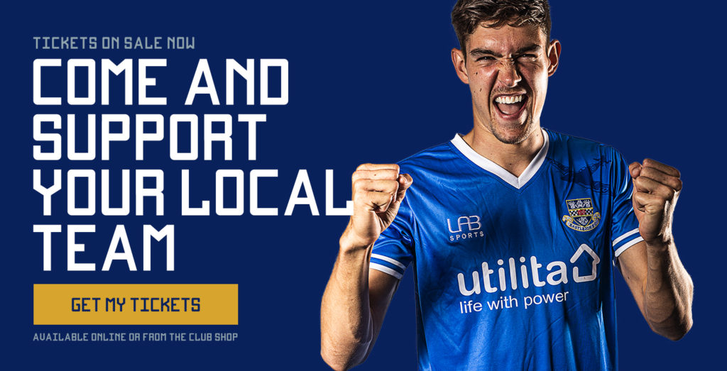
Eastleigh Football club now proudly have a stylish and recognizable new typeface for their brand. A typeface that was inspired by the rich history of Eastleigh and designed especially for the football club. This new typeface will be used across all assets of the football club, and help the football club stand out and be recognized though it’s typography.
Further reading
- Eastleigh Football Club case study
- Behind the scenes : Designing Eastleigh F.C.’s new logo
- Chapters : See the short film that launched Eastleigh F.C.’s new identity