 Back
Back featured reads
Designing York City Football Club’s Minster inspired kits
May 6th 2022
15 Minute read
Christopher Payne is an award-winning British designer and passionate football fan. Backed up by his knowledge of football and the execution in design, Payne creates stylish, unique practical and relevant designs for ambitious and forward-thinking football clubs that are looking to progress both on and off the pitch.
Payne has worked with many football clubs and organizations around the world, designing iconic new logos and creating a detailed branding system, that makes the football club standout, grow off the pitch, and thrive in the modern world.
You can see examples of Payne’s work by clicking here.
Contact me¿Hablas español? Yo también. Contactarme.
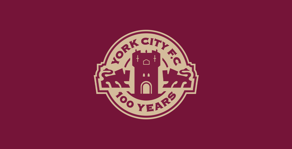
York City’s kit project was announced just days after I’d finished designing their centenary crest, so the proud history of the club was fresh in my mind.
The centenary crest was a one-off, special edition crest designed to celebrate a hundred years of York City Football Club. You can read about its creation here:
After the centenary crest was approved by the club’s board, I turned my attention to the design of the clubs special edition kit. I had collaborated with York City’s extremely talented media manager Dan Simmonite on the centenary crest project, so it was only natural that we work together on this project too.
Dan and I met up to discuss famous York City kits from yesteryear. We covered cult classics and forgotten gems, the legendary moments those kits were involved in, and the various colours the club had worn over the years. It was a fascinating conversation.
Kit colours: Maroon and white
When designing the club’s crest, we landed on a colour scheme of maroon and gold. This was inspired by the fact that York City played in maroon and white when they kicked their first ball in 1922. This colourway stayed with the club, on and off, until the late 70s when they transitioned to the red, blue, and white we know today.
Several fans had suggested that the commemorative kit should be maroon and white, echoing the club’s first colour scheme. Dan and I completely agreed. It would work nicely with the maroon and gold centenary crest too. But what would this special kit look like?
Kit design ideas
To come up with a design for the maroon kits, Dan and I had a brainstorming session. Perhaps the kit could feature the names of past players? Or how about newspaper headlines from historic moments? Too easy. Too obvious, this could be done by any club, we really wanted something that would be highly unique to York City.
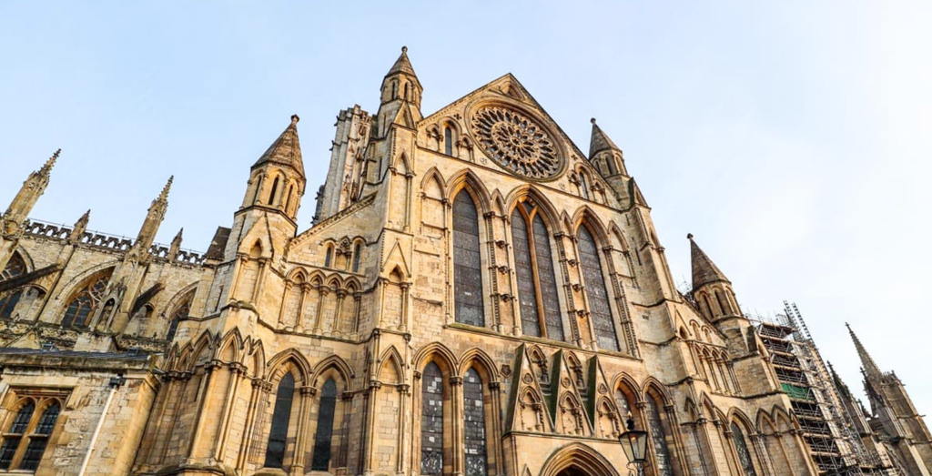
Then Dan had a great idea! He suggested bringing features of York’s world-famous minster into the design. I was intrigued.
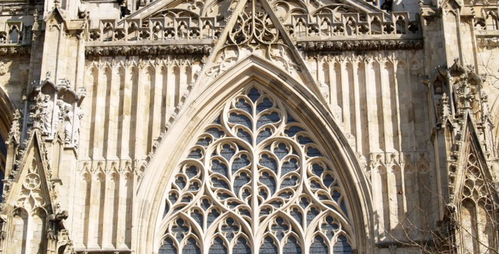
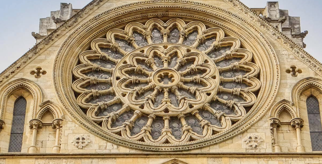
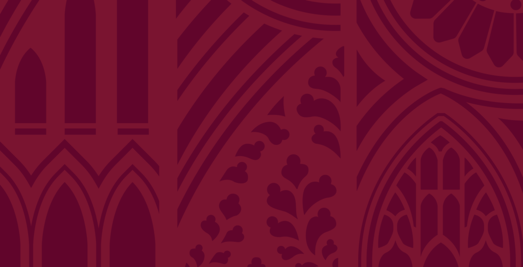
York Minster is a magnificent cathedral that dominates the city skyline. Its construction began nearly eight hundred years ago in 1230 AD, and it has become a building of huge cultural significance to York and England as a whole. This astonishing piece of architecture remains as awe-inspiring today as it would have been in the medieval era.
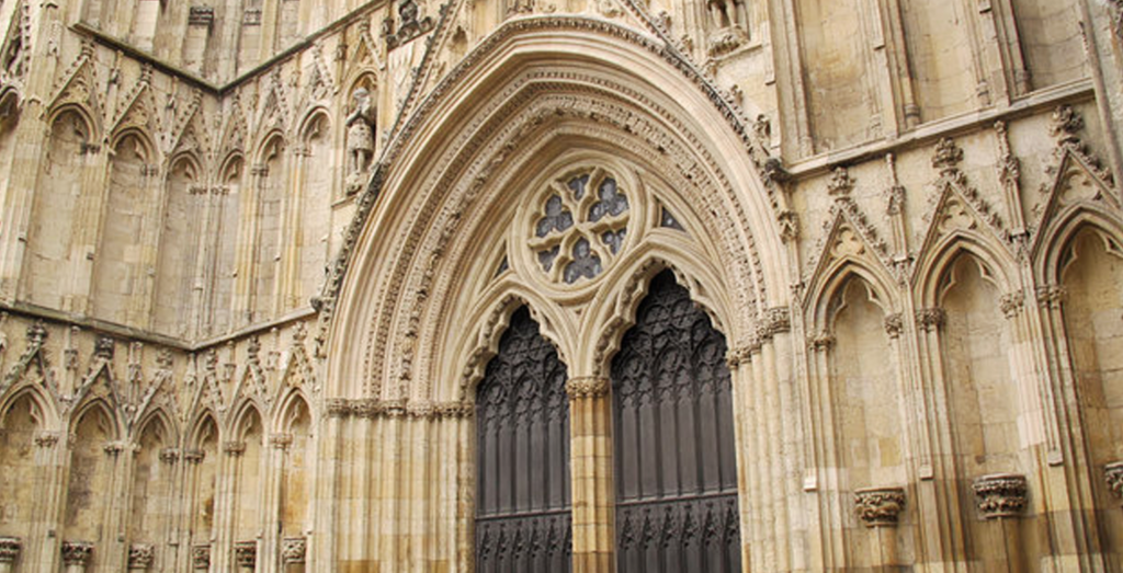
I began studying the building, examining the intricate design features that make it so impressive. From the famous stained-glass windows to the flowing arches and gothic structures, inspiration could be found in every corner.
I was inspired and I instantly knew what to do with this kit design.
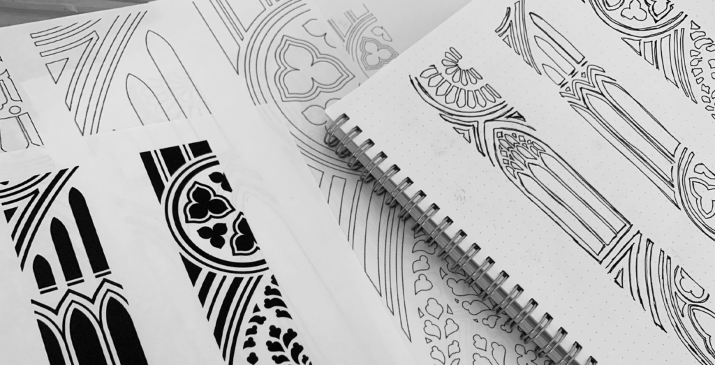
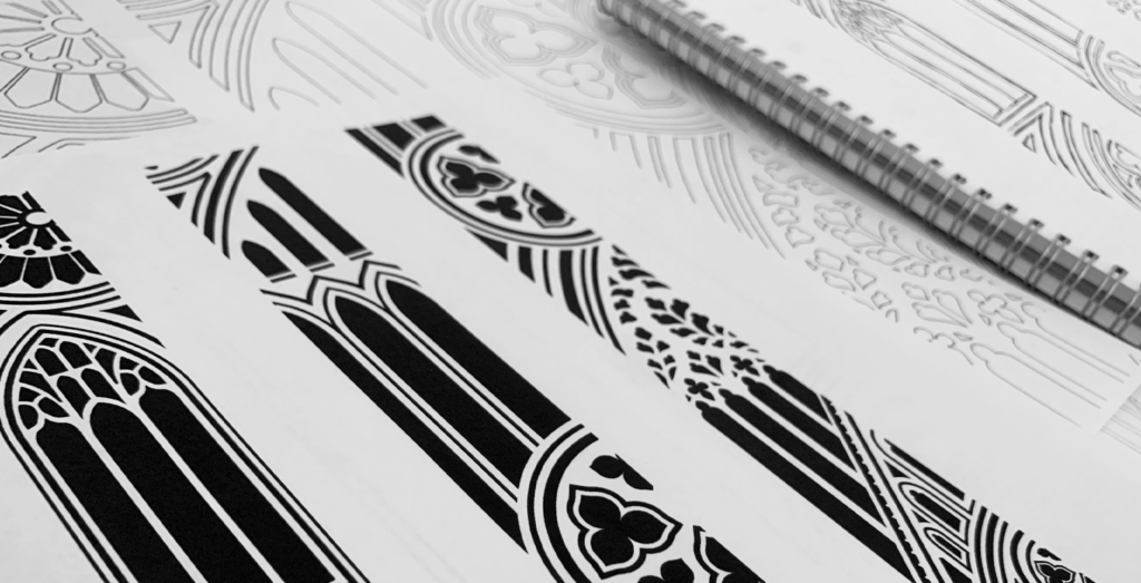
From inspiration to sketch
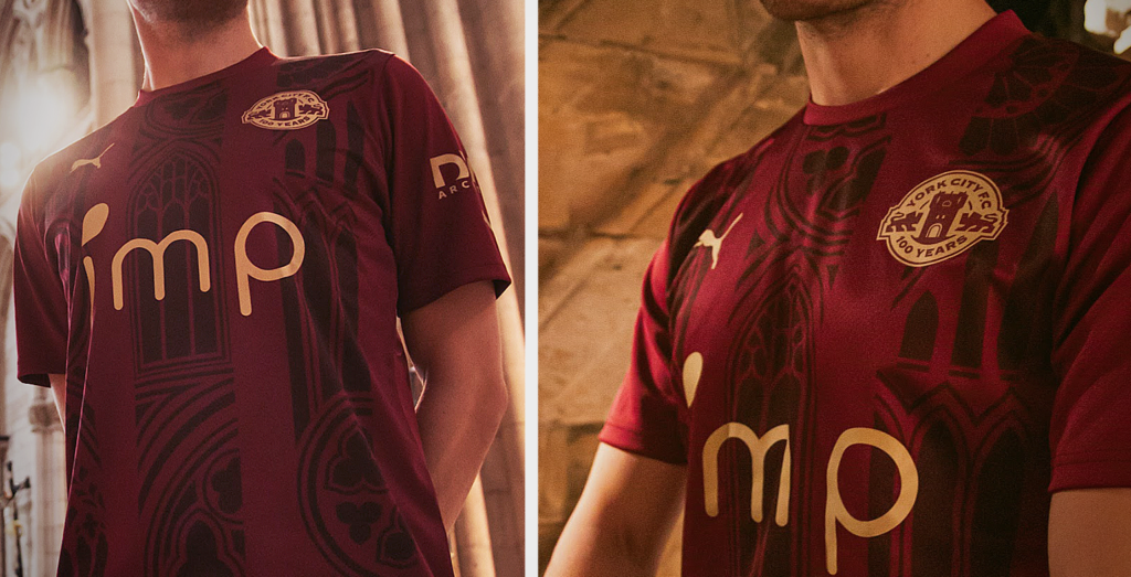
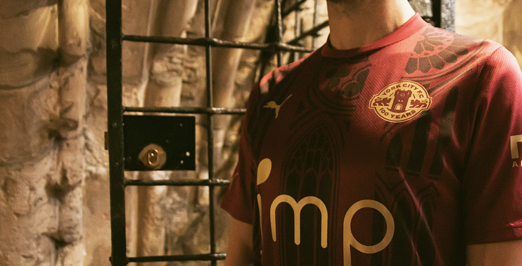
I set out to create a design that abstractly referenced the minster’s most recognisable features. Working with a pen and paper, I created a series of concept sketches that placed different shapes and motifs next to one another. I placed the arched windows of Chapter House, next to the famous and instantly recognisable Rose window, whilst experimenting with the placement of the Minster’s ‘Five Sisters’ window structure.
The aim was to create an intricate pattern that would show recognisable features of York Minster, whilst obtaining the right visual balance.

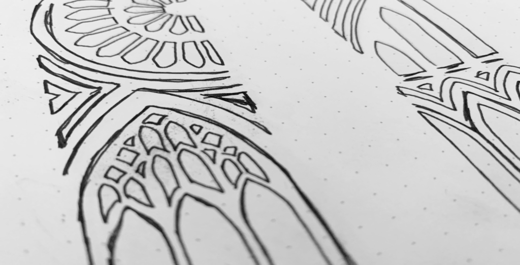
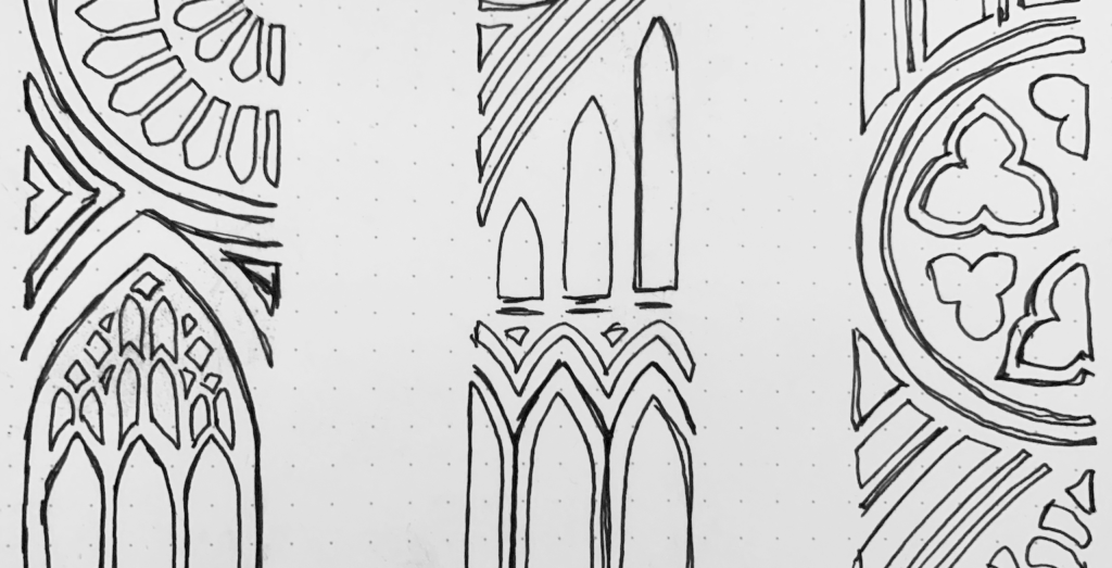
After a lot of tweaking, I landed on a formation of shapes that instinctively worked. Without delay, I scanned it into the computer to further perfect the design.
Digitising the design
The sketch provided a great guide but it needed honing. I used digital design tools to tweak and refine the design. The challenge was finding the right visual balance between the shapes and the negative space. It was a long process with a lot of tweaking, but it was worth the effort.
I love how it turned out. The design is interesting and intricate, and the abstract pattern achieves an old-world, gothic look that feels highly relevant to York Minster and the city’s architecture as a whole.
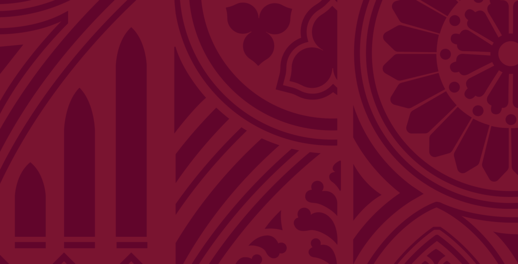
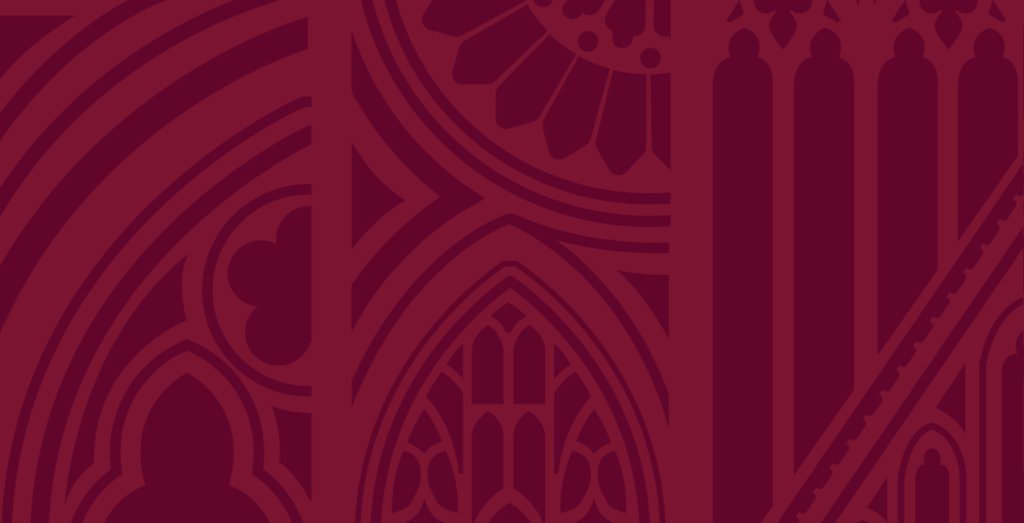
Adding colour to the design
The next stage of this design process was to apply colour to the pattern. This would allow me to see how it worked on a digital representation of the club’s kit.
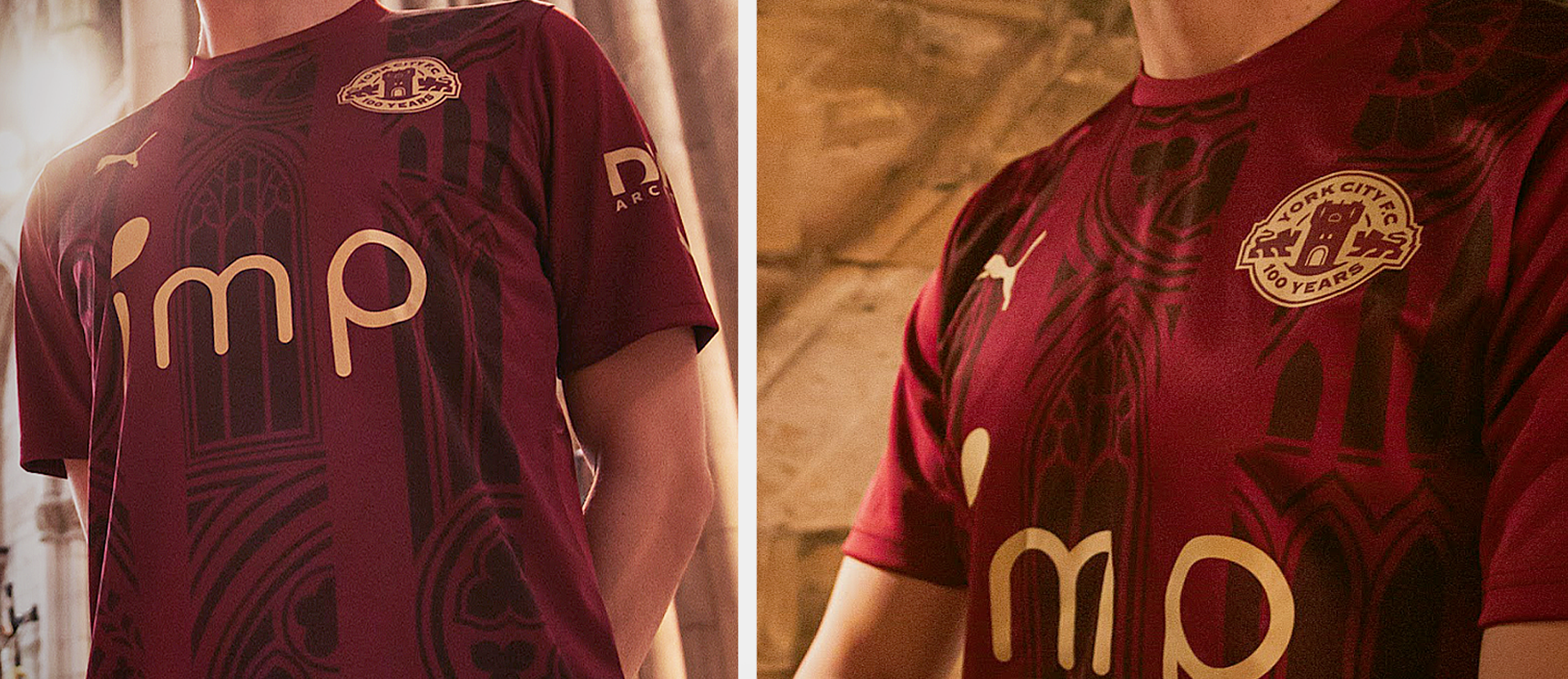
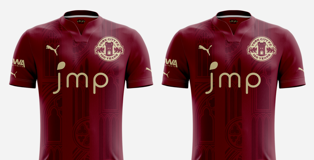
I used two maroon tones, so from a distance the fans would see the players playing in the club’s original colours (maroon and white), and when close up the fans would see the intricate details of the Minster-inspired pattern. It turned out really nice.
Visualising how this design would look on the kit
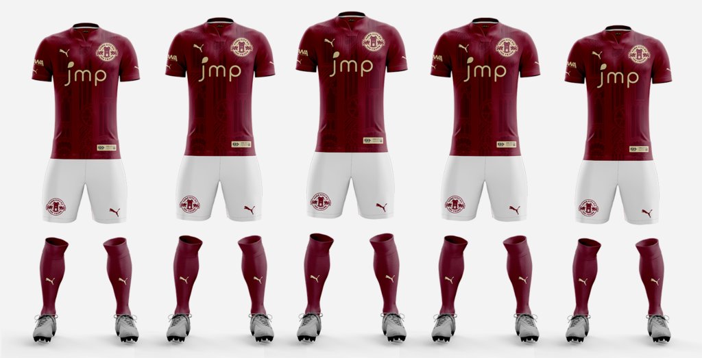
Once I’d found the right combination of maroon tones, I added the minster-inspired pattern to a digital mock-up of the kit (see below). It looked great alongside the centenary crest. It also worked well with the logo of the club’s sponsor and the brand identity of their kit supplier, Puma.
I stood back to take a proper look. It was great. The minster-inspired pattern wasn’t overwhelming or busy, and the balance of the design was just right. I couldn’t wait to present it to the board. But before that could happen, there was an important detail that we wanted to add.
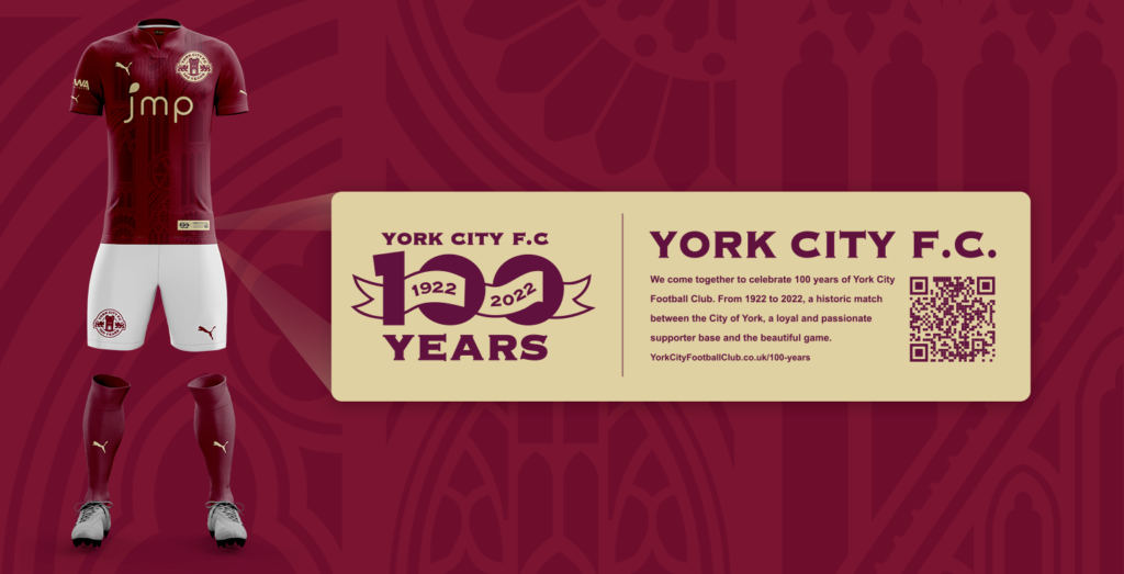
Commemorative tag
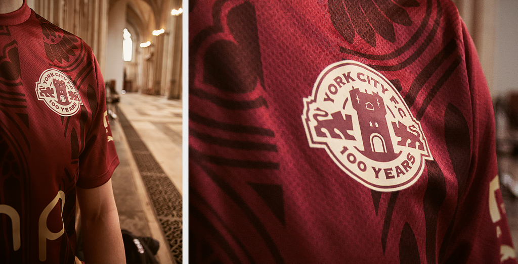
To make this centenary kit extra special, we added a commemorative tag in the lower right corner of the shirt. This tag adds prestige to the look and feel of the shirt, but it also reinforces that this kit is a special occasion with one hundred years of history woven into it.
The tag includes a QR code that links the physical product to the digital world. A quick scan instantly transports fans to a web page that documents the football club’s journey.
I loved the fact that the kit can represent so much history yet retain the modern touch with QR code technology. Like the centenary crest, it effortlessly connects the old with the new.
Presenting to the board
The kit was complete and it looked great. But what would York City’s board of directors make of it? Dan set up a meeting and I presented the design. It was great to have a chance to explain the reasons behind my creative choices.
As with the crest, the board loved it. Once again, they were impressed with the amount of thought and detail that had gone into the design.
York City’s centenary kit and crest were officially approved. Time to get the ball rolling with the club’s kit supplier.
Working with Puma
With the kit approved, I worked with sportswear giant Puma to turn my digital design into a physical product of equal quality. Making a success of this kind of transition requires a keen eye for detail. The colours and the placement of the pattern must be exactly right or the whole design will fail.
There was a lot of back and forth with Puma as we refined even the smallest details, but it was worth the effort. After all, York City has been waiting a hundred years for this kit.
A photoshoot in the Minster
Puma sent the club a physical shirt to approve. It looked and felt great! It was befitting of 100 years of history. All the small details were taken care of and there was an a feeling of history stitched into the shirt.
With the sample shirt in hand, and approved, Dan took the shirt to the place that it’s design drew inspiration from – The York Minster. Dan look a series of photographs that showed off the design and detail of the shirt. it was the perfect setting and made for a great series of promotional photographs.
Pride in the process and delight with the design
Working with Dan Simmonite and the York City board of directors was a joy. They gave me an abundance of creative freedom and completely trusted my design decisions.
I’m extremely proud of the design that we created. It’s unique, stylish, intricate, and relevant to the City of York and its fine football club. I’m confident fans and players alike will embrace a design that is so deeply rooted in their history. I can’t wait to see them wearing this once-in-a-lifetime kit as they celebrate a hundred years of York City Football Club.
Further reading
– Designing York City’s centenary crest
– York City F.C. centenary crest case study
– Get in touch, start a project