 Back
Back featured reads
Brand New – Flower City Union brand design reviewed
December 6th 2021
5 Minute read
Christopher Payne is an award-winning British designer and passionate football fan. Backed up by his knowledge of football and the execution in design, Payne creates stylish, unique, practical and relevant designs for ambitious and forward-thinking football clubs that are looking to progress both on and off the pitch.
Payne has worked with many football clubs and organizations around the world, designing iconic new logos and creating a detailed branding system, that makes the football club standout, grow off the pitch, and thrive in the modern world.
You can see examples of Payne’s work by clicking here.
Contact me¿Hablas español? Yo también. Contactarme.
Shortly after the successful launch of Flower City Union’s new brand, I noticed an influx of traffic coming to my website from Brand New – a hugely popular graphic design blog that is a trusted voice in the design community.
Brand New is famous for reviewing and featuring quality design work across all industries, offering analytical opinion and reaction to new brands that enter a market. They bring attention to people’s work, and openly and honestly review the good and the bad of a design – it is considered a huge achievement to be featured in this blog and get international recognition for your work, no matter how good or bad the review is.
Being a fan of this blog, and a regular reader, I was delighted to be featured, and confident that the review of the Flower City Union brand would be favourable.
Here is the link to Brand New’s: Flower City Union review: https://www.underconsideration.com/brandnew/archives/new_logo_for_flower_city_union_by_christopher_payne.php
Below is what ‘Brand New’ thought of Flower City Unions new identity and brand:
– – – – – – – – –
With Great Flower Comes Great Responsibility
About:
(Est. 2021) “The Flower City Union are an American professional soccer team based in Rochester, New York, United States. Founded in 2021, the team plans to debut in the National Independent Soccer Association, the third tier of the United States soccer league system, in 2022 and play at Marina Auto Stadium.” (Wikipedia)
Designed by:
Christopher Payne
Related links:
Christopher Payne project page
Christopher Payne behind the scenes post
Under Consideration Opinion
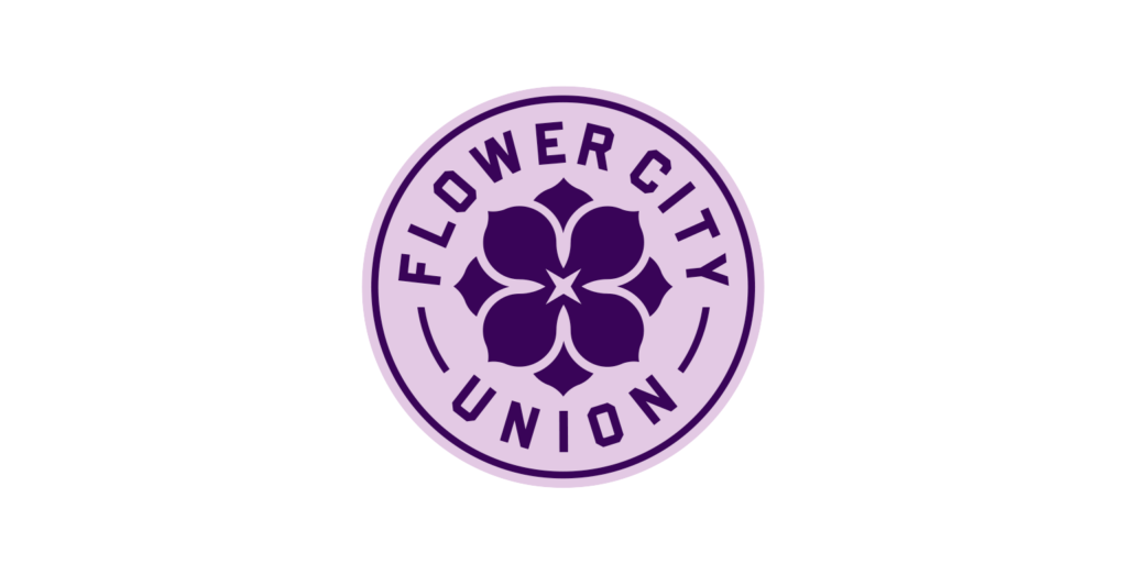
I usually don’t do full posts on third-tier sports teams — sometimes even top-tier teams don’t get this treatment — but this is remarkably nice and well thought out. The concept and references behind it are simple, honest, and relevant: the lilac flower abounds in Rochester, so the icon is a lilac; Rochester has brutal winters, so the little nubs behind the lilac represent the coming of spring; Kodak was founded and is headquartered in Rochester, so the starburst at the center represents a flash; and the typography is industrial because, whatever, it looks damn good.
This is a beautiful icon that on its own manages to look both delicate and strong but the addition of the blocky typeface, Komet & Flicker’s Hammer and Tongs, gives it an excellent burly contrast.
The merch looks great and the introduction video is great… overall, yeah, just great and sort of refreshing in its simplicity and lack of usual bravado-overload of new sports logos.

Relevant quote (By Christopher Payne)
“With the club being called Flower City Union, and the community having an affection with the lilac, I knew early in the process that this soccer club’s brand design should revolve around a flower – specifically a lilac.
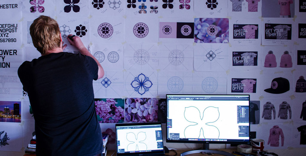
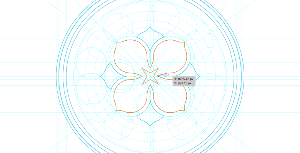
In sketching Flower City Union’s new logo, I wanted ‘quarter symmetry’ to play a big role in the design’s look. A single lilac is a beautiful flower that has four petals, all equal in shape and size. I looked to draw balance and symmetry from those four petals.
The design of the logo has the four-petaled lilac as the central focus, but surrounding the lilac’s four petals are ‘the budding flowers’. These budding flowers reference the joy and excitement of flowers blossoming in Rochester – the sign that the warmer days are head and the good times are coming.
To references this city’s historical association with photography [Kodak is headquartered there], I used ‘the camera flash’ in the centre of the lilac. The shape of the camera flash was in line with the overall design aesthetic. It matched the symmetry and balance of the design and added that subtle nod to an iconic Rochester industry.
As the petals of the lilac are soft and gentle, beautiful and inviting, I wanted the typeface to act as more of a protector of the lilac. I used type to add some grit and edge to the design, to contrast but complement the lilac. The typeface used in the design is called Hammer and Tongs. It is powerful, athletic, bold, and legible. This typeface has a strong visual presence and works exceptionally well in the logo’s design and the more expansive brand.”
Under Consideration community feedback