 Back
Back featured reads
Designing New Amsterdam F.C.’s first ever home kit, and the meaning behind the design
September 8th 2020
5 Minute read
Christopher Payne is an award-winning British designer and passionate football fan. Backed up by his knowledge of football and the execution in design, Payne creates stylish, unique practical and relevant designs for ambitious and forward-thinking football clubs that are looking to progress both on and off the pitch.
Payne has worked with many football clubs and organizations around the world, designing iconic new logos and creating a detailed branding system, that makes the football club standout, grow off the pitch, and thrive in the modern world.
You can see examples of Payne’s work by clicking here.
Contact me¿Hablas español? Yo también. Contactarme.
New Amsterdam Football Club is the latest professional football club on the US soccer pyramid. Based in New York City, New Amsterdam F.C. aim to be the ‘Club of the People’ for all New Yorkers.
The launch of the New Amsterdam’s new logo received great attention – It provided hope and excitement to soccer-loving New Yorkers. The brand and club ethos stated from the beginning that this football club would be different, and was here to disrupt – love us or hate us – New Amsterdam F.C. will do things their way.
![]()
Read the blog post – Designing New Amsterdam F.C.’s brand
https://www.footballbranddesigner.com/design-new-amsterdam-football-clubs-brand/
The honour of designing the club’s inaugural kits
Shortly after the launch of the logo, I was asked to design the official New Amsterdam F.C. kits for the club’s inaugural season. What an honour, and what an opportunity to do something extremely special with this football club, and to further build upon the brand that we created.
Previous experience in kit design
Whilst my speciality is in designing and reimagining football club’s logos, this isn’t the first time that I have been asked to design a kit for a football club.
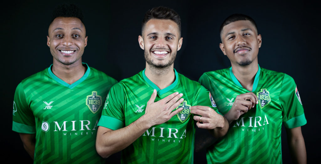
In 2017, California based team – Napa Valley 1839 F.C. asked me to ‘guest design’ their kits as they looked to sell more merchandise, locally and internationally, and get their brand seen more broadly in the community, and beyond.
Napa Valley is famously known for its wine production, and vineyard filled scenery, and so keen to reference the local area in the kit design, I created.a brand pattern that would abstractly show rows of intertwining vineyards – These kits sold out they sold-out in days.
Read the blog post – Designing Napa Valley 1839 FCs vineyard inspired kits.
https://www.footballbranddesigner.com/designing-napa-valleys-vineyard-inspired-kits/
Anyway back to New Amsterdam F.C.
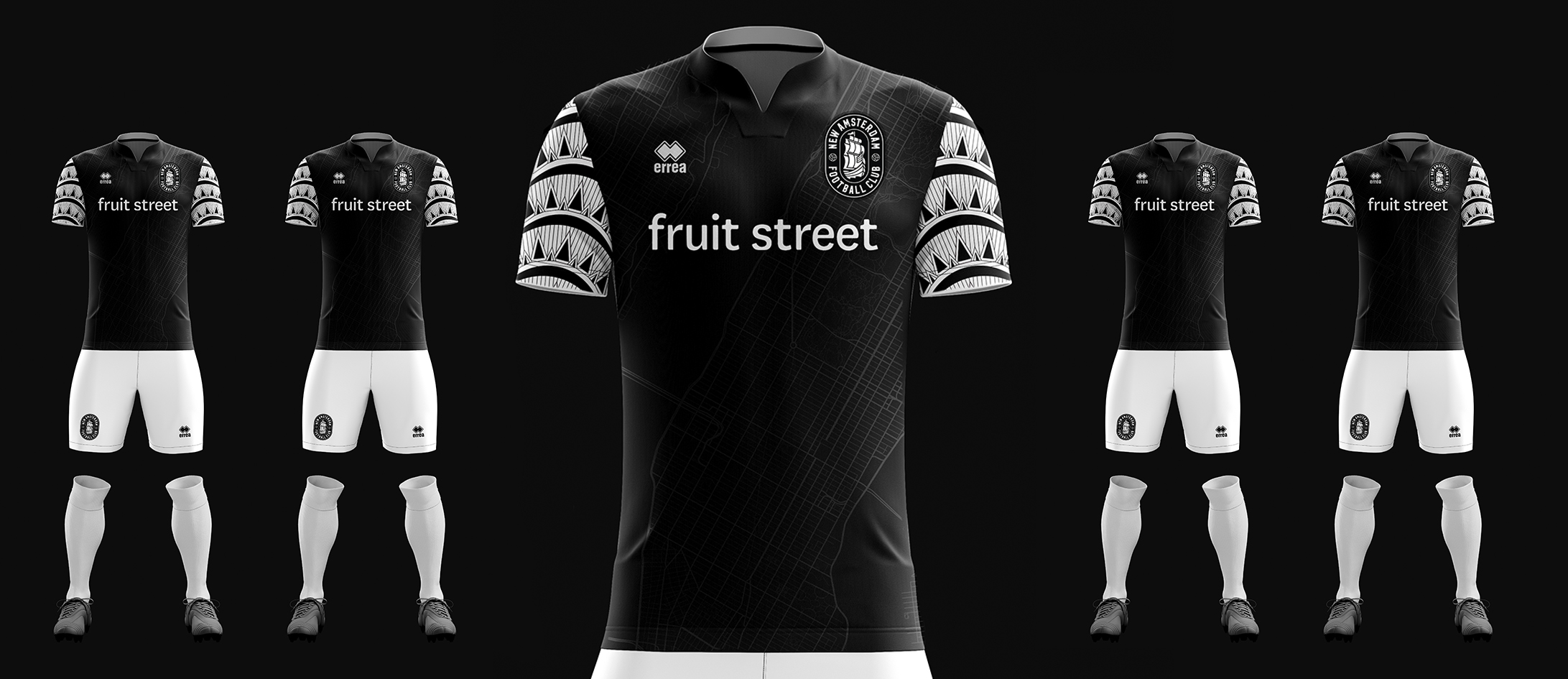
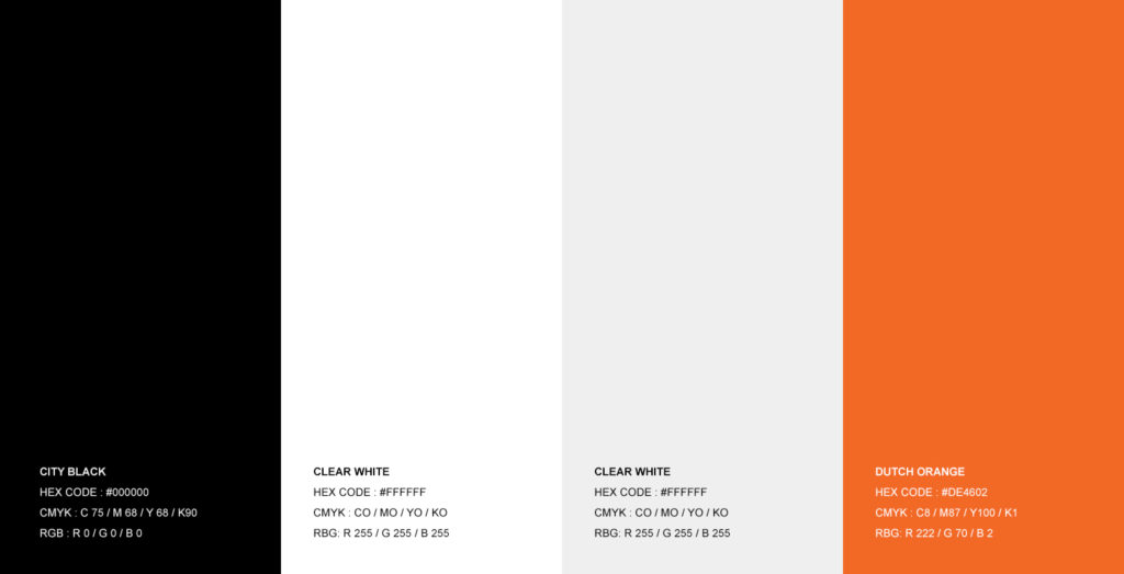
The brand that we created for New Amsterdam F.C. was built upon a colour scheme of black and white – with orange as it’s accent colour.
The black and white colour scheme represents the gritty urban nature of New York City and is inspired by the classic and timeless black and white photography that is associated with New York City.
As the club’s name – New Amsterdam Football Club has dutch relevance, so the colour orange was added to the brand to visually reference dutch football (as Holland’s national team famously play in orange).
These colours where the natural starting points for the kit designs – It made sense that the home kit would be black and white and the away kit would be all orange.
In this article we will talk about the design of the home kit, however, if you would like to see/read about the design of New Amsterdam F.C.’s away kit, here’s the behind the scenes story link: https://www.footballbranddesigner.com/designing-new-amsterdam-f-c-s-dutch-inspired-away-kit/
Making the designs relevant to New York City
New Amsterdam is proud to represent New York City. They provide a platform for players and fans to come together from all boroughs of this iconic city.
Going into this project I knew that it would be hugely important for the kit designs to reference New York City.
Luckily for me, New York City has many iconic buildings and structures, so I was spoilt for choice in having multiple landmarks to reference.
In the design process, I sketched out abstract concepts that included Brooklyn Bridge, the Empire State Building, NYC’s iconic skyline, the Statue of Liberty, and many other great and iconic landmarks that New York City had to offer.
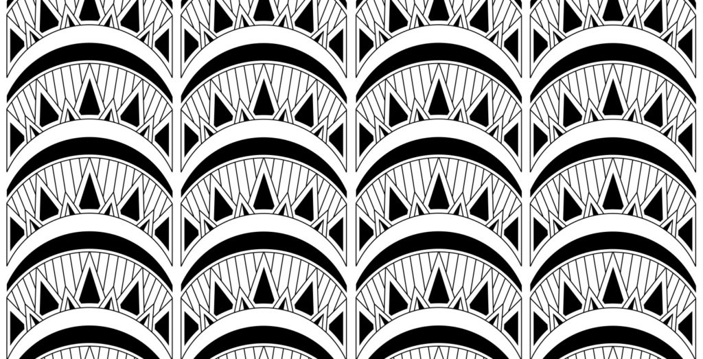
After all the experimentation and searching for the right NYC visual to reference in the kit design, it was the Chrysler Building that really stood out, and captured my imagination.

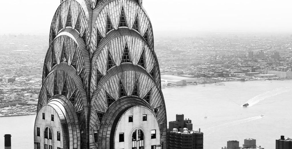
The Chrysler Building
I loved the shapes that form the top of the Chrysler Building, they are a beautiful combination of sharply-pointed spikes and calm, flowing, curves. There was something interesting in this combination of shapes that could be used as a pattern for New Amsterdam F.C.’s kits.
After studying the Chrysler building, I recreated the curves and the sharply pointed triangles, to make them a repeatable and practical pattern. It was instantly apparent that this was a visually interesting pattern, that would certainly make the football club stand out. There was complexity and intrigue to the design, but it has a very uplifting feel, and subtly references a dominant piece of New York City skyline. It is a pattern that is very ‘current’ and on-trend, with ‘loud’ graphics and eye-catching designs being very popular right now.
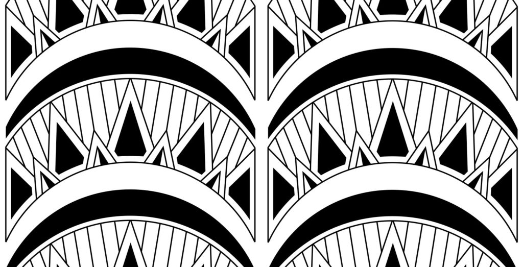
Applying the pattern
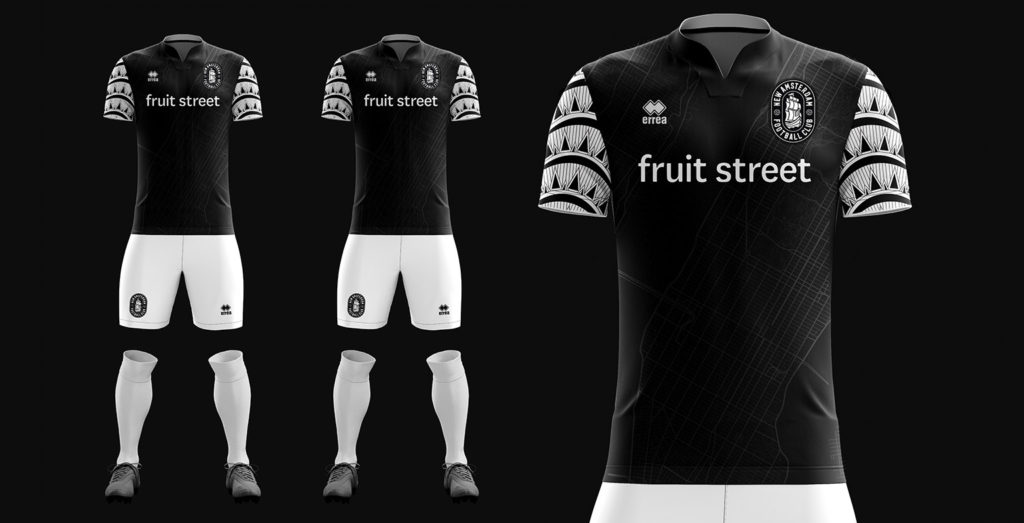
As the ‘Chrysler inspired’ pattern design was visually very busy and complex, I wanted to restrict this pattern to just the sleeves of the jerseys and leave the body part of the jersey black. This would give the jersey design a nice balance of eye-catching design on the sleeves, and a calmer and controlled body colour.
As seen below, I created a 3D render of the full kit design to present to the football club – It was love at first sight! I knew that this kit would turn heads, and be a popular item in the club’s shop. I loved how the design really pops and how relevant it is to New York City.
Max Mansfield (the club’s Sporting Director) and Michael Hitchcock (the club’s Technical Advisor) loved the unique style of this design straight away, commenting on how cool it looked and how the ‘Chrysler-Building-pattern’ brought relevance, as well as style to the design. With their excitement for the design, I began to work with the team at Errea (the club’s sportswear partner) to produce the kits.
Working with Errea to produce these beautiful kits.
New Amsterdam F.C. had signed a deal with Errea to be the football clubs, official kit supplier. This was such a great decision. Errea is a joy to work with and an organization with great tradition, and momentum.
I worked with their team to ensure that the production was as good as the design, and the vision was executed flawlessly. Errea’s team worked alongside me every step of the way, sending me digital proofs and samples to approve. They are an organization that I would recommend and hope to work with again.
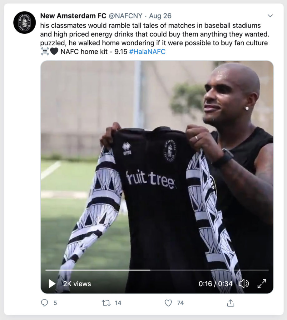
The first cryptic tease of the new kit was published on Twitter in August
Conclusion.
The process of designing a football kit is an exciting one.
Many claim that football is becoming a ‘templatized’ sport with many clubs choosing to use an ‘off-the-shelf’ design or a ‘template’ provided by their sportswear partner. This is often for financial reasons and is perfectly fine – as some of the off-the-shelf templates are very stylish, however, New Amsterdam F.C. look to be unique and do things their way. They strive to create something different, something unique and something relevant to them, and it really does make a statement and lasting impression.
I am a huge fan of how New Amsterdam F.C. handle themselves, and what they stand for – they could have easily chosen an off-the-shelf design, however, instead they partnered with Errea and myself, and between us we creating something stylish and meaningful for New Amsterdam F.C.’s and for New York City.
I am extremely proud of every part that I have played in this football club’s formation. Their brand goes from strength to strength, and there is more to come from this football club. Long live the ‘Club of the People’.
New Amsterdam F.C. inaugural season home kits on sale today.
Today the football club are proud to launch these kits. They are available for purchase on the football club’s website: https://newamsterdamfc.com/shop
Further reading
– New Amsterdam F.C. case study
– New Amsterdam F.C. brand guidelines
– New Amsterdam F.C. brand video
– Designing New Amsterdam F.C.’s brand
– Got questions? Want to start a project?